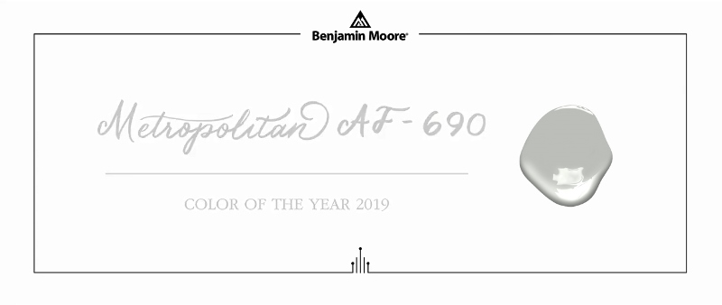
Benjamin Moore, the producer of legendary paints announced the Color of The Year 2019.
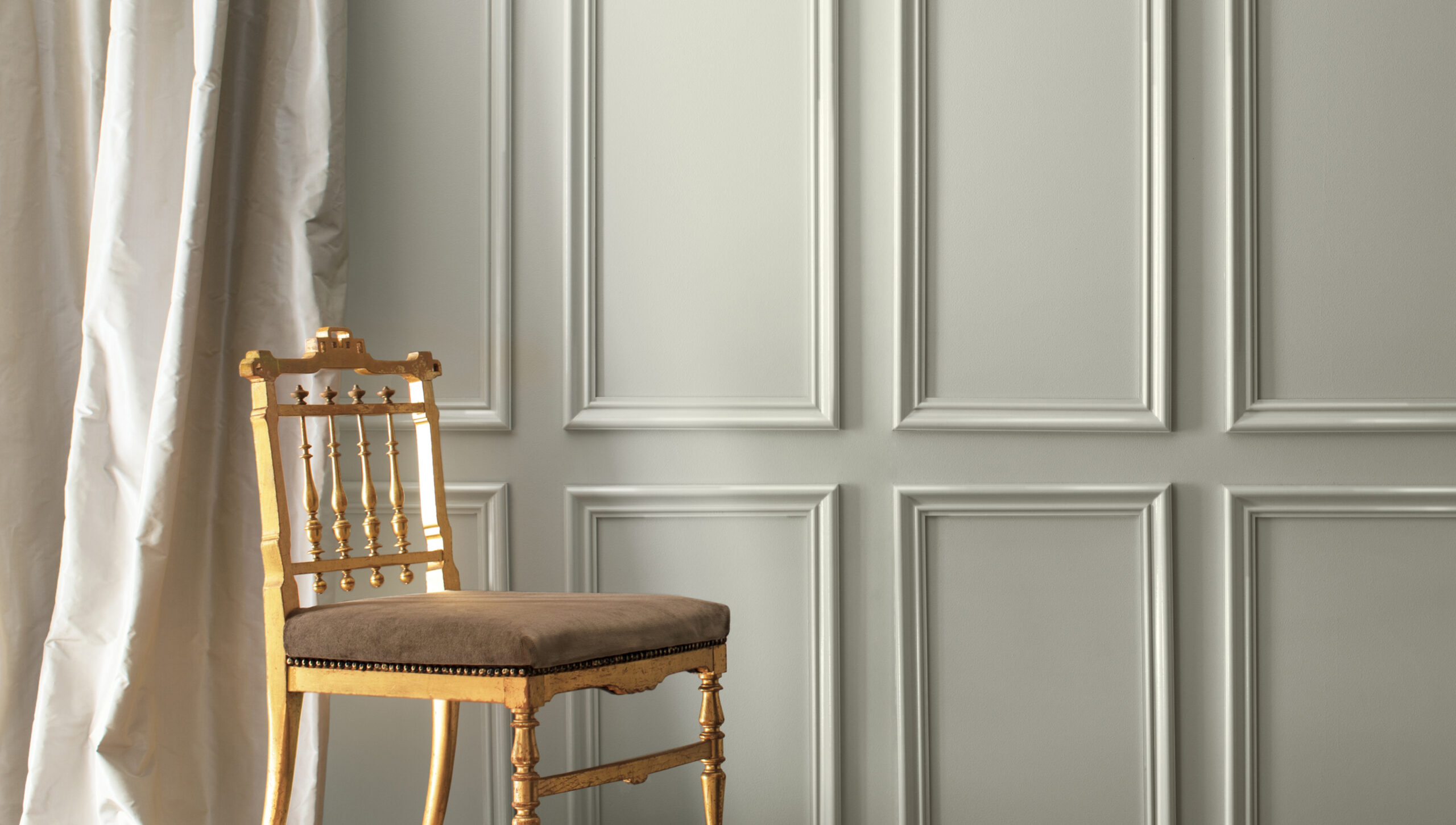
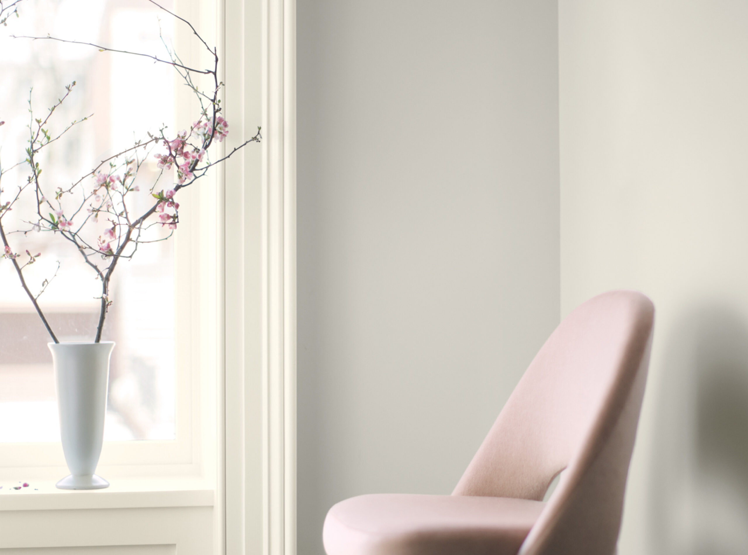
Comforting, composed and effortlessly sophisticated, METROPOLITAN AF-690 exudes beauty and balance.
Color of The Year was presented for the first time in the pool room of Philip Johnson's famous Seagram Building (is there any venue more quintessentially metropolitan?).
Why this silver-gray shade become the most important color?
Ellen O’Neill, Director of Strategic Design Intelligence at Benjamin Moore & Co., each year canvases the globe with a team of private eyes, carefully building a case for a single color (chosen from the brand's palette of more than 3,500) that captures the look and feel of the moment—beyond mere trends.
With last year's choice—a striking red called Caliente—she colored in the passion and voice that had erupted across the country. But this year, as she took society's temperature, something altogether different floated to the surface: People wanted quiet.
Proof rolled in with the fog, last November in London. And there it was again in Amy Sherald's portrait of Michelle Obama; in the sweet serenity at the Noguchi museum in a quiet corner of Queens, New York; and even in the silvery streaks of a bizarre new hair color trend called mushrooming.
"I read about it about six months ago and put it in my folder" says O’Neill and adds “About a month and a half after we announced Caliente—a very aggressive, bold color—I headed over to London to be on a panel about color. I remember going to the National Portrait Gallery and looking at a painting by Gerhard Richter and it said - gray, the color of indifference. I burst out laughing and I said - oh, my God, how appropriate is that?"
Benjamin Moore Color Team went through a whole neutral palette that included khakis and warmer tones in addition to grays.
They wanted to find a midtone color that had a little bit of life to it and focused in on the gray family because grays are incredibly popular. Color hunters tried to glamorize it—to not make it just an industrial, commercial sort of reference. They wanted it to have a bit of metallic; there’s a story folded into this about shine and reflection. That’s exactly why in the Color Trend Book 2019 you can find Metropolitan in two different gloss-grades – eggshell and semi-gloss. Benjamin Moore decided to do that for the first time.
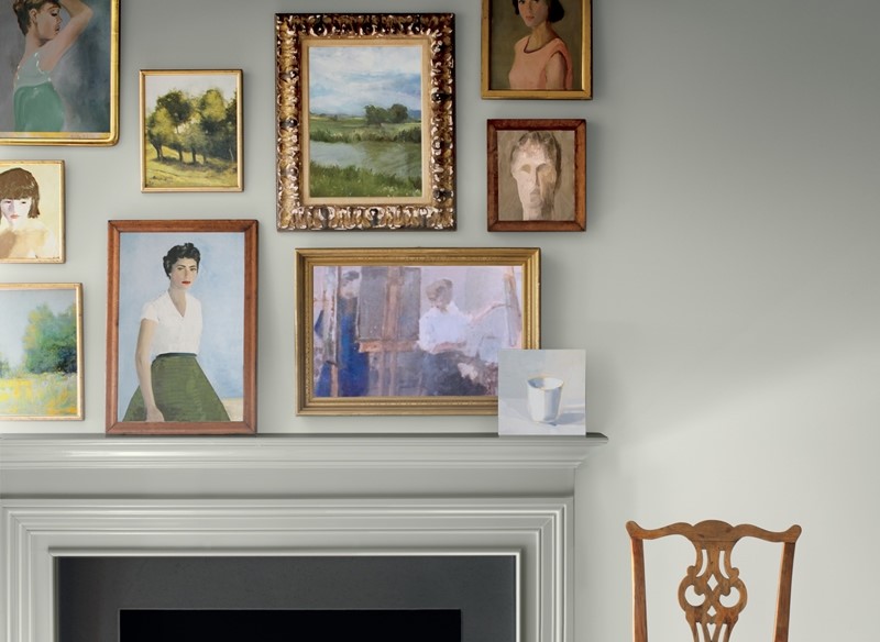
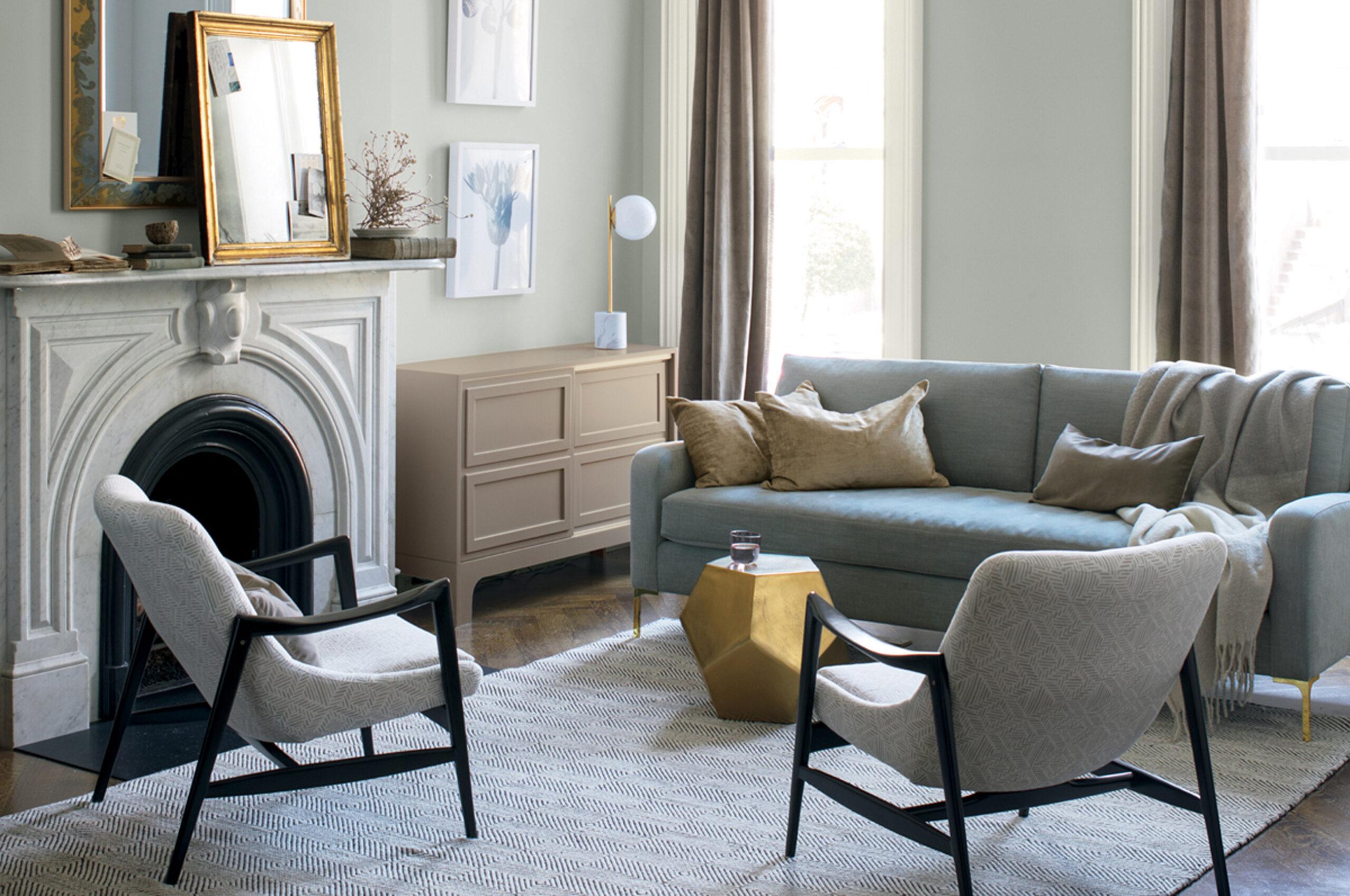
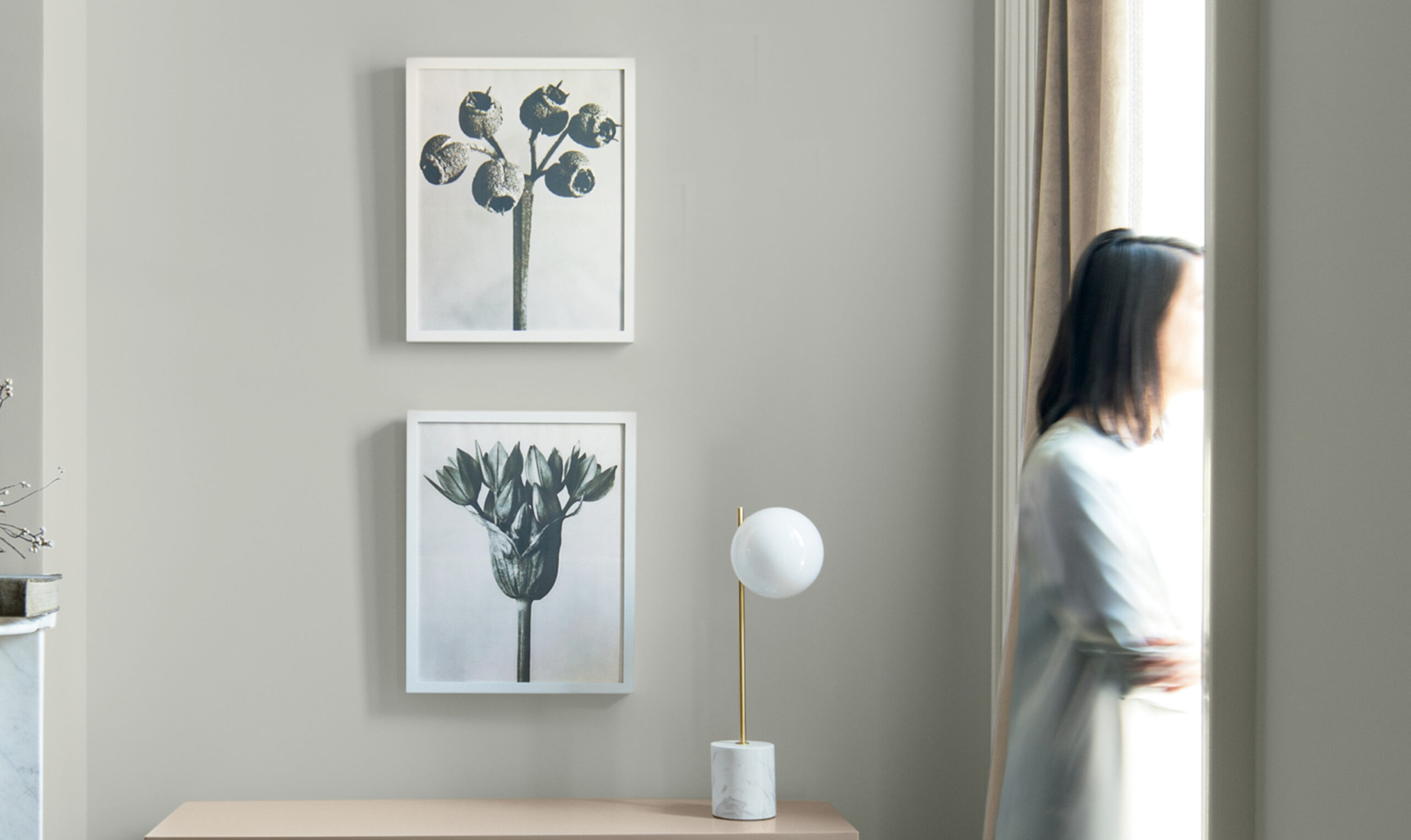
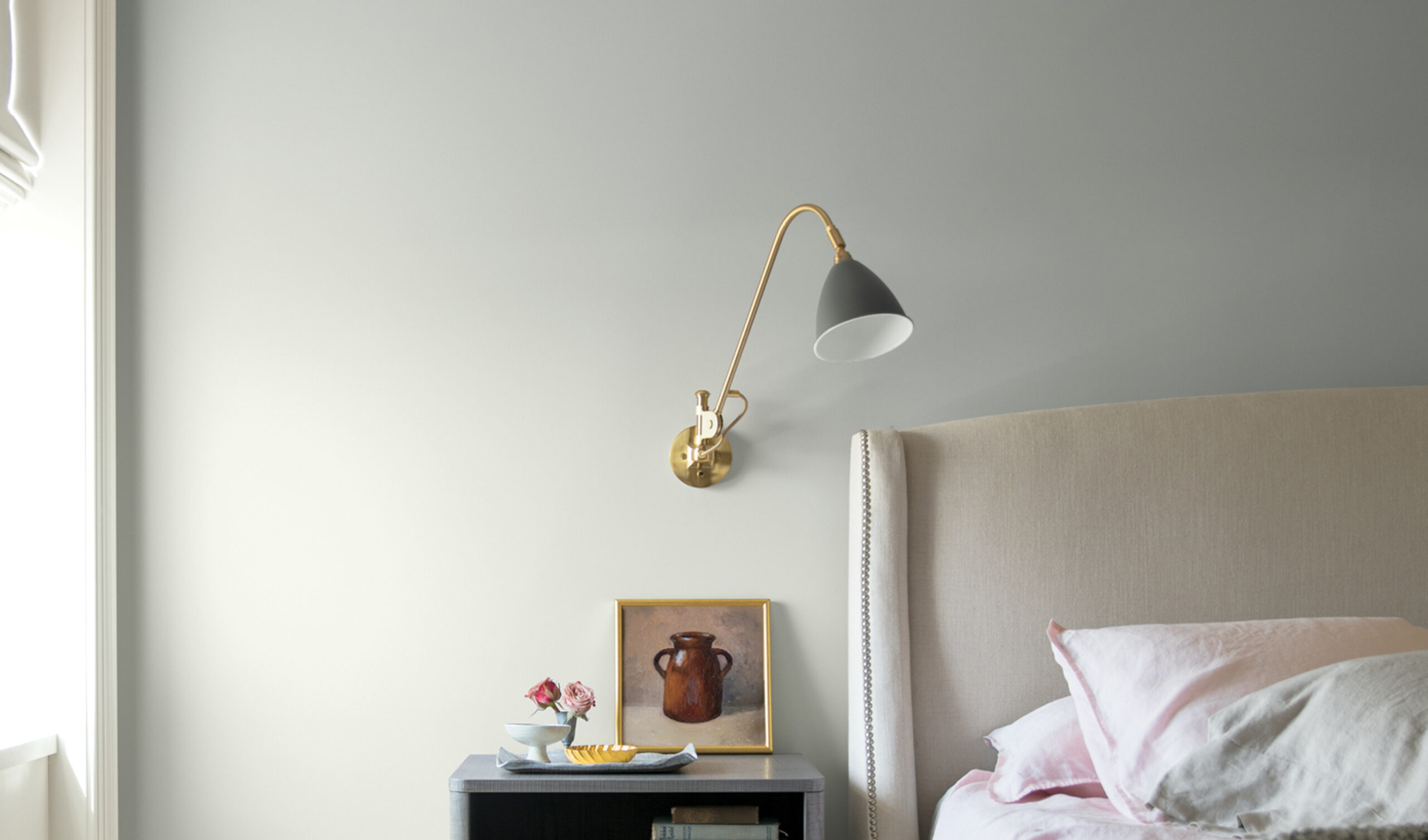
Ellen O’Neill says - “I think it (Metropolitan color) will make spaces feel serene. With different kinds of sheen you can make it feel glamorous and more formal or you can make it more textural. We shot this year's campaign in a single house and we used Metropolitan in the kitchen, living room, and two of the bedrooms. I think it worked in all the rooms, frankly. It's very versatile and the color can shift. And I think there’s discovery in every way that it executes. You can pick a chip and think it’s a one note story but the reality is it’s very metameric. I think it gives gray some welcome unpredictability. In our pictures we leave the natural shading and lighting rather than go crazy color correcting so you can see the way it transforms”.
“It’s a color in the neutral spectrum that references a contemplative state of mind and design. Not arresting nor aggressive, this understated yet glamorous gray creates a soothing, impactful common ground” - explains Ellen O’Neil.
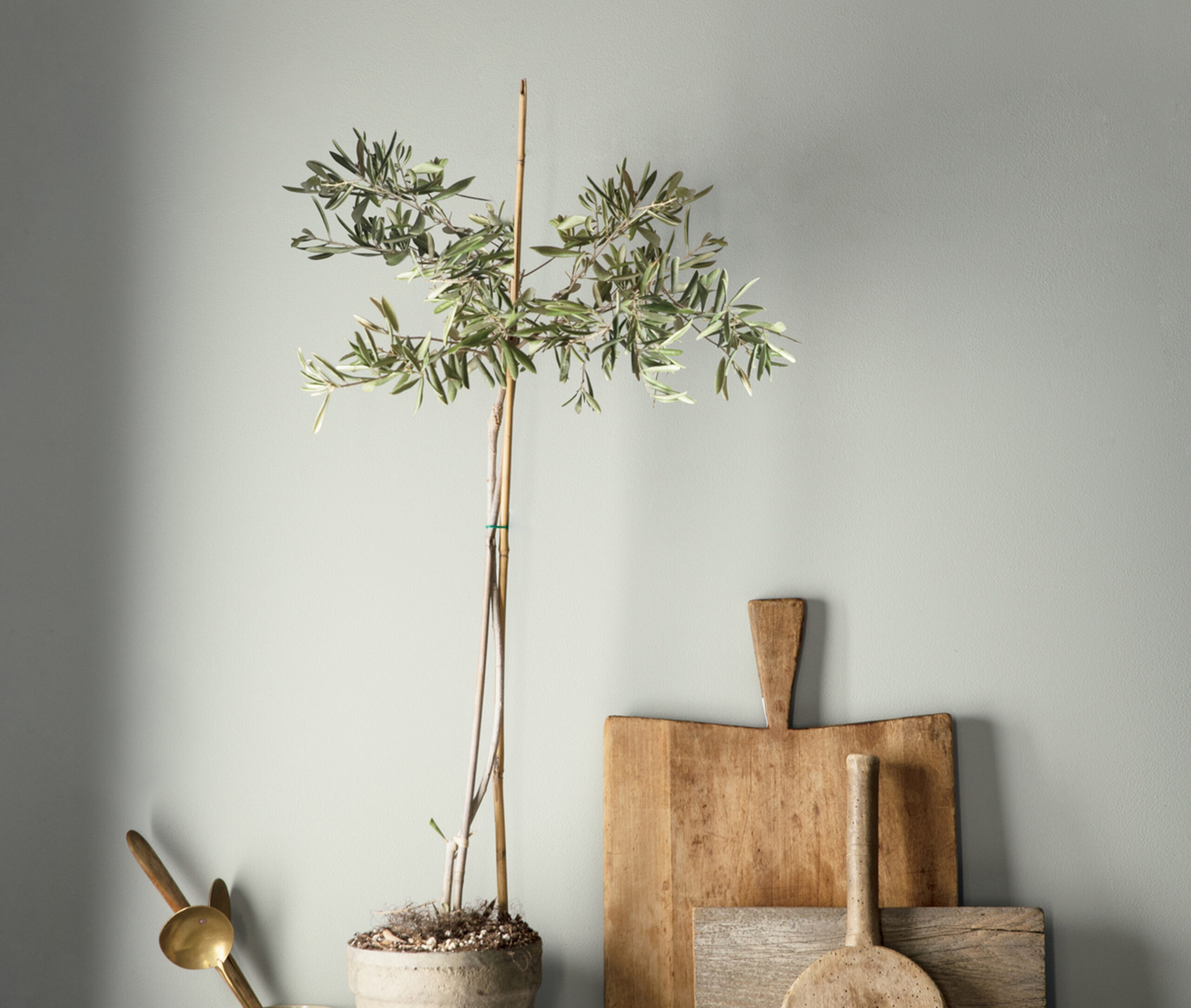
Metropolitan goes well with soft pinks and blush tones but it really accommodates any gesture of color—greens show up a lot in our palette.
You see nature softening the more sturdy, raw, man-made materials. It’s a great backdrop—it can stand alone—but it can also be punched up as most neutrals can.
Ellen O’Neill explains – “Look, I want to take the beauty of the gray palette away from this idea of - I’m only using it because I’m afraid of color. I think that’s sort of selling it short. It really does have an essence and a beauty and I think that’s why it’s popular, not because people think it’s safe. When you start noticing it, whether it’s in mushrooms or animals or stone walls or whatever—that’s what’s special about it”.
