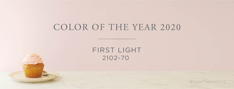
Color Of The Year 2020 Benjamin Moore "First Light 2102-70"

In the new decade with rosy optimism.
While it seems these days every paint color has a designated, much buzzed-about Color of the Year, arguably no company makes a bigger show of it than Benjamin Moore. Last year, the brand took over the iconic Pool room at the Four Seasons to reveal Metropolitan AF-690; the year before that it was Caliente AF-290, unveiled to much applause at none other than Frank Lloyd Wright's Guggenheim Museum.
Where was announce the Color of The 2020 Year? In New York's Skylight Modern, which name matches perfectly to the selected shade name.
New white, beige or gray…
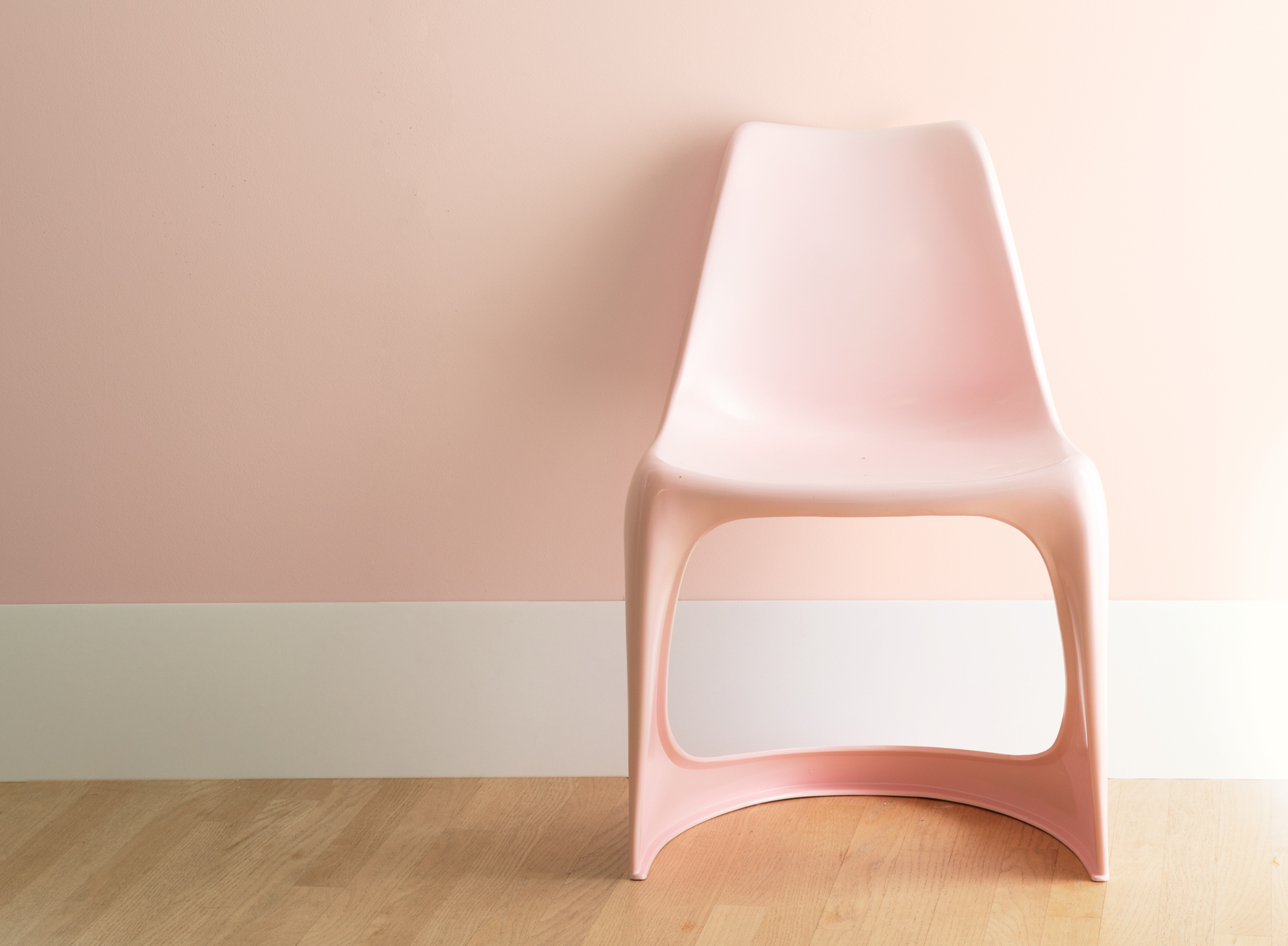
Color of the 2020 Year - First Light 2102-70 is soft and not so sweet pink. We might venture to say it's the new white, beige, or gray - in the way that the tone can layer with almost anything.
First Light 2102-70 is sophisticated and warm, and is appropriate for all seasons and styles. This color has a feminine quality, but it works very well with colors traditionally considered to be masculine.
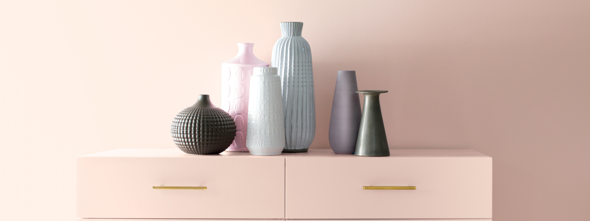
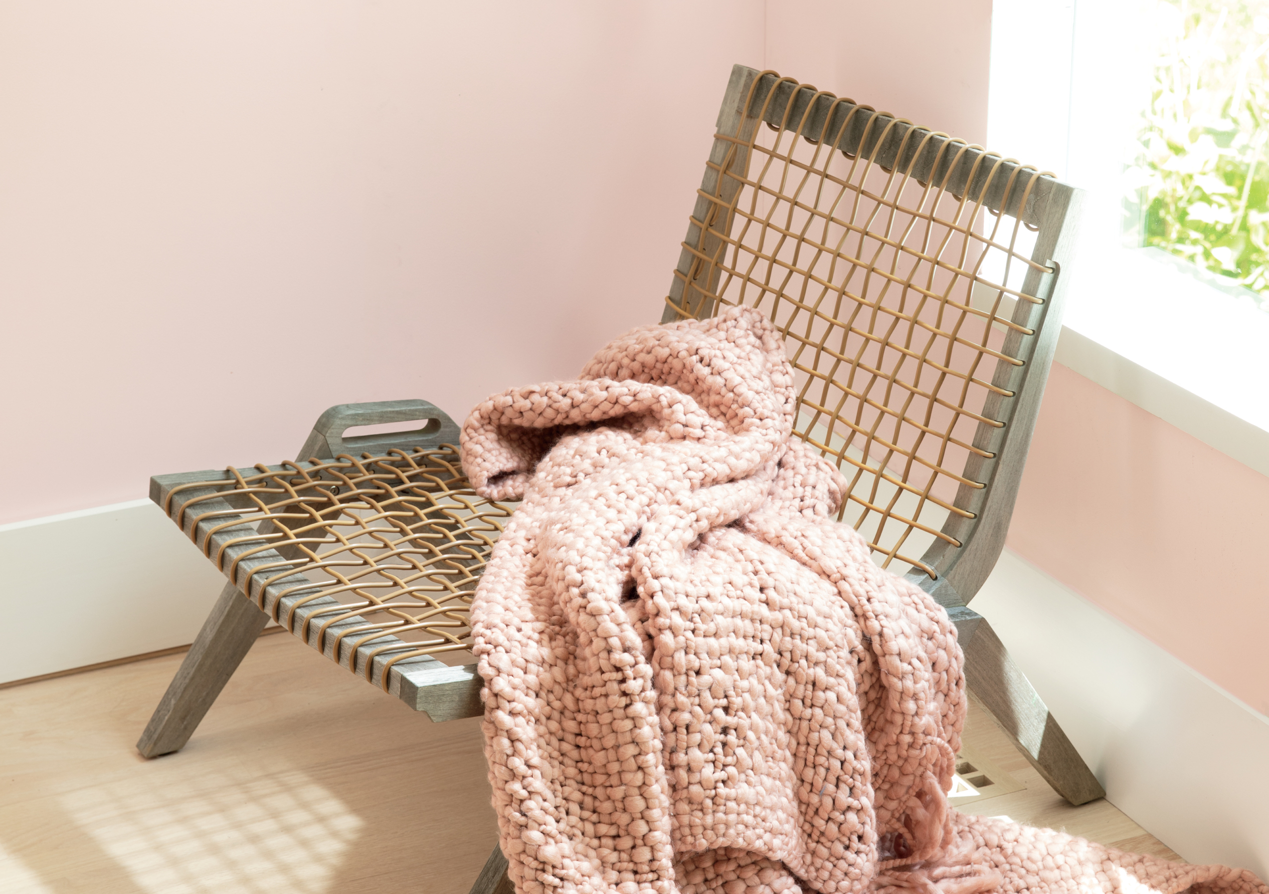
Color of the 2020 Year is an ideal backdrop for any room as it will enhance various textures and materials while bringing a flattering glow to a room. Additionally, this hue works exceptionally well with minimalist interiors and clean lines by incorporating softness that brings a welcoming feel to a room.
The color that stood out as the most symbolic of the mindset and direction for 2020 is First Light 2102-70. This soft pink represents a new dawn in thinking, a revitalized spirit, and a rosy outlook for the decade to come with an optimistic outlook for how we live, work, play, and design as we head into the future.
"When you look at color over time there is often a direct relationship between what shades are popular and what is happening in the world" - explains Andrea Magno, Benjamin Moore’s Director of Color Marketing and Development, which in March 2019 carried out the color workshop in Warsaw during the international Benjamin Moore retailers meeting.

Companion of humanity…
Pink feels fitting and there's no denying it's in the air. Pink is visible in the newest trends as well as in the oldest architecture - varying shades have been popping up everywhere.
Magno says - "From a research standpoint, we’ve seen pink becoming a more mainstream color".
Once reserved for baby showers, lipstick, and little girls' rooms, these days pink is just as likely to color the chic offices of Dimorestudio, an AD100 design firm based in Milan, or the Brooklyn home of fashion designer Adam Lippes. After decorating the home of Anne Hathaway and Adam Shulman, AD100 designer Pamela Shamshiri noted, "They're very into pink" - said Andrea.
Over the last few years, Magno argues "pink has evolved." And First Light is a testament to that. "With slightly blue undertones, it's more nuanced than millennial pink and, in Magno's words, "something you can really live with day in day out."

Creates cozy climate and harmonious space
"You're not hit over the head with pink" Andrea Magno explains. "Even if you use it on all four walls - it’s there, it’s enhancing the surroundings, it's pulling everything together. But it’s not, like, whoa!"
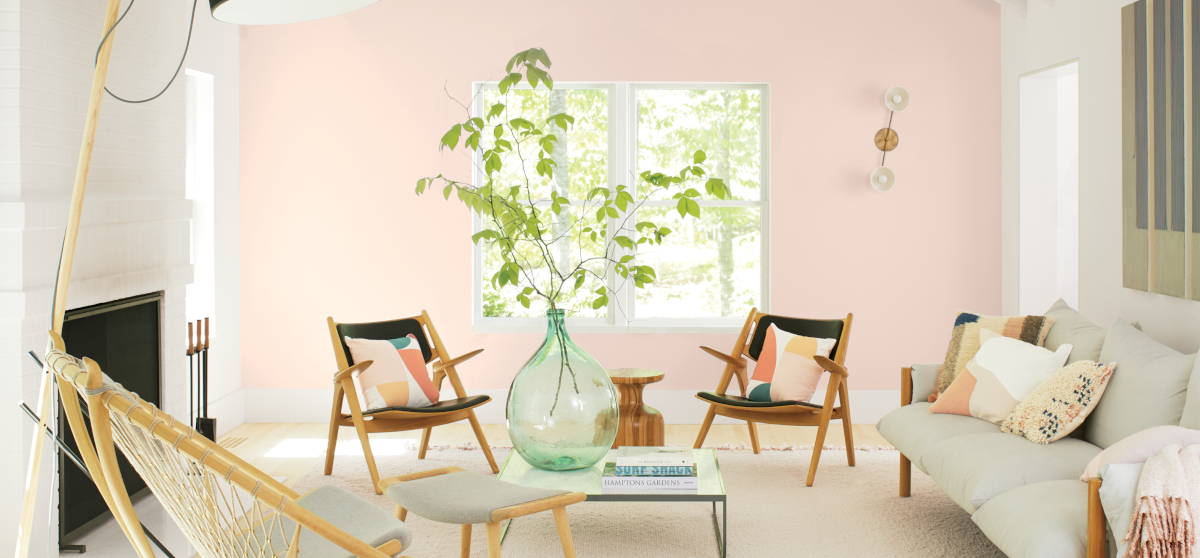
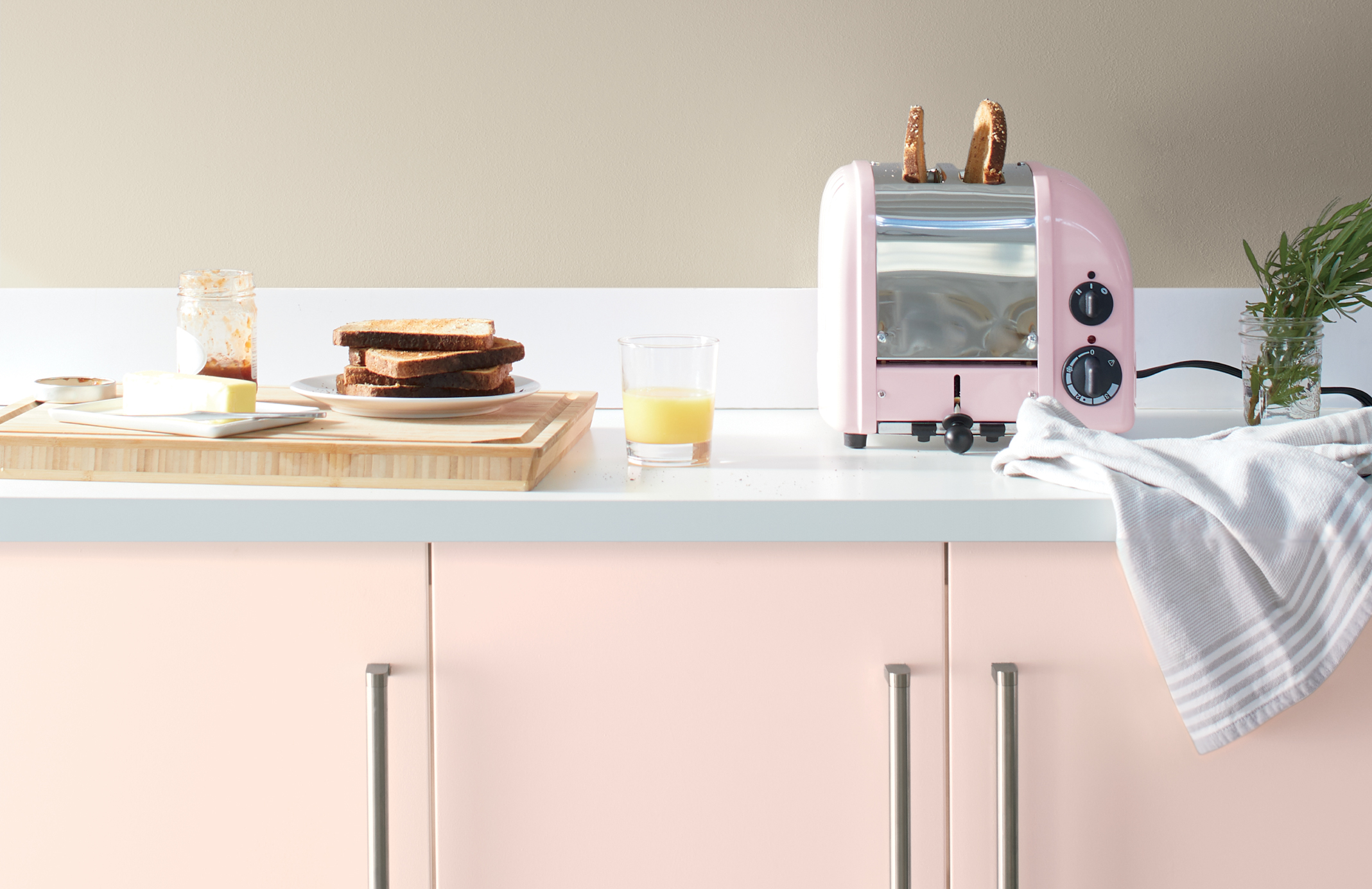
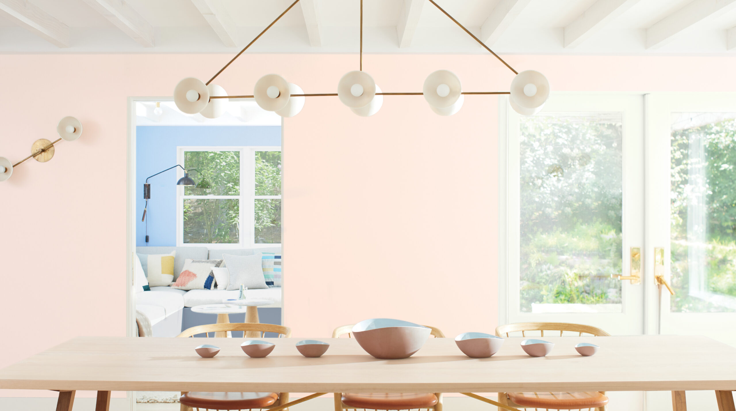
Color hunter suggests trying First Light on a whole room—particularly in a living or dining space where the color feels unexpected and memorable or as an accent on the ceiling. The way the light bounces, you get that glow-y feel.
For those looking to simply dip a toe in, she suggests a powder room, dressing room, or bedroom.

The new color of the year, the new definition of "American Dream"…
Across generation we are seeing a change in the “American Dream” with human needs or ideals that are interpreted in new ways.
After the Great Depression and World War II the pursuit of happiness hinged on decent housing, a good job, education and healthcare. Later generations followed with similar priorities around housing, education and healthcare in addition to an interest in consumption.
Today we see a shift in this thinking with a renewed focus on what matters most today and into 2020. Creating meaning in one’s life through experiences, connections with others and contributing to society to make it a better place have risen in importance.
“We selected First Light 2102-70 as our Color of the Year 2020 to represent a new dawn of idealism, design and living” - said Andrea Magno.
First Light 2102-70 reflects a new definition of the home – a shift in mindset from the material to satisfying the core needs in life: community, comfort, security, self-expression, authenticity and ultimately, optimism.
This modern definition of dwelling replaces long-standing post-war ideals, shining light on a new era of design rooted in fluidity for the multigenerational, multifunctional and different states of mind now found under one roof.

Perfect shade for the “selfie generation”
There's something else the First Light pairs well with: you. "Pink is just one of those colors,"Magno says, repackaging an age-old decorator trick for the selfie generation. "Everyone looks good in a pink room." Now that's a claim that can sell paint.
The shade First Light belongs to soft pink hues which gained notoriety over the past few years for their popularity with 25- to 35-year-olds. We can use a term “Millennial Pink”. As Andrea Magno says, though, selected hue is a slightly cooler take on the hue, making it more flexible.
Color hunters encourage homeowners not to think of First Light as pink, but rather, as a new kind of neutral. It's one of those colors that's the perfect backdrop to anything.
It’s worth to add that it was a trend this year in Nike tennis shoes and other women’s gear more on the pinkish side.

BEAUTY
With so much of our time being centered on time in front of screens and devices, there is a craving for softness and beauty in our lives, with First Light being the perfect hue to express the desire to celebrate beauty in the home.
The definition of beauty has never been so diverse, with the meaning of the word becoming something very personal. The home has become a place where we can surround ourselves with beauty infused with quiet simplicity and joy.
We’ve seen neutrals and muted colors dominate the most popular list, with opportunities for deeper colors and bold winks of color to make their way into color schemes over the past few years.
For 2020, it’s the wash of beautiful, fresh color to complement spaces that are designed with neutral or deeper colors demonstrating the evolution of color choices that move from year to year.

First Light – integrated element of COLOR TRENDS 2020
Benjamin Moore has also created beautiful pallet of nine additional hues that perfectly go well with First Light.
The color of the year palette ranges from deep, dramatic shades like Cushing Green HC-125 and Blue Danube 2062-30 to sweet, Gustavian tones like Golden Straw 2152-50 and Windmill Wings 2067-60.
Its possibilities extend beyond Benjamin Moore's prescribed palette. When pressed to come up with a color that wouldn't go well with First Light, Magno was stumped. "My first thought was: I don’t know if I’d pair it with orange. But actually, if orange is an accent, it could work. This color is surprisingly flexible."
Here comes the NEW DECADE, and we will welcome 2020 year in PINK GLASSES ;-)
