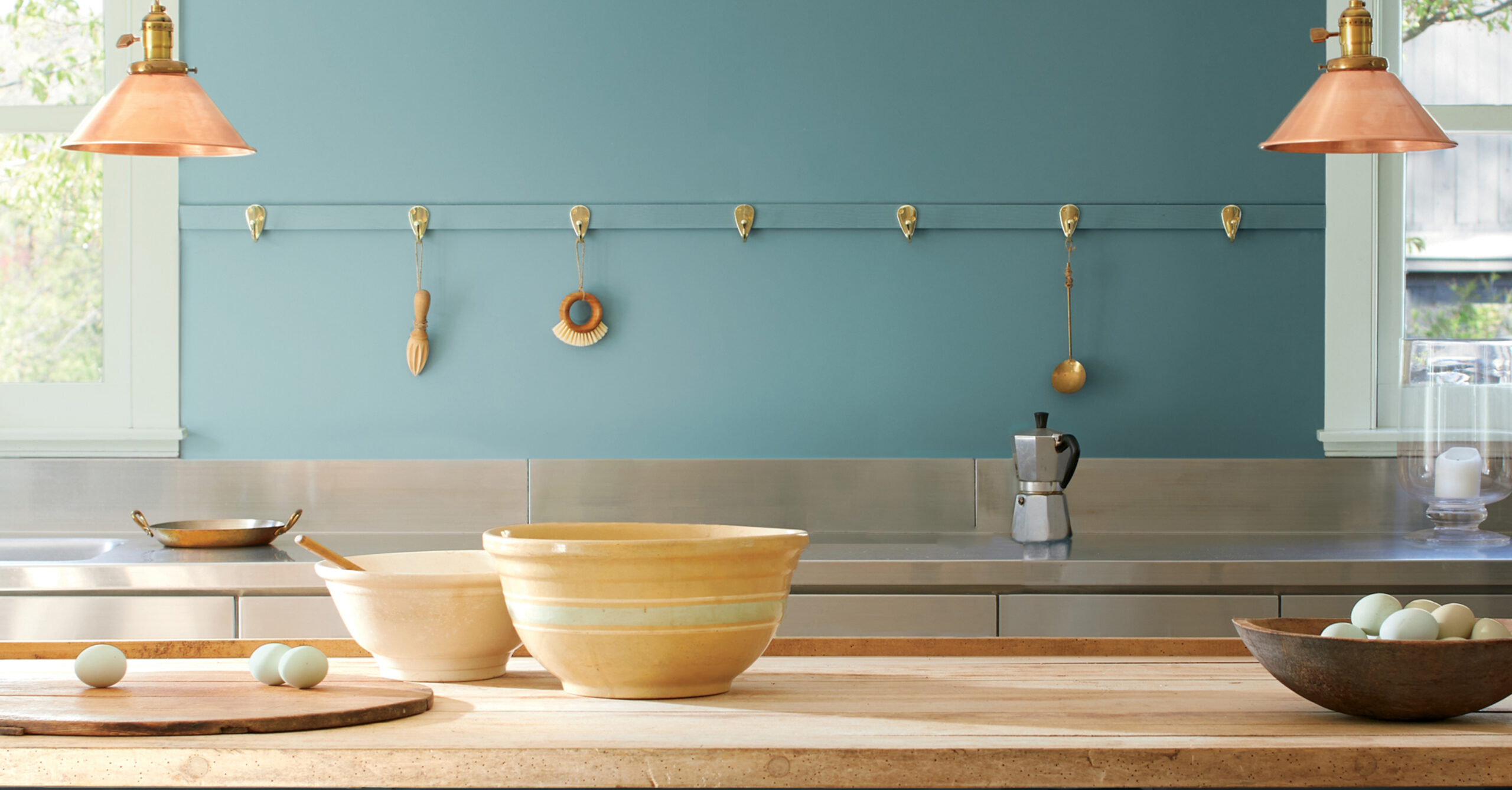
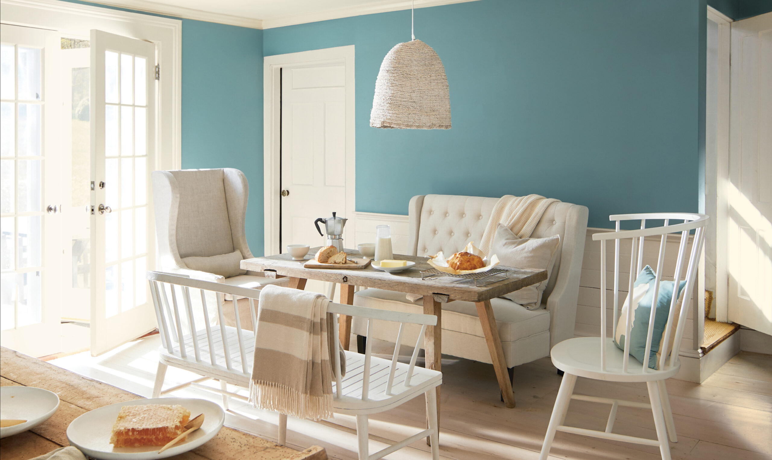
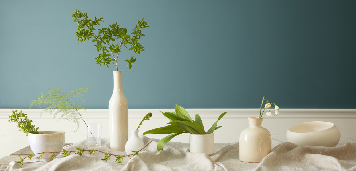
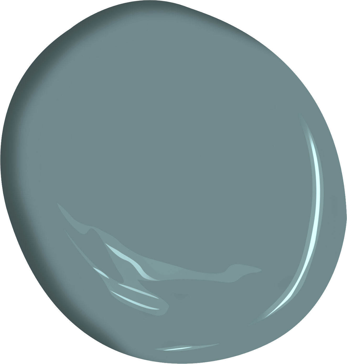
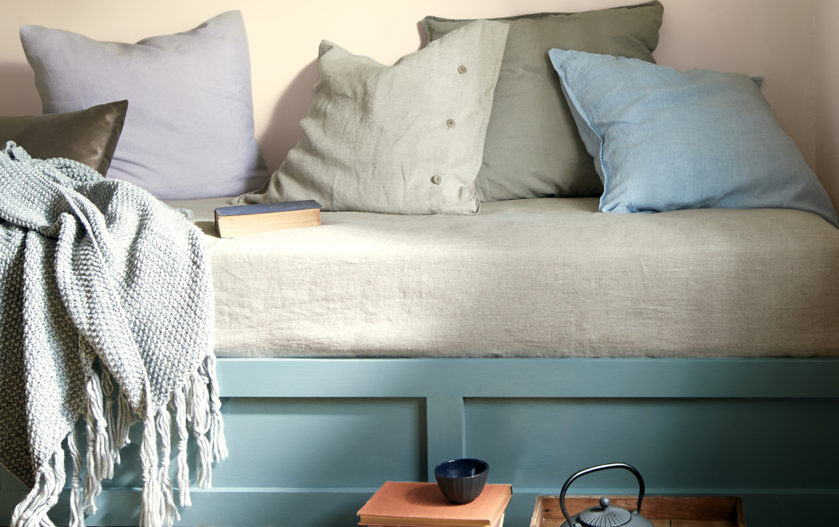
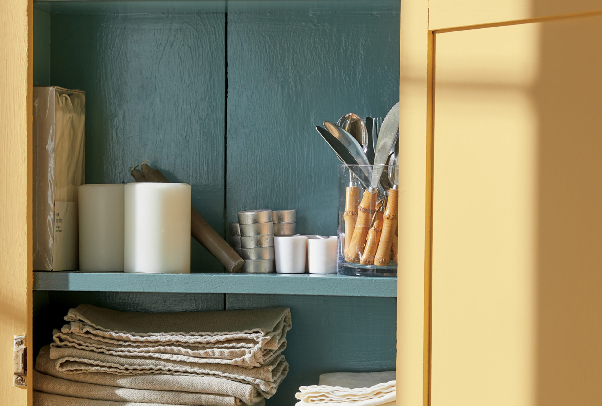
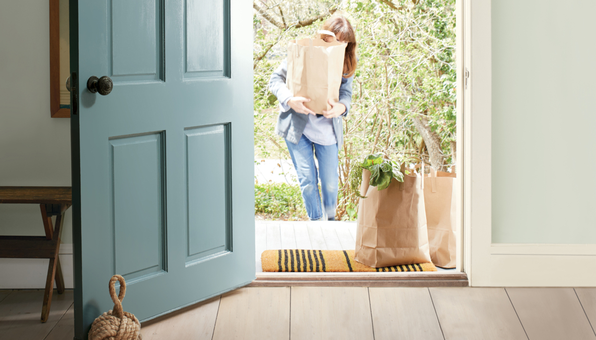
"Aegean Teal 2136-40", is the "Quietly Striking" Shade You're About to See Everywhere.
A harmonious blend of blue-green and gray, this shade is both a statement hue and a neutral. “Aegean Teal” complements and enhances the other colors in the Color Trends 2021 palette, as it bridges the warm and cool hues with its harmonious nature.
The brand has typically feted the unveiling with a wild bash in New York City—at the Guggenheim Museum, the New York Public Library, or the glamorous, Philip Johnson–designed Grill and Pool Room in the Seagram Building.
But with such large gatherings off the table for the foreseeable future, the paint brand has announced the news virtually, reaching a much broader international audience than usual and opening up the conversation to color enthusiasts across the globe. For the first time we have felt such a sense of one community.
If the pandemic has taught us anything, it's how precious our homes truly are. While respecting mandatory quarantines and social distancing measures, many of us have found joy in simple domestic projects, such as baking, gardening, and decorating.
And as the cold weather season approaches and we plan to spend even more time indoors, it's more important than ever that our spaces feel warm, comfortable, and rejuvenating. Benjamin Moore feels the same way.
The brand just announced their 2021 Color of the Year and Trend Palette, and it's a reminder that even in the toughest of times, we can still find comfort in our own homes and backyards.
Part of Aegean Teal’s appeal is its versatility, which Andrea says makes a statement without being loud.
“Aegean Teal is a unique front door color and it is a beautiful choice for millwork and cabinetry,” she says. “Aegean Teal complements and enhances the other colors in the Color Trends 2021 palette, as it bridges the warm and cool hues with its harmonious nature.”
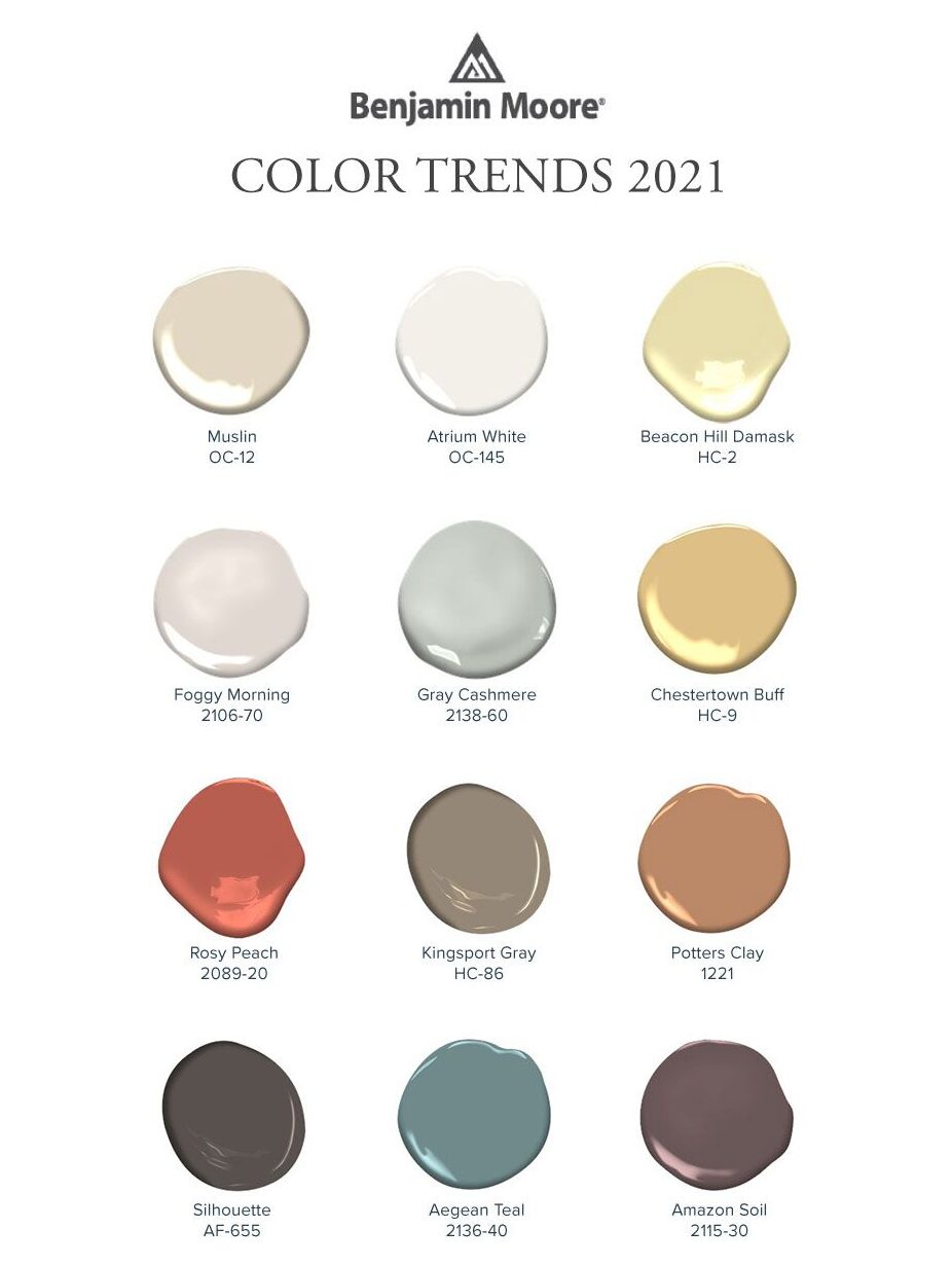
Aegean Teal was introduced alongside a complementary palette of eleven earthy hues:
Atrium White (OC-145); Muslin (OC-12); Foggy Morning (2106-70); Rosy Peach (2089-20); Beacon Hill Damask (HC-2); Potters Clay (1221/CC-360); Chestertown Buff (HC-9); Amazon Soil (2115-30); Gray Cashmere (2138-60); Kingsport Gray (HC-86); and Silhouette (AF-655).
Ranging from the soft creamy tones of Foggy Morning 2106-70 to the rich, purple-brown of Amazon Soil 2115-30 and the warmth of Rosy Peach 2089-20.
Andrea Magno and her team looked for colors with a lived-in quality.
“We were drawn to the emotional connections between the home and the colors we surround ourselves with to create a particular mood,” she says. “The palette has a soothing yet upbeat quality, with a casual elegance that is enveloping and welcoming, making it very appropriate as the home takes center stage.”
While Aegean Teal is versatile enough to pair with each of the selected colors, Andrea says that the eye-catching hue can also stand alone - "It's a quietly striking color. It bridges the gap between a warm and cool palette, and offers a balanced alternative to navy or green."
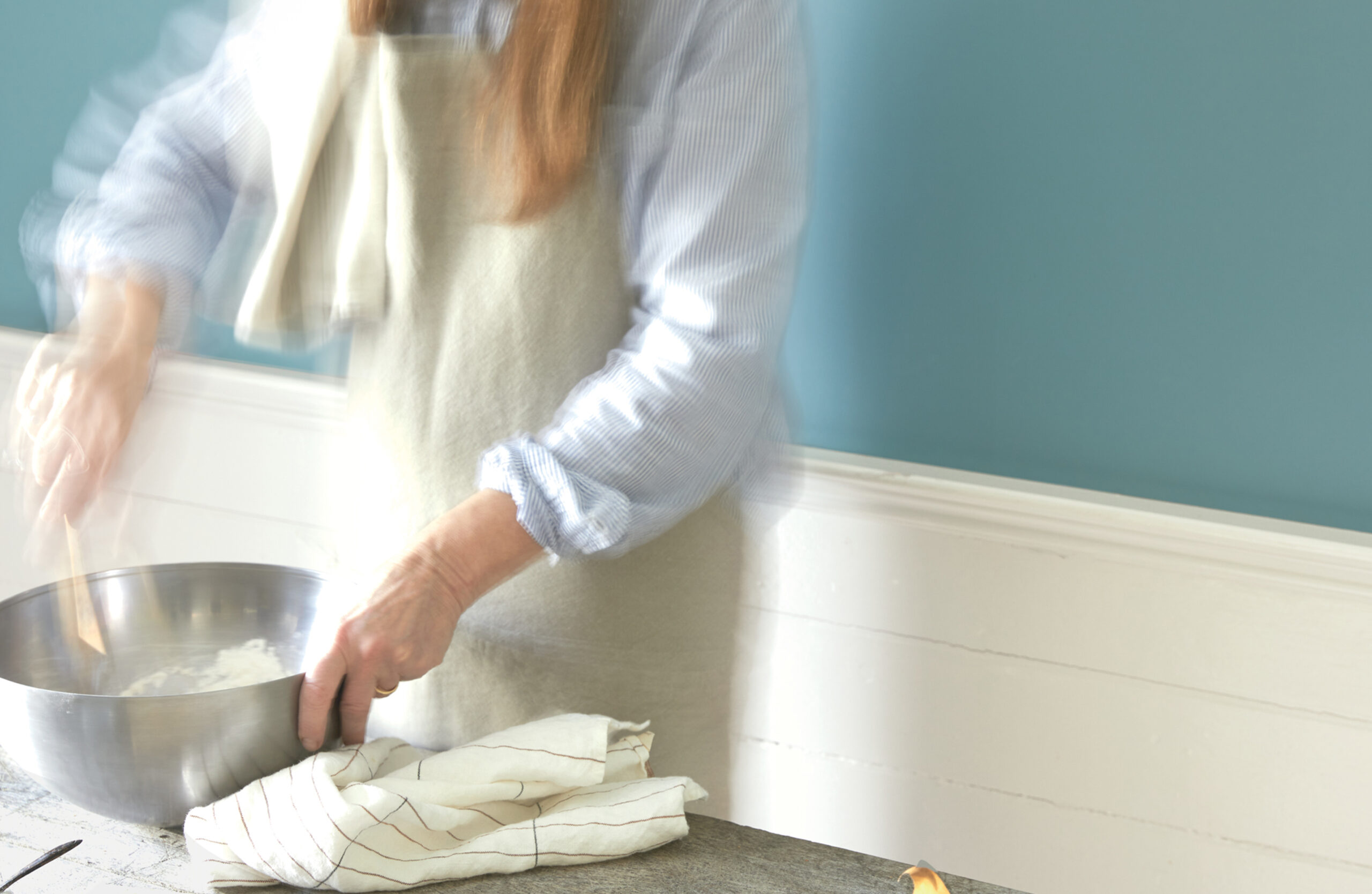
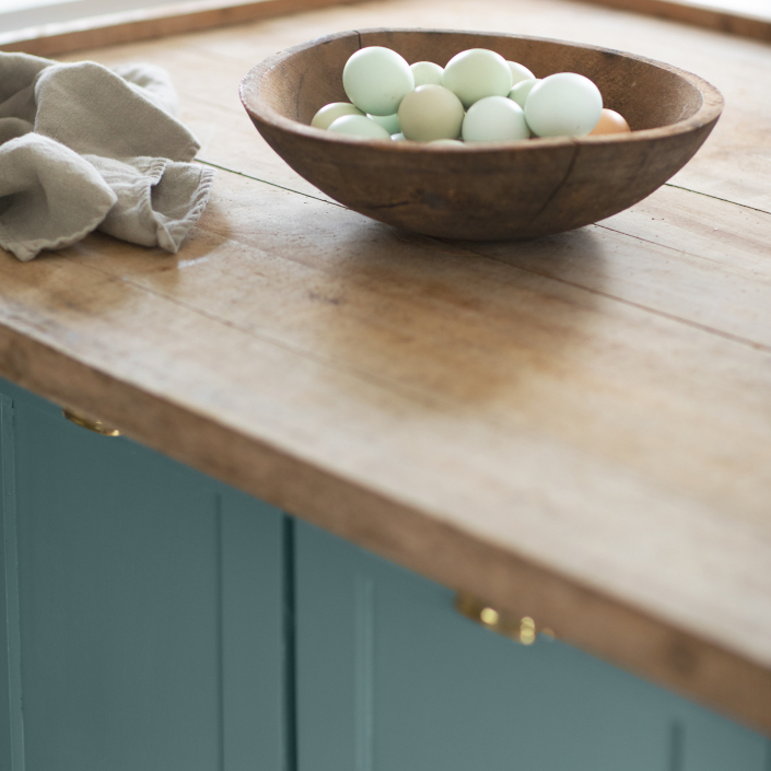
Andrea Magno says the team was inspired by colors of natural foods like fruits, vegetables, and quail eggs—and also by the belief that the kitchen serves as the intersection for nourishment, craft, and community.
"The home is a place of comfort, restoration, and rejuvenation, and therefore the need to reset and find simple, small moments of joy inside them is paramount," she explains.
And as we prepare to spend even more time indoors this fall and winter, Andrea Magno says there's no better time to integrate Aegean Teal (or any of the other casually elegant hues from the palette) into your home.
"It's warm and enveloping, which makes it a great color for a living room or powder room," she explains.
However, if you're not ready to commit to an entire room painted in teal, she says there are also smaller steps you can take.
For an easy fall project, she suggests upgrading your kitchen cabinets with a fresh coat of Aegean Teal paint.
She also recommends painting the front door of your home in the elegant, but intriguing hue, so you can welcome guests in style when it is safe to gather again. "More than ever, people are craving color right now," she says. "This palette is a reminder that there's beauty all around us and that we have renewed thinking to look forward to."
“I feel the palette speaks to this current moment, as well as the year ahead, in that we are looking at things from a different perspective as we find joy in simple moments throughout the day, which can be related back to color,” says Andrea.
“This need for uplifting colors relates to the amazing power of color to create a backdrop that sets a particular mood, promotes well-being or is a means of personal expression.”
