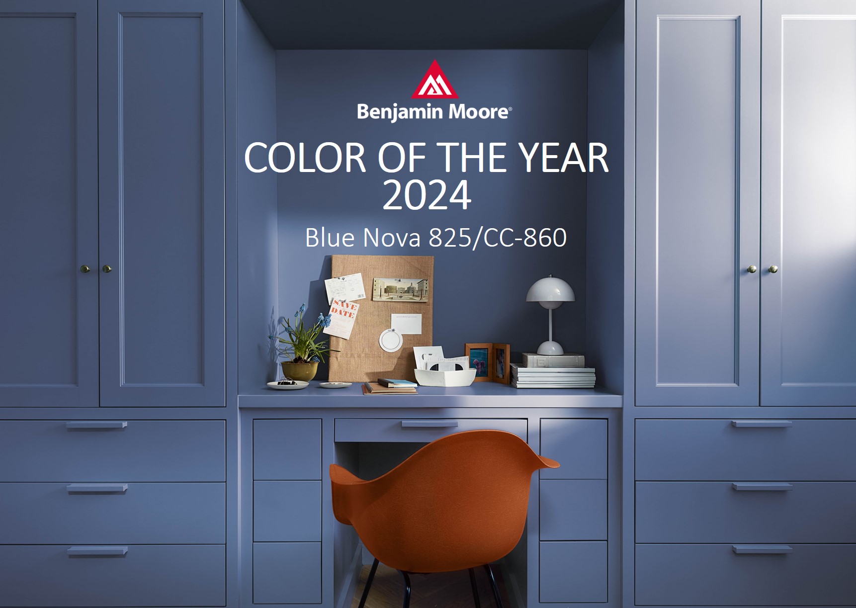
Blue Nova 825/CC860 - THE NEW, BLUE STAR on the sky…
Violet and blue join to form Blue Nova 825, an elevated, sumptuous color that balances a sense of depth and intrigue with an undercurrent of reassurance. Inspired by the brilliance of a new star formed in space, Blue Nova beckons us to unknown places for new experiences.
Not only does the deep blue conjure shades found through the lens of a telescope, the announcement also took place at the orbital launch site of Blue Origin - the Jeff Bezos founded space exploration company and defense contractor in Cape Canaveral, FL.

A WORLD OF OPPOSITES and CONTRASTS…
New and old, day and night, light and dark, warm and cool, near and far – we are surrounded by contrasts and opposing forces at every turn. From simple opposing relationships to the most thought provoking and complex, these juxtapositions shape our surroundings.
For 2024, our conversations and research findings centered on contrasts and opposing relationships.

How was this color of the year chosen?
Every year, this is the first question asked by Color Hunters, led by Andrea Magno, head of the Color Team at Benjamin Moore & Co.
The team had quite a hard time having several contenders for the color of the year. Some hues fell to the warm side of the color wheel, while we saw a number of hues that were cooler but had a quality that was captivating and inviting. Much like assembling a puzzle, the team worked through various options that brought us to the Color of the Year for 2024 – Blue Nova 825.
The otherworldly quality of Blue Nova is enchanting, combined with a classic appeal.
Oh, those eye-catching colors…

Blue Nova continues the move started in 2023 to use eye-catching color with a true presence in the home, while expressing personality and a willingness to explore color.
“We are still seeing designers being brave with color”, says Andrea Magno, Benjamin Moore's Color Marketing and Development Director. As though a souvenir from far-off travels, “people are looking to bring color into their home, and we want to continue that thread”.

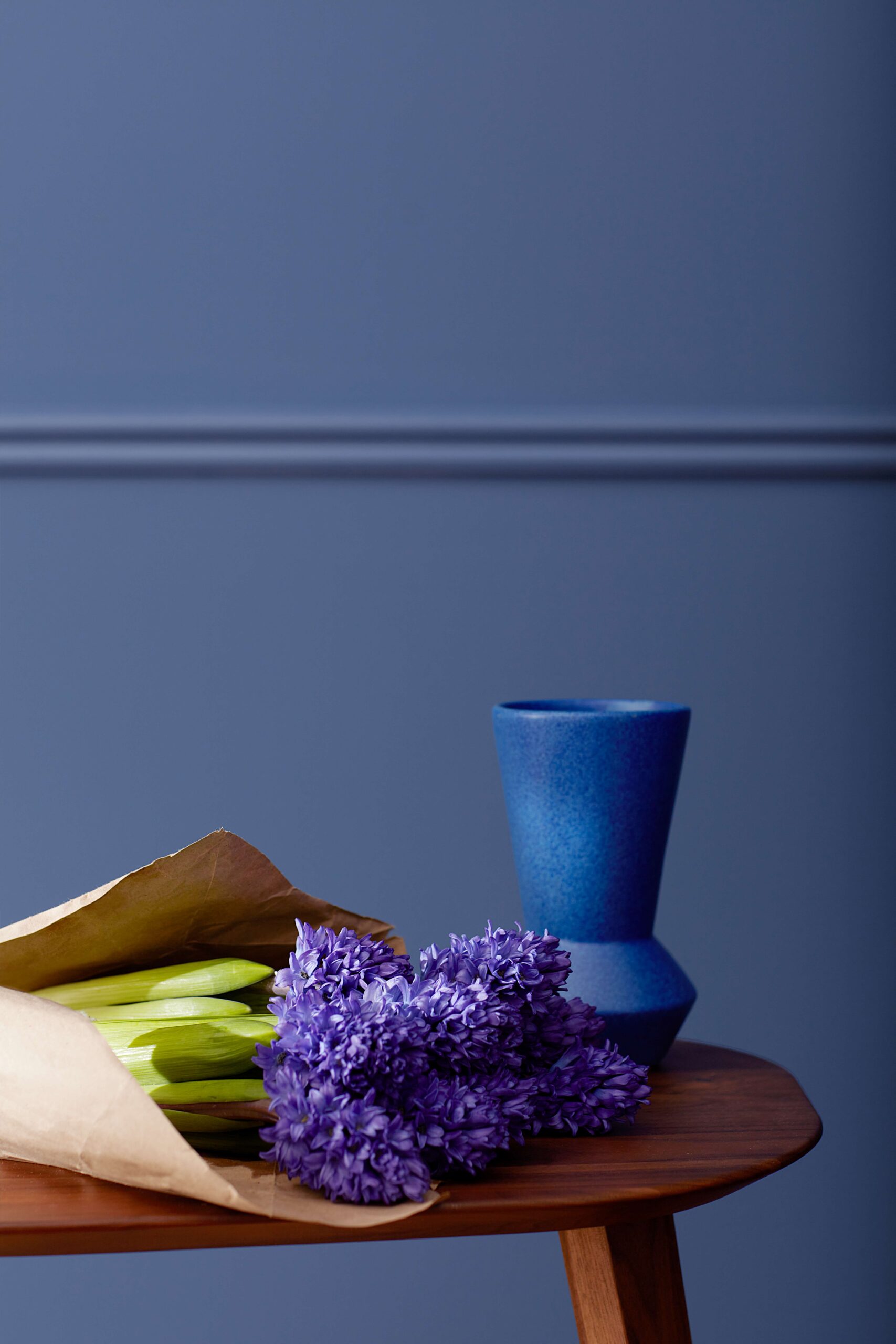
Color of The Year 2024 is an intriguing hue because it falls in the blue color family, but it has a hint of red in its makeup that creates an appealing violet cast. Through this touch of warmth, the Blue Nova is alluring and comforting all at once.

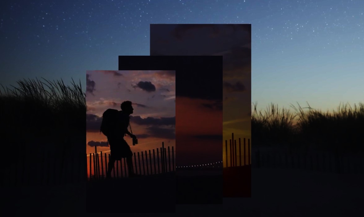
Blue Nova a celestial “new star", as Andrea calls it is rooted in nature’s blue hour, the time of day just after sunset when the sky takes on a deep blue, almost purplish haze just above the fiery topaz of the remaining sun’s rays. “It’s a captivating, otherworldly color that is kind of magical and can elevate the everyday”, she says.
“It really is an eye-catching blue”, added Sharon Grech, the other Color Hunters. “It's a mid-tone hue. It's not too dark, it's not too light. So it really doesn't just fall into the background, but rather it holds our attention with its personality”.

Hannah Yeo, Color Marketing and Development Manager at Benjamin Moore, calls the winner the perfect blend of blue and violet. “It falls under the cool color family because it’s blue but it has a red undertone”, she shares, “and that allows it to work with so many different warm hues”.
Since this is a mid-tone hue, Blue Nova 825 does not blend into the background, rather it holds our attention and invites our gaze.
Transformation 22-24

It is also interesting to follow the progression that brought us to this color.
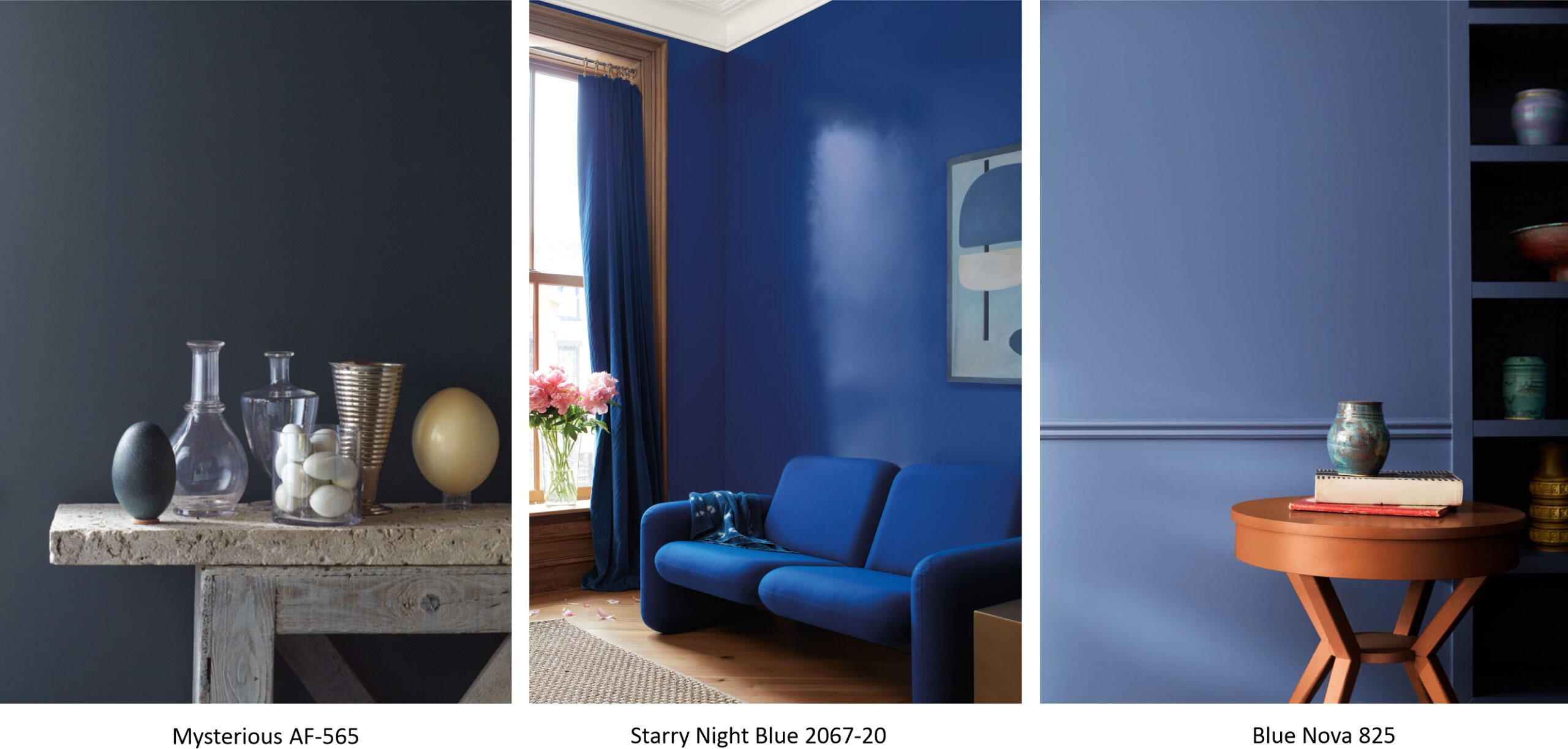
Starting with 2022, we featured the deep navy hue Mysterious AF-565 in our palette. Then in 2023, we brought the saturation to a completely new level with Starry Night Blue 2067-20. This is an impactful color that makes a very confident color statement that is not for those who are timid in their color selections.
Then for 2024 we moved to a portion of our color offering that still makes a color statement, but is toned down to make it approachable yet captivating while serving as an alternative to classic navy. We continue to see consumers wanting to step outside of their comfort zone and experiment with more saturated hues, making Blue Nova the right fit.

NOT ONLY FOR WALLS…
Blue Nova 825 is an approachable, almost trustworthy hue that can be applied to a kitchen island, cabinetry, or even the front door. “There is a lot you can do with it”, Andrea Magno says. “I love the idea of using it in a matte finish to have this velvety feel and really appreciate the depth of it”. She also recommends a semi-gloss or satin for adding softness to a bedroom or dining room.
Harmonious combination

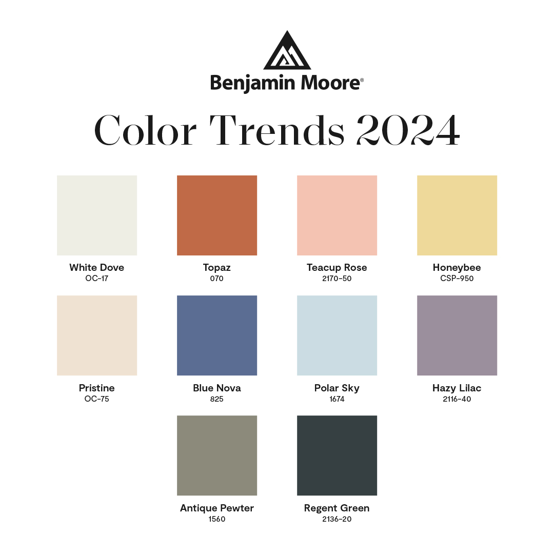
When discussing the Color of the Year 2024, it is impossible not to mention the Color Trends palette for the new season.
As we looked through the color research collected by each member of the color team, we found many examples of complementary or contrasting color relationships. Interesting combinations came through that related back to basic color relationships on the color wheel, but done in ways that played with saturation, value, and undertone, making them memorable. Beyond complementary color schemes, we also considered the play between warm and cool, light and dark – this sparked several great discussions on how this duality can deliver beautiful results in the home.

Let's now take a look at the Color Trends palette with two examples of color contrasts used in interiors in which photos from the Color Hunters' travels were used, in relation to the inspiring effect of the Color of the Year 2024 on other shades.
BLUE NOVA inspires…

When the Color Hunters sank into the comfortable seats of the plane, they saw a spectacular combination - navy blue and red-orange tones from the setting sun.
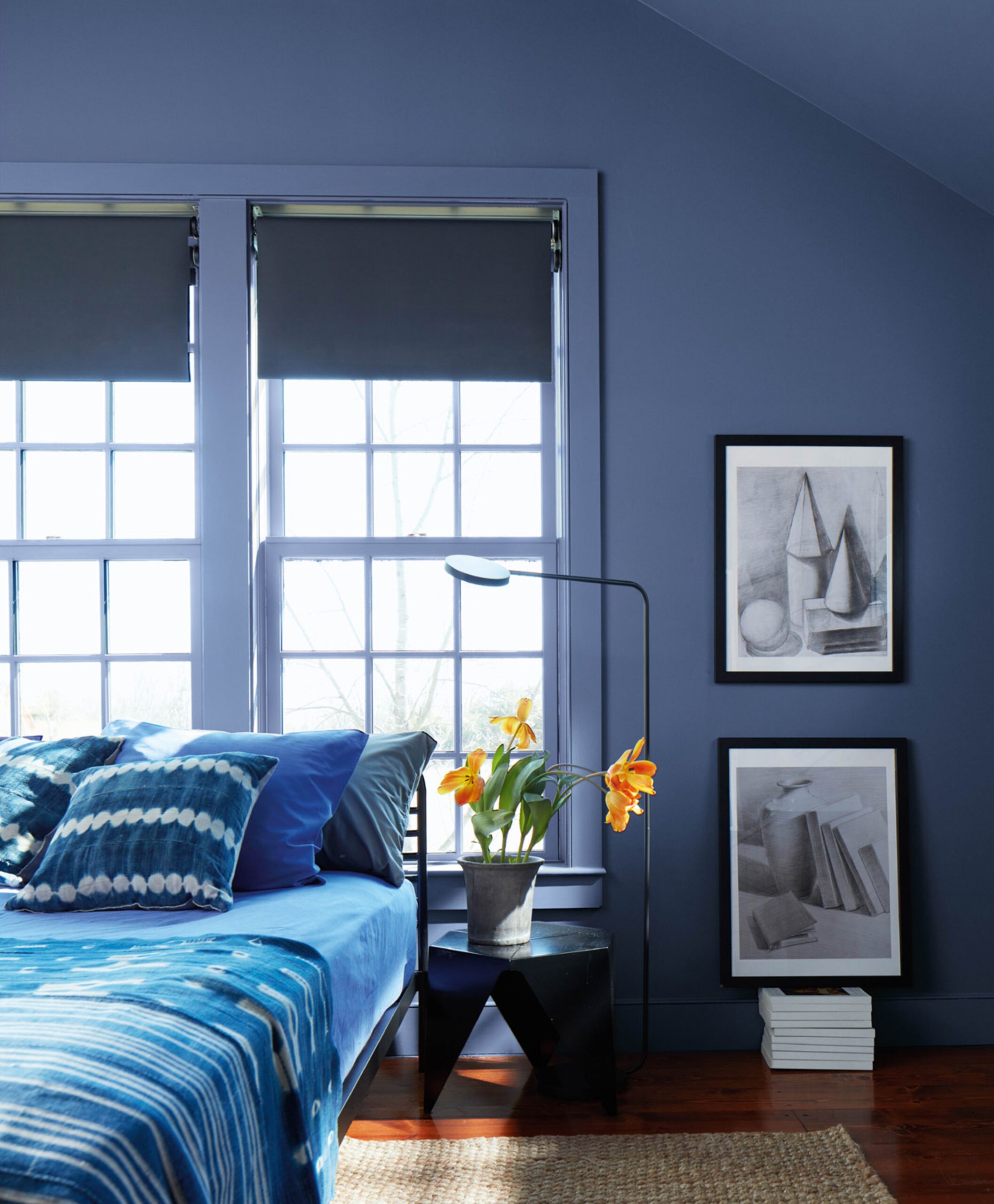
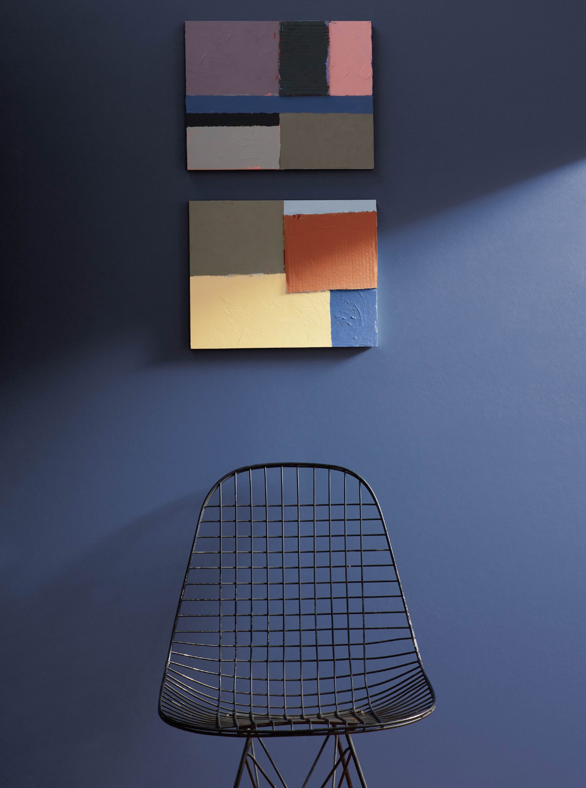
The walls, trim and cabinetry are painted in Blue Nova 825, demonstrating the presence of this color. To create a complementary scheme, vibrant terracotta bedding in color similar to Topaz 070 provides high contrast, energizing the overall look of the room. This combination is not unlike the colors in the sky at sunset with clouds that take on a blue-violet cast with a last look at the fiery orange of the sun.

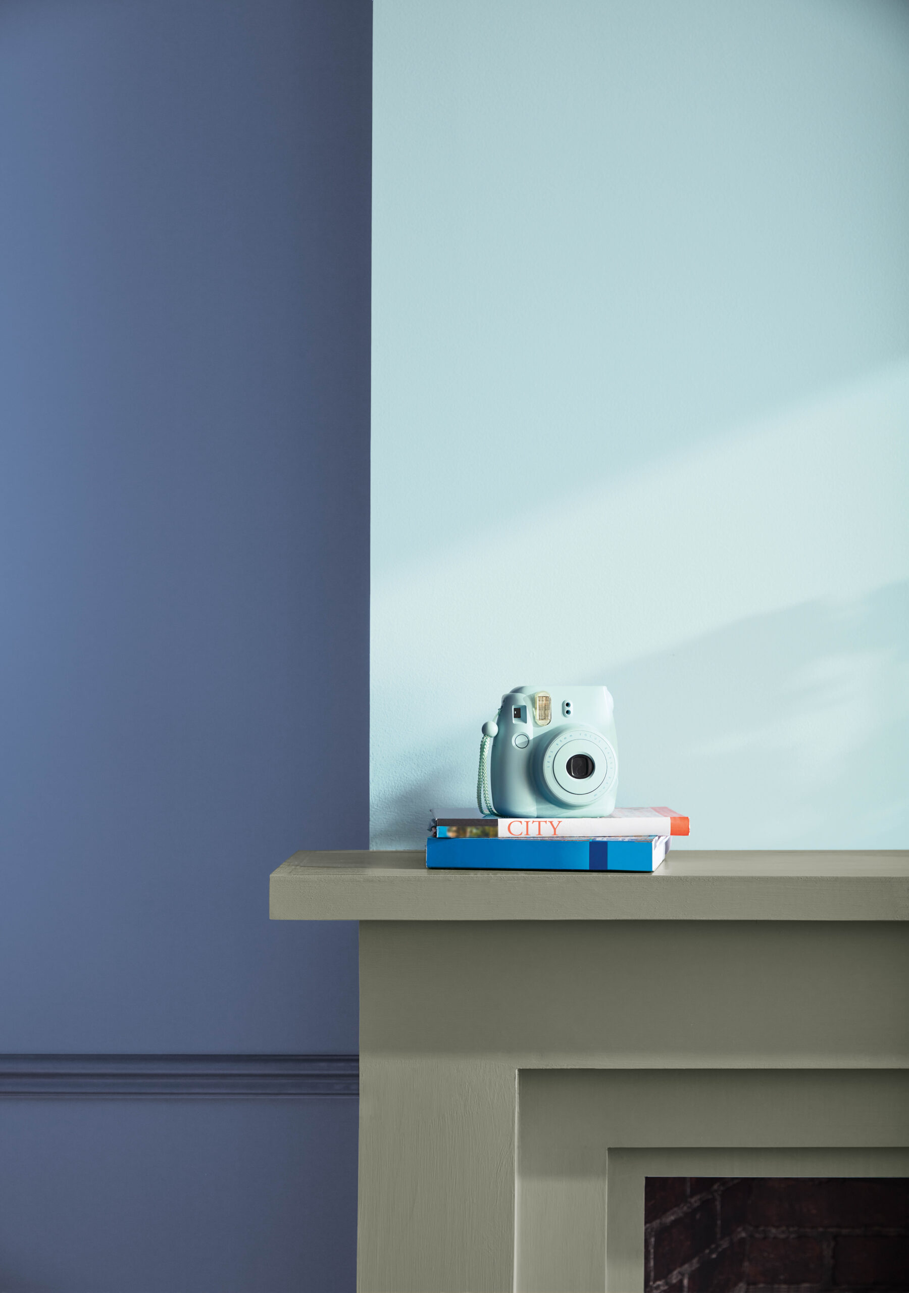
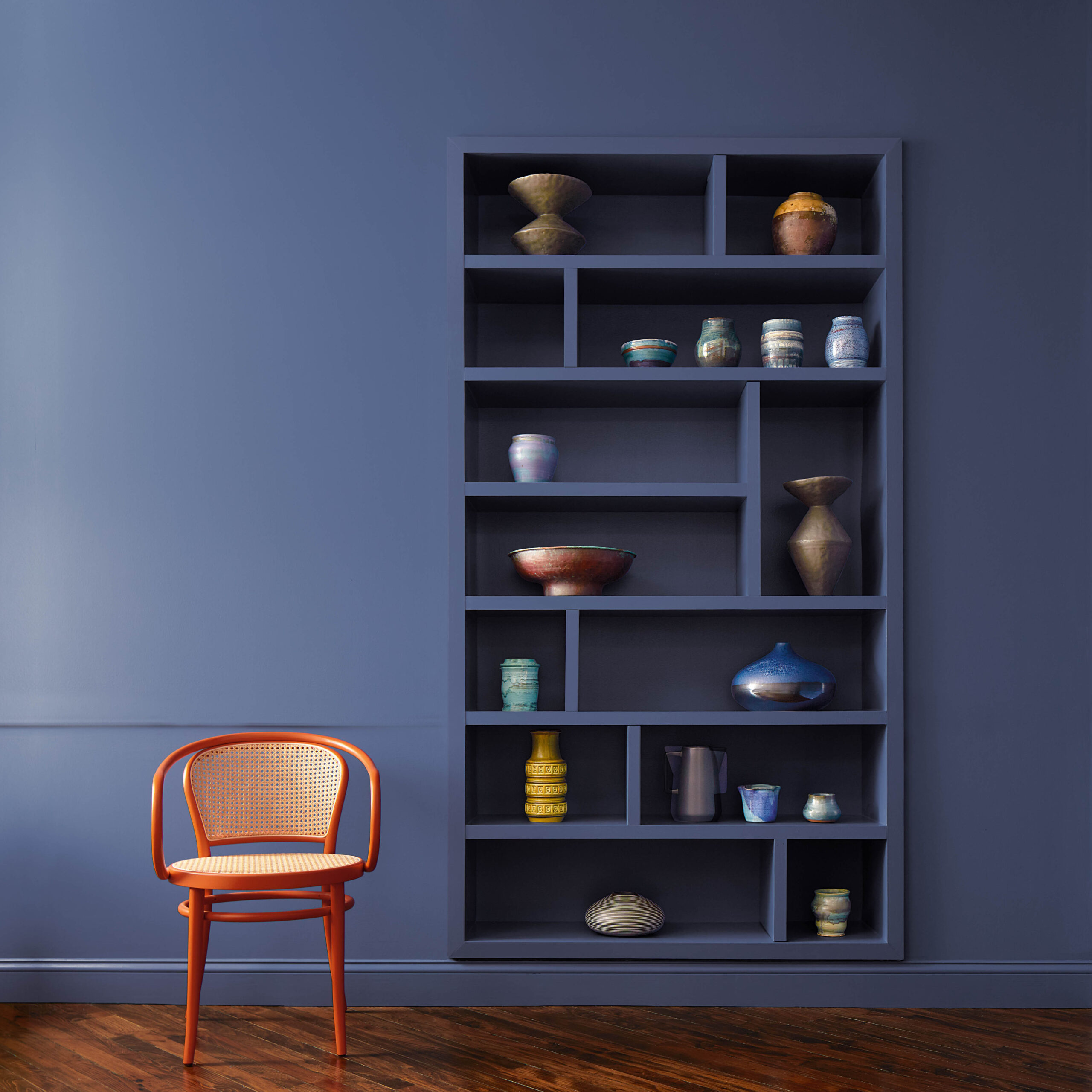
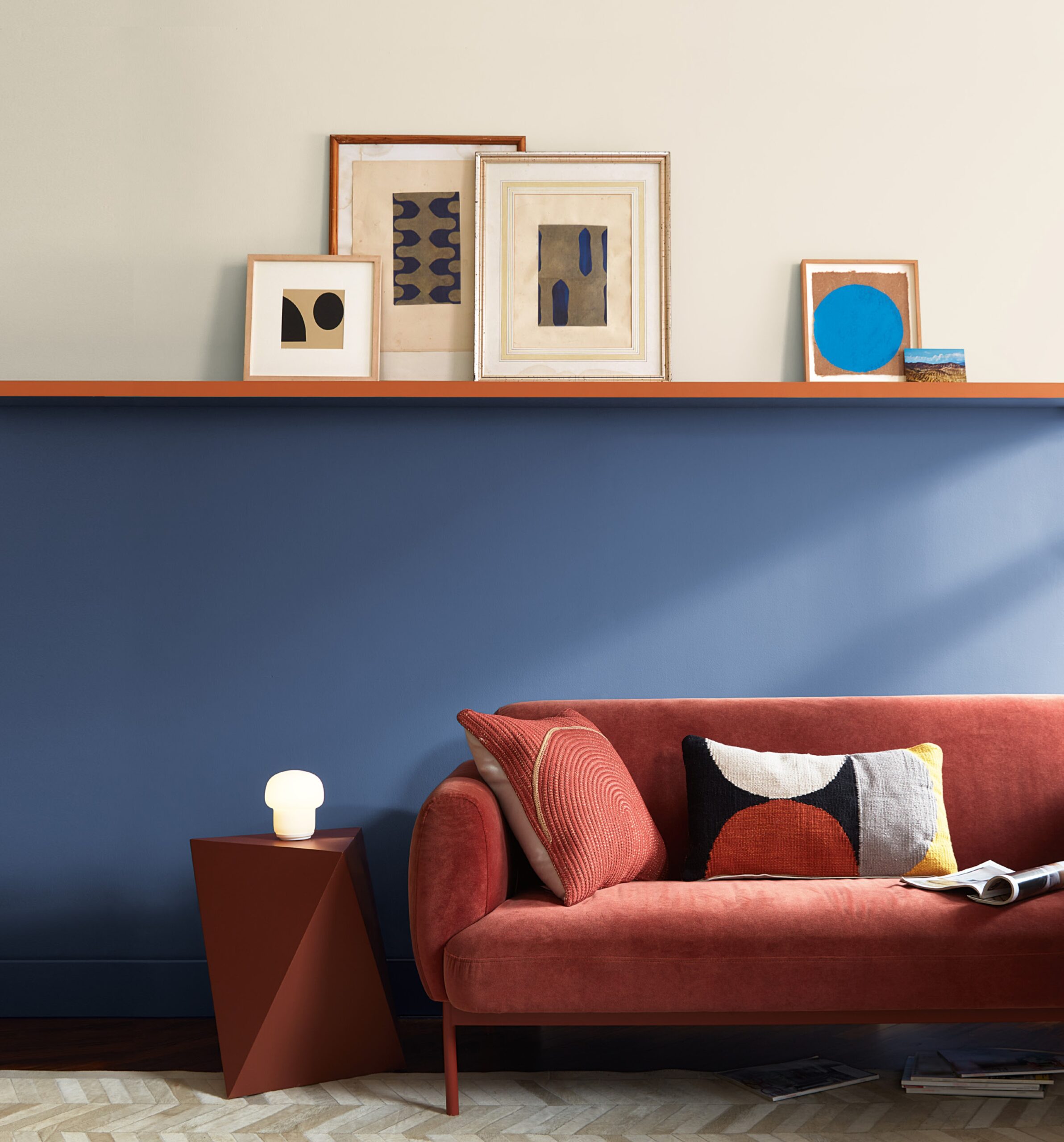
In another example, Blue Nova 825 acts as an anchor with White Dove OC-17 on the upper section, divided by a shelf painted in Topaz 070.
This complementary scheme is furthered by the red-orange sofa positioned against the mid-tone blue hue, which is both unexpected and dynamic. A complementary scheme can take on a vibrant look as shown here, or it can be done with just a small hint of the opposing color for a look that is a bit more subtle.
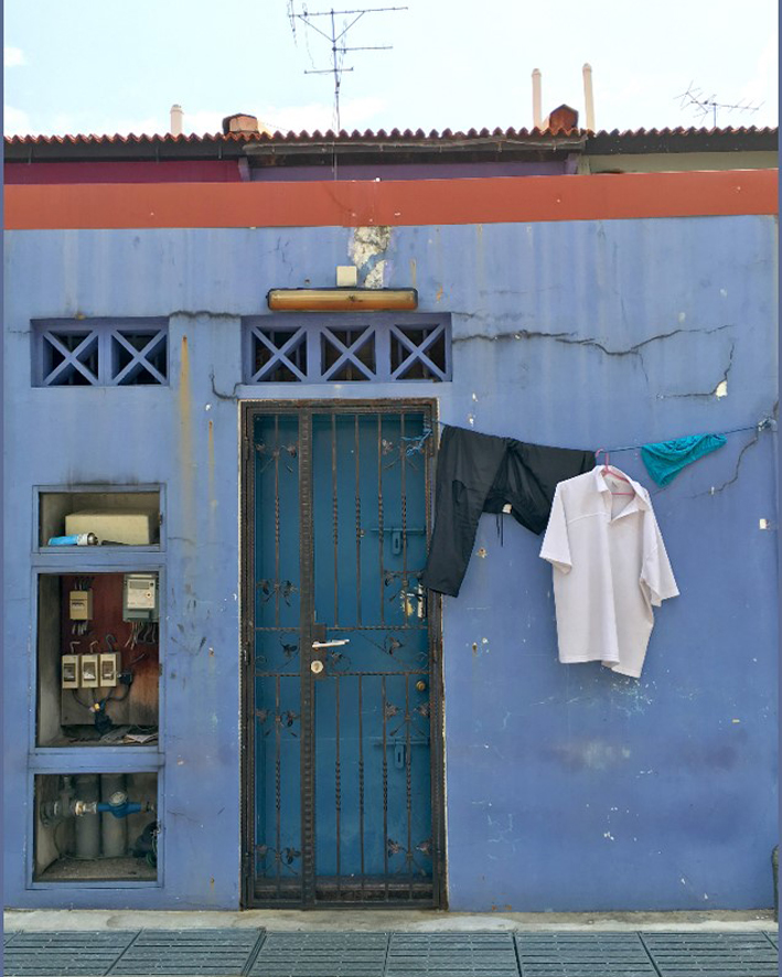
What was the inspiration for the described interior? One of the buildings in Singapore that stood out with an earthy orange stripe against the inky blue walls.

DISCOVER A NEW STAR IN THE DESIGN SKY and explore the extraordinary.
Blue Nova isn’t the final frontier for Benjamin Moore, however. 2024: According to the company, the announcement kicks off a design partnership with Blue Origin’s nonprofit, Club for the Future, which will involve design interventions at local hospitals, and “space-themed experiences” at community events, in efforts to promote STEM fields.

STEM is a whole concept combining NATURAL SCIENCES, TECHNOLOGY, ENGINEERING and MATHEMATICS, aimed at increasing the participation of these fields in education to help children build connections between them and better understand them.
