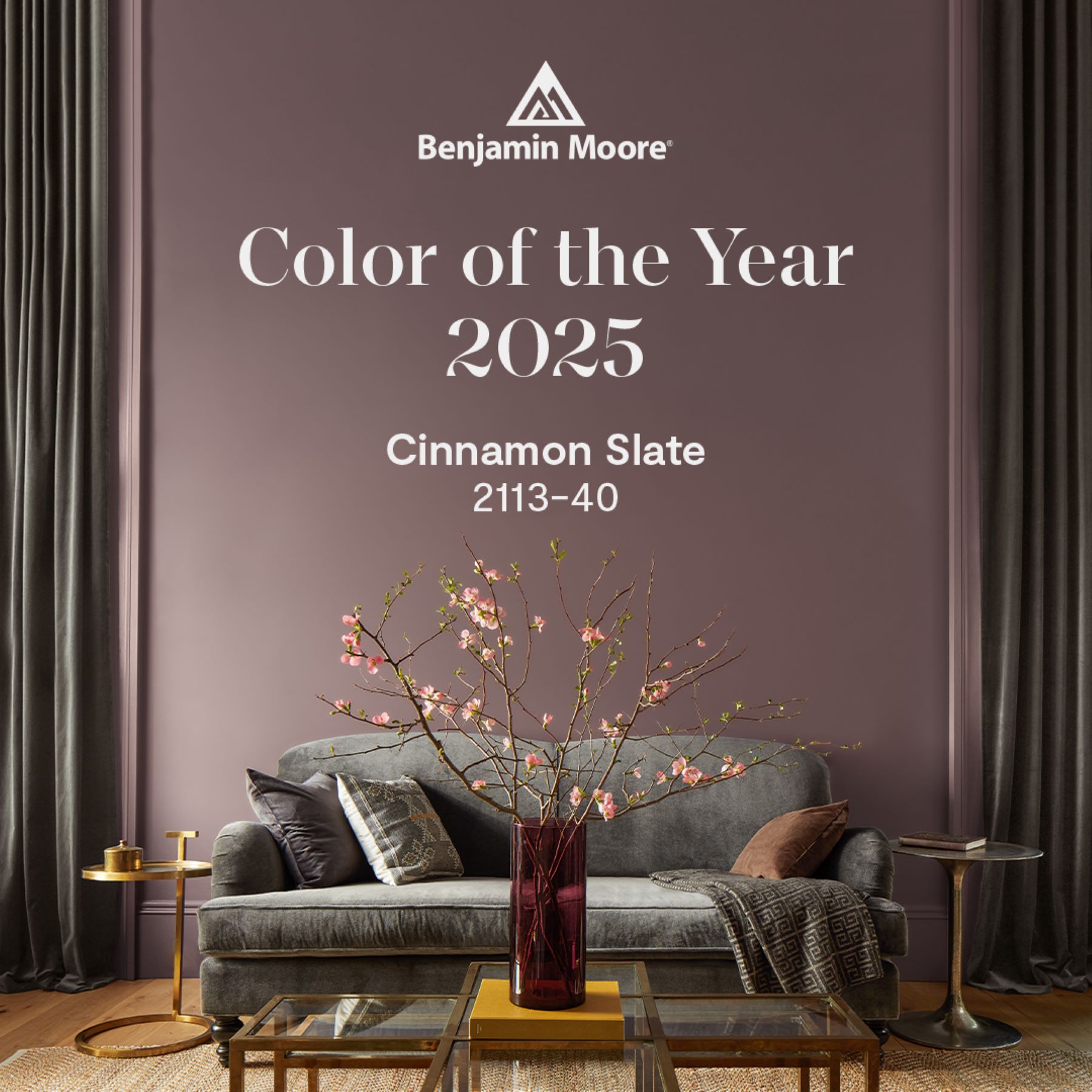
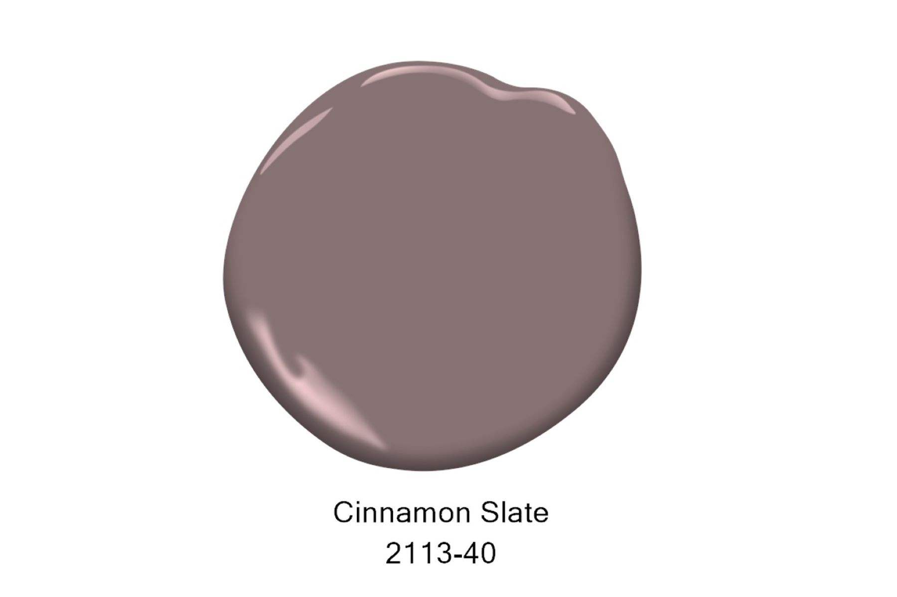
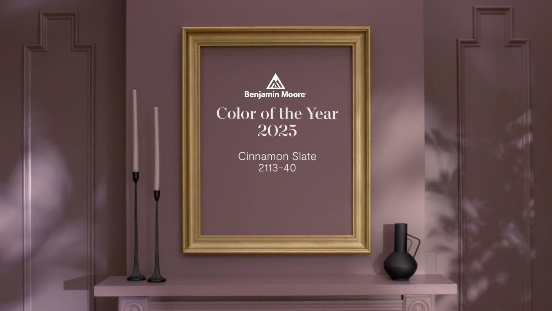
Dignified, sublime „COLOR OF THE YEAR 2025” - Cinnamon Slate 2113-40
Picking the color of the year is a delicate process and big challenge. You have to capture the aesthetic moment, translating disparate trends and emerging design movements into a single, resonant color choice.
"Color Trend Hunters" by Benjamin Moore & Co. decided to find a golden mean for these color dilemmas this year. Therefore, the main place in the palette of "COLOR TRENDS" for 2025 was taken by "Cinnamon Slate 2113-40", i.e. "COLOR OF THE YEAR 2025".
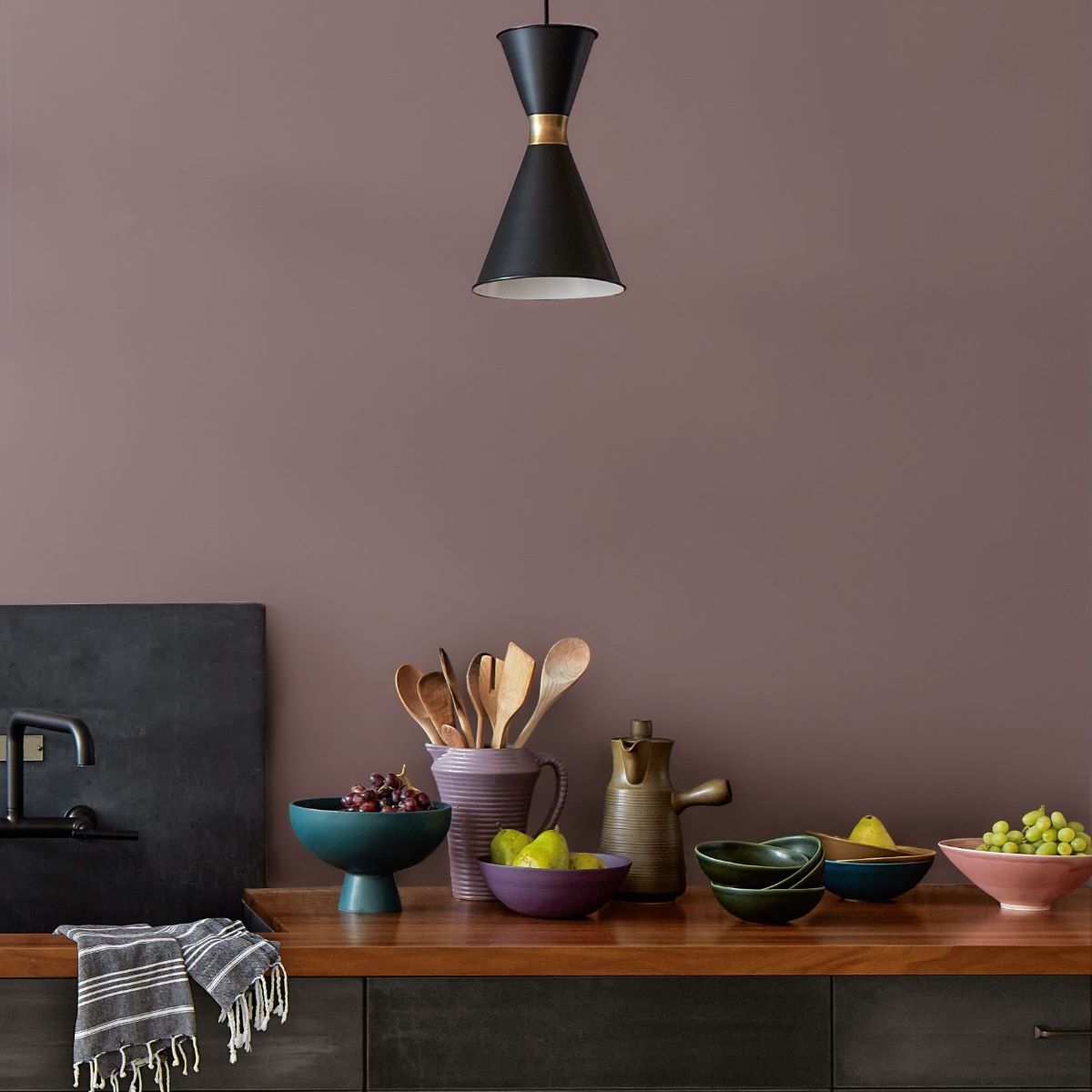
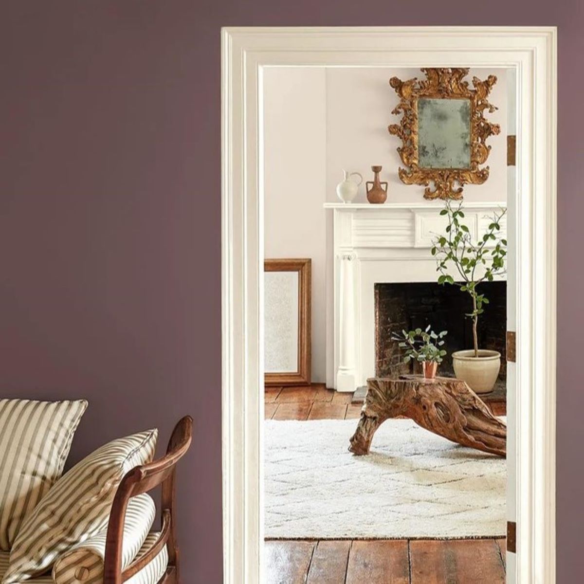
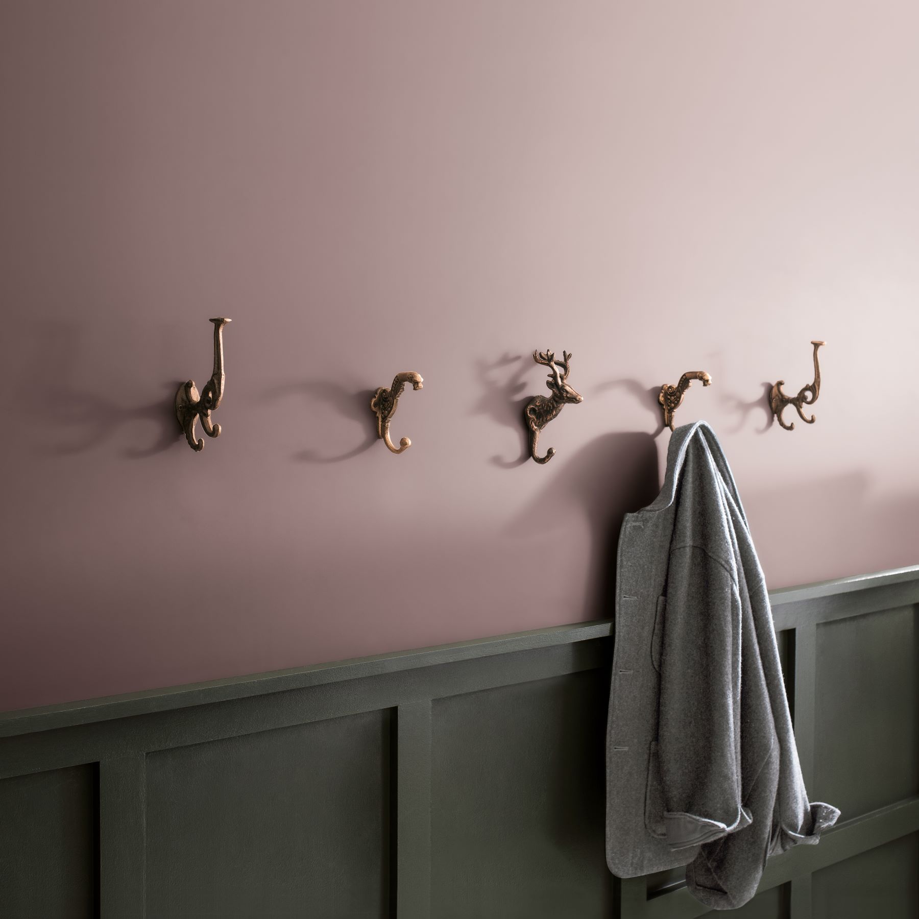
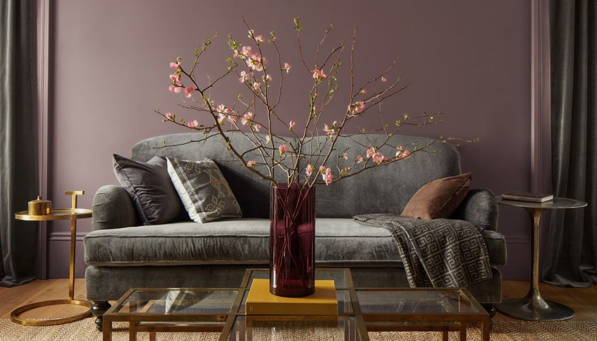
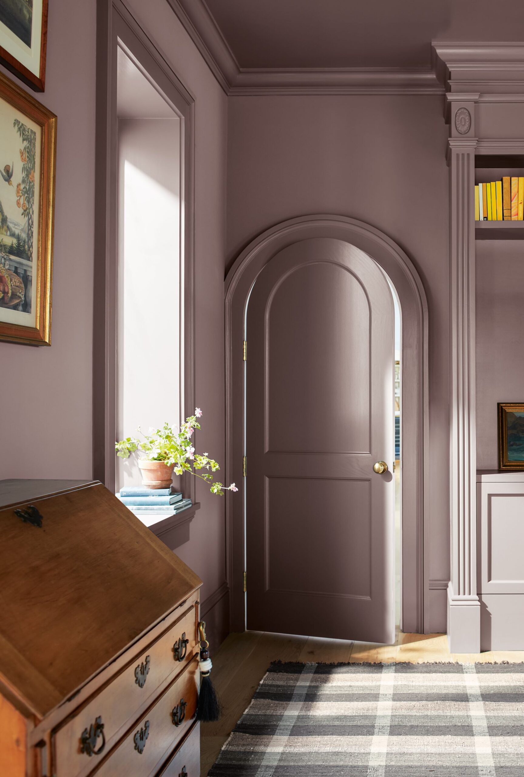
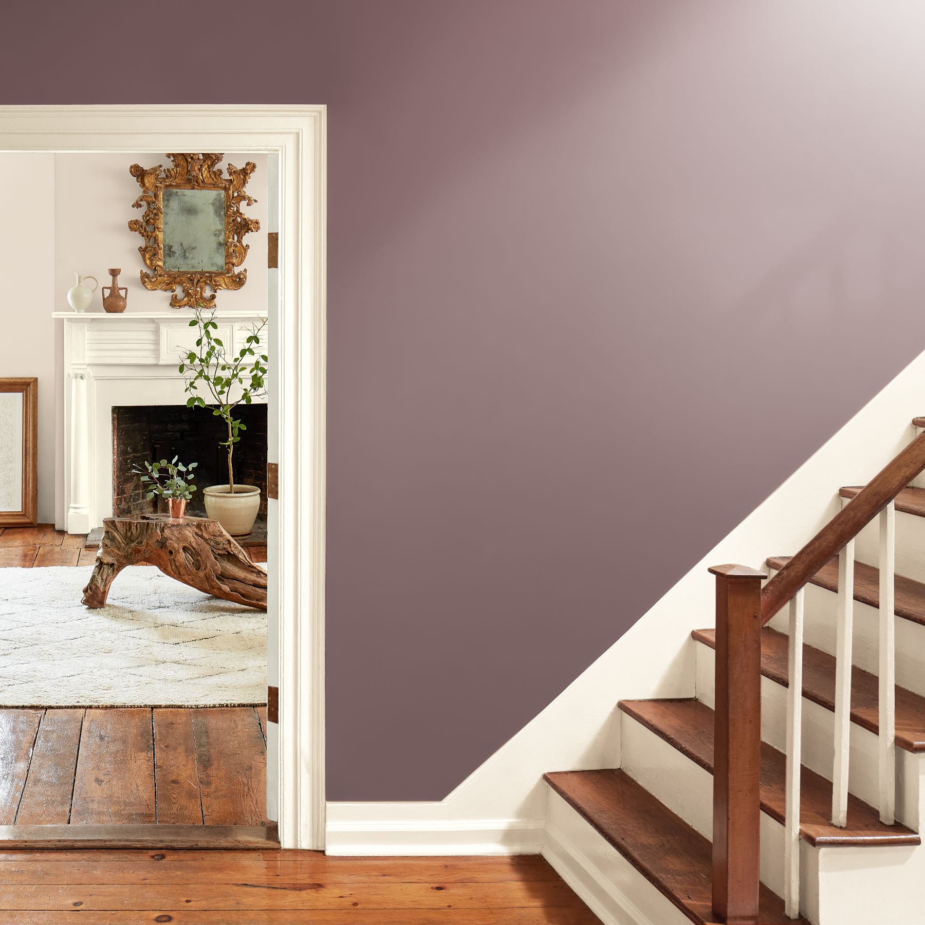
A delicate mix of heathered plum and velvety brown, Cinnamon Slate 2113-40 offers enduring style and a modern sensibility. It encapsulates the idea of quietly colorful.
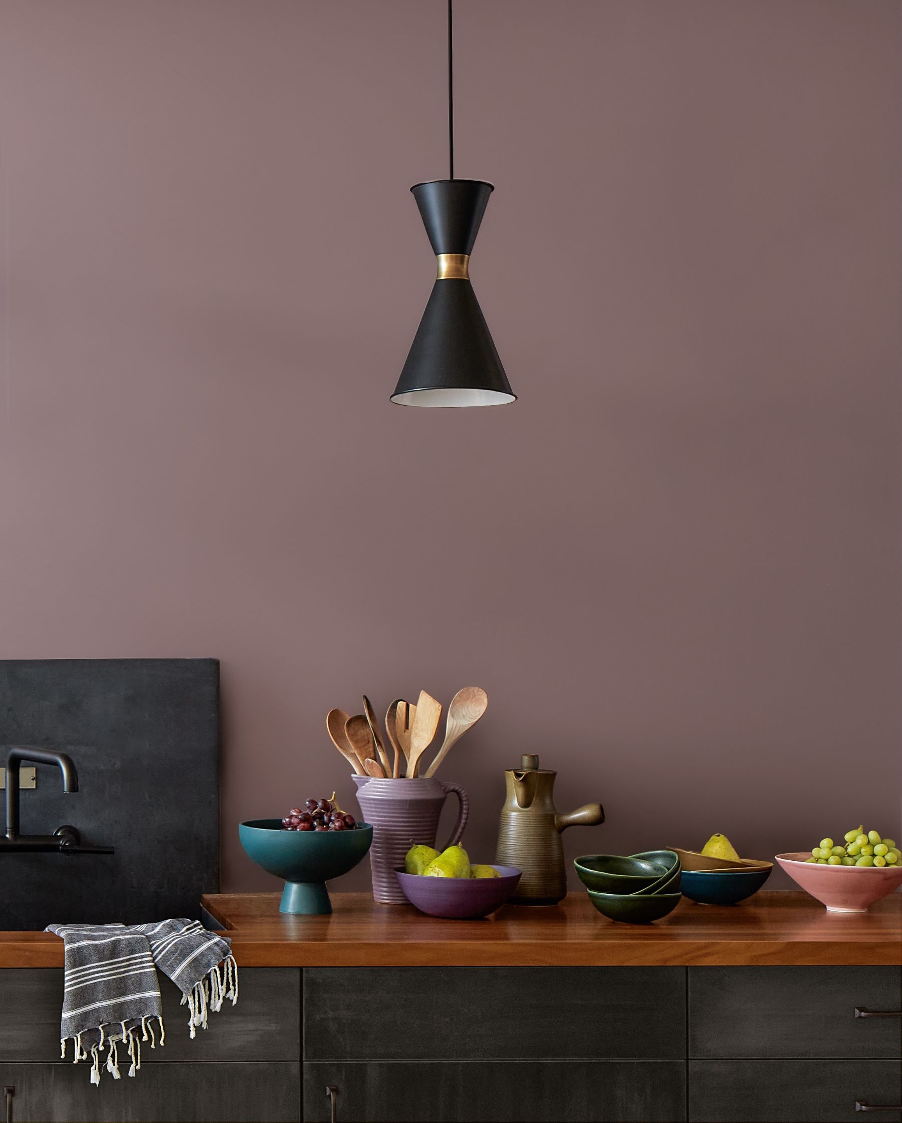
To define this color without undertones would be impossible. The unique undertones add to the versatility and adaptability of this hue. It gives this color a presence without distraction.
When designing a room with "Cinnamon Slate", bringing in warmer accents in golds and ambers can make the violet undertone more distinguishable. Conversely, by using cooler colors and lighting, and plum hues, Cinnamon Slate can take on more of a neutral look.
COLOR OF THE YEAR 2025 is a hue that shows the beauty and nuance that undertones can have and bring to a design. It shows the confidence of these types of in-between hues and all that they can bring to a space.
Brand of the senses – tactility…
Tactility is also an essential part of “Cinnamon Slate’s” color story.
Andrea Magno, Director of Color Marketing & Design, Benjamin Moore & Co., cites the “velvety” and “softened textile” feel of quietly colorful shades like this, which pair perfectly with soft, rounded-edged furniture and cozy-yet-classy materials.
Of course, its brown-tinted qualities also mean “Cinnamon Slate” feels right at home with wood materials and finishes as well.
Evolution, not revolution…
Now let’s look at the progression of color that brought us to the Color of the Year 2025.
In 2023, we had “New Age 1444”. Understated and ethereal, “New Age” was the softest color in the Color Trends 2023 palette.
It brought ease and restraint to the palette playing the role of quietly colorful among much more saturated hues. It stood out as a delicate, gentler approach to color.
In 2024, we had “Hazy Lilac 2116-40”. Slightly darker, this midtone violet became an unexpected favorite. Subtle notes of gray bring versatility and depth allowing it to work beautifully in many different styles and settings.
This hue tends to lean more violet aligning with trends towards more saturated hues.
This leads Color Hunters to “Cinnamon Slate 2113-40”. With its toasted undertones, Cinnamon Slate leans warmer and more neutral than the previous colors mentioned. Its nuanced undertones highlight the notion of quietly colorful hues and the beauty of undertones in paint colors.
“Cinnamon Slate” can enhance traditional homes with a contemporary touch while also adding warmth and comfort into modern spaces.
It all started with undertones…
Andrea Magno, Director of Color Marketing & Design, Benjamin Moore & Co. explains that the term undertone has gained popularity over the past few years, offering a way to help decipher color and explain why the same paint color looks blue in one room and green in another.
It has added another word to design vocabulary and tool in kit to help us describe what it is we are looking for (or not looking for) in a paint color.
Although a paint color may look like it is just blue, often multiple pigments blend together to create that exact shade and that is what results in undertones.
As the Color Team met to discuss our research, findings, and insights for the Color Trends 2025 palette, this idea of quietly colorful hues came to the forefront quickly.
“Color Trends Hunters” knew they wanted to celebrate the beauty of undertones and all that they can bring to a design. They wanted to look at the nuances of color and the intricacies of undertones.
This year Color Team didn’t start with a specific color or even color family, but was gravitating towards colors that had a comfort, a calm, but still a confidence to them. Color Team members kept reaching for in-between hues that blurred the lines and had unique undertones because they found that is what made them adaptable, versatile, and easy to personalize in a space.
For the past couple of years, we’ve seen this reach for more saturated and colorful hues with “Raspberry Blush” and “Blue Nova” leading the way.
These are colors that get straight to the point, they make a statement and draw your attention.
With this, there has become an appreciation and overall better understanding of color and how to use it in design.
Color Trends Hunters feel it has led them to the next step in their color journey as they discover the beauty of more nuanced color.
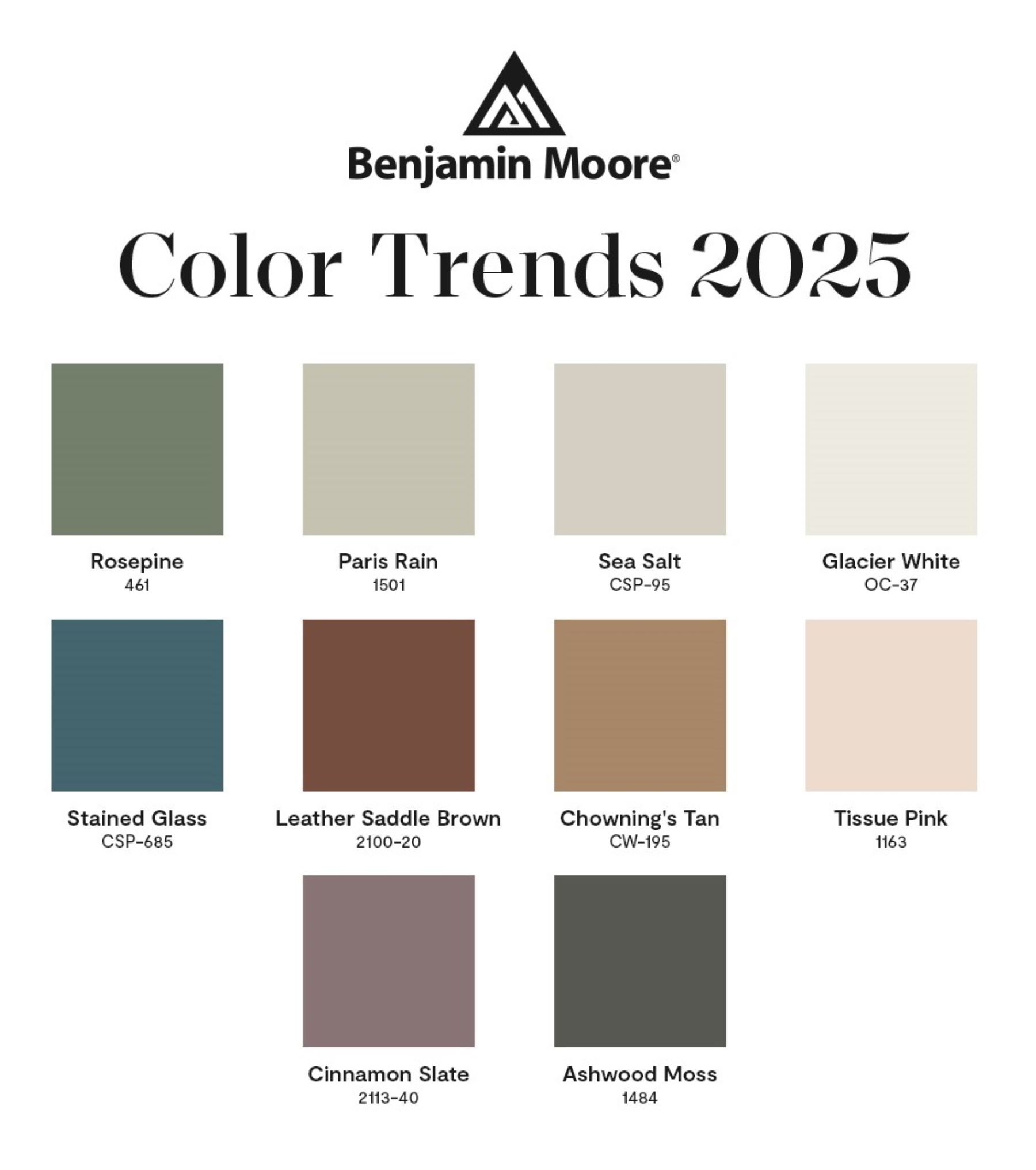
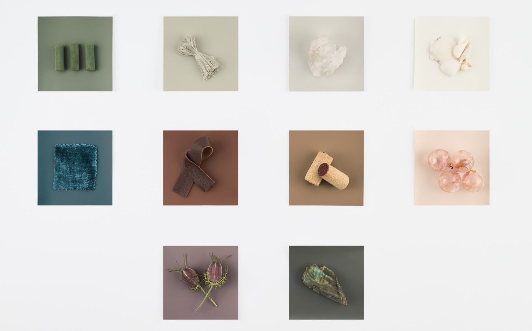
Together, these ten hues make up the Color Trends 2025 palette. They can stand alone beautifully or work together harmoniously creating a color palette that transitions gracefully from room-to-room.
These “in-between hues” celebrate a more nuanced approach to color. These are colors that are not oversaturated, you won’t tire of them easily.
They are adaptable and work with the lifelong curation of our homes as we swap in and move around items forever combining new with old.
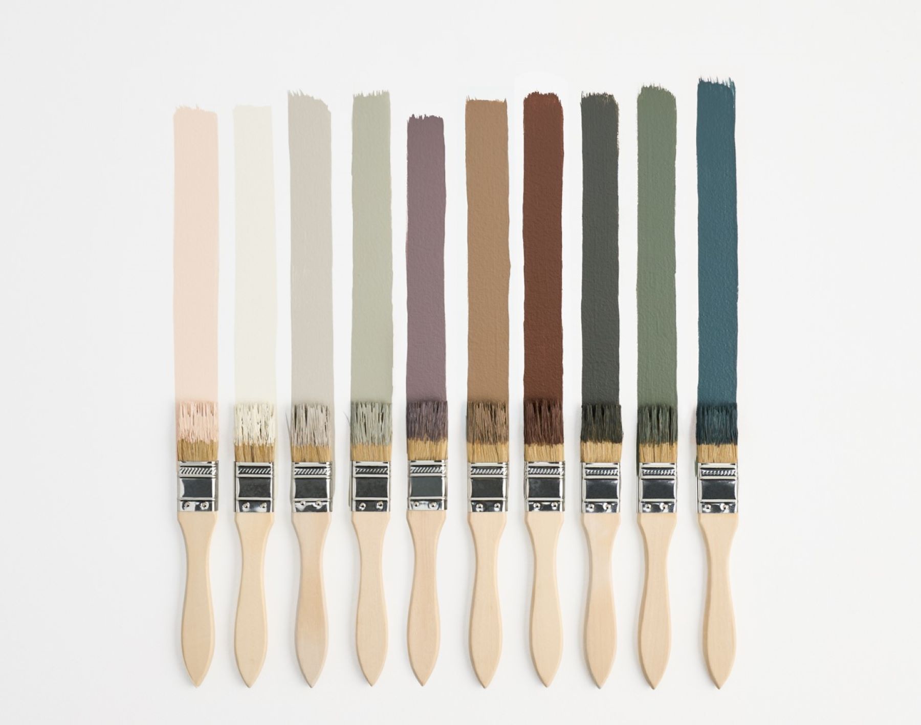
These hues help us find our color confidence without overwhelming a space. They feel comfortable and have a sense of familiarity but don’t fade into the background.
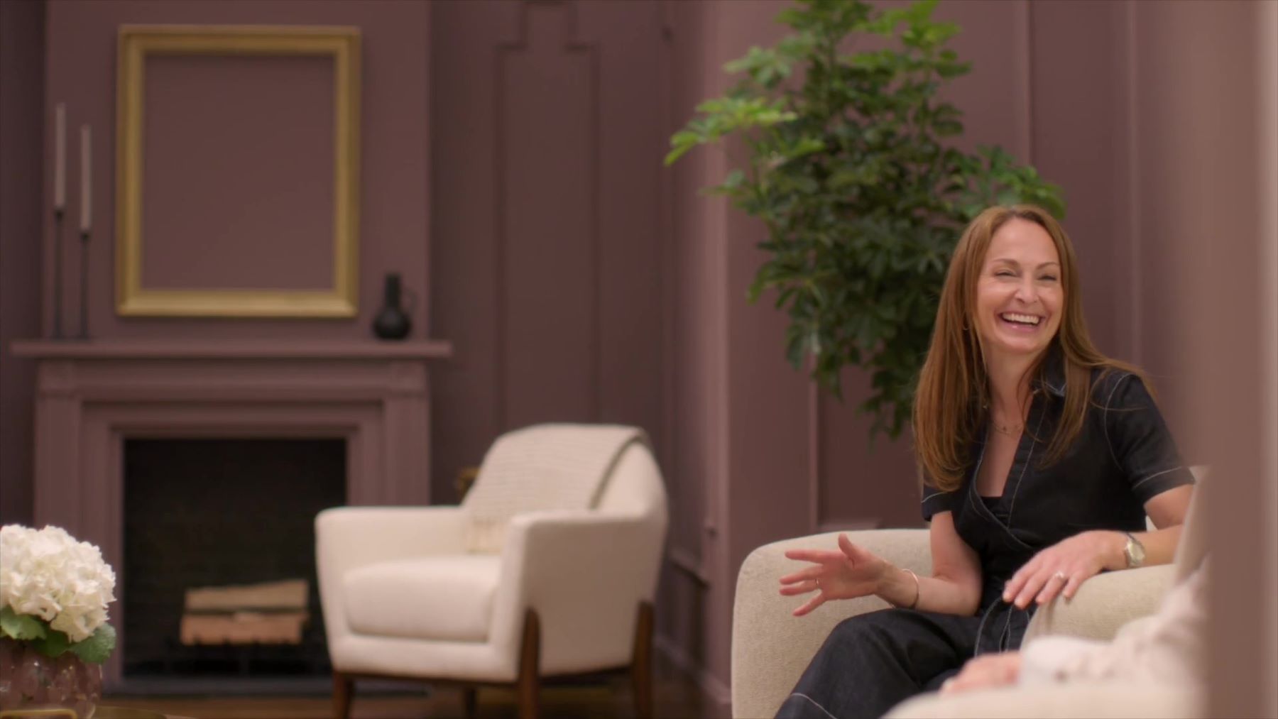
Andrea Magno concludes - “You can play with these 10 colors and come up with a lot of different ways to use them while still putting your personal stamp on it.”
We hope this palette encourages people to see the beauty of nuanced colors and the power of undertones.