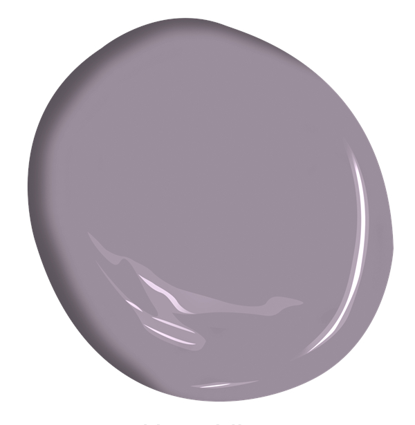
New horizons are sought by exploring disparate places, thoughts, and colors to form endless creative possibilities. Softly saturated with a nuanced approach to contrast, the Benjamin Moore Color Trends 2024 palette takes inspiration from the hues experienced through travels and moments that span beyond routine. On adventures near or far, we encourage collecting poignant color moments with verve and personality that are unexpected and boundlessly magical.
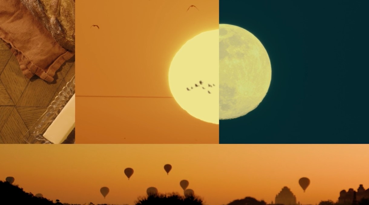
New and old, day and night, light and dark, warm and cool, near and far – we are surrounded by contrasts and opposing forces at every turn. From simple opposing relationships to the most thought provoking and complex, these juxtapositions shape our surroundings.
For 2024, Benjamin Moore’s Color Experts conversations and research findings centered on contrasts and opposing relationships. Their discussions and trend workshops focused on the question: we say opposites attract, but is it more a story of things that are seemingly different complementing one another? And do those differences come together for results that are unexpected, exciting, or compelling while taking us on a journey filled with new adventures?
These questions set the stage for the exploration that brought us to Color Trends 2024.
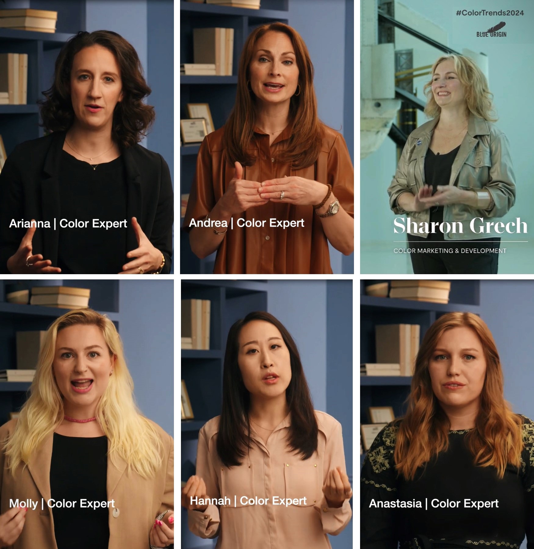
"The palette is a story of adventure and duality and juxtaposing light and dark, warm and cool and experiences from near and far", said Sharon Grech, Media Spokesperson, Colour Marketing Development at Benjamin Moore & Co.
The first theme centers on the relationships between complementary and contrasting colors.
When combing through research, images and in discussions, there was a strong story coming forth around complementary pairings as well as contrast used in color schemes.
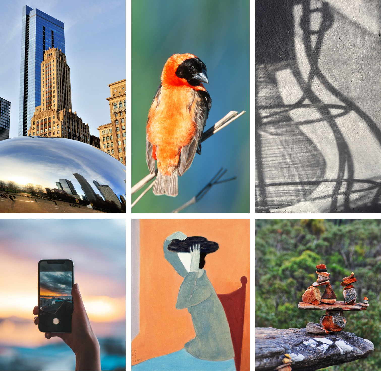
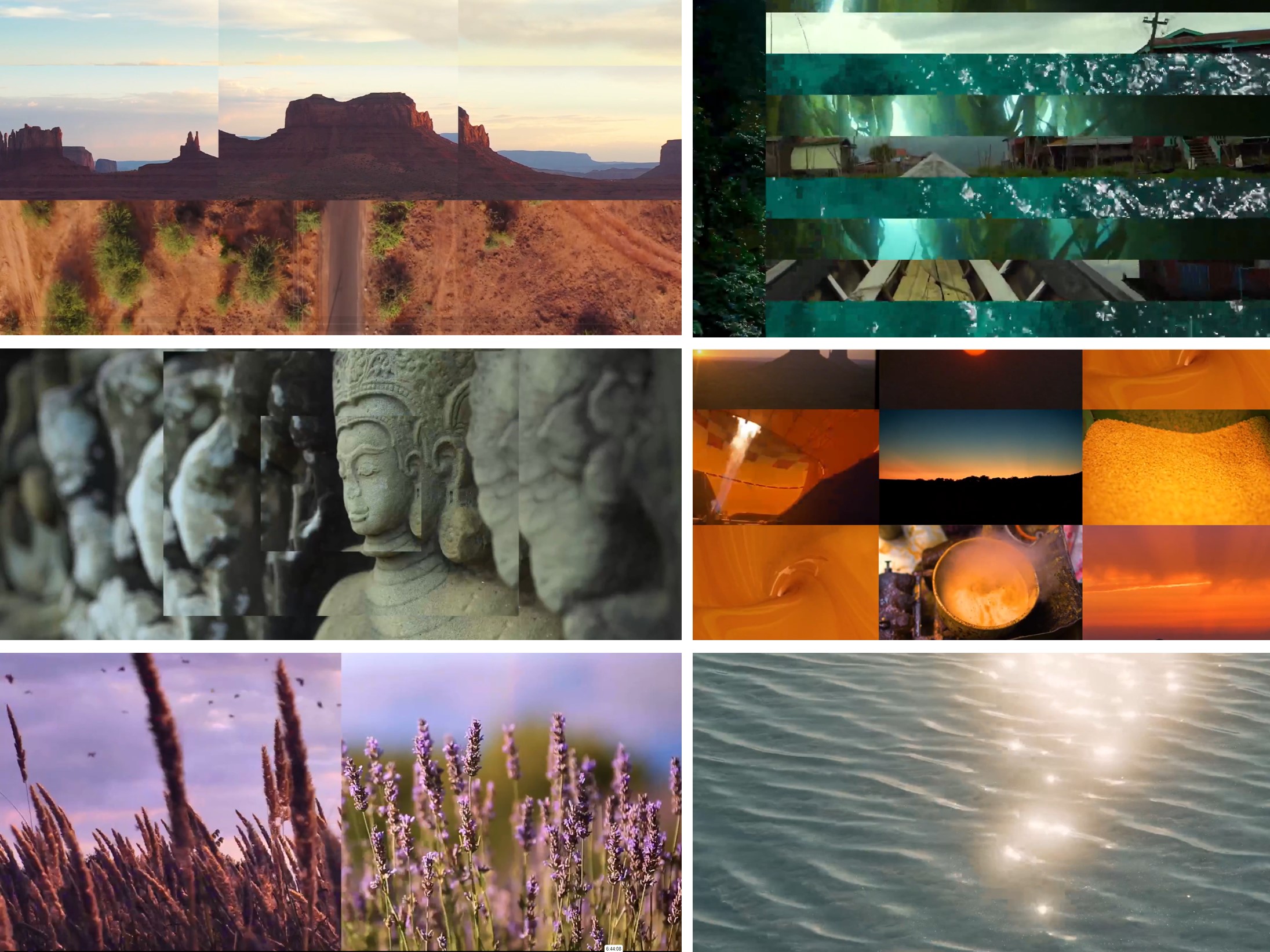
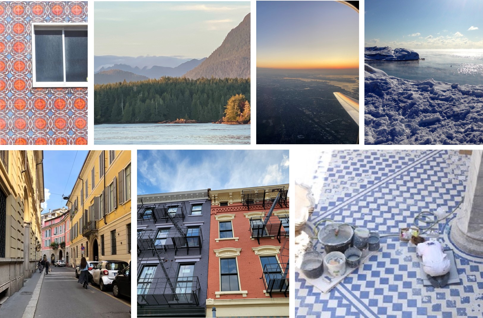
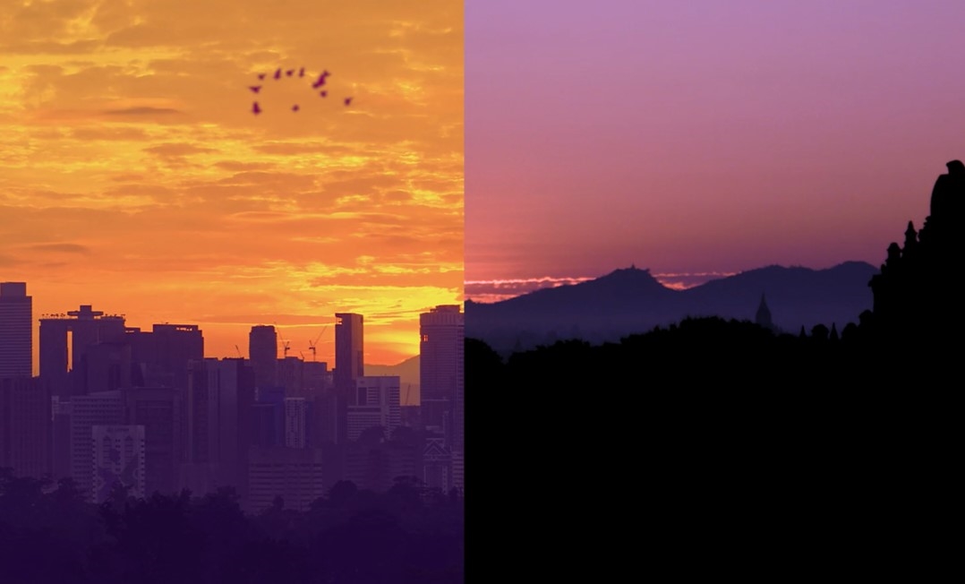
In Color Team members travels this theme reoccurred through art installations where the works of master colorists were observed, exhibits focused on various cultures where textiles and other artifacts filled with color and pattern, architecture we noted through our travels, as well as smaller moments that made us stop and snap a picture.
Whether something was modern and new or dated back hundreds of years, these color relationships captured our interest and triggered our thoughts on opposing colors on the colors wheel, and other diametric relationships.
This brings us to the second theme that stood out not only in its congruence to macro trends, but also its connection to our personal relationships with color – the need for new experiences.
Key macro trends include a strong sense of nostalgia, sustainability as a key part of everything we do, the interest in making meaningful connections and enriching our lives with new experiences, as well as a newfound value for time.
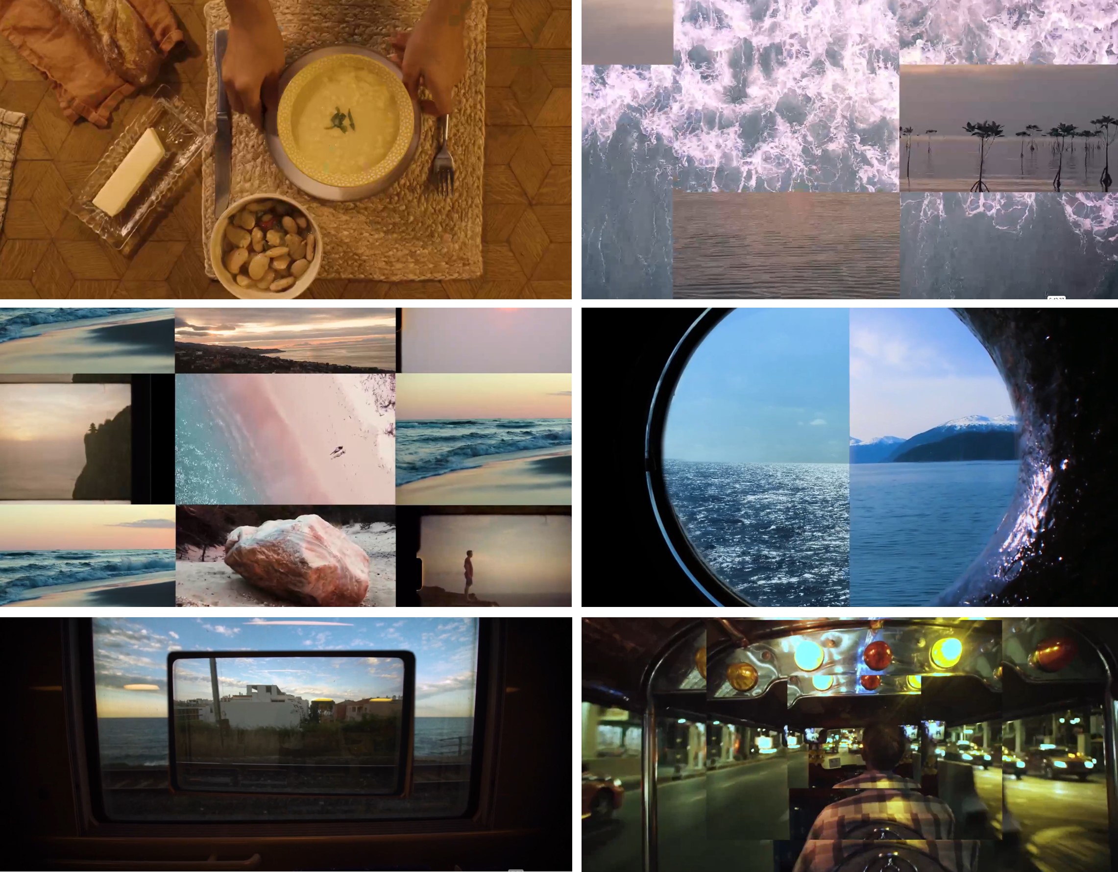
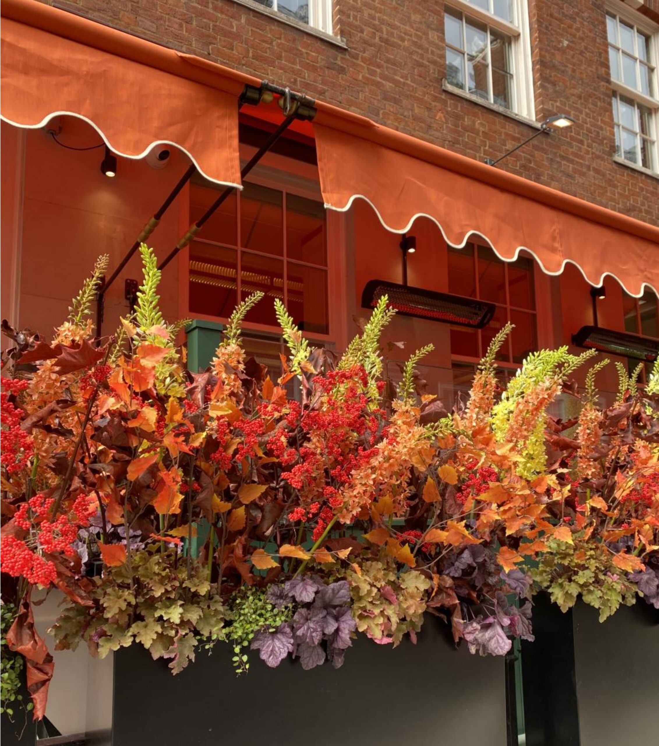
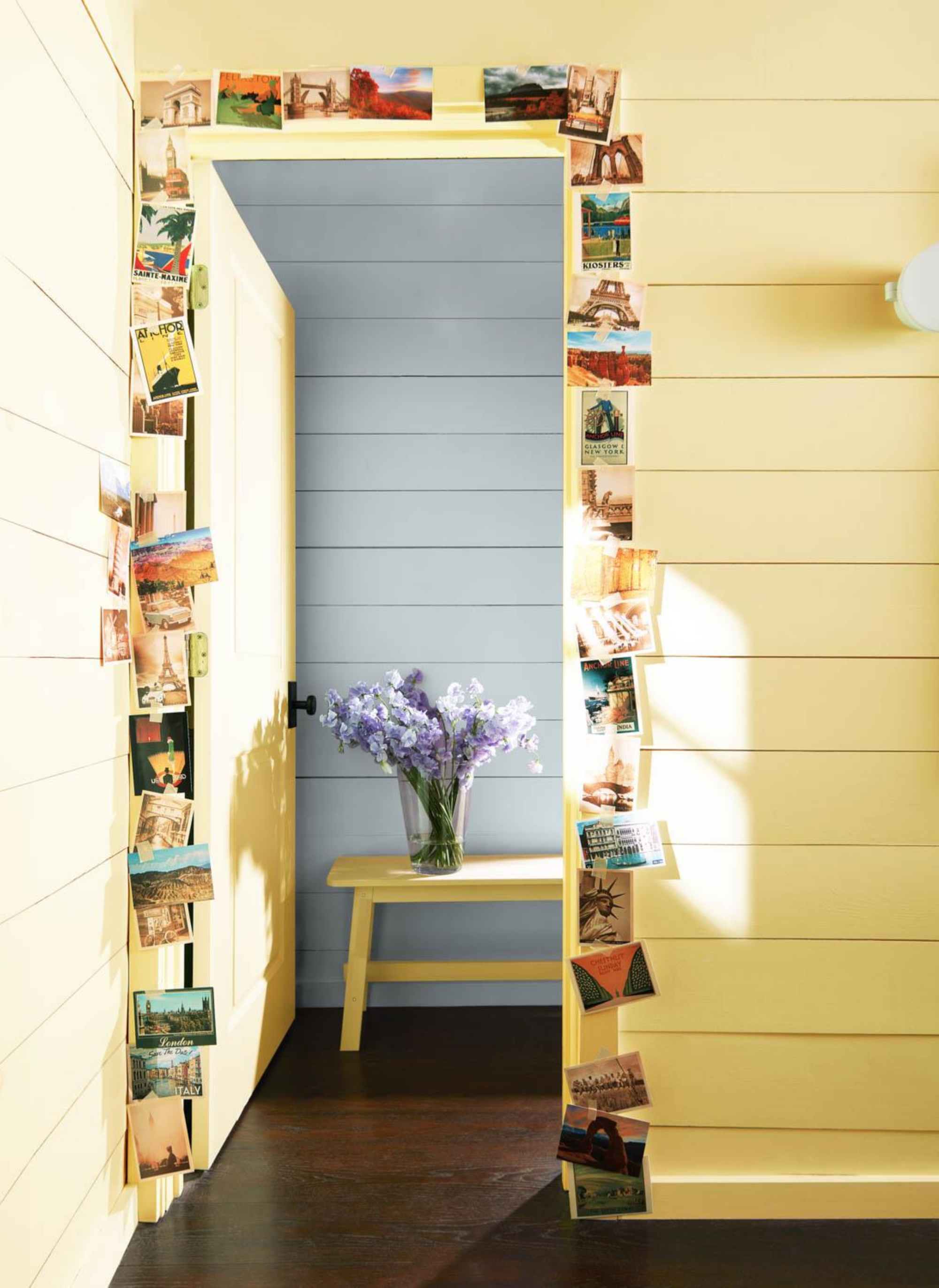
We’ve noted a need for adventure and breaking away from the everyday for something new and different. This may bring us to far flung places or just a drive away. In either instance it’s the idea of finding a change of scenery to enrich our lives. Even as a team, we found that some members are yearning to fly thousands of miles to exotic places, while others love the ability to hop in the car for an escape that is closer to home.
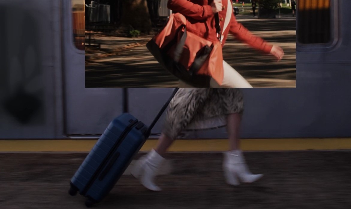
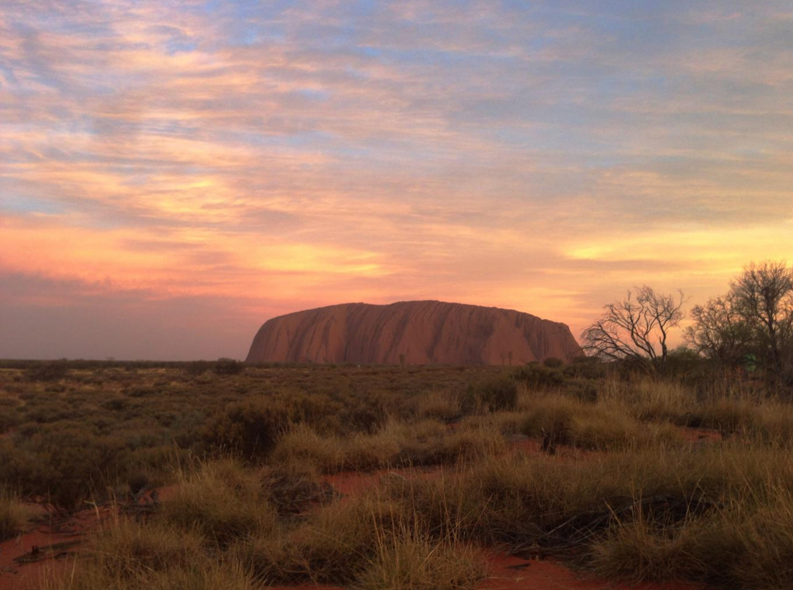
The interest in travel and getting away helps us collect memories or “color mementos” that influence our color choices. When we think about a trip and the pictures captured in our memories, often the character of a place is shaped by the geographic colors of that region, in addition to the culture and history that makes that place unique.
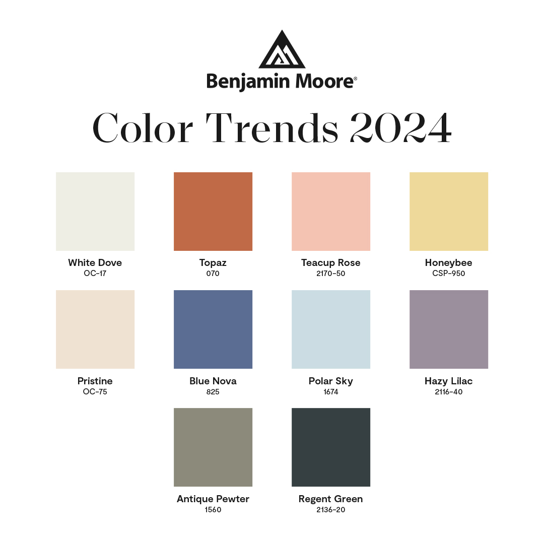
Collecting color moments whether near or far is part of the color trends process each year. For 2024 this was a key influence that brought us to our Color of the year and the process of building the Color Trends palette.
Let’s move to the compilation of the Color Trends 2024 palette.
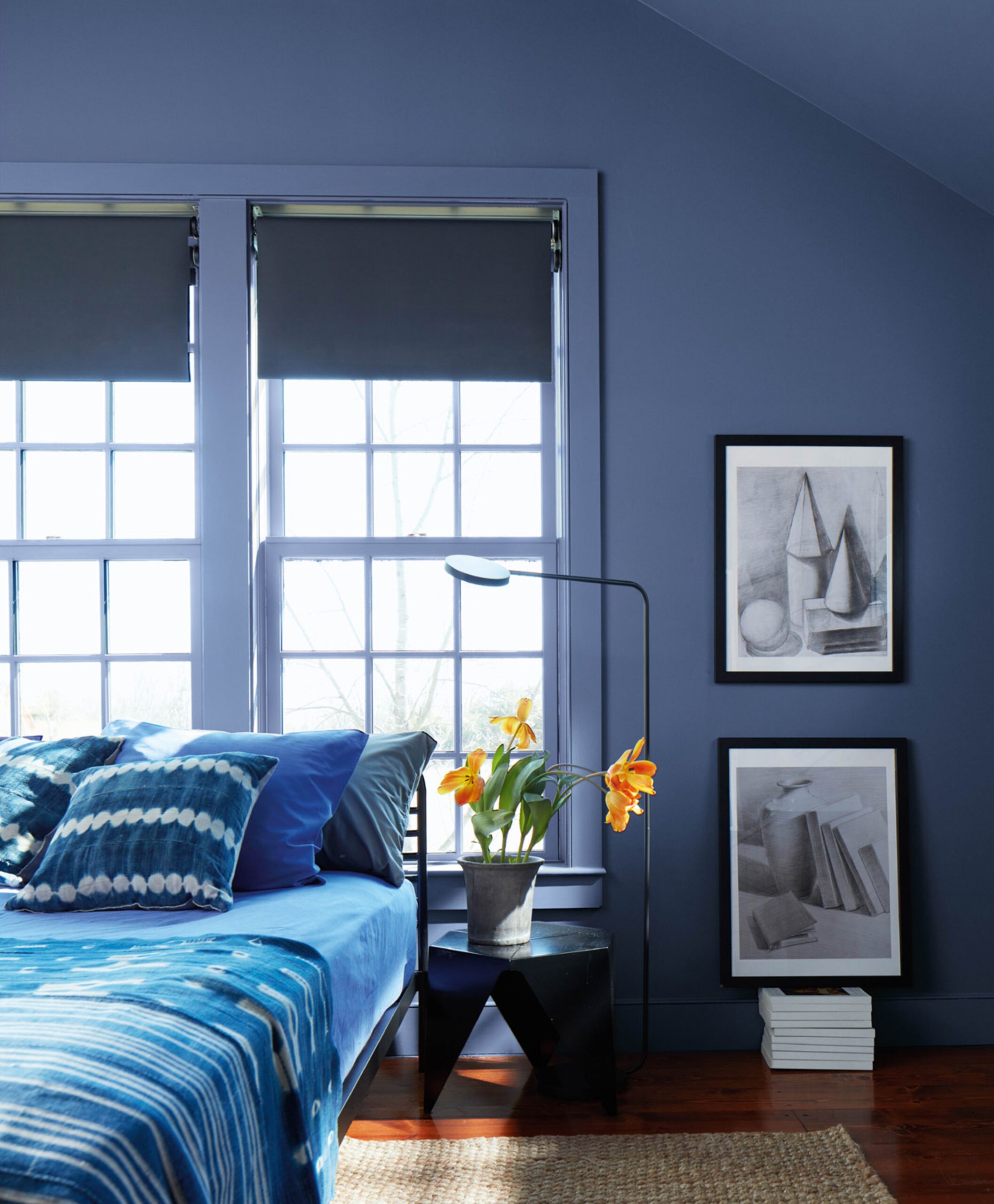
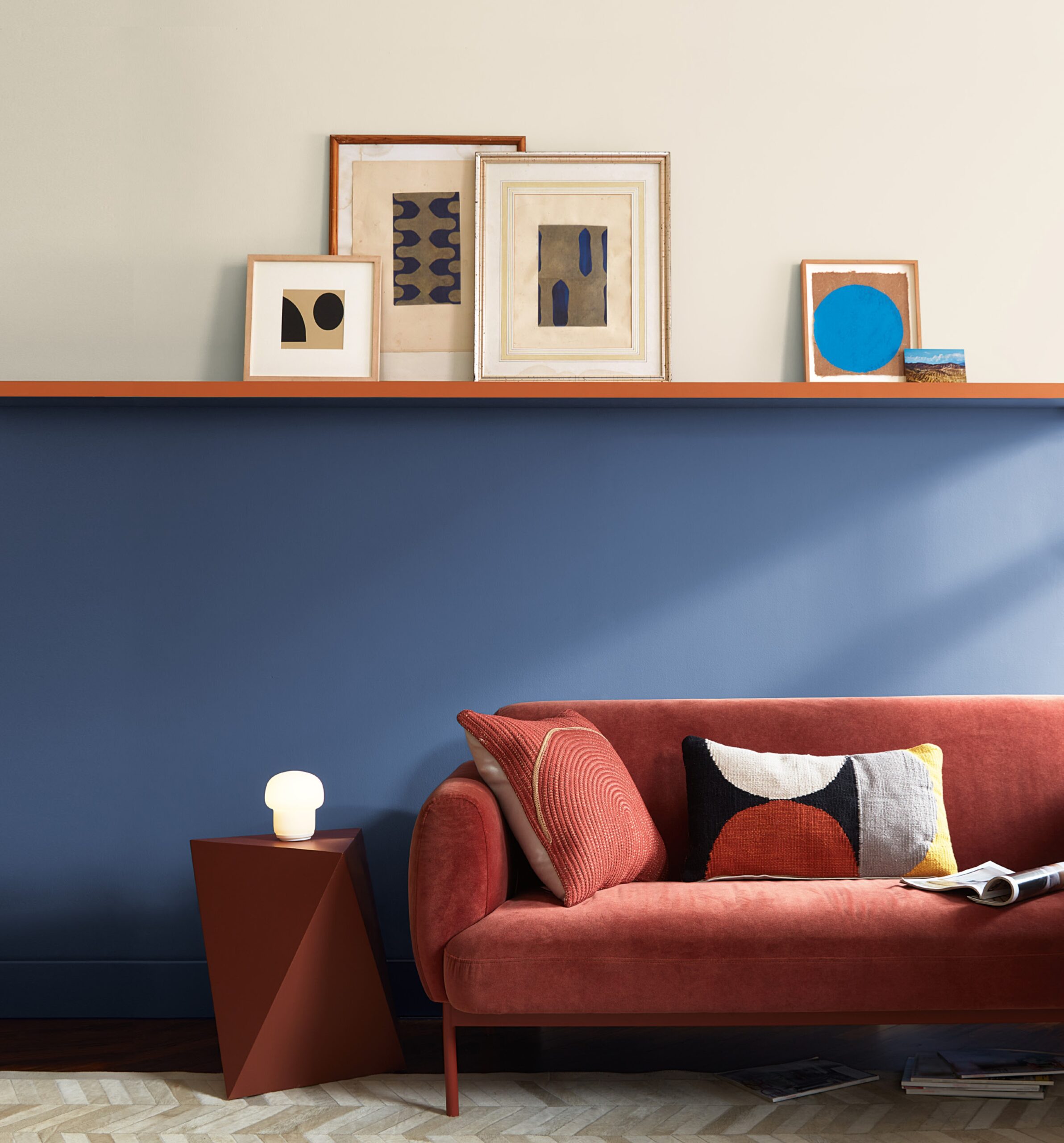
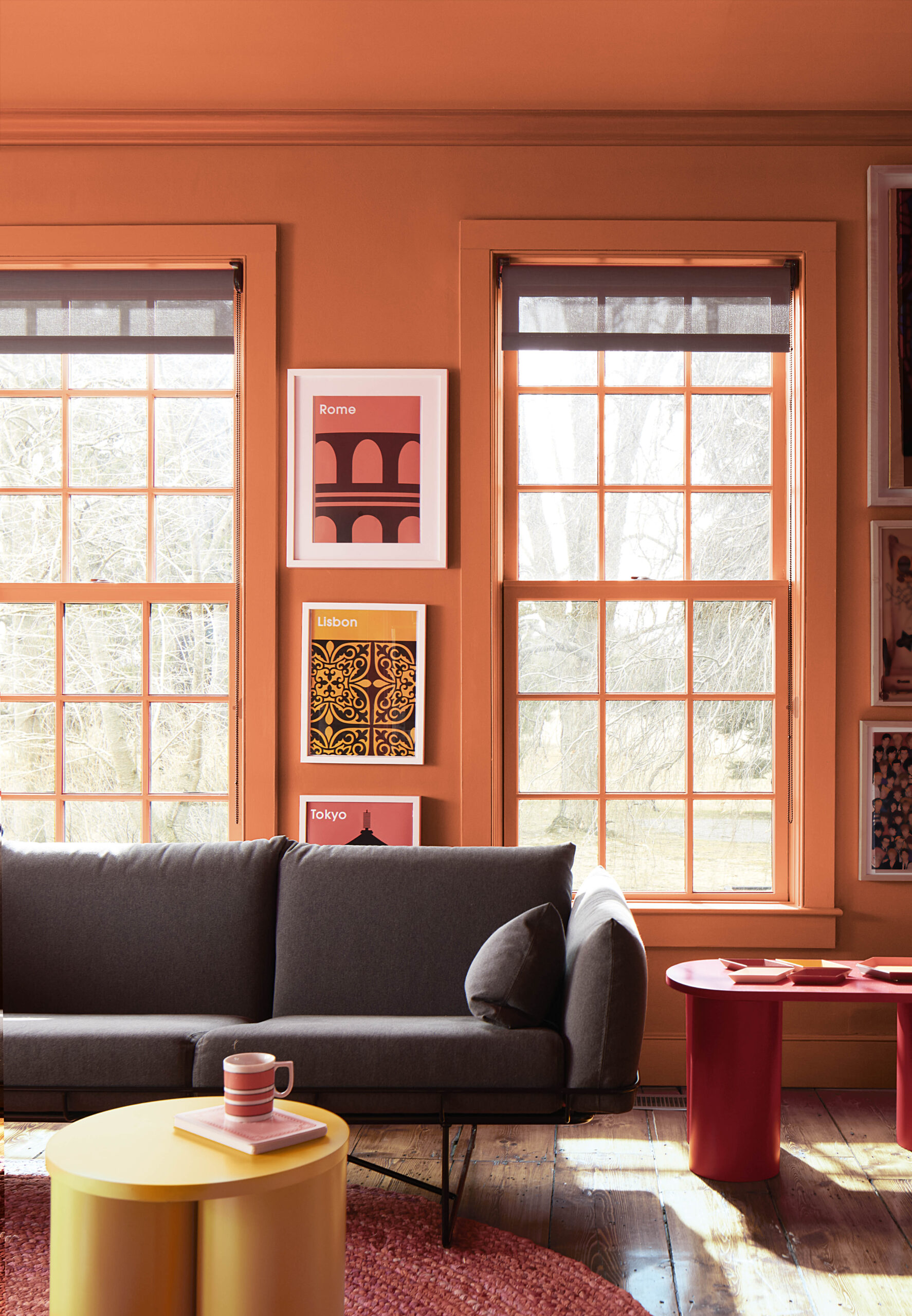
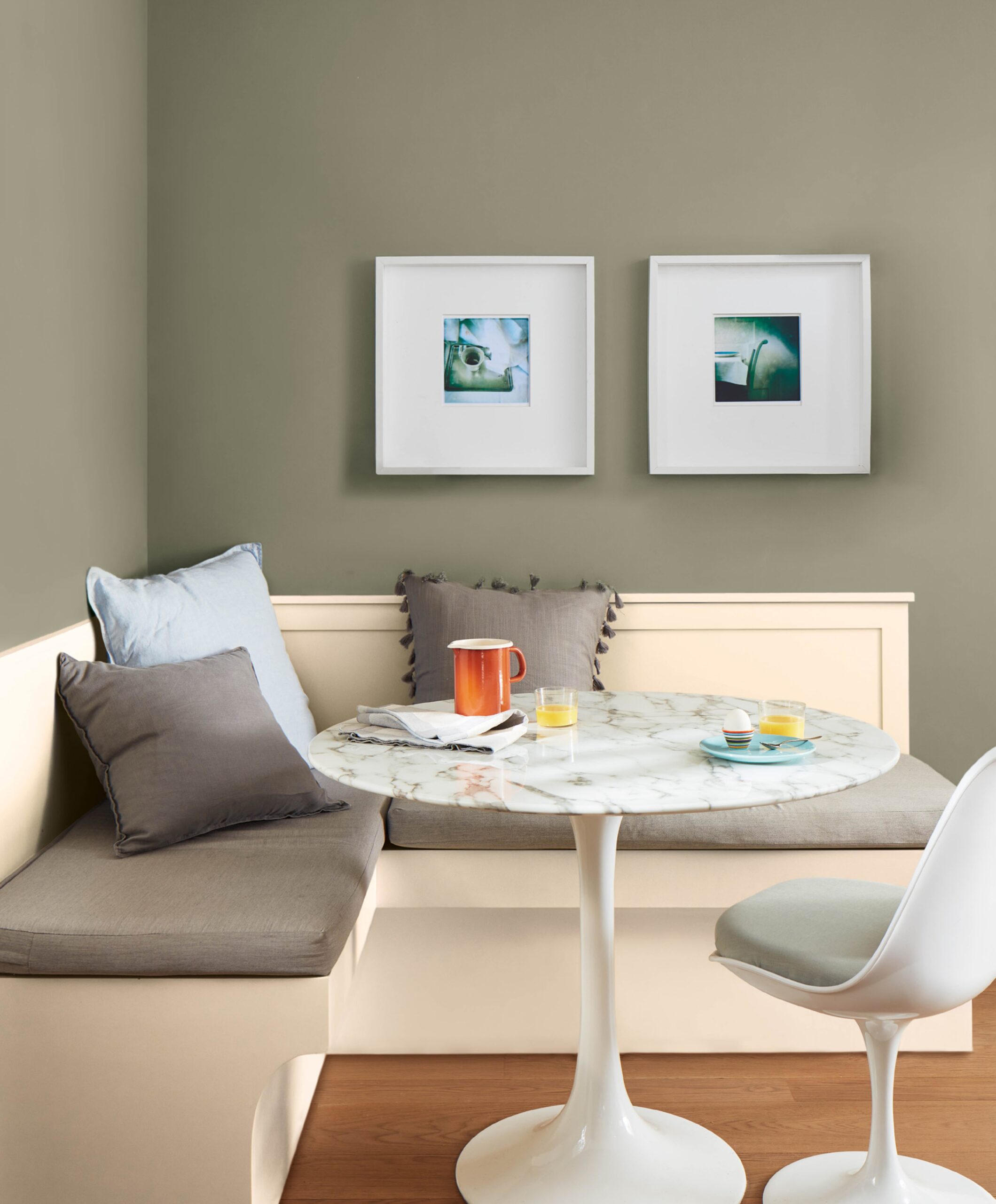
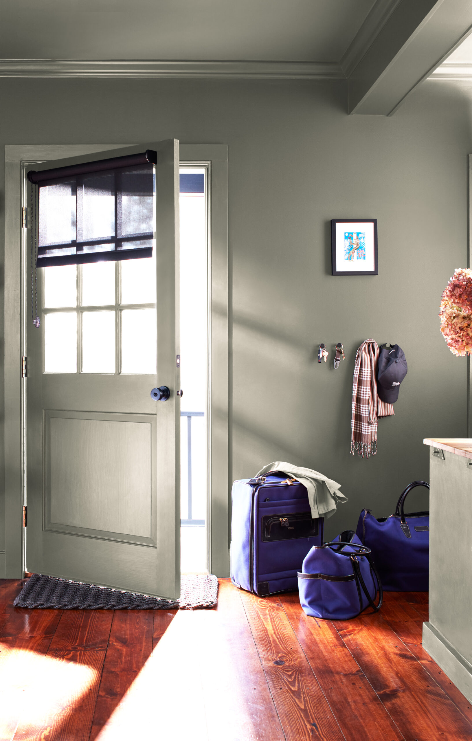
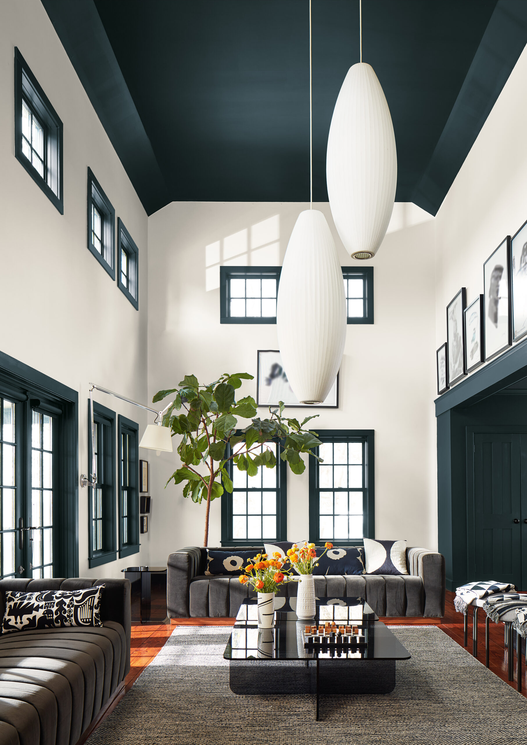
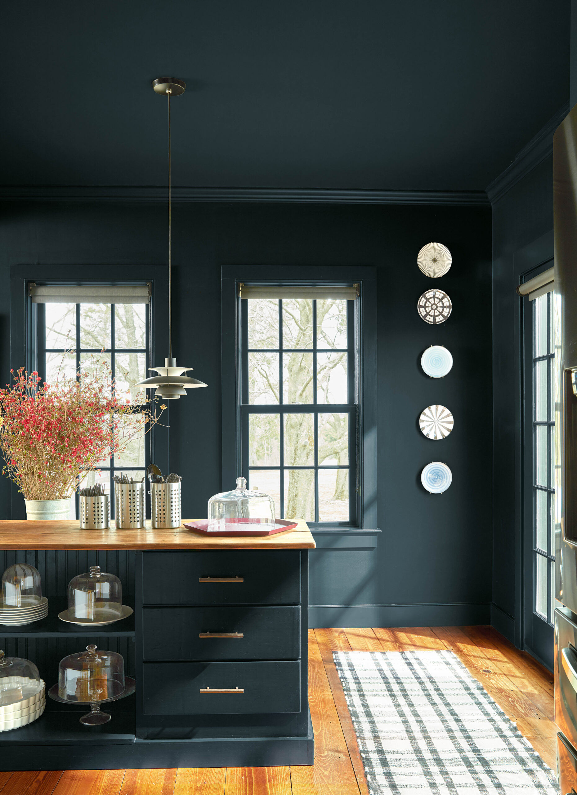
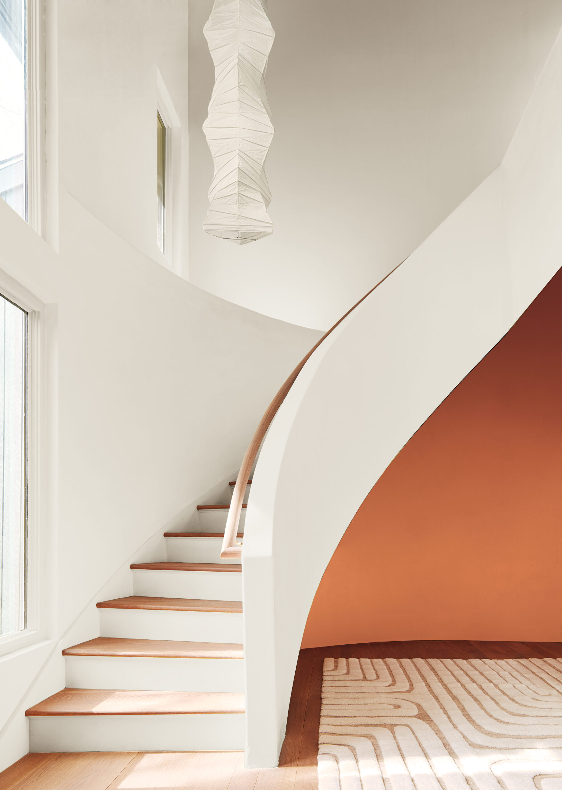
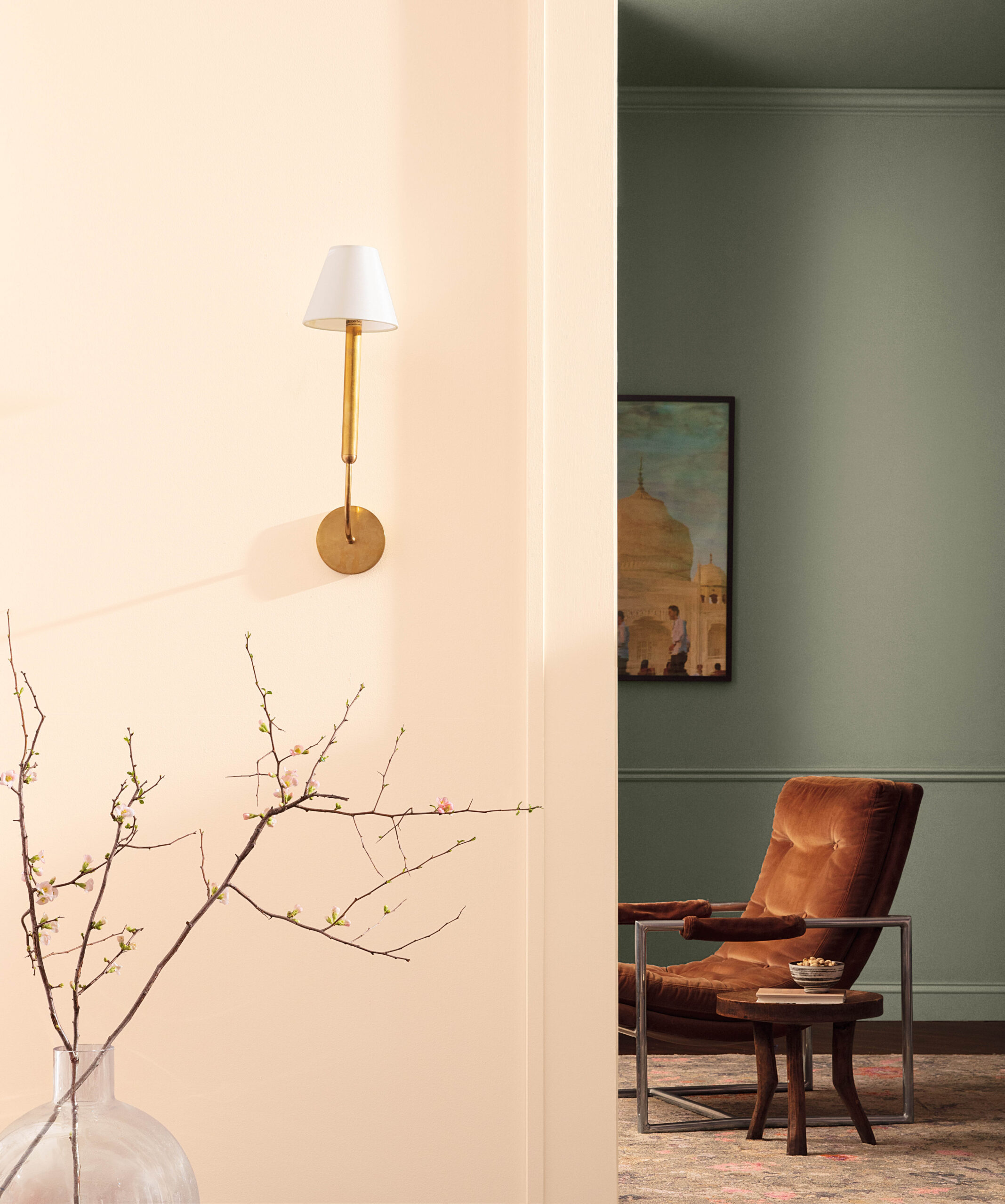
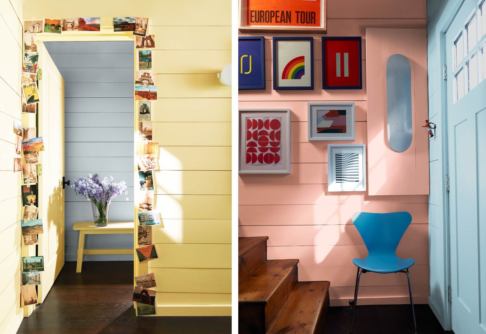
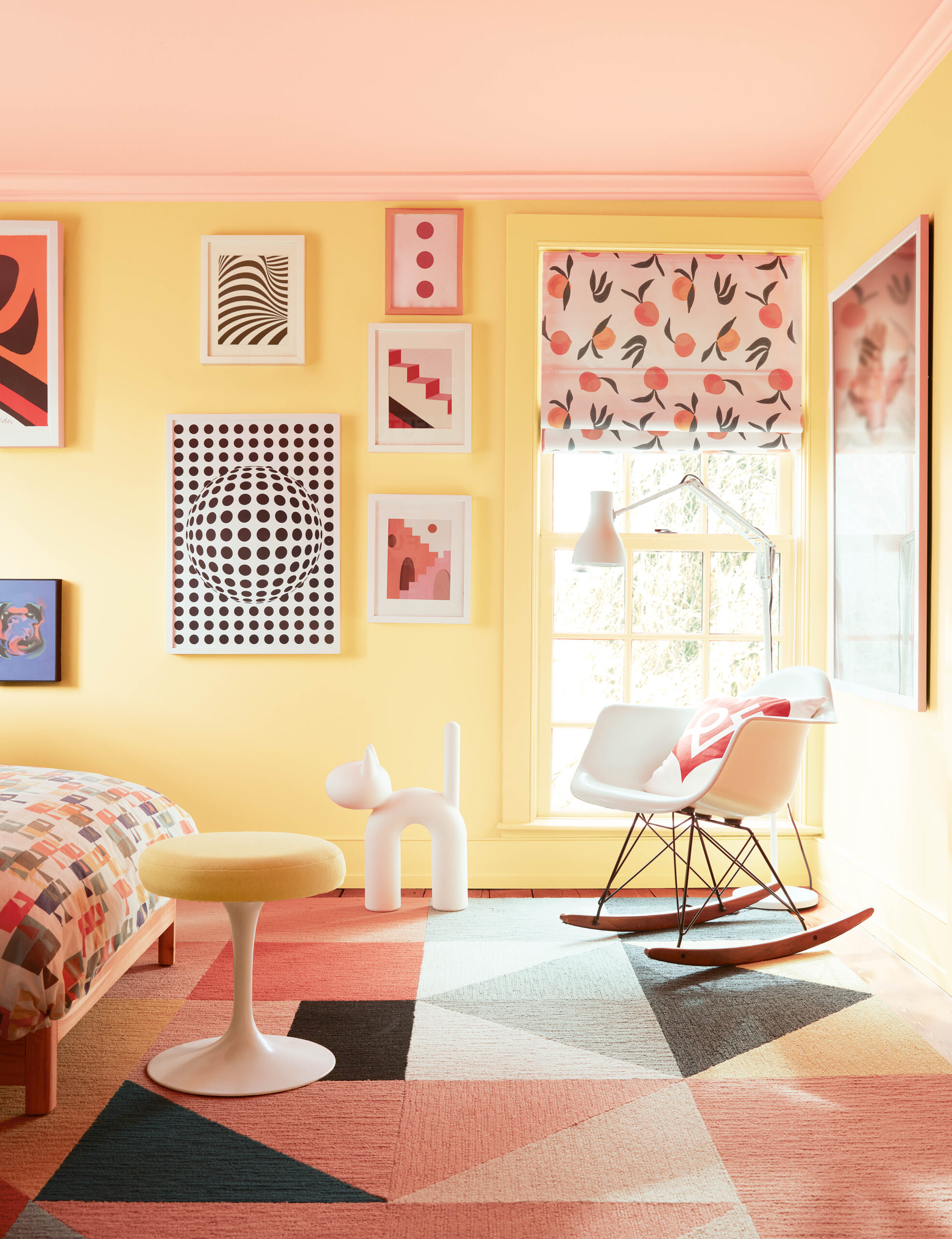
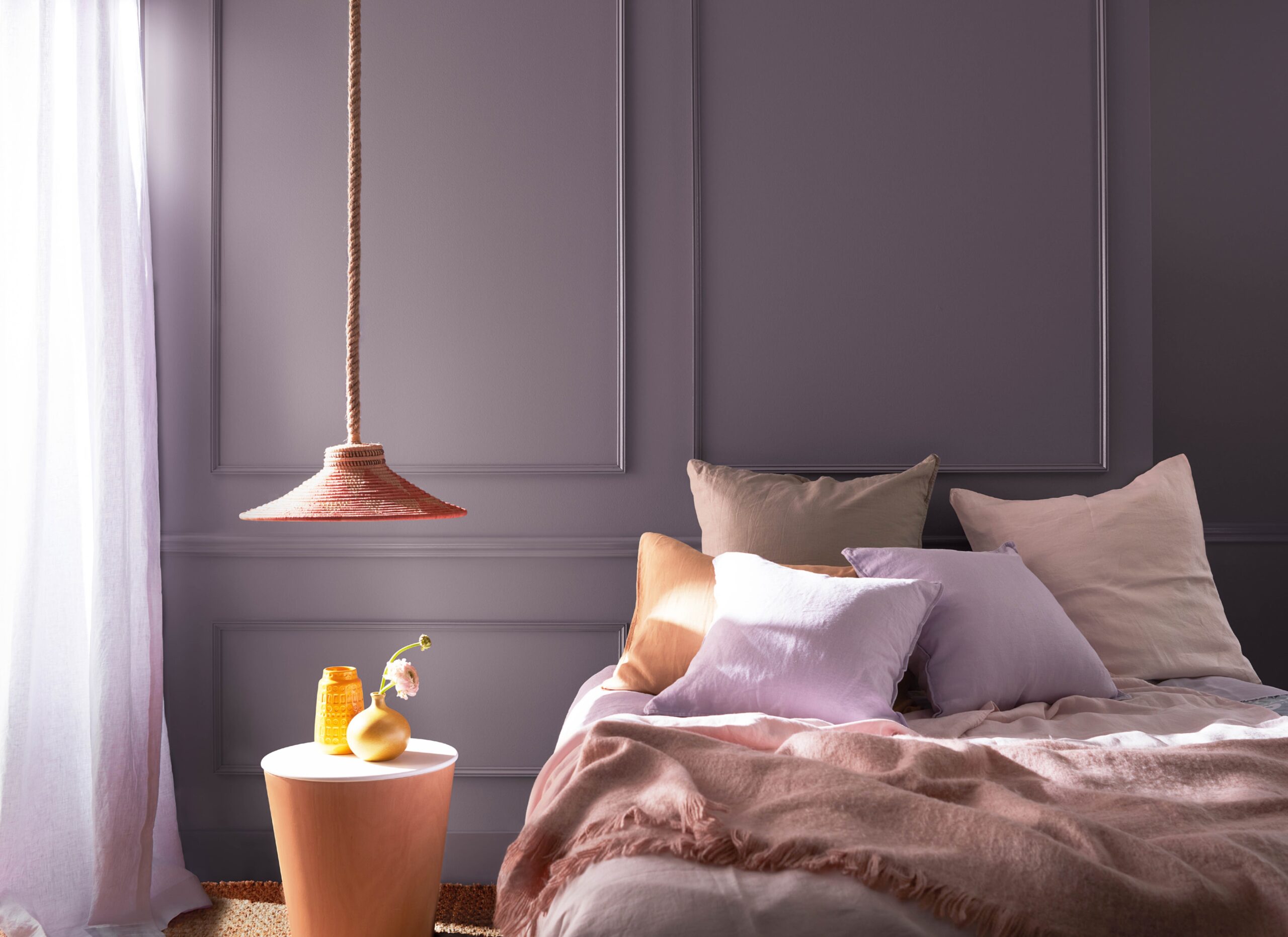
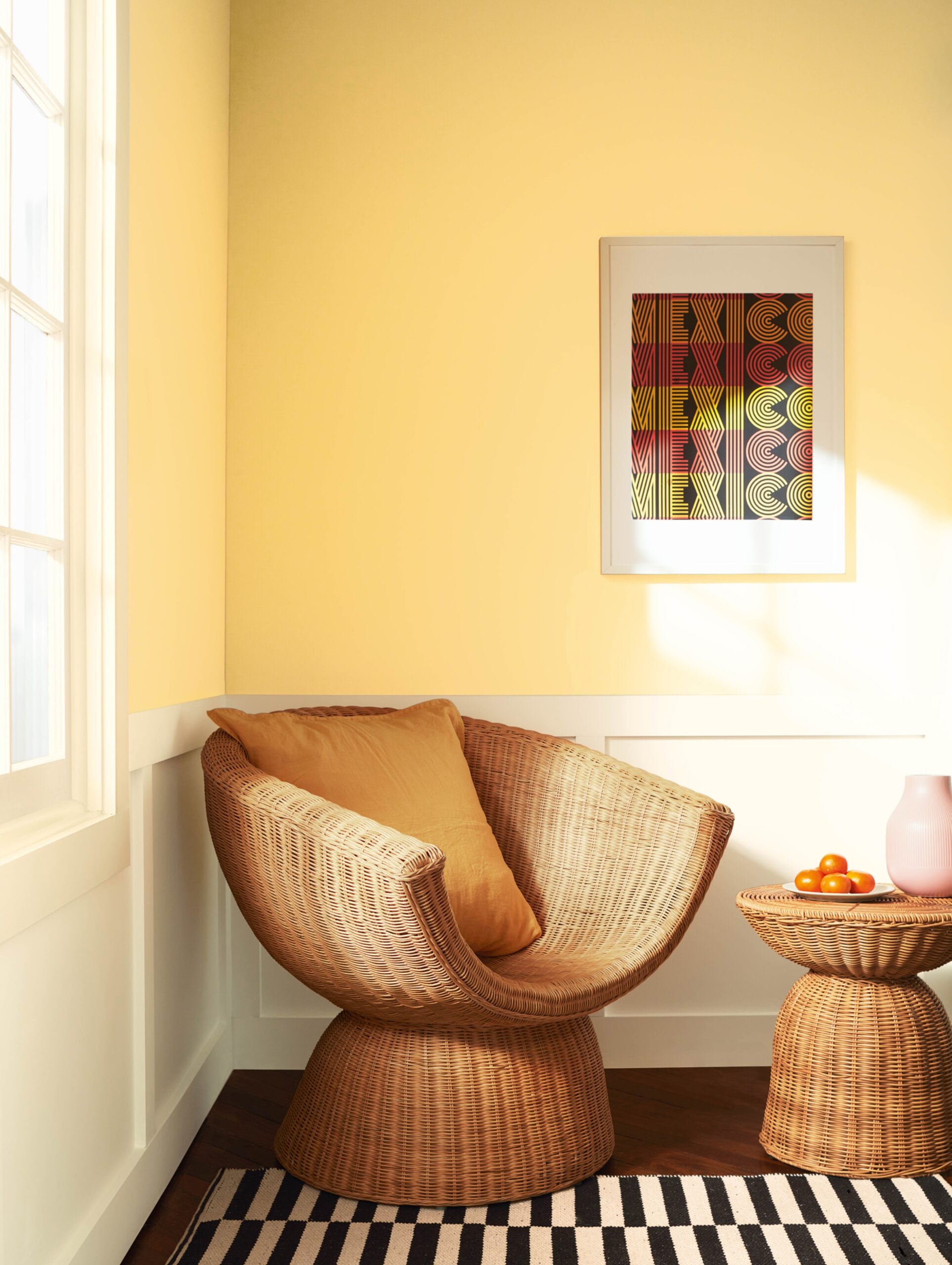
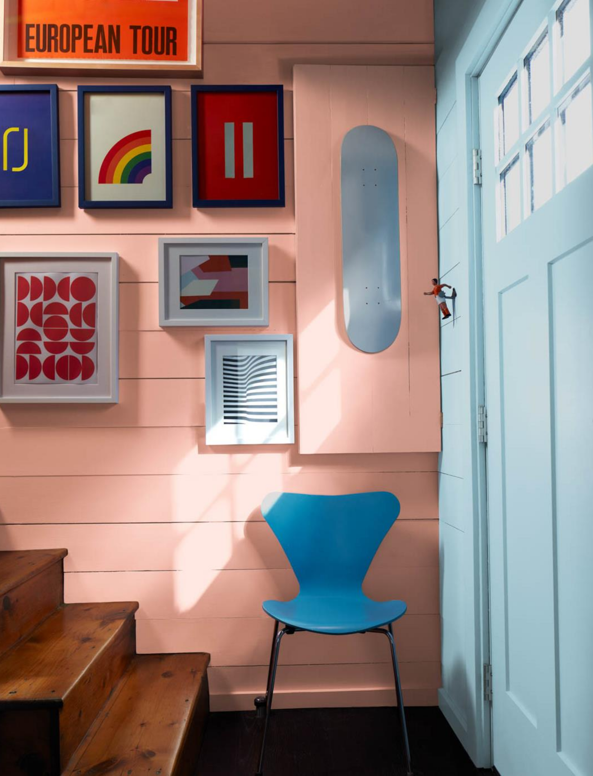
As we looked through the color research collected by each member of the color team, we found many examples of complementary or contrasting color relationships. Interesting combinations came through that related back to basic color relationships on the color wheel, but done in ways that played with saturation, value, and undertone, making them memorable. Beyond complementary color schemes, we also considered the play between warm and cool, light and dark – this sparked several great discussions on how this duality can deliver beautiful results in the home.
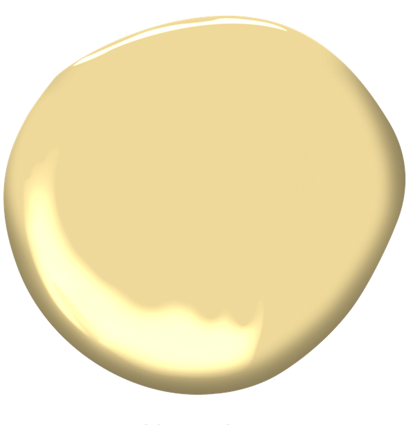
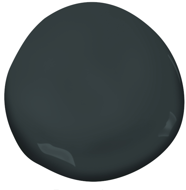
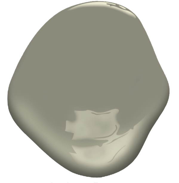
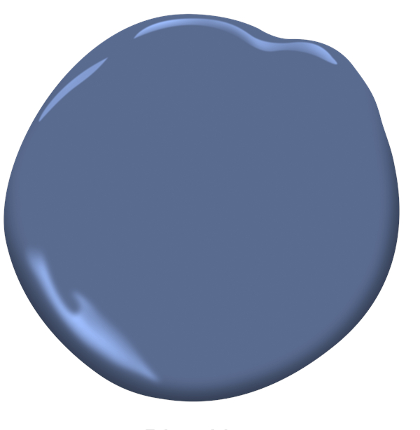
Next, let’s walk through the palette with examples of complements and contrasts used in interiors, paired with images from our travels that helped to inspire the 2024 palette.