COLOR TRENDS 2023

COLOR TRENDS 2023

COLOR TRENDS 2023

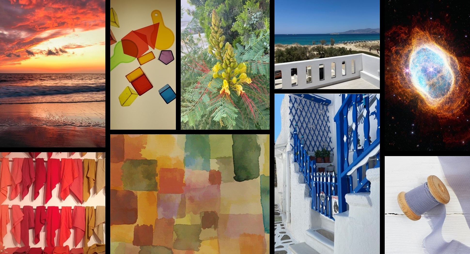
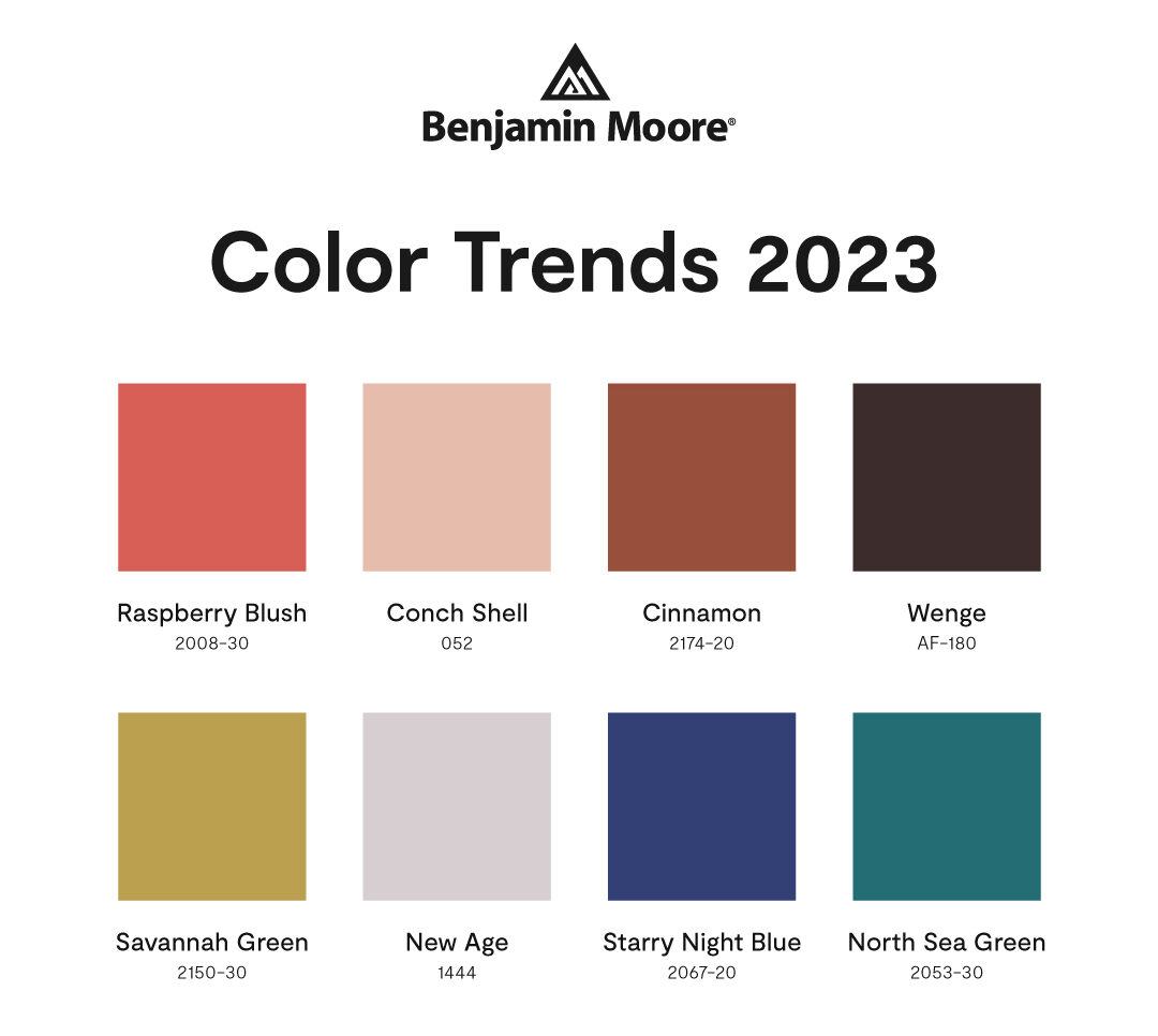
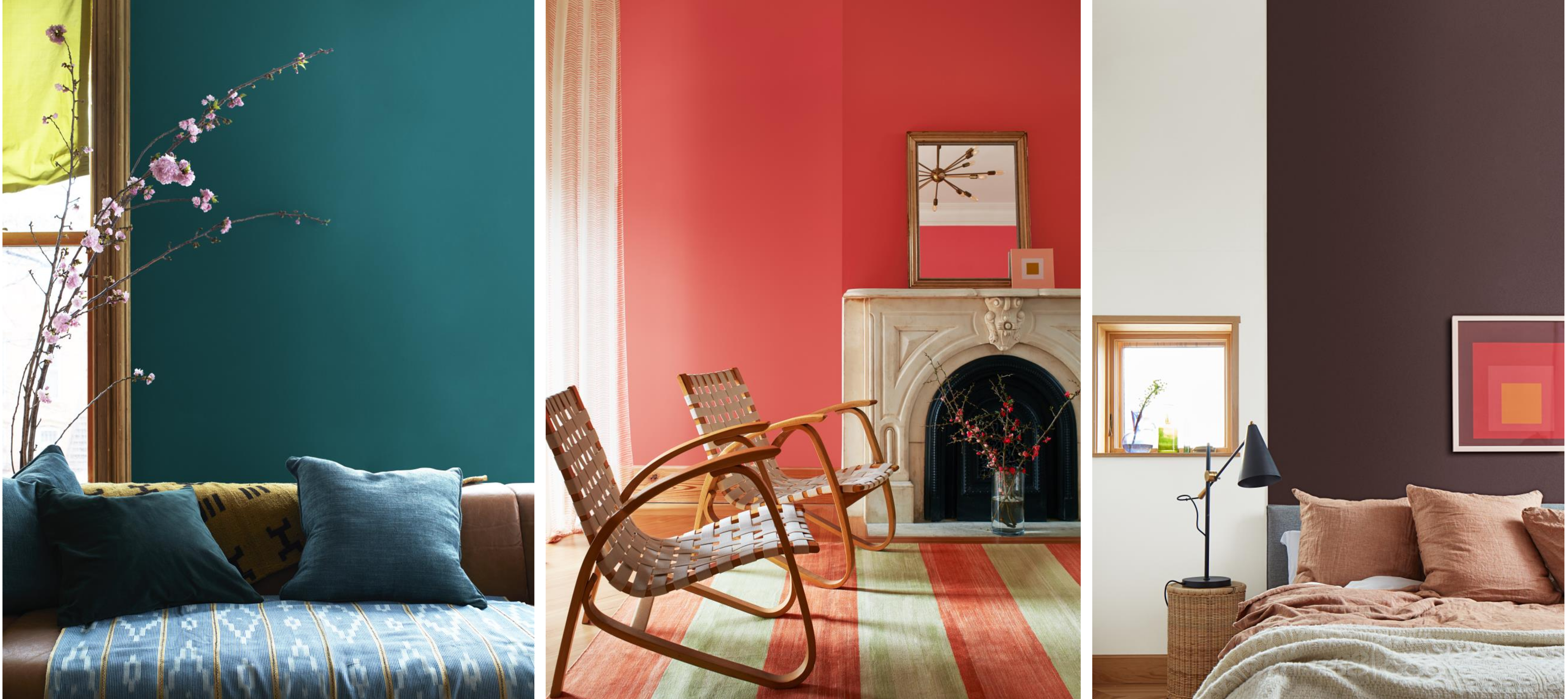
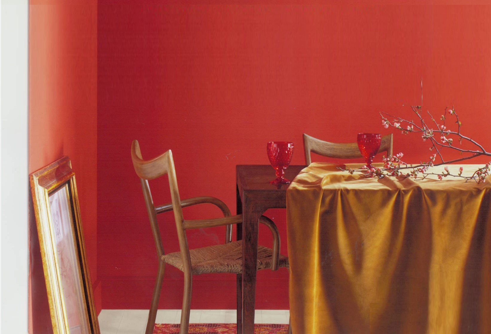
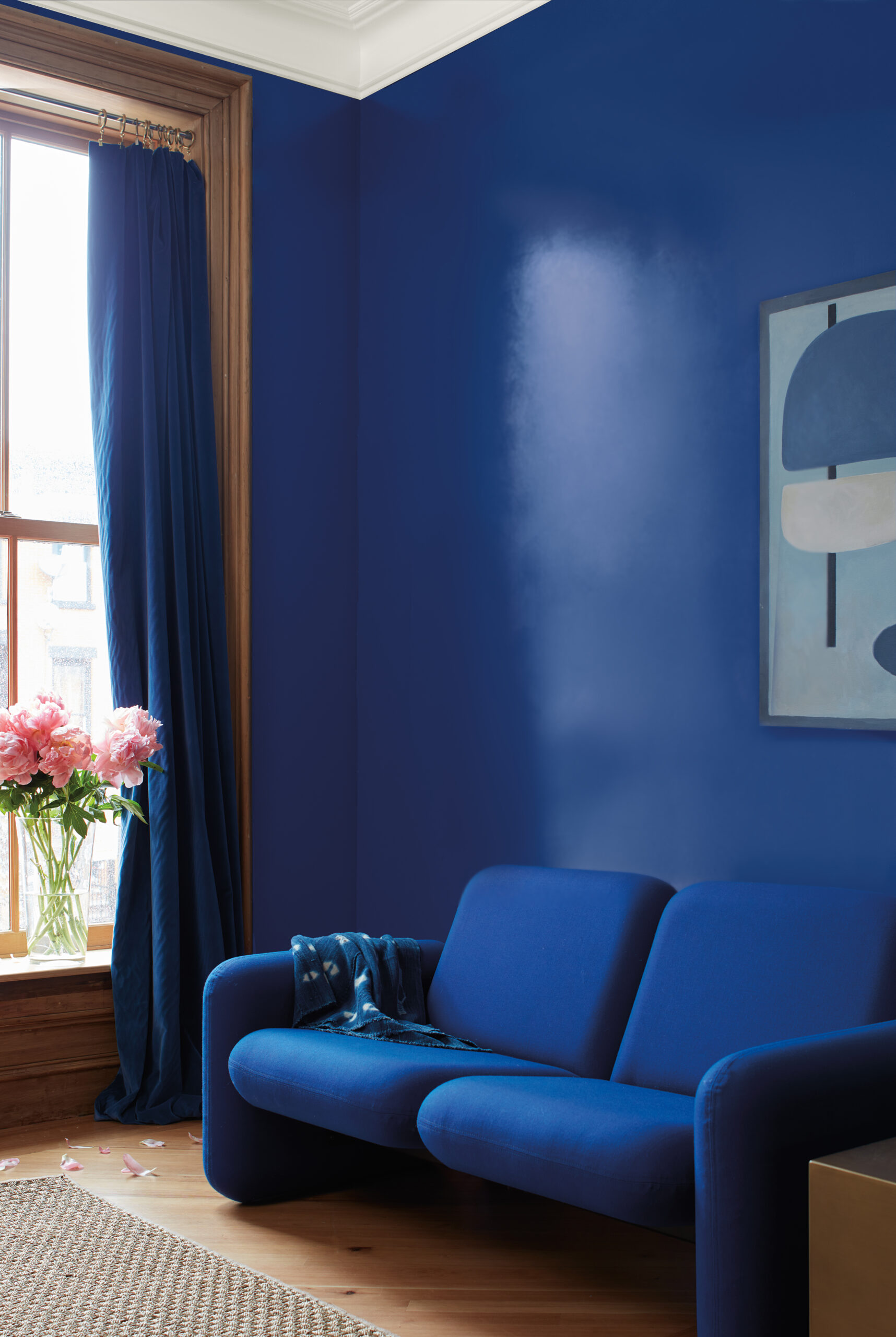
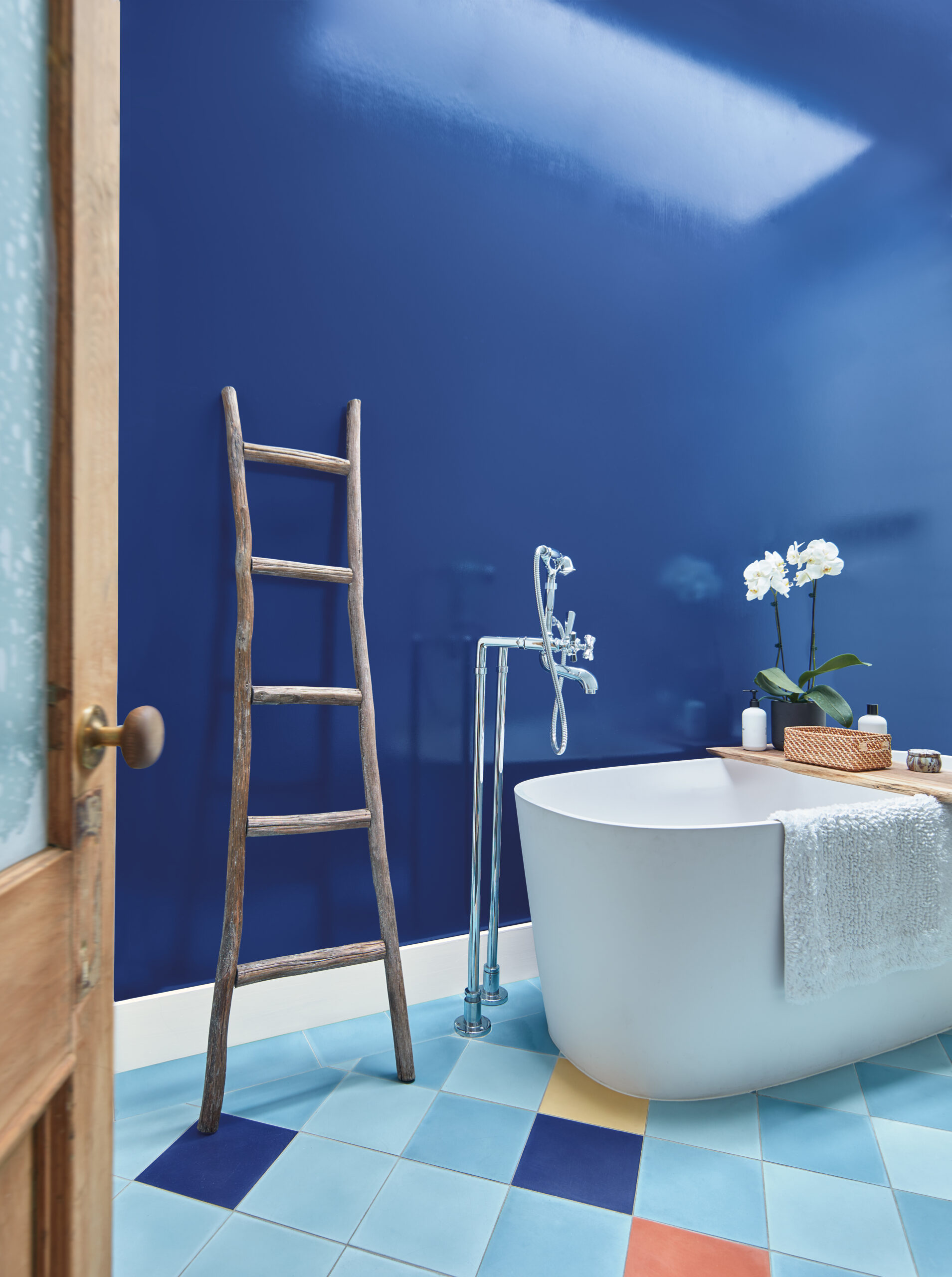
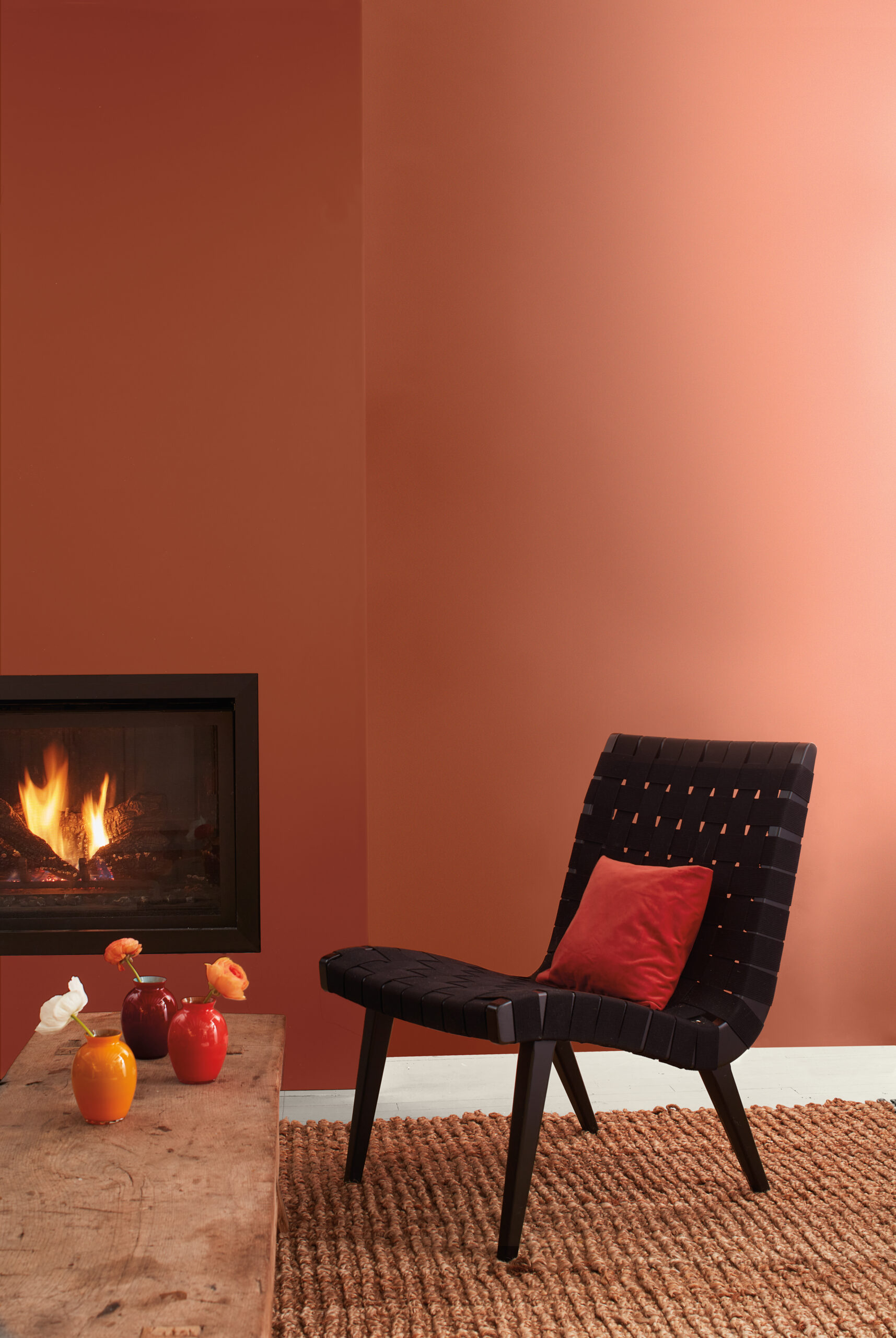
Coral, terracotta, reds and red-orange, inky blues, intriguing teals, and citrusy greens. These colors captured Benjamin Moore Color Hunters’ attention during theirs color pallet for the next season. This time they were drawn to the upbeat energy and vivid quality of these clean, saturated hues through examples of these colors being used in very successful and inspiring ways.

„An audacious EIGHT…”

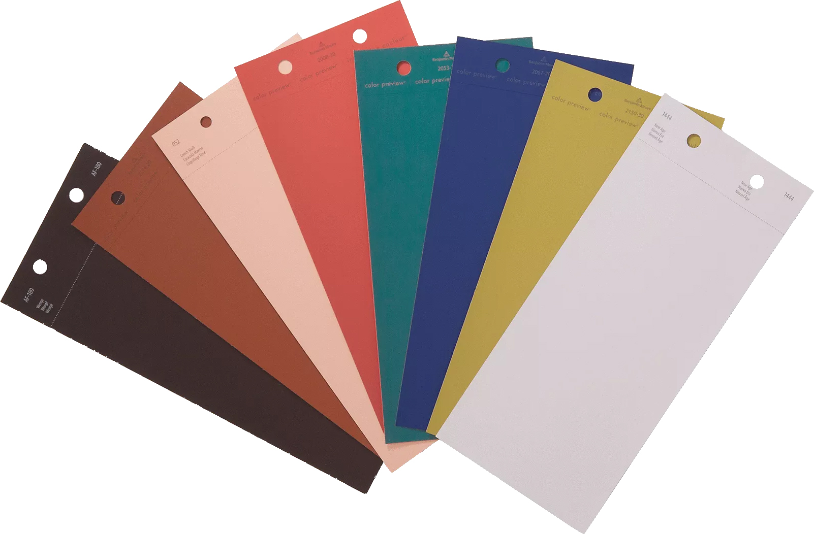
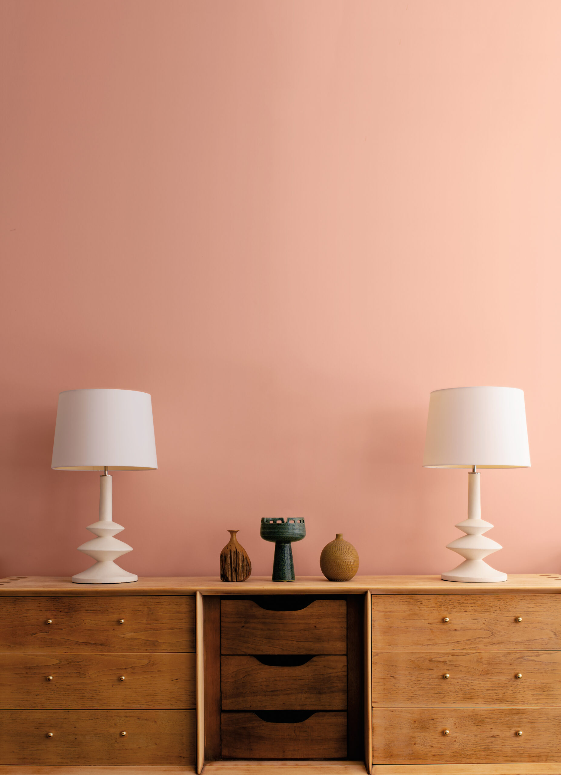
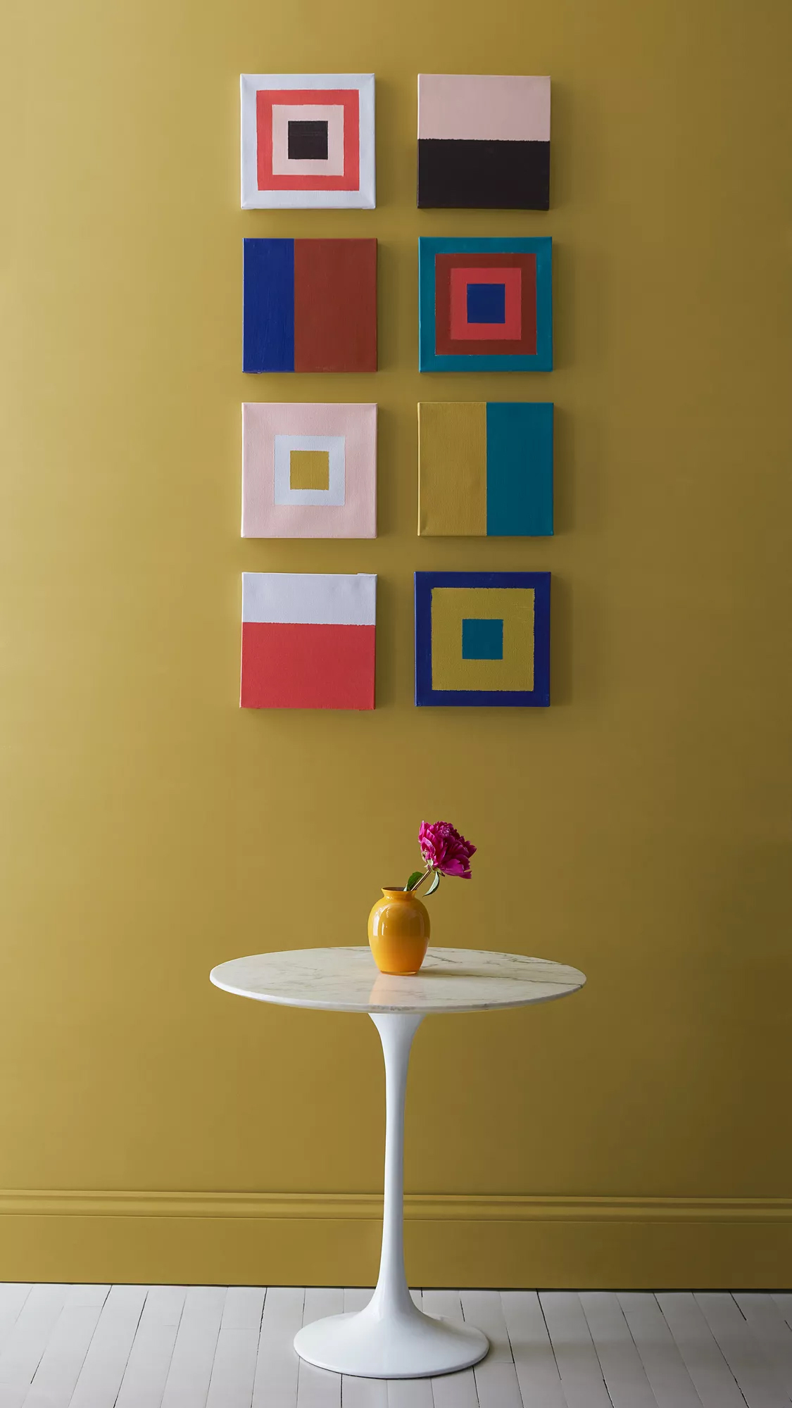
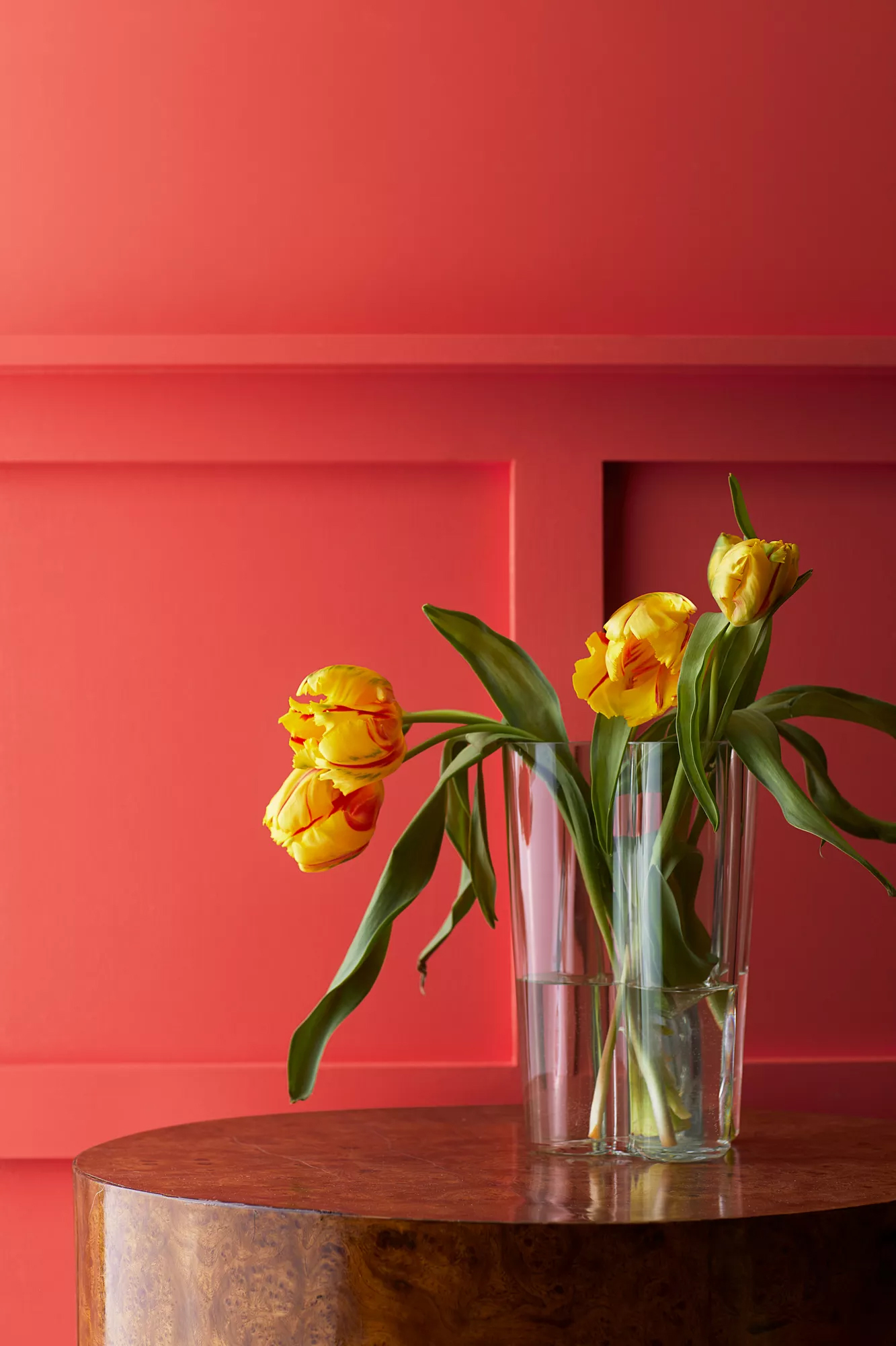
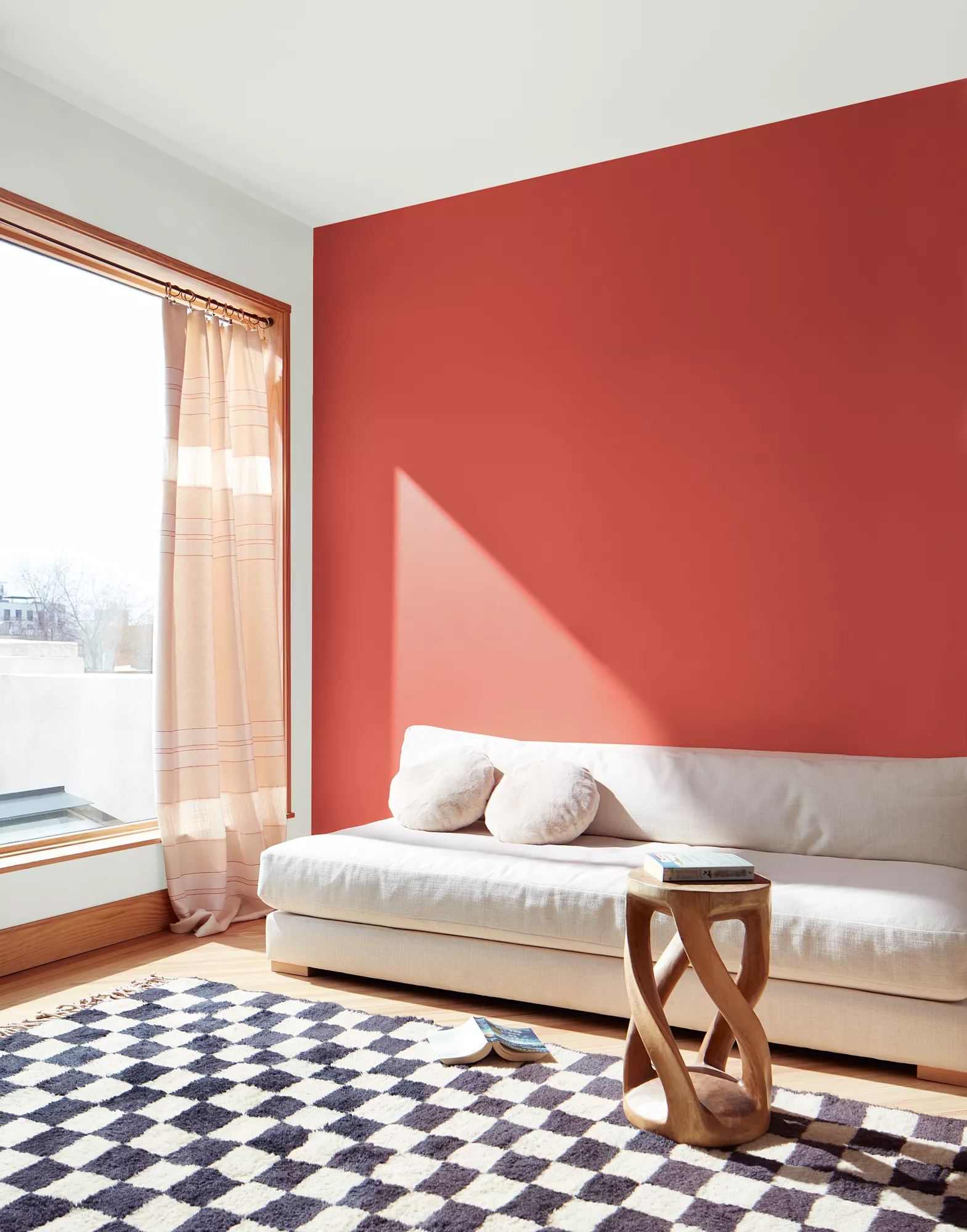
The images shown beside were collected through Color Team travels and various points of inspiration that grabbed Color Hunters’ attention as they researched color for 2023.
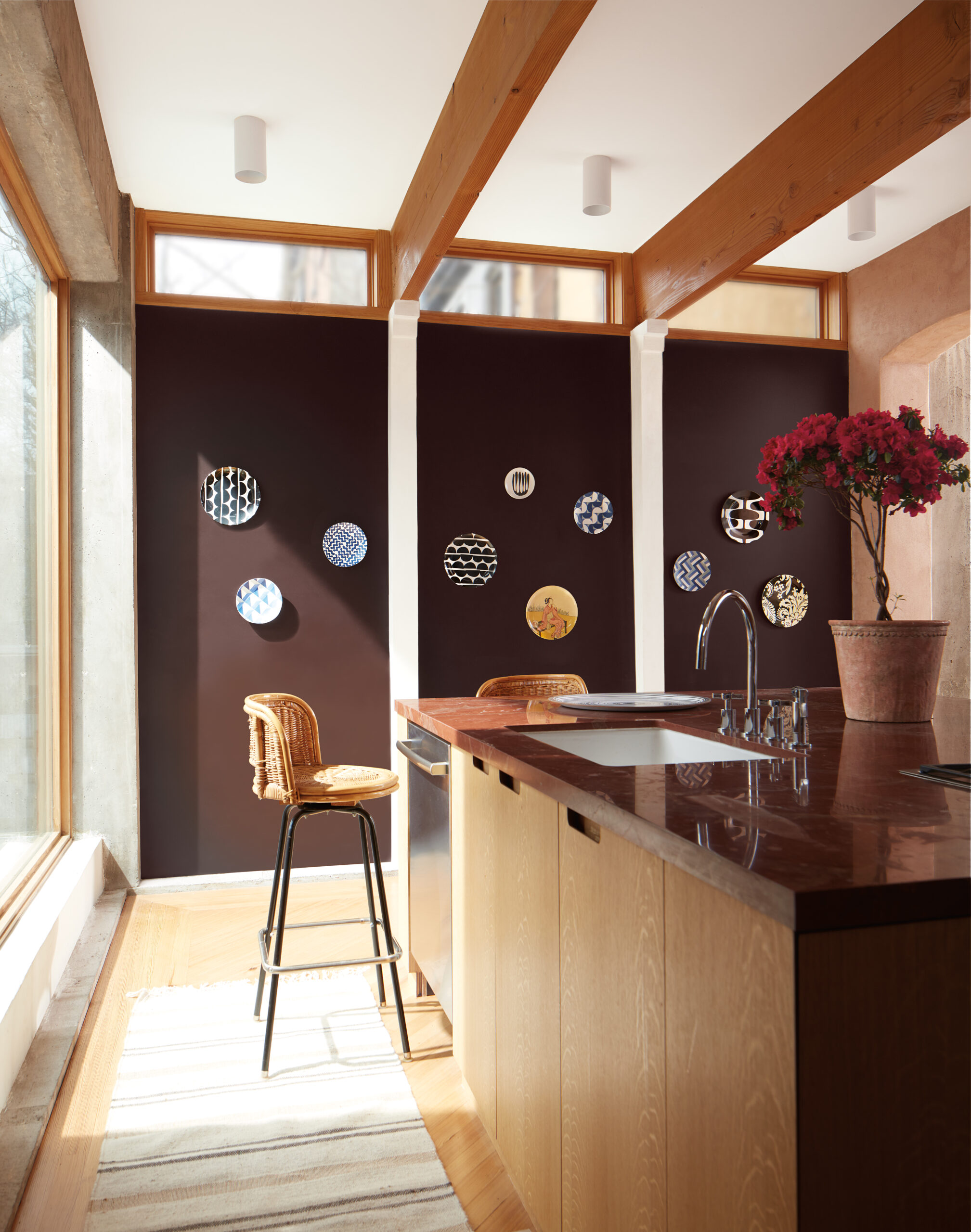
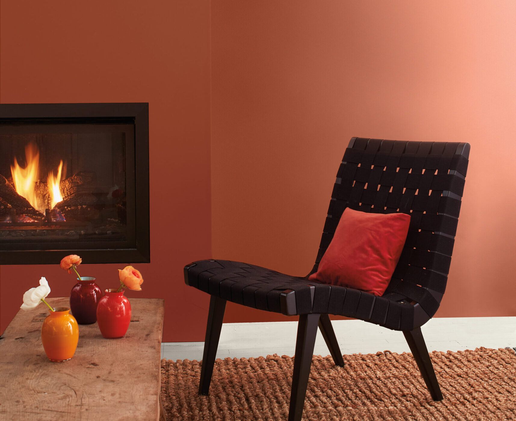
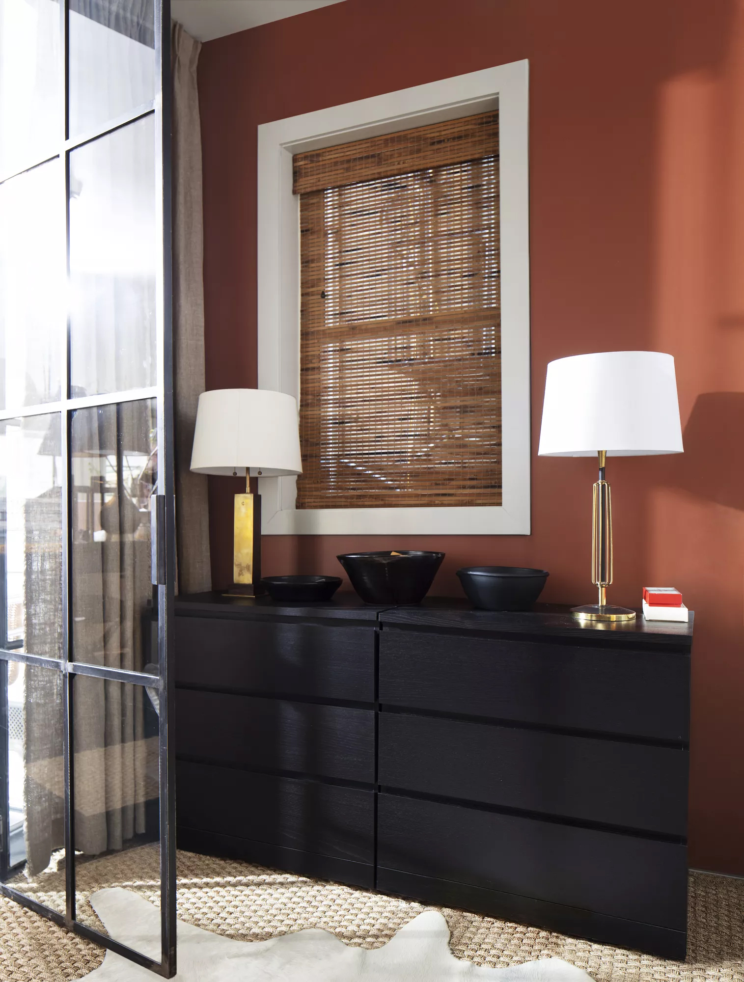
As they put the pieces together they found 2023 to be the right time to highlight bolder hues that  communicate the joy and exuberance that color delivers. For 2023, we are finally ready to bravely dive into color. We are taking inspiration from spaces drenched in color, pushing us beyond our comfort zones.

Andrea’s small helpers…

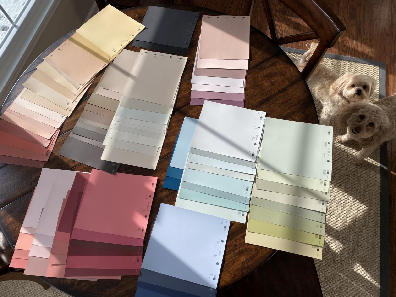
Back in the winter, at an early stage in choosing color trends, Andrea Magno, Color Marketing and Development Director, invited two dogs (Bode and Will)to the project while working with her Color Team online. Of course, on the "in-game" table, you can still see many color possibilities. Over time, the strict selection narrowed the range of colors sharply.
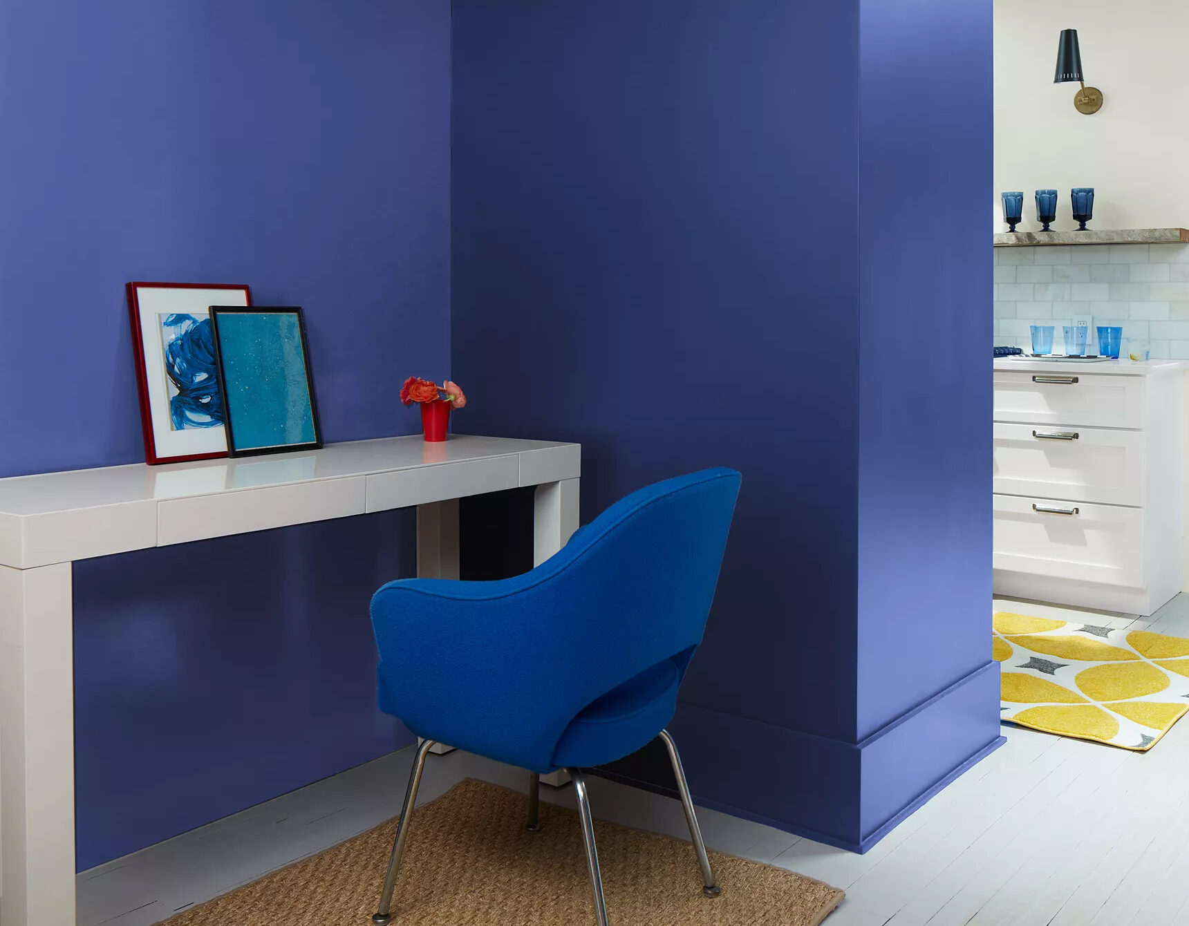
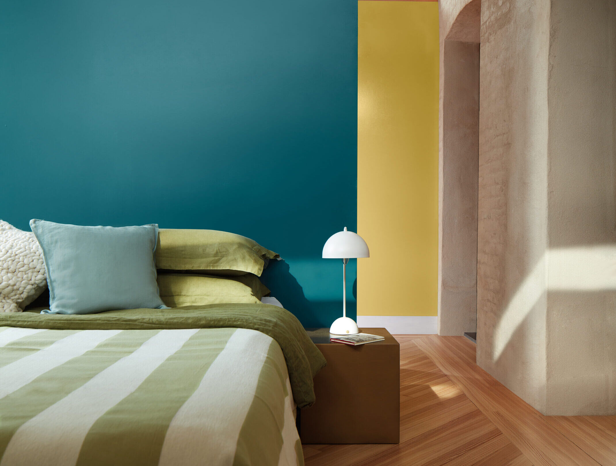
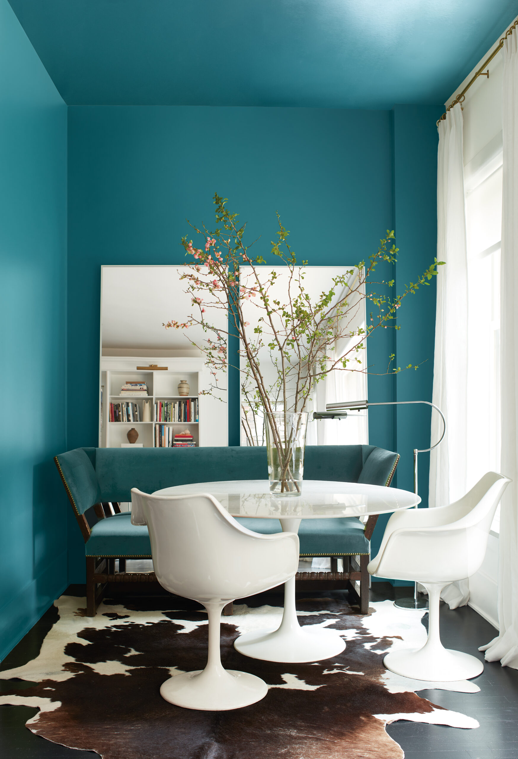
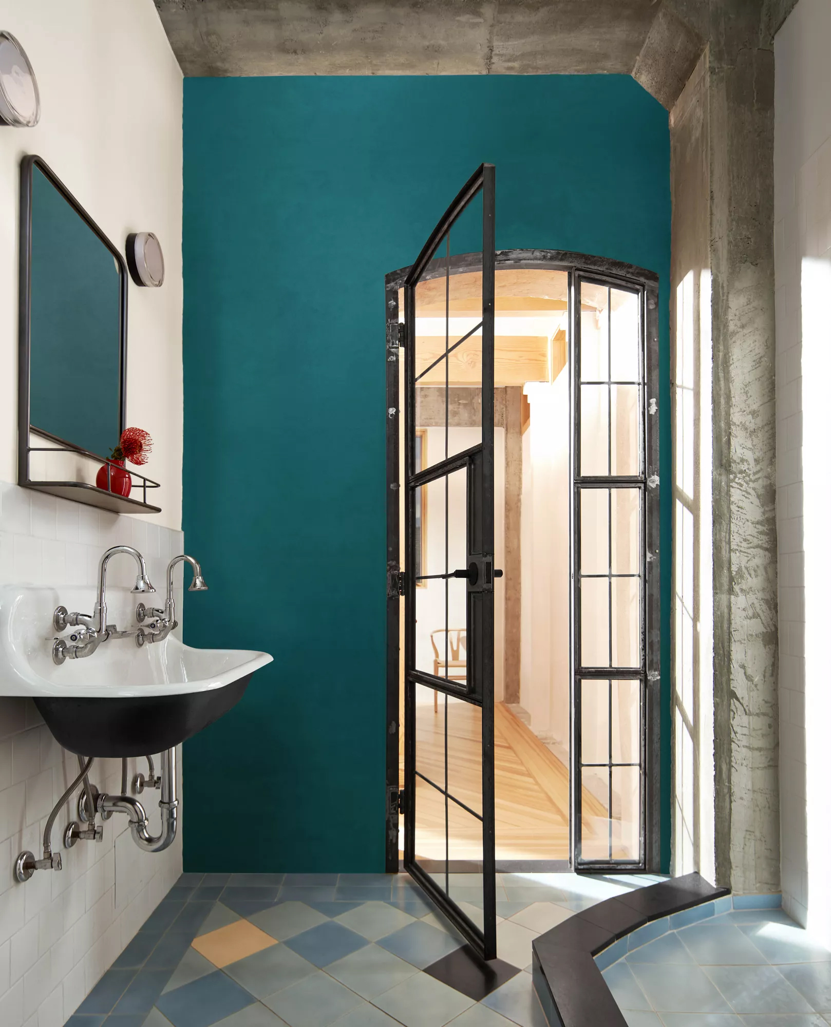
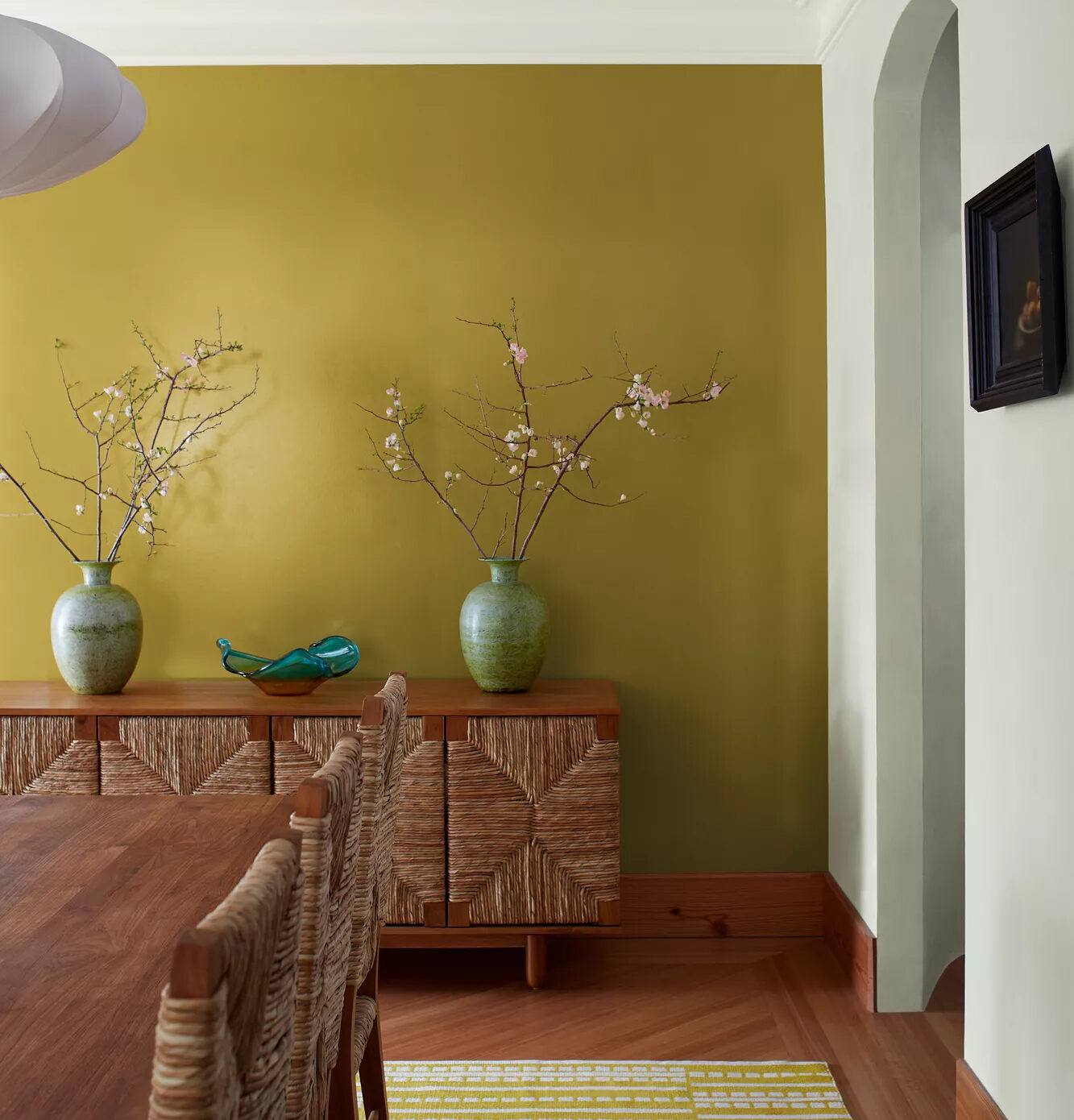
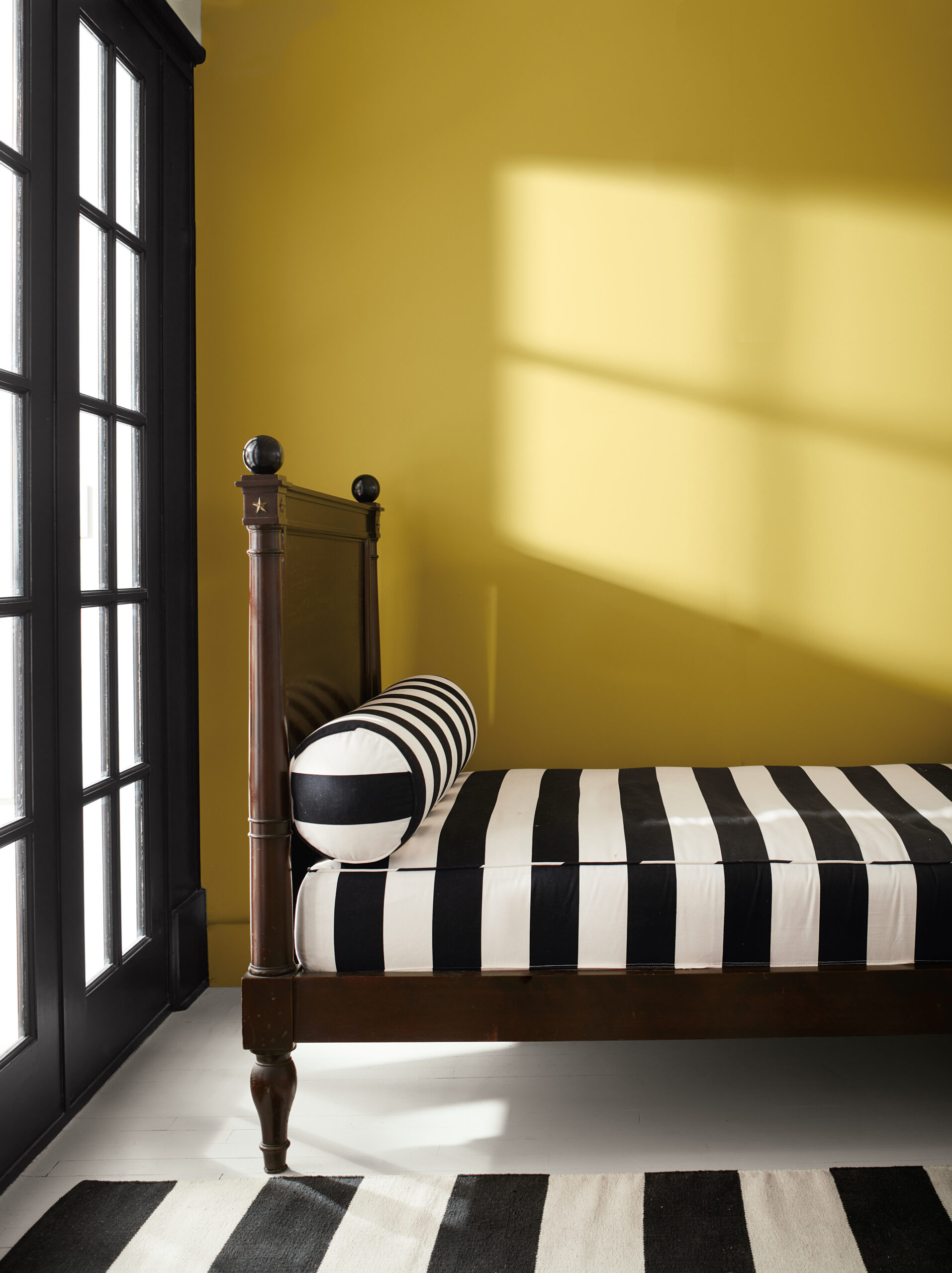
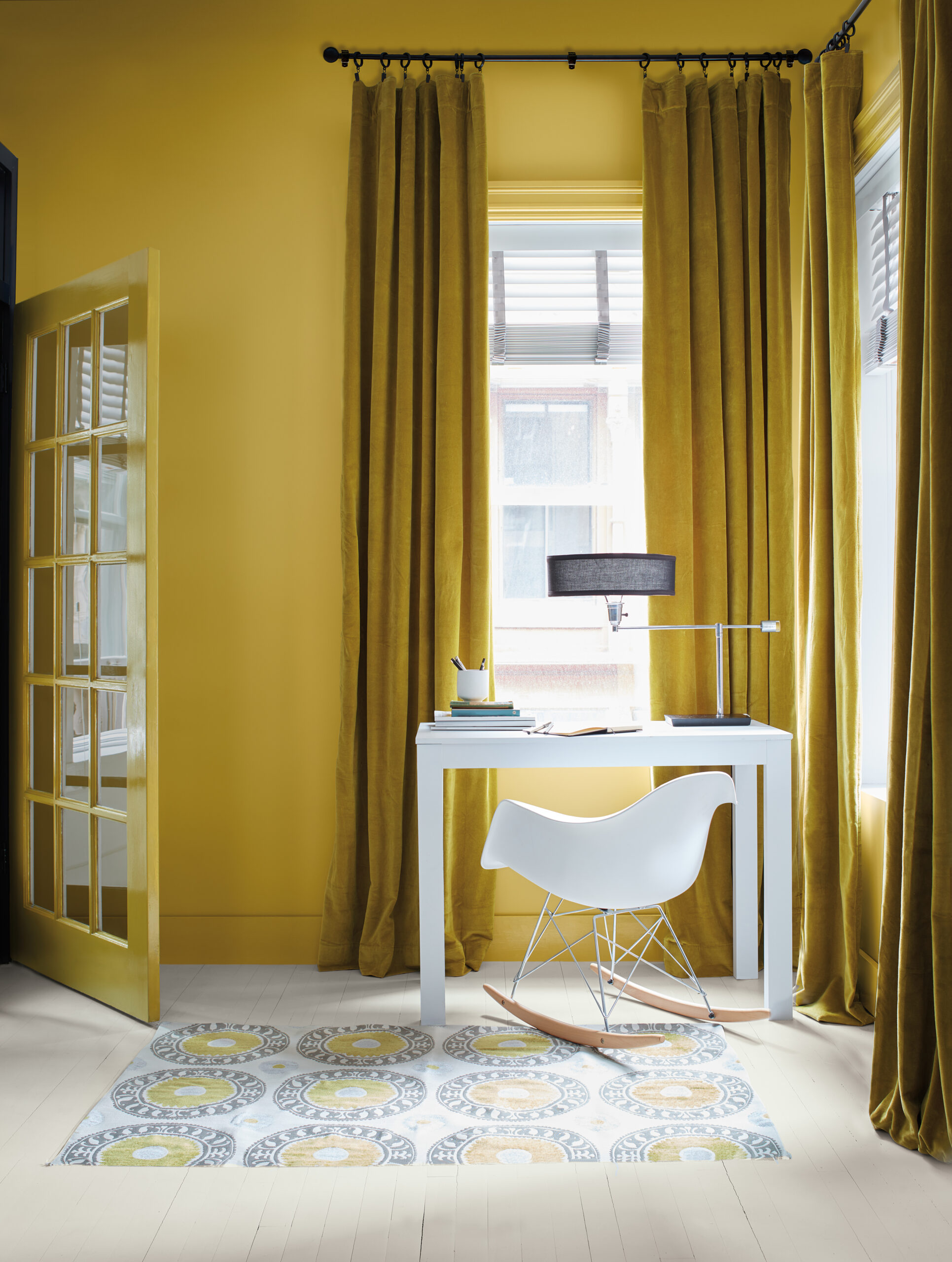
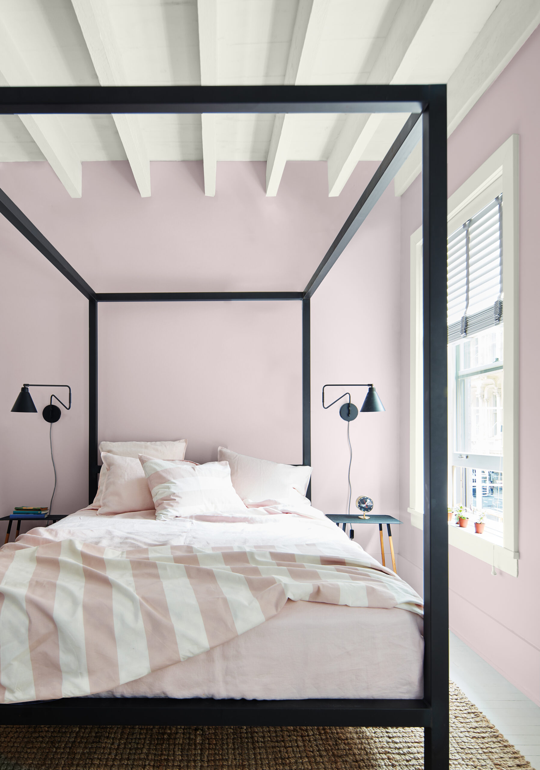
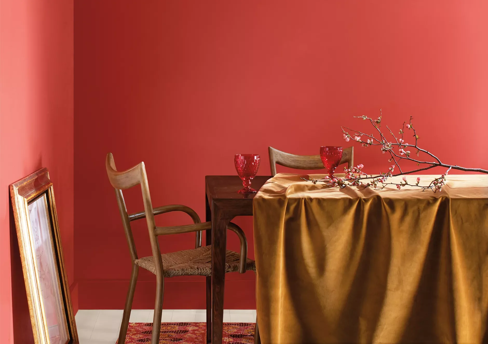
The Color Trends 2023 palette has a distinct presence and personality, with stand-alone colors that each make a brave color statement that is sure to stand out.
Each of these confident hues offer inspiration and creativity, while encouraging a push beyond the traditional to experience truly exceptional color. These sumptuous colors were inspired by the bold strokes of modern art, the myriad of bold colors in nature, and the desire to express ourselves through color.
For 2023, we are looking ahead to bring vitality and individuality to your space while embracing the transformative power of paint.
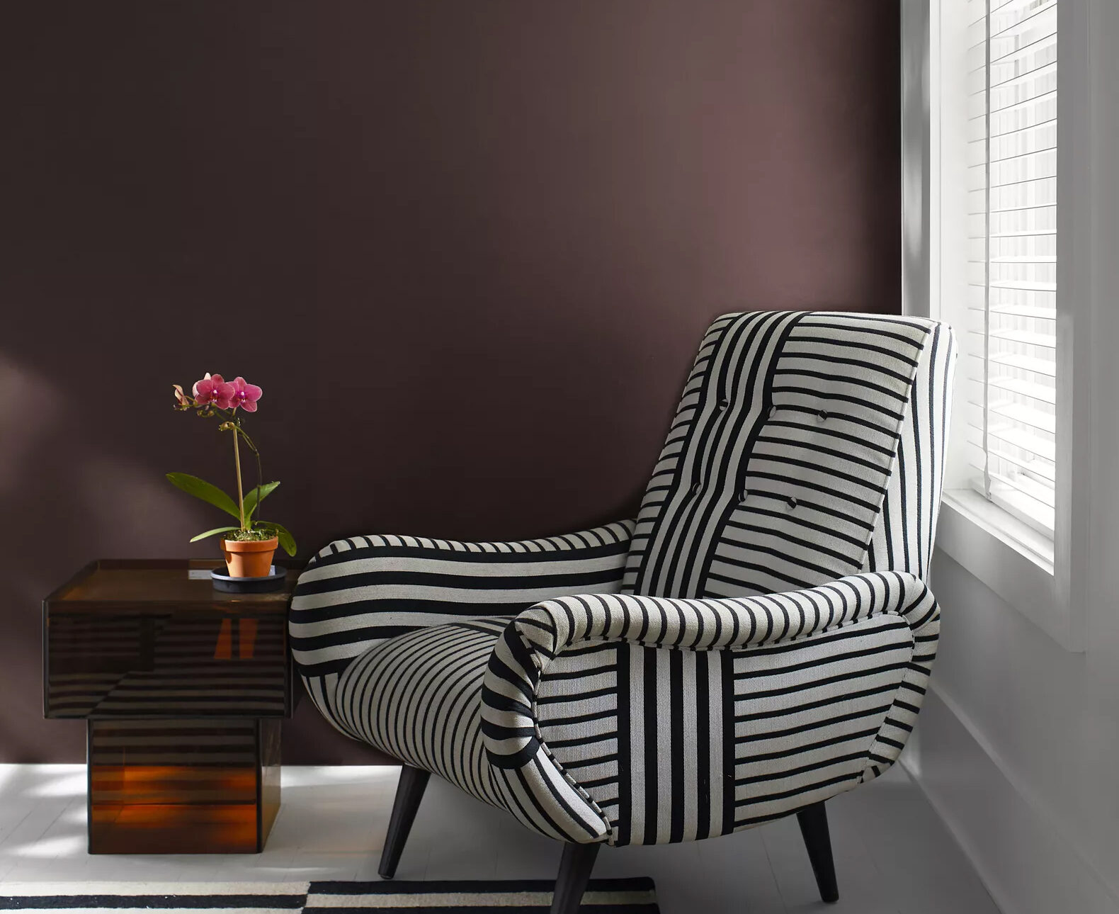
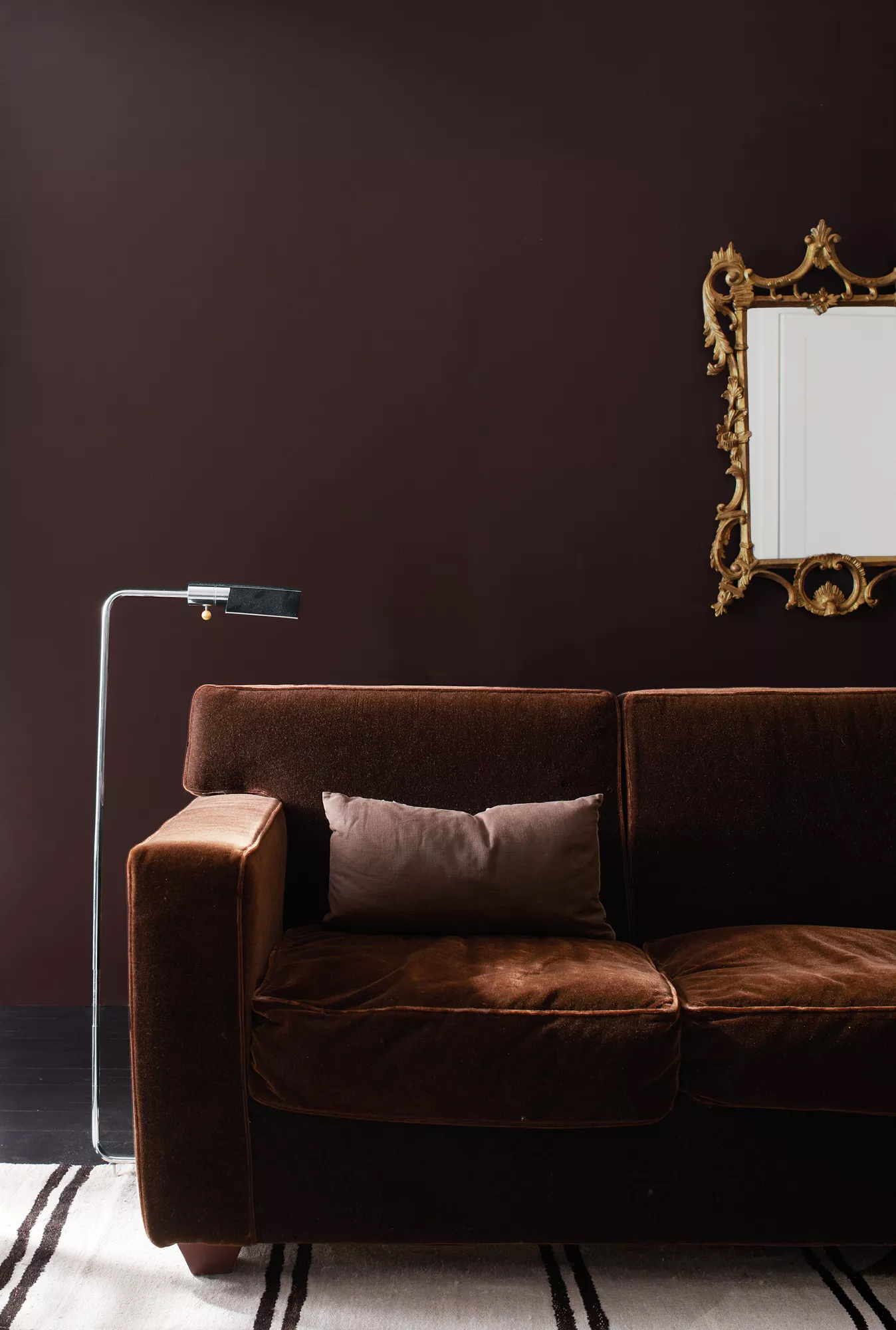
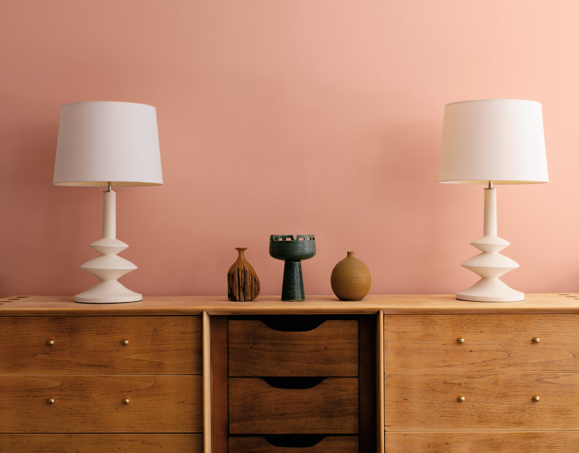
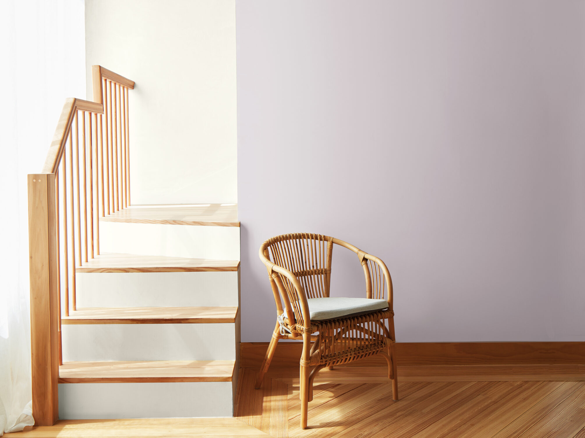
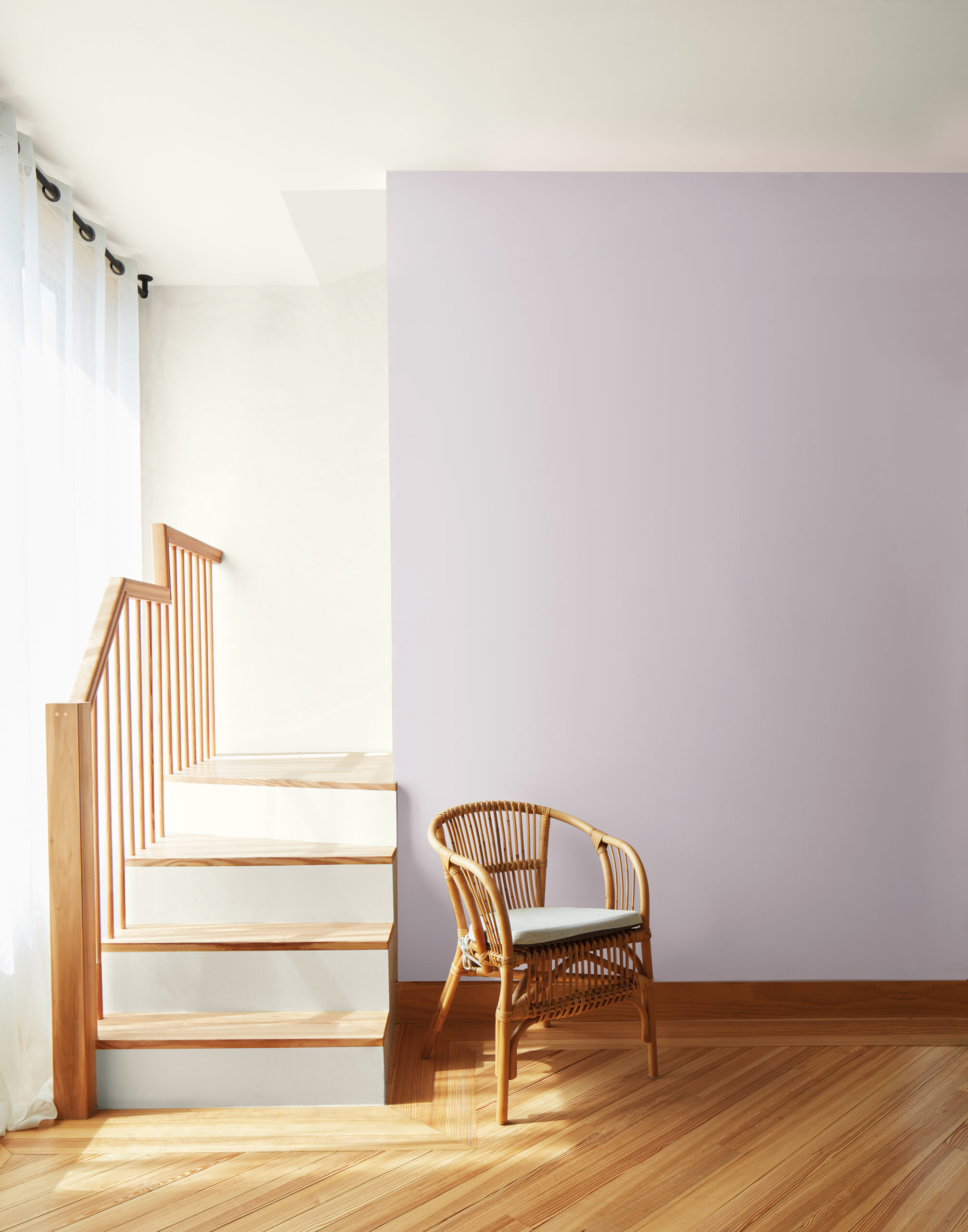
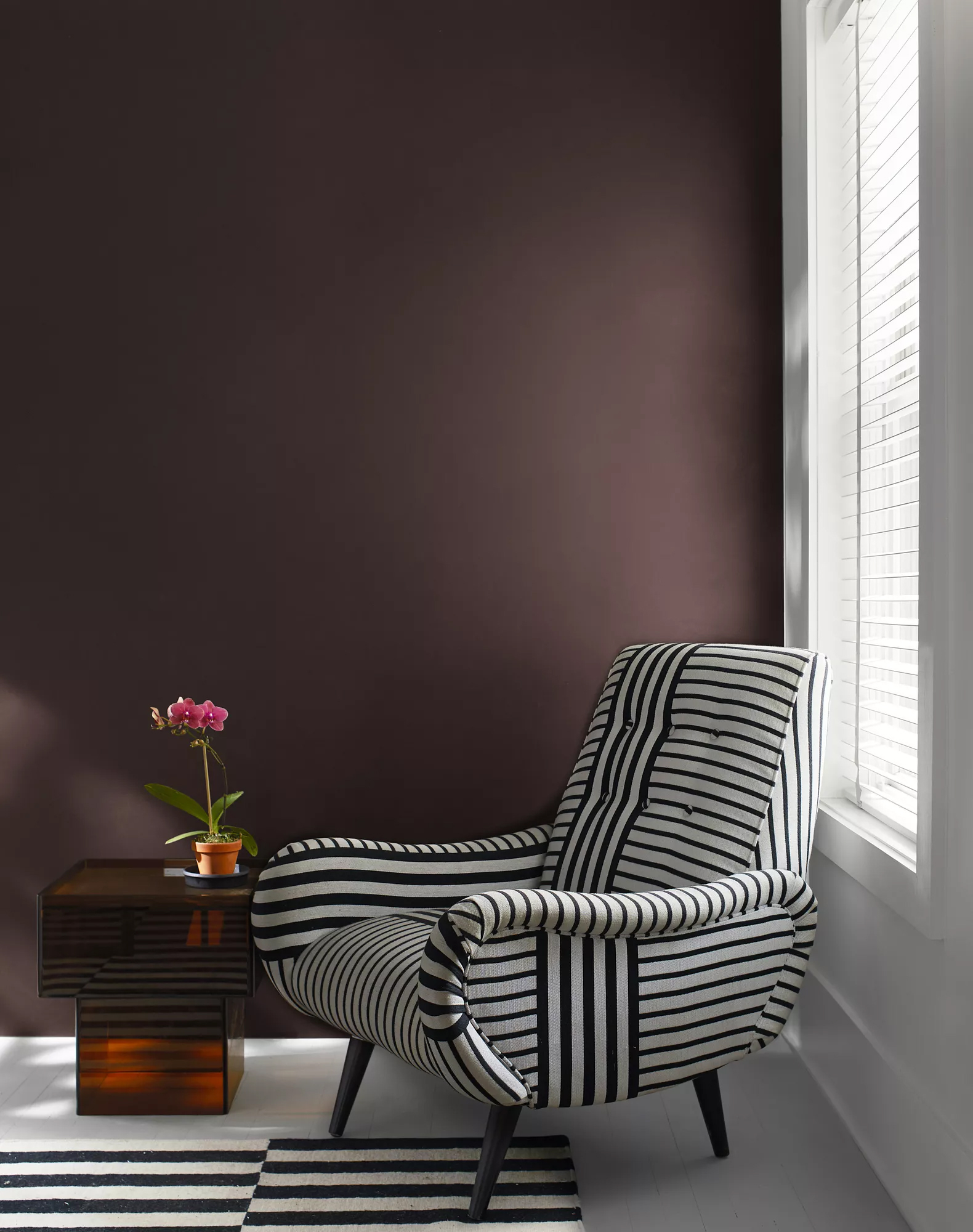
To further guide our customers in taking the step to use bolder colors, we’ve included a selection of four neutrals to provide guidance on how to pair these colors: black “Onyx 2133-10”, “White Heron OC-57”, “Gray Owl OC-52” from „Off-whites” collection and warm gray “Etiquette AF-50” from Affinity palette.
While the 8 colors of the Color Trends palette serve as the main event, our well-loved neutrals help to being these expressive colors to life.

Mysterious and dignified WENGE…

Starting our journey through the colors of the palette 2023, let’s begin with Wenge. Wenge is a deep chocolate color with hints of brown, black and violet in its undertone.
A step away from a black paint color, Wenge is a sultry alternative that has become important in our trend research. By using a slightly softer alternative to black, we combine comfort and drama with a color that works well in a space of any style.
We love this enigmatic hue when paired with lighter colors to create a pleasing balance, but we also love a space drenched in this color, blurring corners of a room for a truly enveloping color experience.
We used this color is a kitchen paired with warm woods and contrasting white beams for a welcoming feel. This color also was used in a small study in order to achieve a modern, monochromatic look between the rich wall color and the plush velvet sofa, paired with metallic accents.

A pinch of „cinnamon”

Another color from COLOR TRENDS 2023 that can serve as an excellent bridge between neutrals and more saturated shades, „Cinnamon 2174-20” is sure to bring some spice to a room.
This color is a rich and rusted brown touched by orange undertones, this warm hue is a great alternative for a bolder neutral that stands as a strong focal point.
The inspiration for including „Cinnamon” in this range came from observing work by artists that focus on various metals and the natural color changes that bring about beautiful hues in this range.
Color Hunters aimed for a pleasing balance between brown, orange and terracotta to land on a color with a gracious yet fresh feel.
In addition, „Cinnamon 2174-20” has a distinct personality, yet it pairs well with artwork, various materials and furnishings that range from traditional to modern.

Subtle pink

Moving to a lighter color in the palette, „Conch Shell 052”, is a gentle pink reminiscent of a sepia tone. May bring a blush to your space, but this hue is not shy.
This comforting shade balances out the bold vibes of this palette, appearing almost neutral alongside such striking hues. It is a slight step away from pink, with a slightly peachy hue that was observed in various furnishings and fabrics.
Using Conch Shell in a living room brings a refreshing quality and a flattering glow, making this a room you’ll want to spend time in. Likewise, the undertones of this color complement the warmth of leather and a range of wood tones.

Chilling the atmosphere…

Taking a step over to the cooler side of the color wheel, „Starry Night Blue 2067-20” is a radiant navy akin to the deep indigo of dusk. A touch of violet in its undertone adds to the sophisticated quality of this color.
When determining the right color for the palette, “Starry Night Blue” rose to the top with ease in that this inky hue provides both depth and dimension for a captivating result.
We love it used for a dramatic allover look, playing off a monochromatic color scheme.
There is also a playful side to this color, particularly in a higher sheen or when used on cabinetry as a fresh alternative to navy.

Chilling the atmosphere…

A teal that echoes the depths of the ocean, „North Sea Green 2053-30” is an engaging color that offers a playful twist on a traditional hunter green and was noted in rugs and upholstered items throughout Color Hunters’ research.
When paired with a crisp white trim or slick white furnishings North Sea Green is self-assured and brings an approachable personality to a room, as seen here in this dining area.
Take inspiration from a jewel box for an allover look with this teal hue, or create a story of contrasts by playing up the acidic nature of Savannah Green, balanced by the weight of North Sea Green, the next color included in COLOR TRENDS 2023, as illustrated in this bedroom.

Unusual shade…

A rich ochre with strong notes of yellow and green combine to create „Savannah Green 2150-30”, a truly unique hue.
Like gold leaf for your walls, “Savannah Green” is a statement-making shade that plays well with neutrals and other saturated hues. A point of inspiration for this color was the intriguing color of aged or burnished gold, with a slight green undertone and a defined golden cast. This was especially notable in Milan where velvets and metals used for light fixtures had this interesting blend of yellow and green.
This is an eye-catching color that is balances well with colors along the grayscale from crisp white to deep black for a distinct, high contrast effect, as seen in this room with a black and white rug on a floor painted in „Gray Owl OC-52”.
Take the look a step further with a monochromatic look featuring trim and doors also painted in Savannah Green, with window treatments in a similar hue, strengthening the strong color statement.

Strong name, soft color

A pale violet grounded by a drop of gray, „New Age 1444” is a perfect addition to the palette for its soft and ethereal quality.
New Age emanates a spiritual sensibility, leaning into the softer side of the Color Trends 2023 palette. Appearing both gray and lavender depending on the lighting, infuse a touch of color into any space with this engaging hue.
Ideal for bedrooms and connector spaces where a step away from neutral is desired, New Age invites us to take a second look as it shifts in different lighting conditions, while enhancing a gorgeous color experience.

COLOR to the STAGE!

For 2023 we extend an invitation to indulge in bold color with confidence. Color serves as an ideal means to express a mood or statement, whether a color is used in a big or small way.
By creating an envelope of color, a room takes on an immediate mood and energy – and we encourage making this a personal statement that resonates with those who use the space.
In addition, bringing color to life with the right products is crucial. Color and product work in concert to create memorable and impactful rooms that truly sing.
The Color Trends 2023 palette pushes boundaries and brings new ideas to the forefront with charismatic color. The time has come for color to move into the spotlight, ready to take center stage.

COLOR OF THE YEAR 2023

When we are talking about COLOR TRENDS we have to mention about the hero of the next season – Color of the Year 2023„Raspberry Blush 2008-30”.
The definition of charismatic color, a vivacious shade of coral tinged with pink, enlivens the senses with an eclectic optimism.
This is the kind of color that fills the room with exuberance and delight.

GALLERY

GDPR & PRIVACY POLICY
Cookies
Terms & Conditions
linkedin facebook pinterest youtube rss twitter instagram facebook-blank rss-blank linkedin-blank pinterest youtube twitter instagram