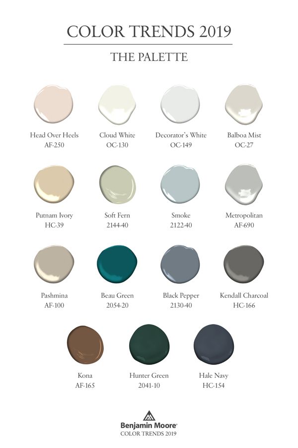
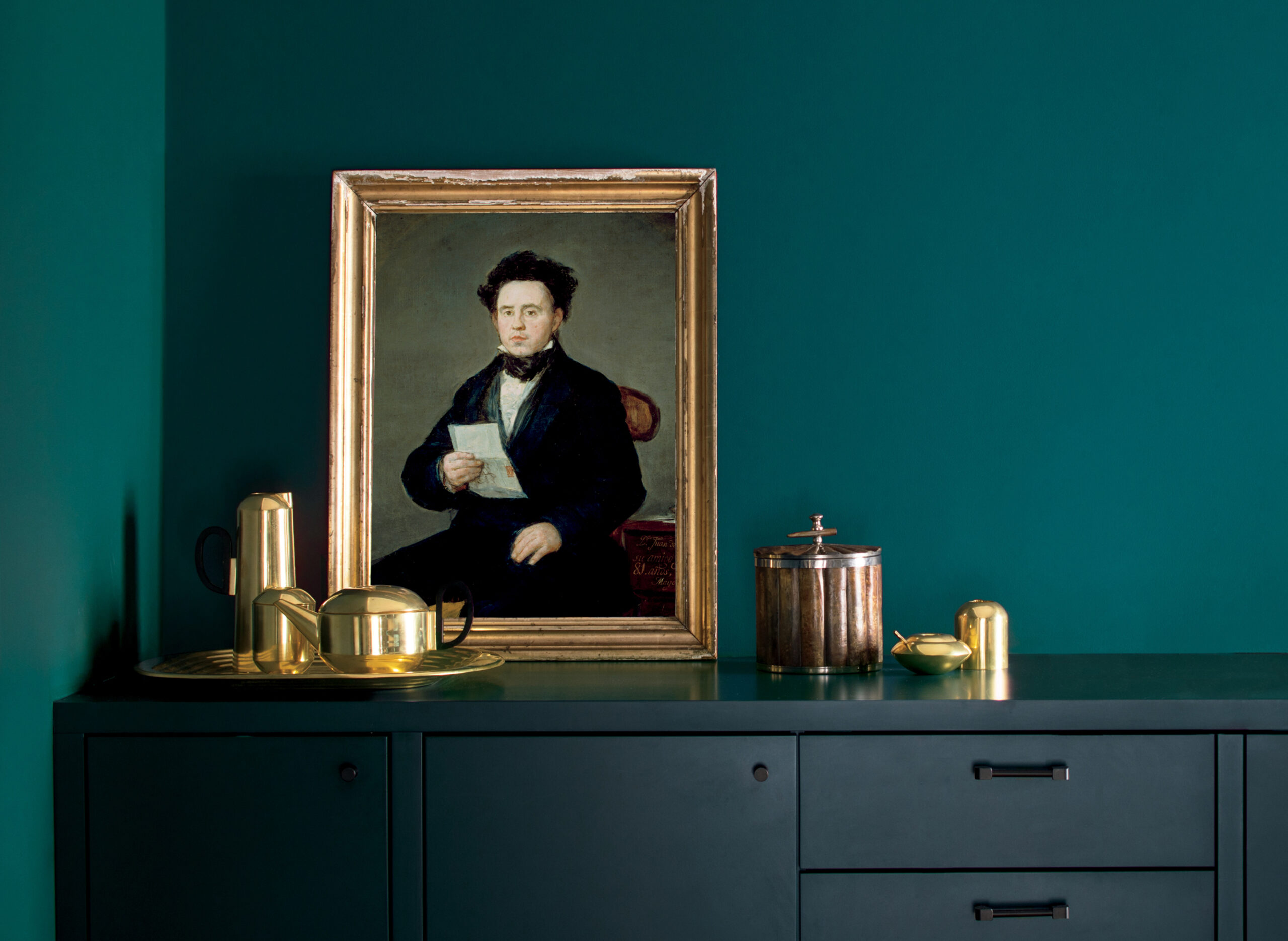
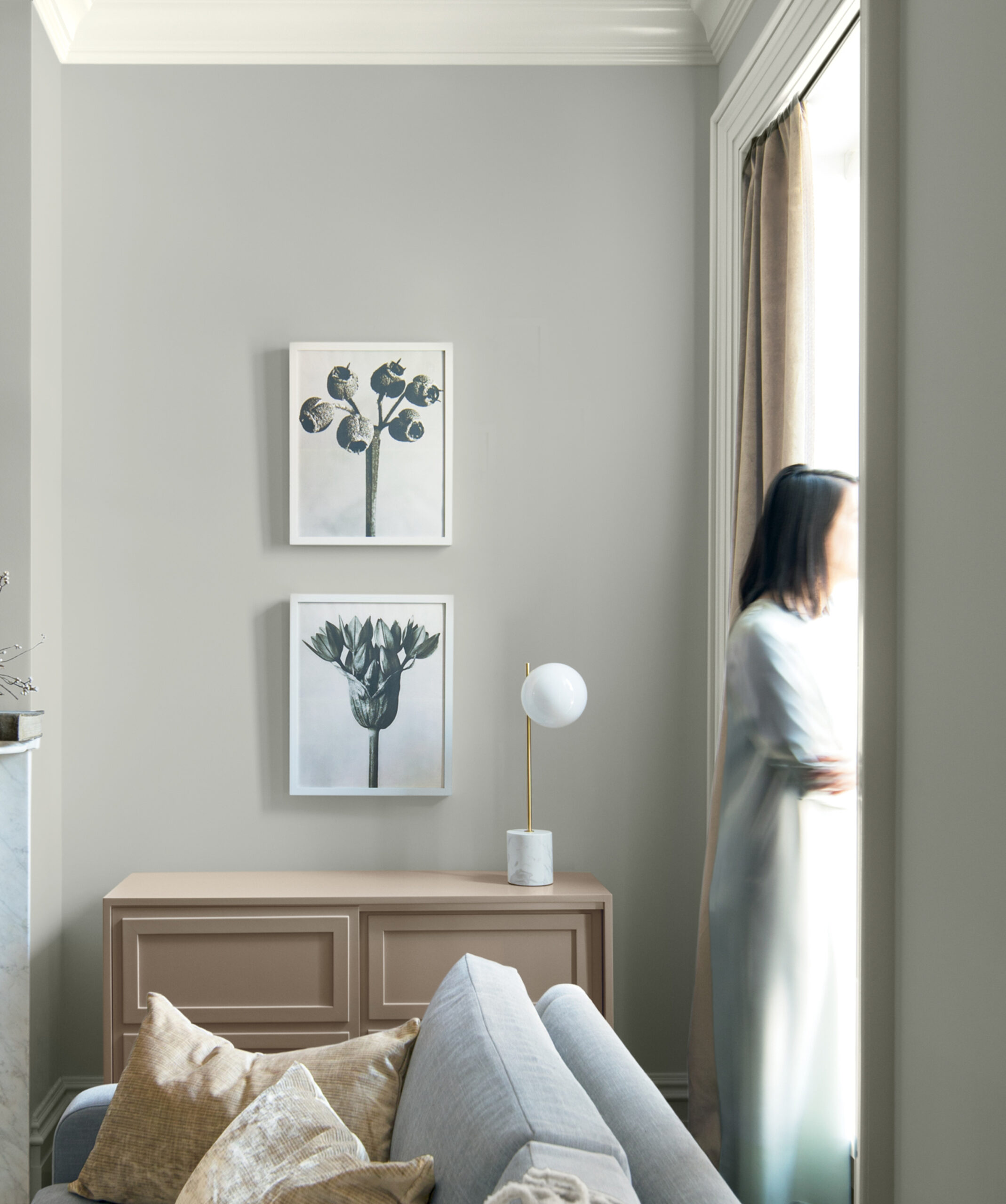
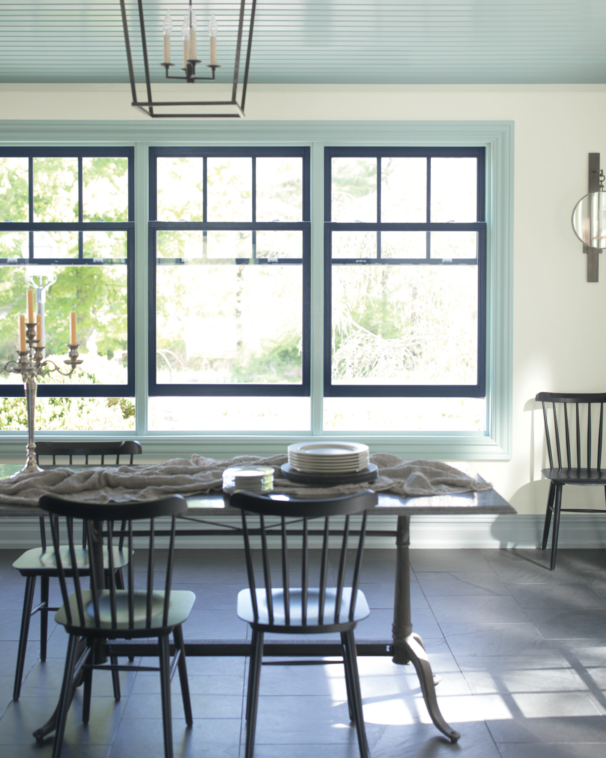
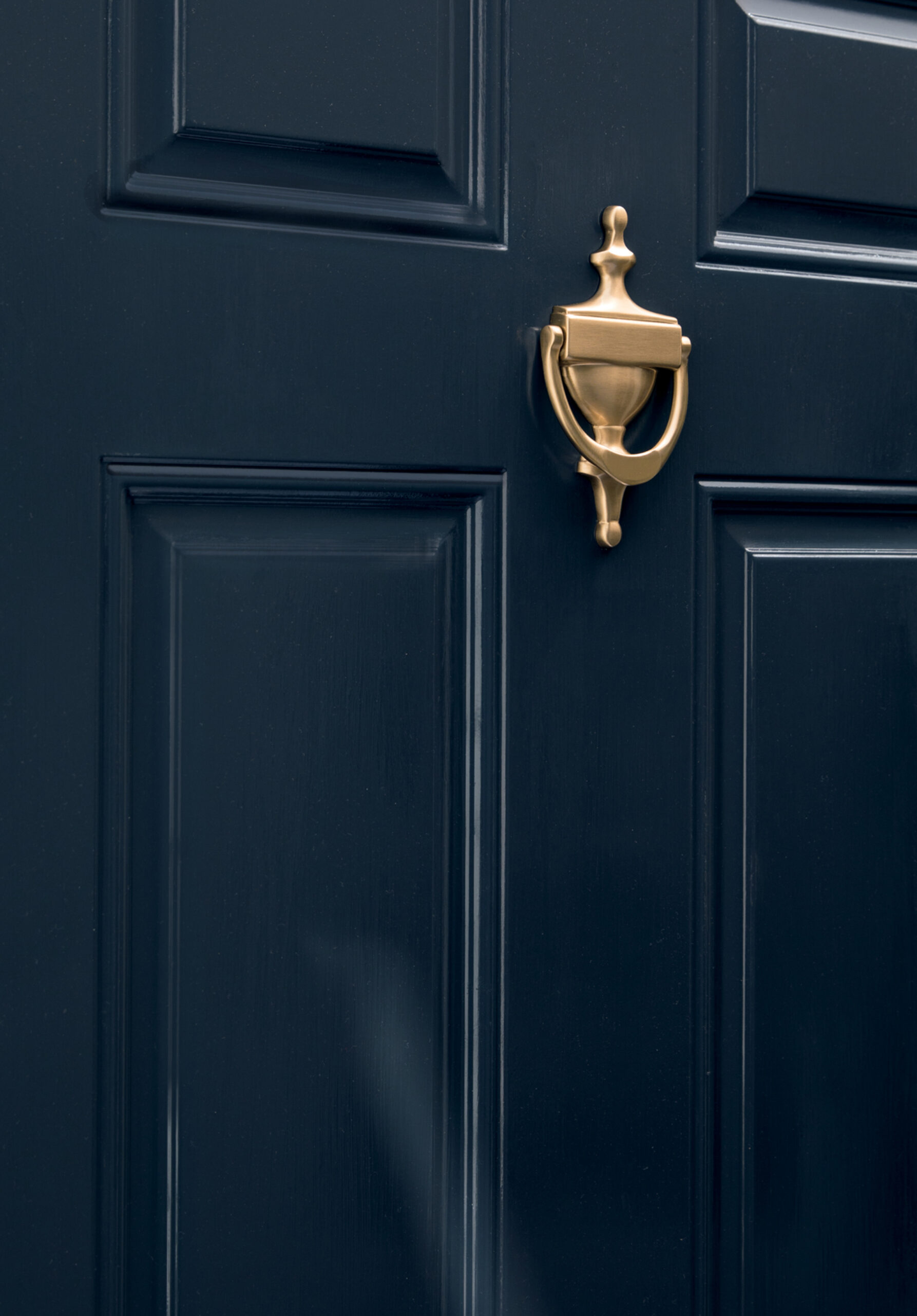
Ranging from ethereal neutrals to frothy pinks to rich blues and greens. Corresponding palette of 15 harmonious hues that further amplify the cultured grace of color of the year - Metropolitan AF-690. Elegant, sophisticated and harmonious.
"I don't know about any of you, but I need quietude. I need a pause. I need earplugs. I don’t even know what was going on at the time, but it was just like, stop the aggression, the crescendo of voices, the cacophony of tweets and breaking news. It’s so invasive. I said, I know this is totally uncharacteristic of me personally, but I have a feeling that we should look in this [neutral] spectrum of colors” – these words of Ellen O’Neill Benjamin Moore’s Director of Strategic Design Intelligence reflect the climate of color trends searching...
Color Trends 2018 brought us exuberant color with Caliente that made a statement in both small and sweeping expressions of color.
For 2019, color hunters of Benjamin Moore & Co. Color & Design Team observed a shift where quietude and a retreat from noise and chaos seemed to pervade the mood. Theirs research signaled a need for softness and glamour, presented in a way that was powerful through it’s subtlety. It was beauty in architecture, finishes and detailing that became a key element that seemed to resurface in every trend-related conversation among the Color & Design Team.
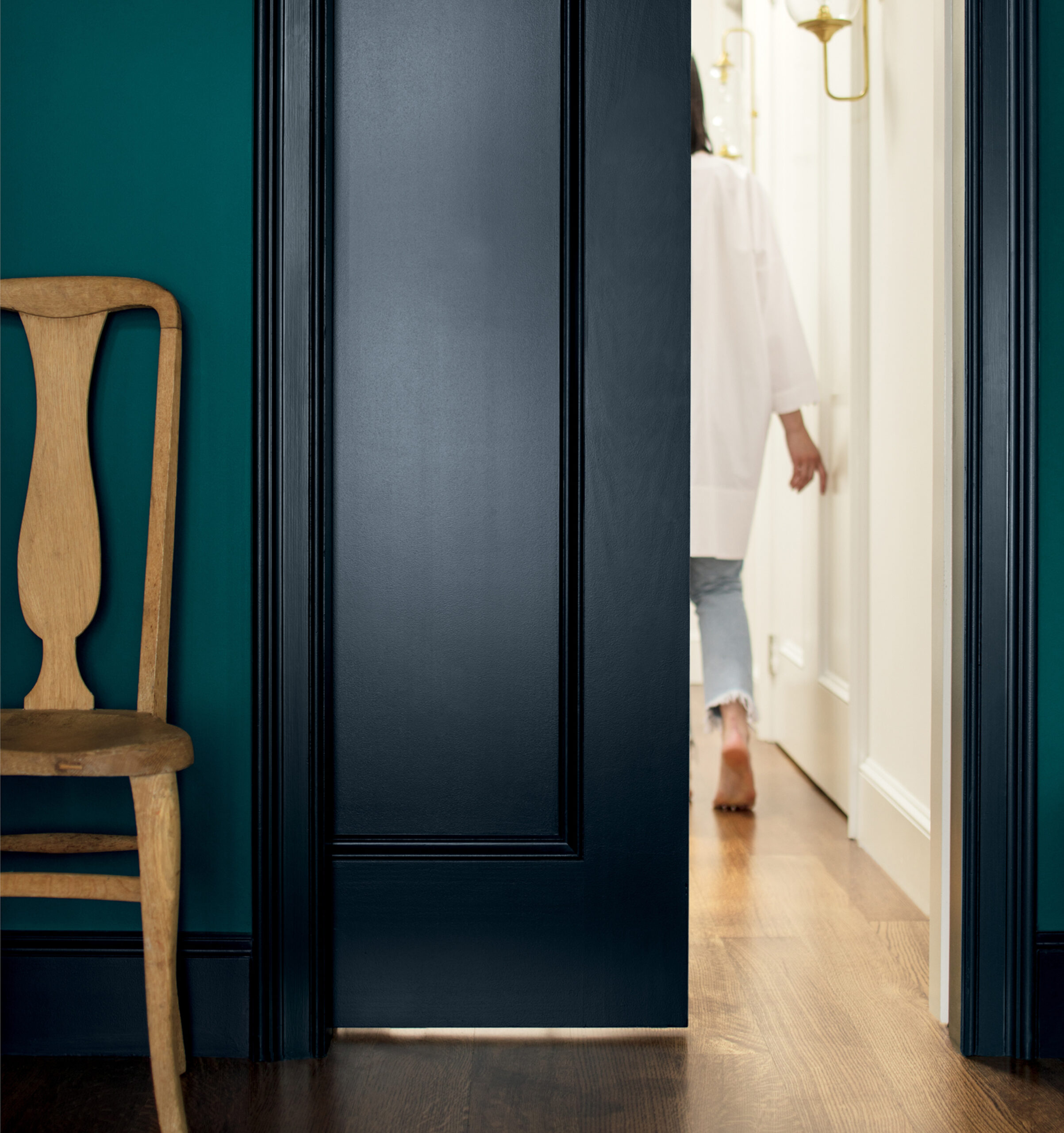
The term “soft power” also became a theme in our discussions as the colors we gravitated toward and reflected our travels were not bold and bright as we saw in 2018, but rather softened and muted with elegance and a strong presence that is not overt.
This was a color found in new designs from across the globe, but is also rooted in an array of materials that exhibit strength and provenance, with distinct character and grace.
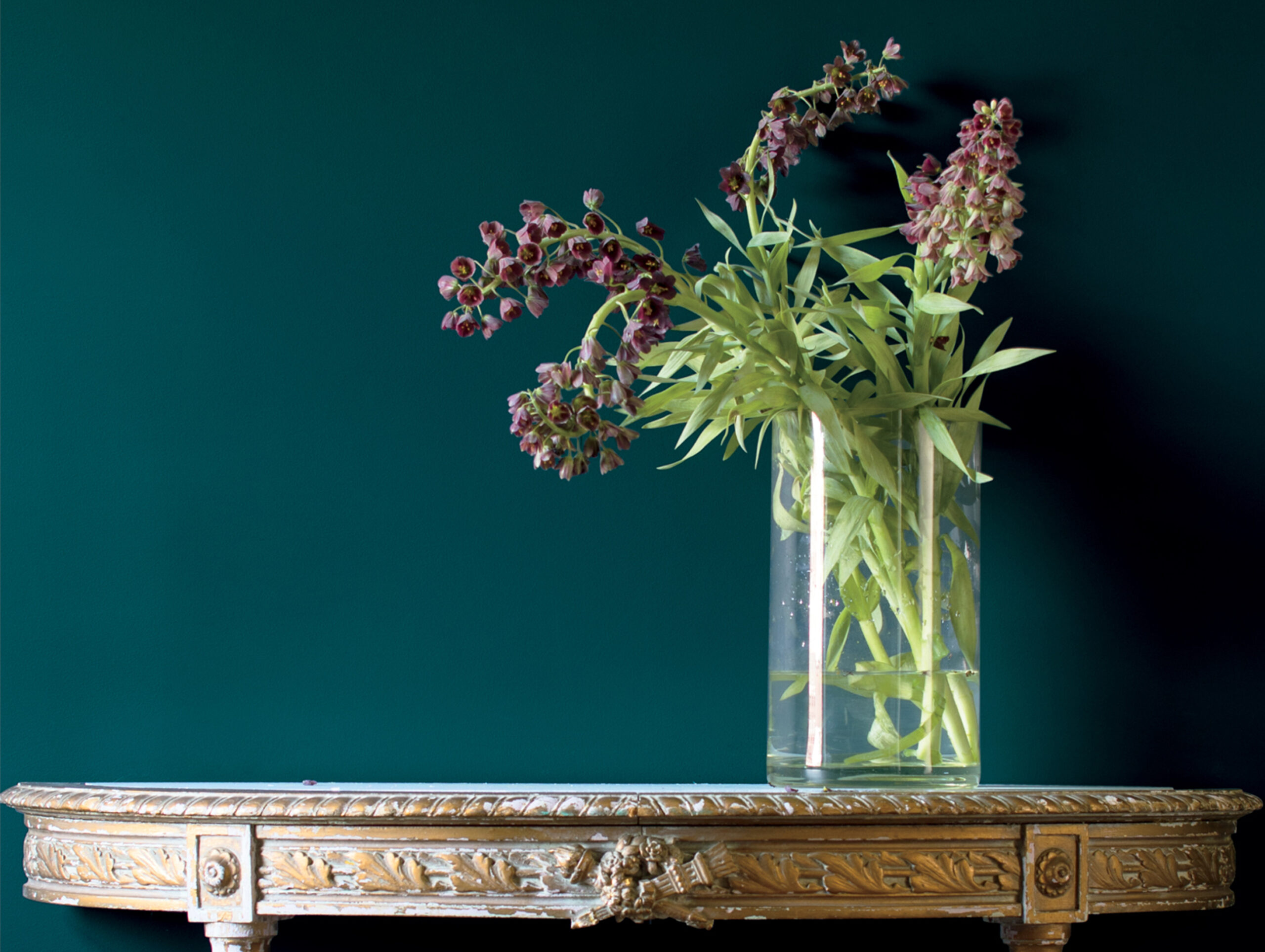
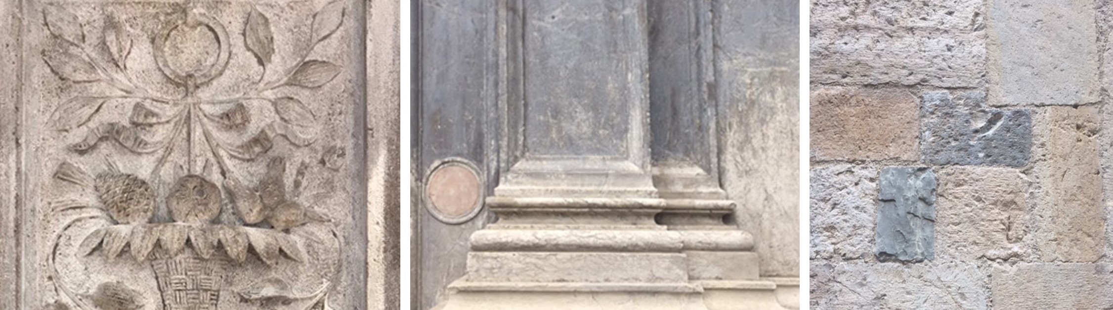
Color specialists also set their sights on the finishes associated with the colors observed. For example, on the image below there are aged stone and carvings.
Color hunters were intrigued by the strength of the material, but also the hues that through it – a connection between strength and softness.
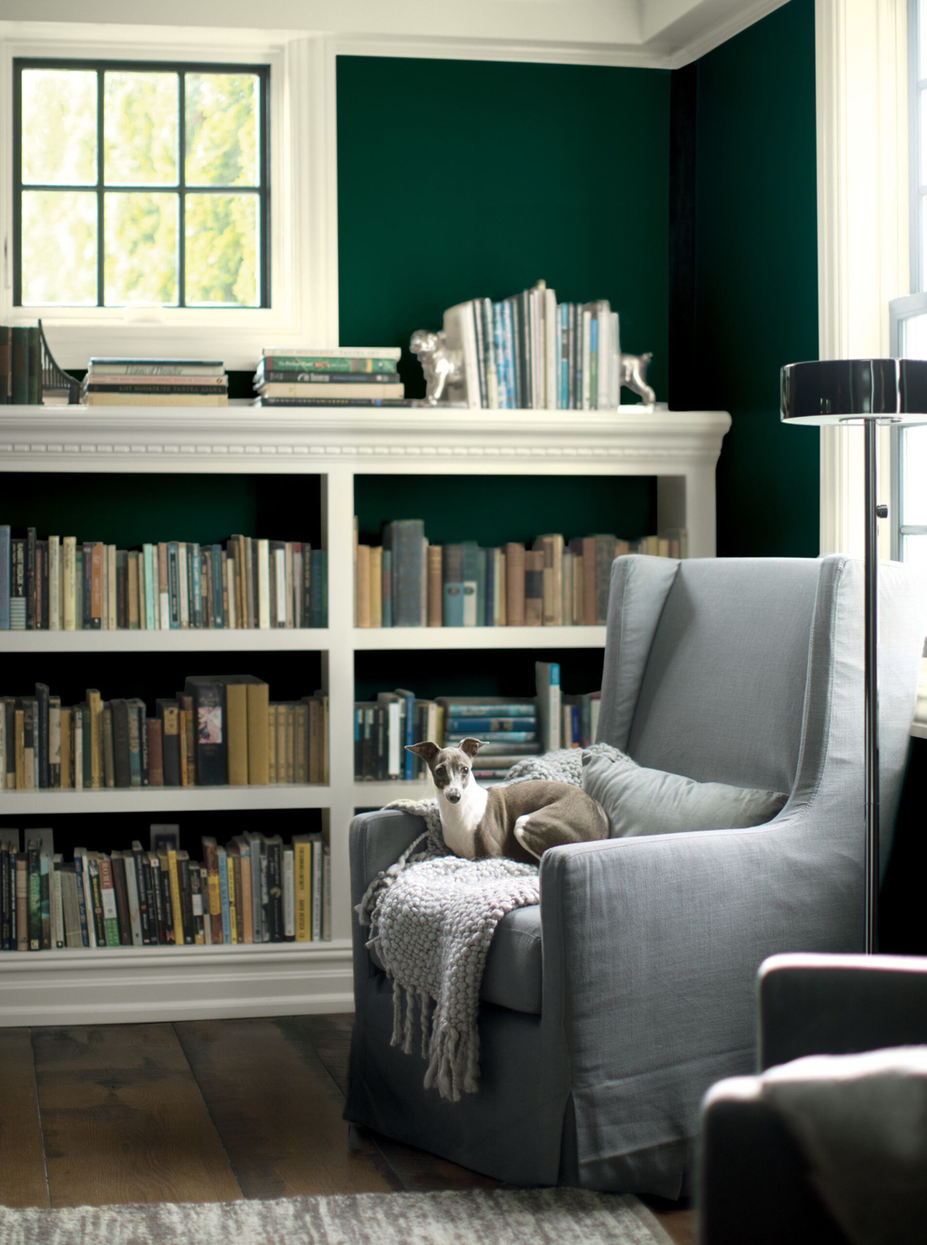
The move toward a color that is understated yet can influence the overall mood of a room feels right for 2019, and though we have been seeing the dominance of grays over the past few years, it continues to shift and evolve – becoming increasingly complex and sophisticated while providing a backdrop for our homes that reflects today’s design sensibilities.
To recap, for 2019 we are moving away from the noise, and retreating into a contemplative space where the power of our thoughts an intentions act as our guide.
The palette of colors selected for 2019 complement our Color of the Year, Metropolitan, in addition to being amazing colors on their own.
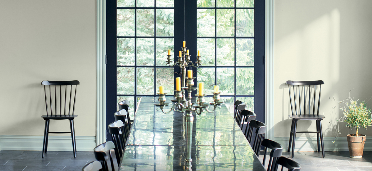
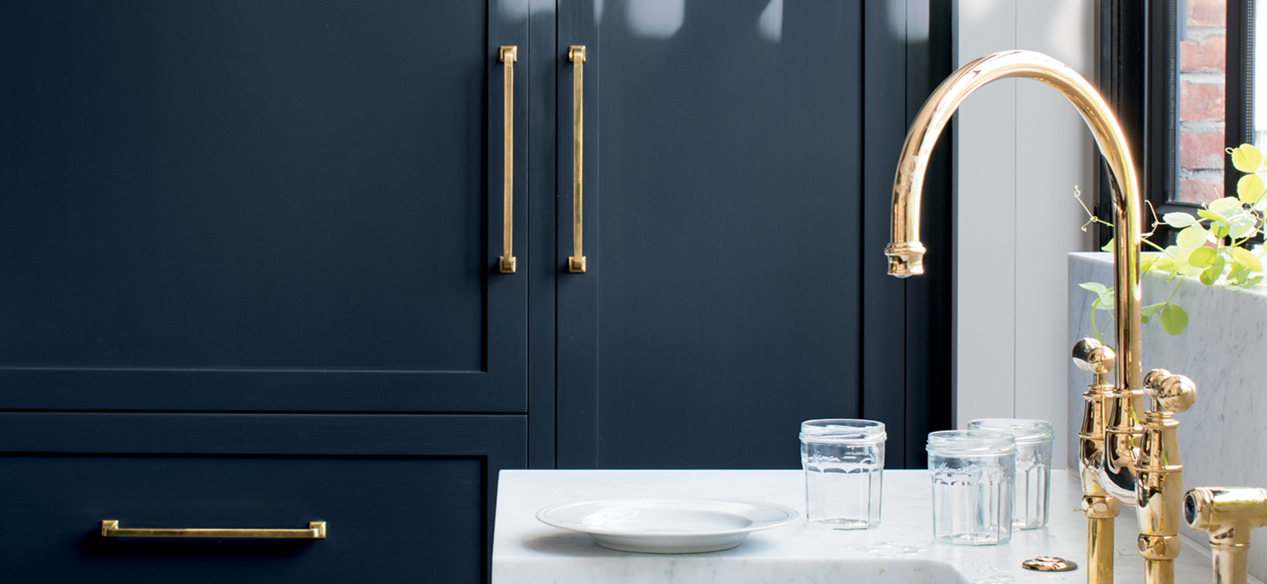
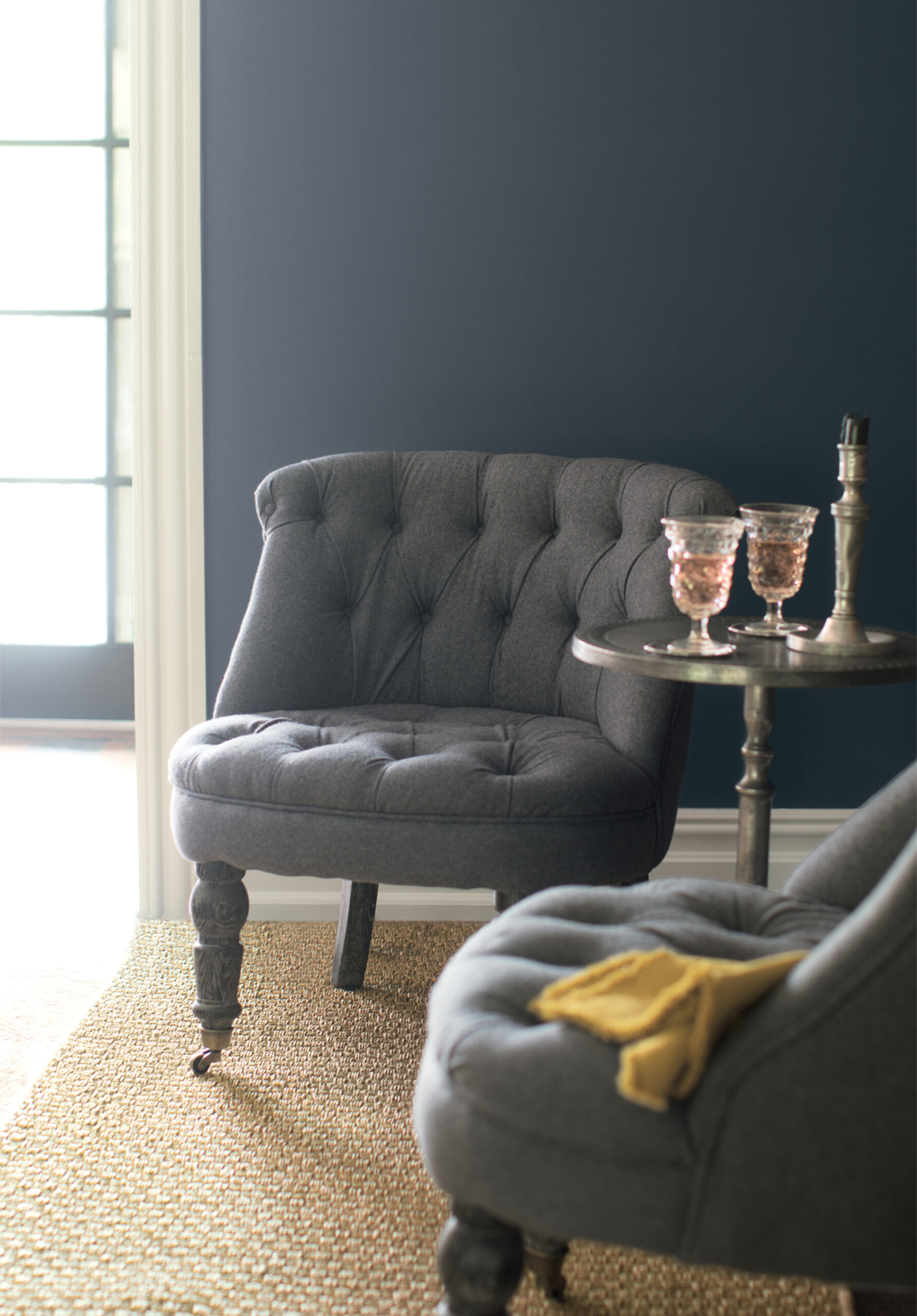
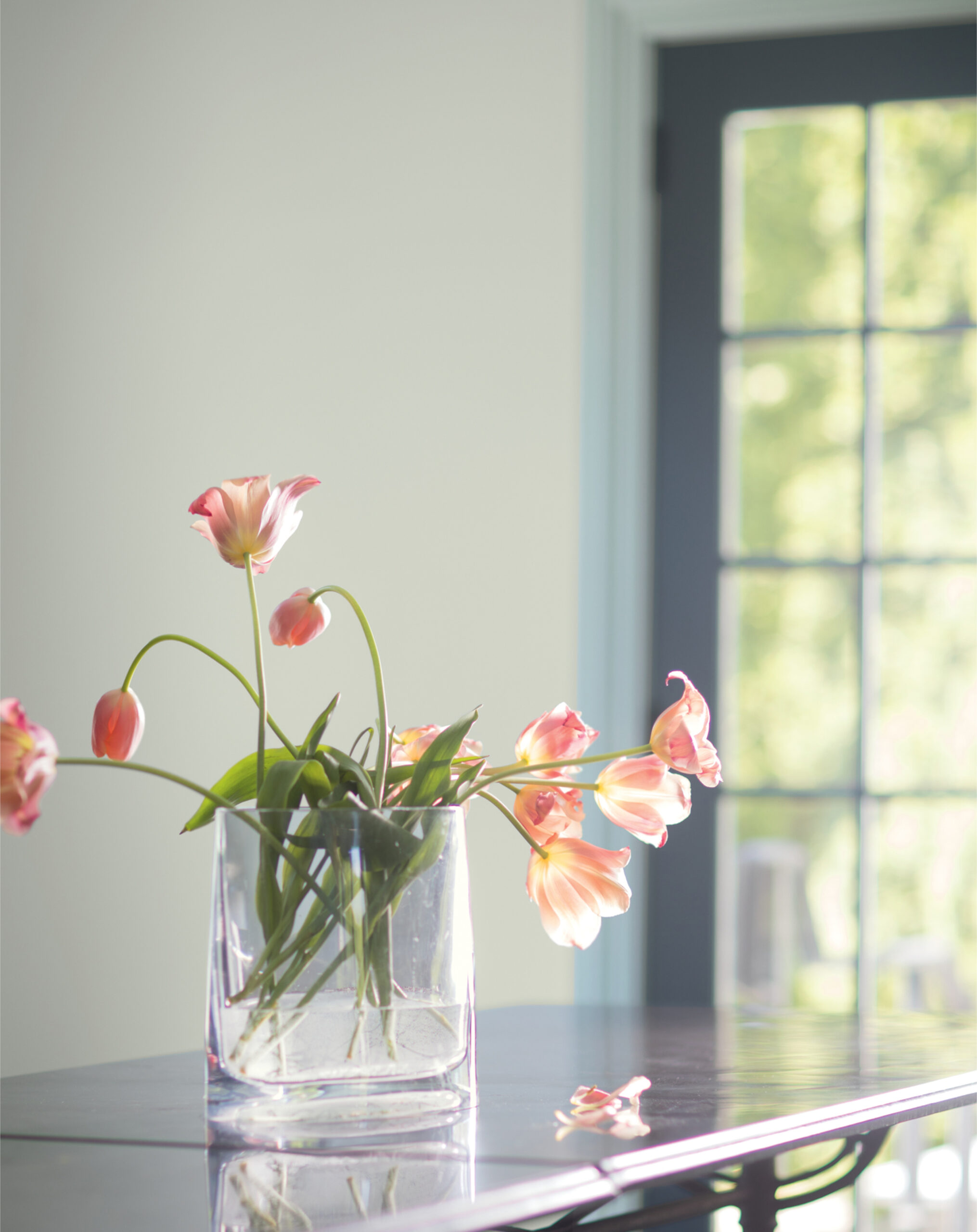
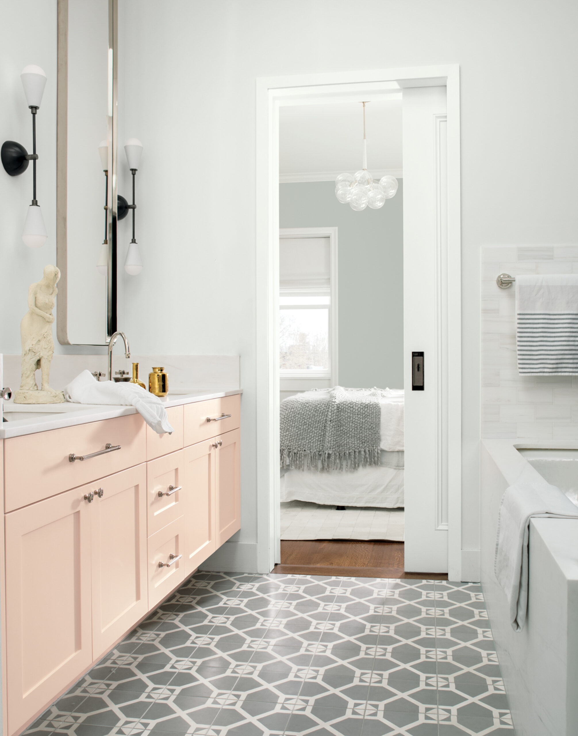
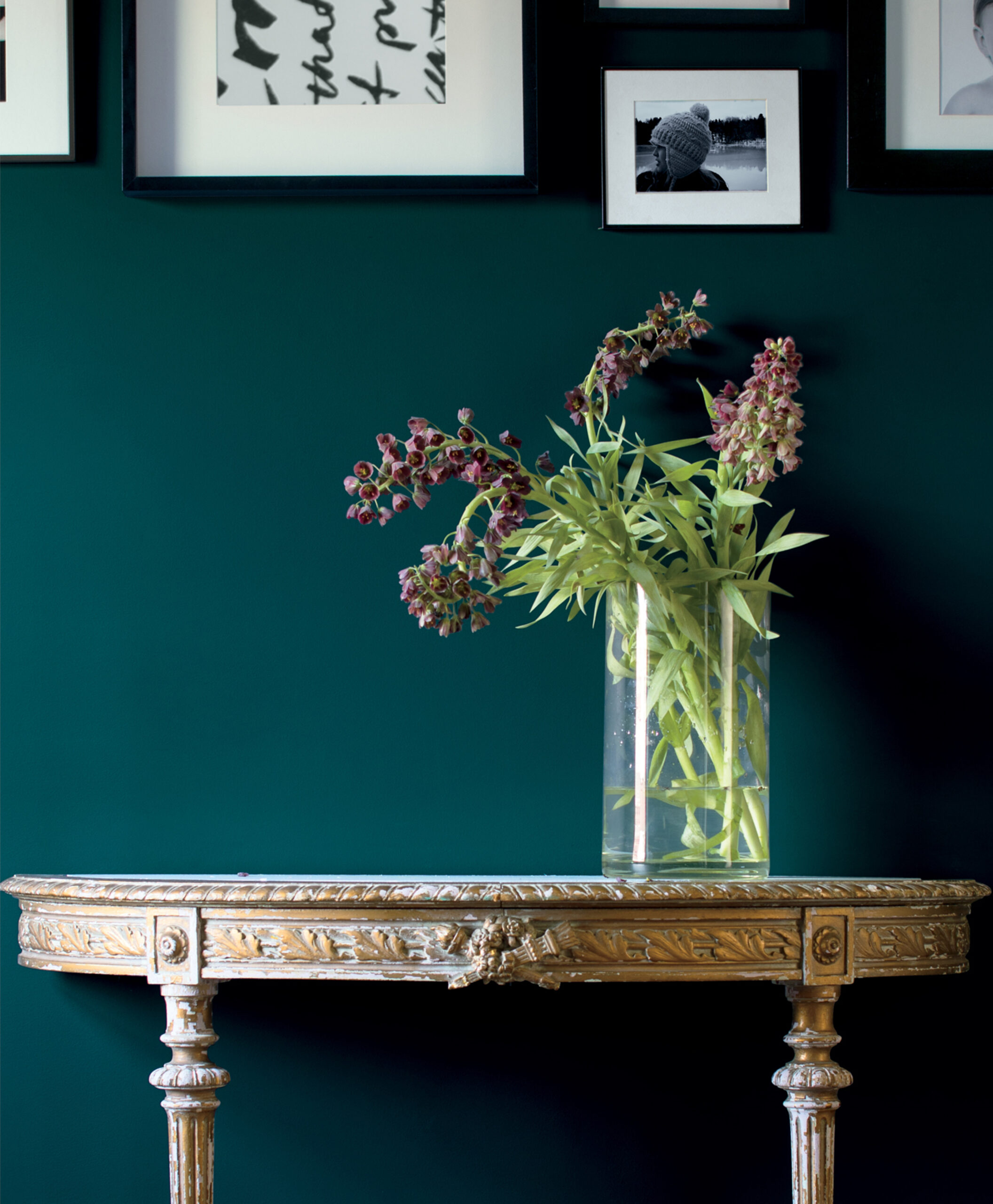
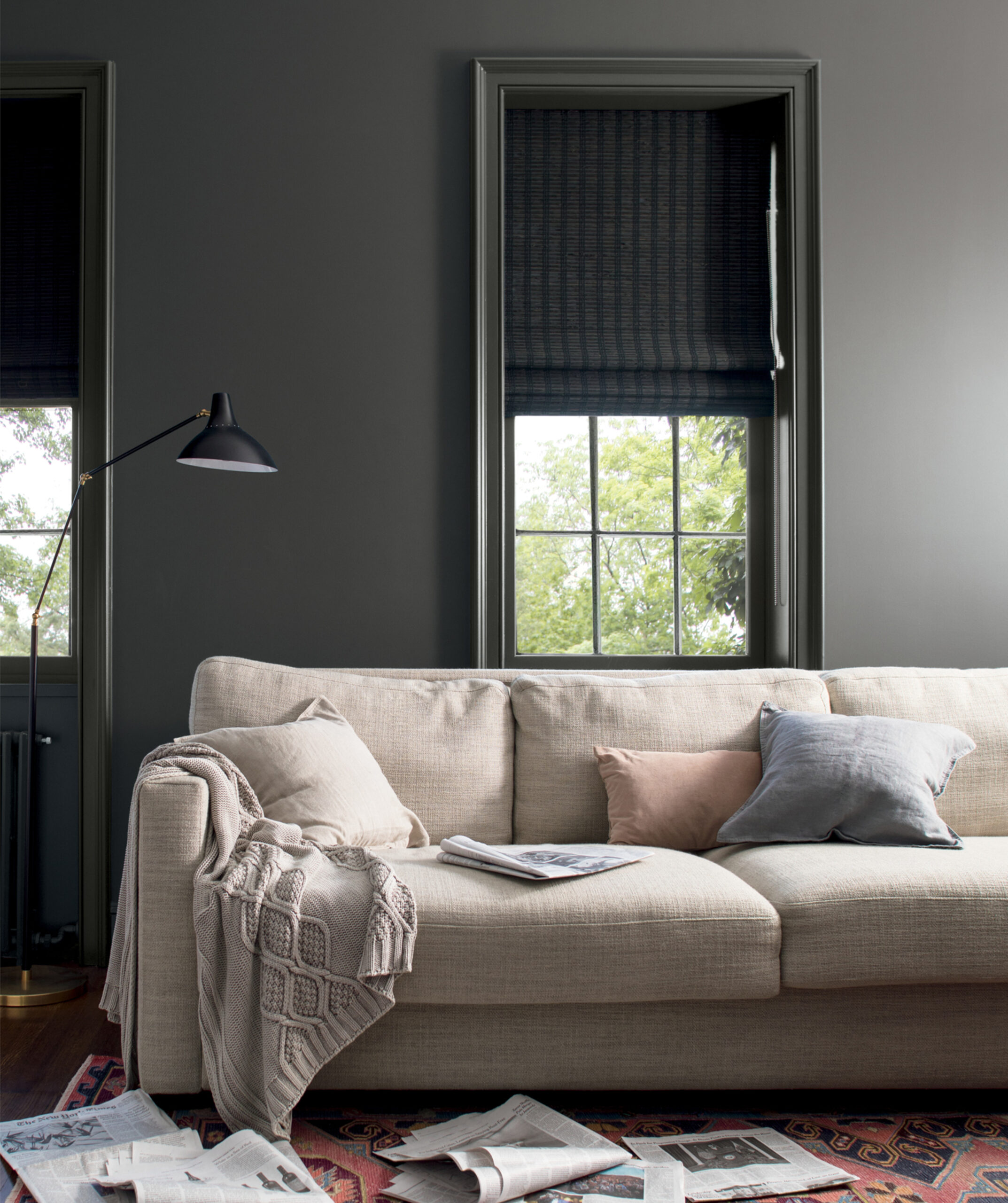
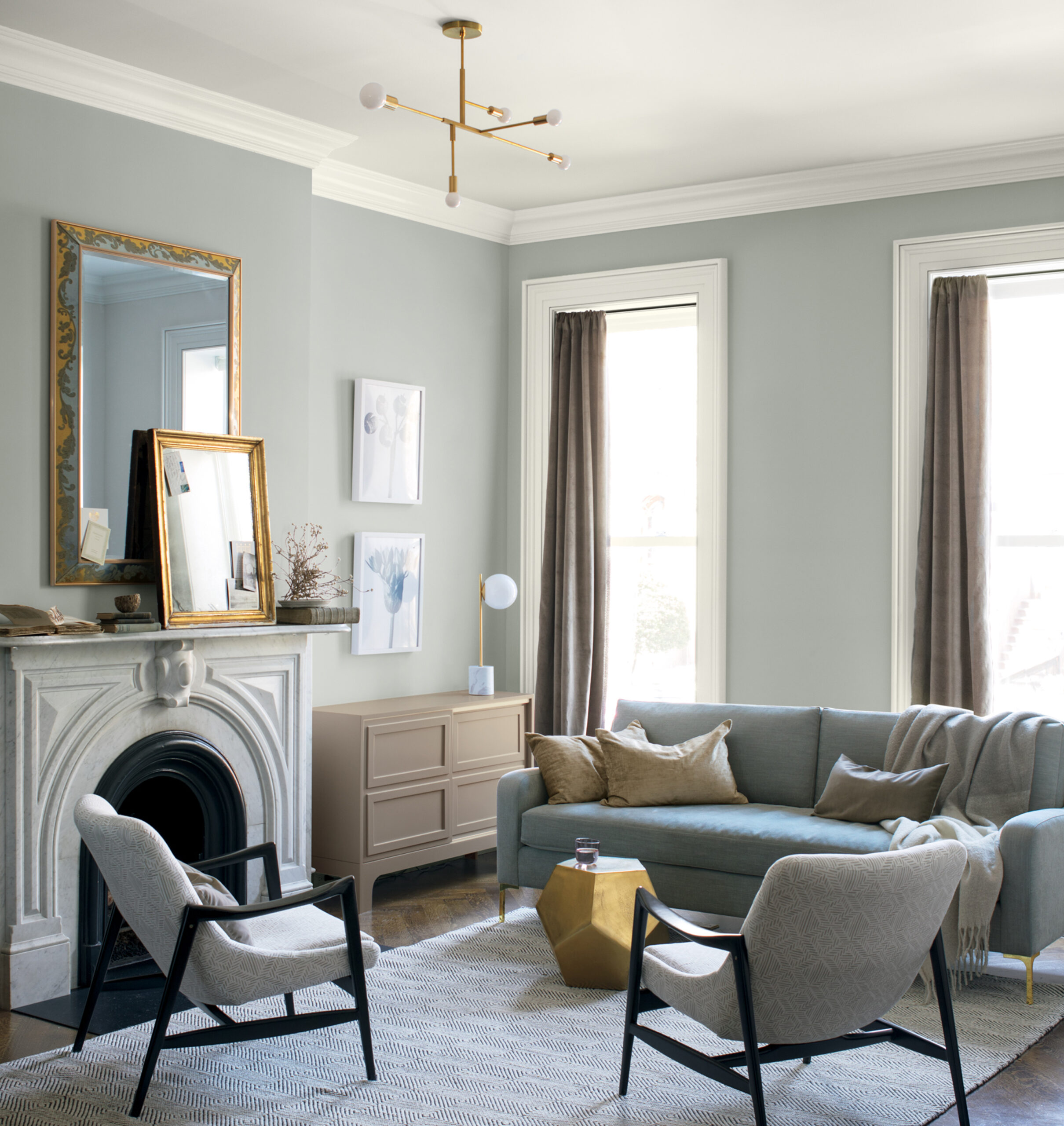
The overall color story for 2019 is calming and exhibits restorative quietude in any setting. Colors cues are reminiscent of heathered grays, soft linens, soft metallic accents, and rich deeps that provide balance to the array of easygoing neutrals.