COLOR TRENDS 2021
Oto historia opowiedziana przez Łowczynie Trendów koncernu Benjamin Moore &. Co.
Jednym z najczęściej zadawanych pytań, dotyczących trendów kolorystycznych na nadchodzący sezon, dotyczy procesu ich selekcji. Kluczową rolę w pracy badawczej stanowią podróże, obecność na słynnych targach poświęconych projektowaniu wnętrz, wystawach sztuki i obserwacja, w jaki sposób różne branże stosują kolory.
Łowczynie Trendów nieustannie poszukują ciekawych pomysłów na nowe, kreatywne ich wykorzystanie. Prześledźmy jak wyłoniono tegoroczną paletę i jakie były główne trendy oraz nastroje społeczne.
Poniższa relacja prowadzona jest w trzeciej osobie liczby mnogiej, rodzaju żeńskiego.
ULICE i KLIMATYCZNE KAWIARENKI...
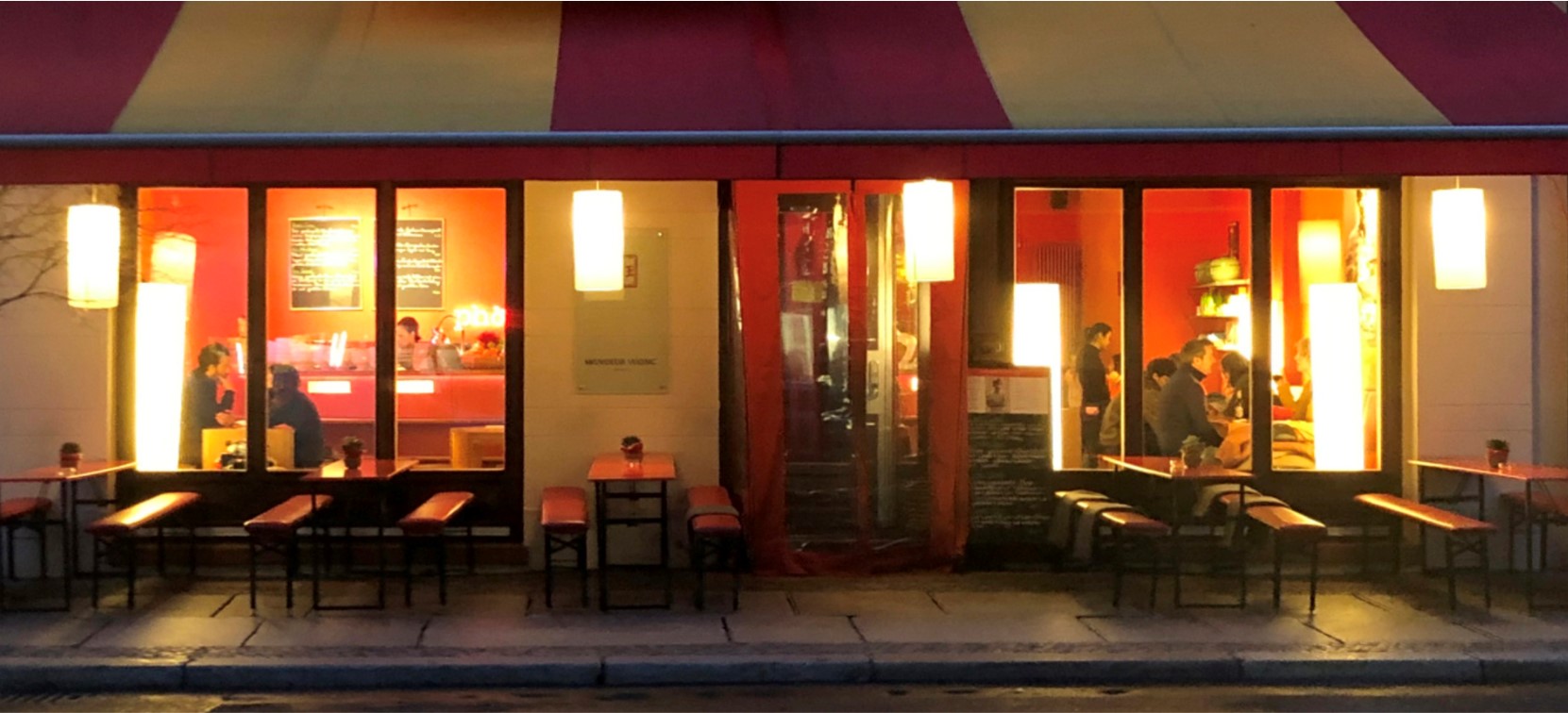
W tym roku szczególnie zainspirowały nas odcienie tworzące uliczny krajobraz, pięknie podane dania w małych klimatycznych kawiarenkach, a nawet obserwacja ludzi poświęcających się swoim hobby, rzemiosłu czy innym wspólnym zainteresowaniom.
Naturalnie znalazłyśmy wiele cennych spostrzeżeń na temat kolorów podczas targów i imprez wnętrzarskich, w których mieliśmy szczęście uczestniczyć (pomimo ograniczeń wymuszonych przez pandemię).
Dokonałyśmy również analizy kolorów na poziomie emocjonalnym, sprawdzając, w jaki sposób mogą one zapewnić komfort oraz spokój i jak te czynniki zostają odzwierciedlone we wnętrzach naszych domów.
NIE MA JAK W DOMU...
Pracując nad paletą trendów na rok 2020 przyjrzałyśmy się bardzo dokładnie szeregowi podstawowych potrzeb, wspólnych dla wszystkich ludzi. Od bezpieczeństwa, poprzez kreatywność po optymizm. Analizowałyśmy, jak przywołane dążenia wyrażają się poprzez kolor oraz w jaki sposób są implementowane.
Od 2019 roku kontynuowałyśmy dyskusję nad rolą domu jako miejsca wielofunkcyjnego czy wielozadaniowego. Koncepcje i obrazy w badaniach na sezon 2021 miały organiczną jakość, swobodny, nieco niedbały wdzięk i specyficzny czar.
Z jednej strony urok niedoskonałości produktów wytwarzanych ręcznie (hand-made), z drugiej zaś obecność starannie wykonanych materiałów, tkanin farbowanych naturalnymi barwnikami roślinnymi i świeże, cudowne jedzenie prosto z targu stworzyły barwną historię na nadchodzący rok.
Gdy niedawno witaliśmy nową dekadę, podekscytowani rozpoczęciem „nowego rozdziału”, nasze życie zmieniło nadejście globalnej pandemii. Sytuacja skłoniła nas do przemyślenia wielu aspektów naszego codziennego życia, dodatkowo zapewniła naszym domom wyjątkowe znaczenie.
PANDEMIA ZMIENIA ZASADY GRY...
Kiedy wiosna zapoczątkowała powrót do „nowej normalności”, nasze skupienie się na własnym domie pozostało niezmienne, jednak niektóre elementy historii nabrały znacznie większego znaczenia.
W 2021 r. nadal rozmyślamy nad sposobem naszego życia, a ten cenny czas refleksji stwarza możliwość „zresetowania się” i zmiany nastawienia. Szukamy radosnych chwil w naszej codzienności, dzięki którym celebrujemy proste przyjemności. Rzeczy, które wcześniej uważaliśmy za oczywiste, teraz nabierają nowego znaczenia.
Rozwinęły się nowe zainteresowania, znaleźliśmy nowe sposoby łączenia się z innymi, nawet jeśli oznacza to jedynie „przestrzeń wirtualną”. Spędzamy więcej czasu na świeżym powietrzu, gdzie odbudowujemy dobre samopoczucie i nawiązujemy kontakt z naturą.
W domach stosujemy kolory w bardziej „organiczny” i świadomy sposób, ponieważ wpływają one na nasze emocje. Odnajdujemy wyjątkową satysfakcję obserwując poranne promienie roztańczonego światła na pogniecionej, lnianej pościeli czy soczystych, dojrzałych owocach z naszego przydomowego ogrodu leżących na parapecie.
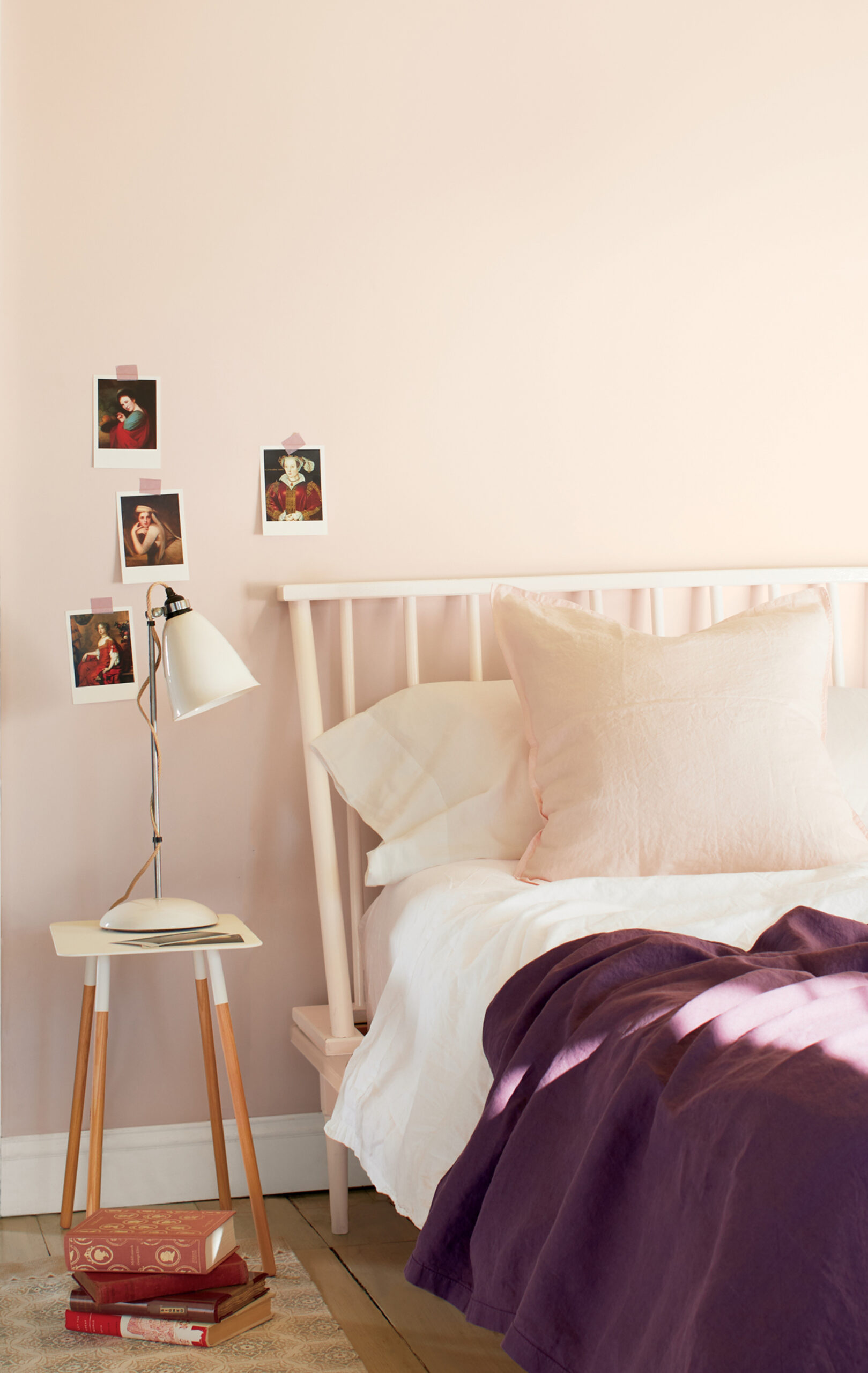
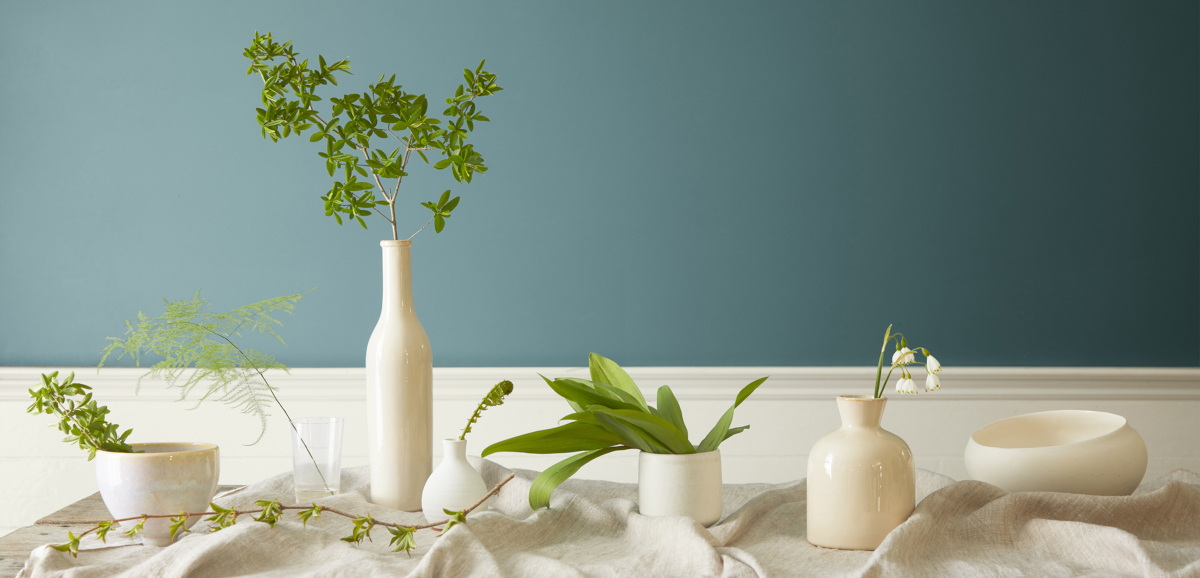
Na sezon 2021 wybrałyśmy przede wszystkim gamę „wypalonych słońcem” odcieni, która odzwierciedla pragnienie poczucia stabilności. Kolory harmonijne z idealną równowagą między ciepłymi i chłodnymi odcieniami.
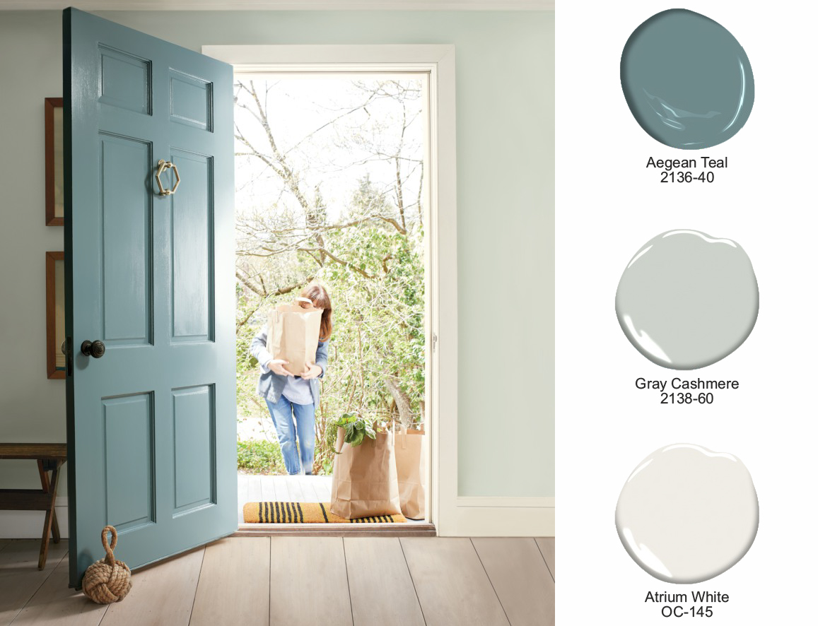
Symbol nieskończoności, prawdy i jasności umysłu.
Oto chwila na refleksję i „reset”. Intrygujący, wyważony i kojący „Aegean Teal 2136-40" zapewnia naturalną harmonię.
Wyjątkowo wyważony, złożony kolor o średnim nasyceniu, z lekkim odcieniem szarości, perfekcyjnie łączy się z innymi kolorami i różnymi materiałami. Przywodzi skojarzenia ze spokojem i regeneracją.
Co istotne, w niektórych kulturach cyraneczka (aegean) uważana jest za symbol nieskończoności, prawdy i jasności umysłu - symboliki, która ma szczególne znaczenie w 2021 roku.
W czasie poszukiwania koloru roku przeanalizowałyśmy wiele niebiesko-zielonych i głębszych zieleni, zanim ostatecznie wybraliśmy „Aegean Teal", który szczególnie się wyróżniał. Idealnie odzwierciedlał swobodny i komfortowy styl życia.
Podczas tworzenia ogólnej palety Color Trends 2021 osiągnęłyśmy równowagę pomiędzy obiema stronami koła barw, a „Aegean Teal" działa jako „pomost”, aby wzmocnić to poczucie harmonii.
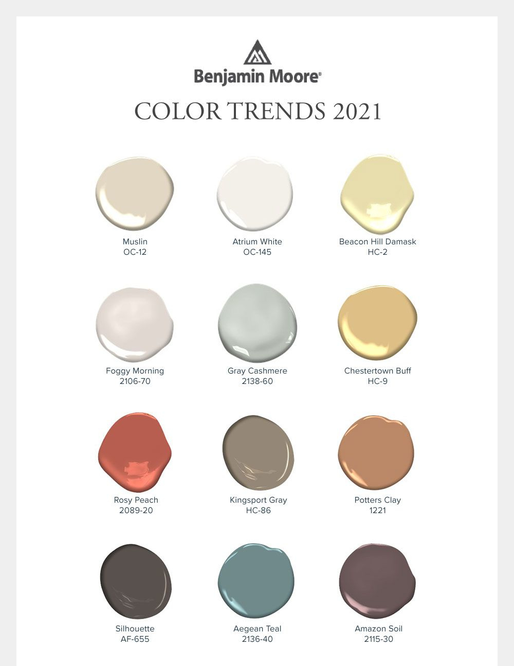
Paleta 12 pięknych odcieni
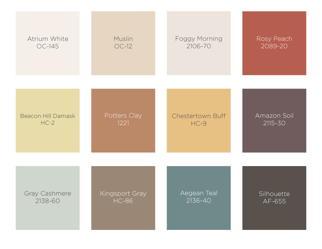
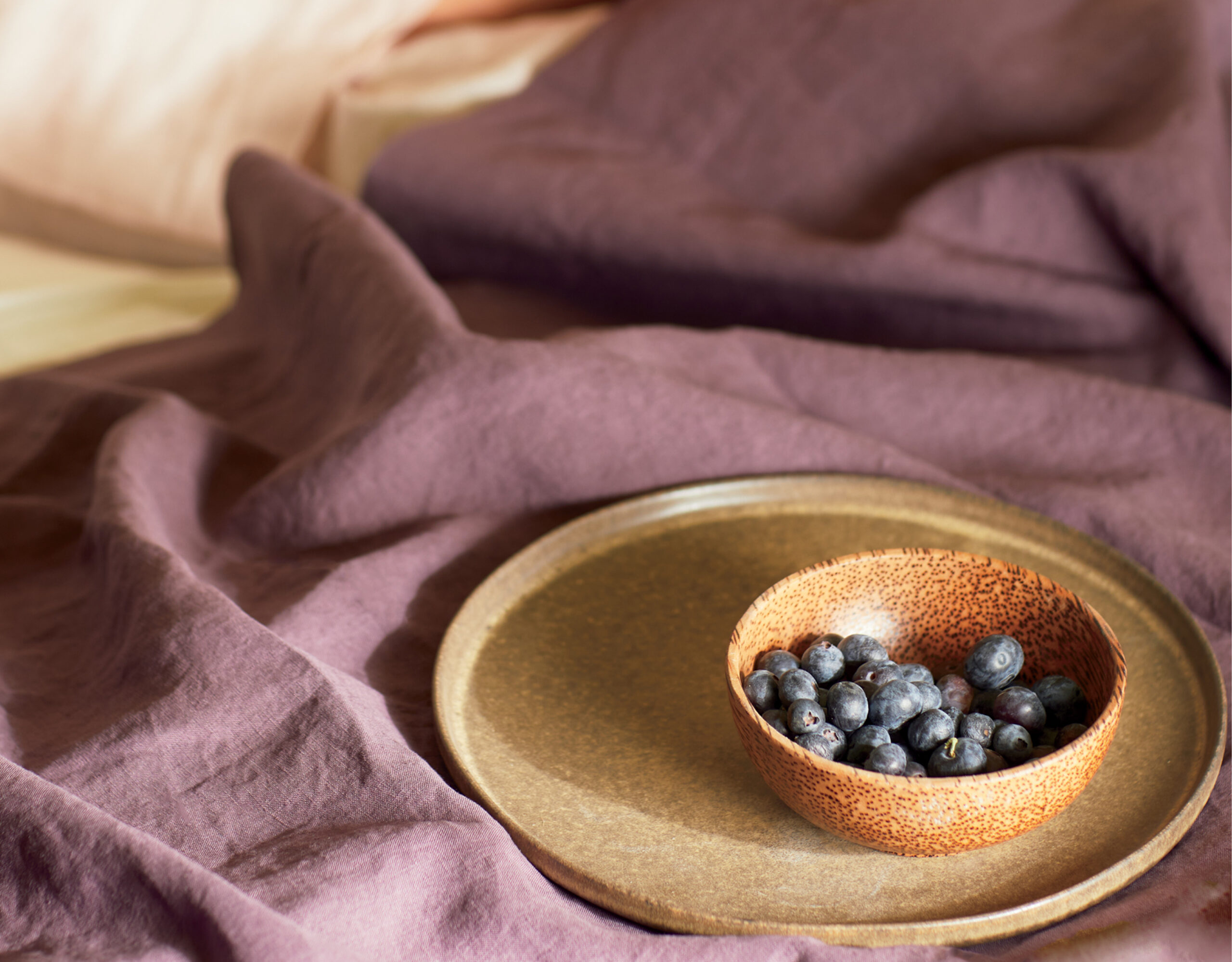
Większość naszych dyskusji koncentrowała się wokół „korzennych”, przyjaznych kolorów. Choć wiele odcieni w tym zestawie pochodziło z cieplejszej części koła barw, zostały one perfekcyjnie zbalansowane chłodniejszymi kolorami.
Ostatecznie wybrana została paleta dwunastu radosnych odcieni, które promieniują ciepłem, zapewniają dobre samopoczucie.
Aby zapewnić szerszą gamę możliwości, w tym roku położyłyśmy większy nacisk na kolory o średnim nasyceniu, które równoważą głębsze i jaśniejsze odcienie z palety.
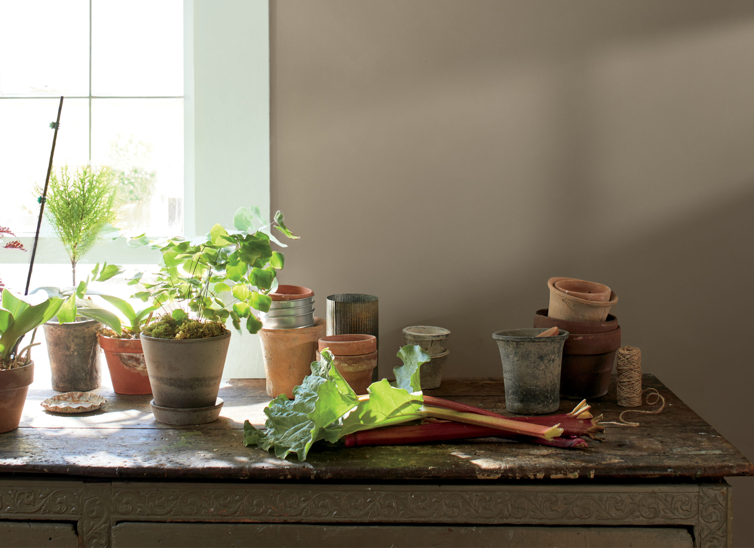
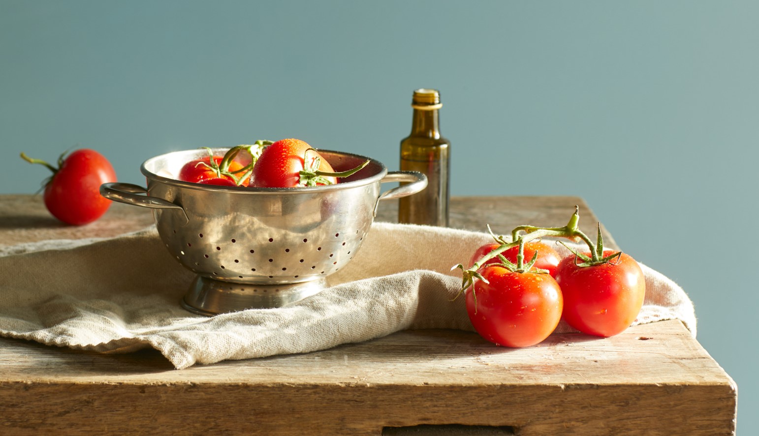
KOLORY W PROMIENIACH SŁOŃCA...
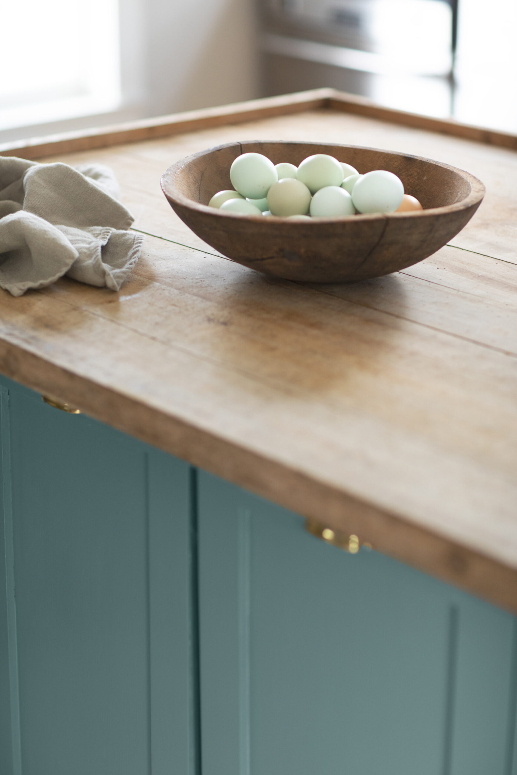
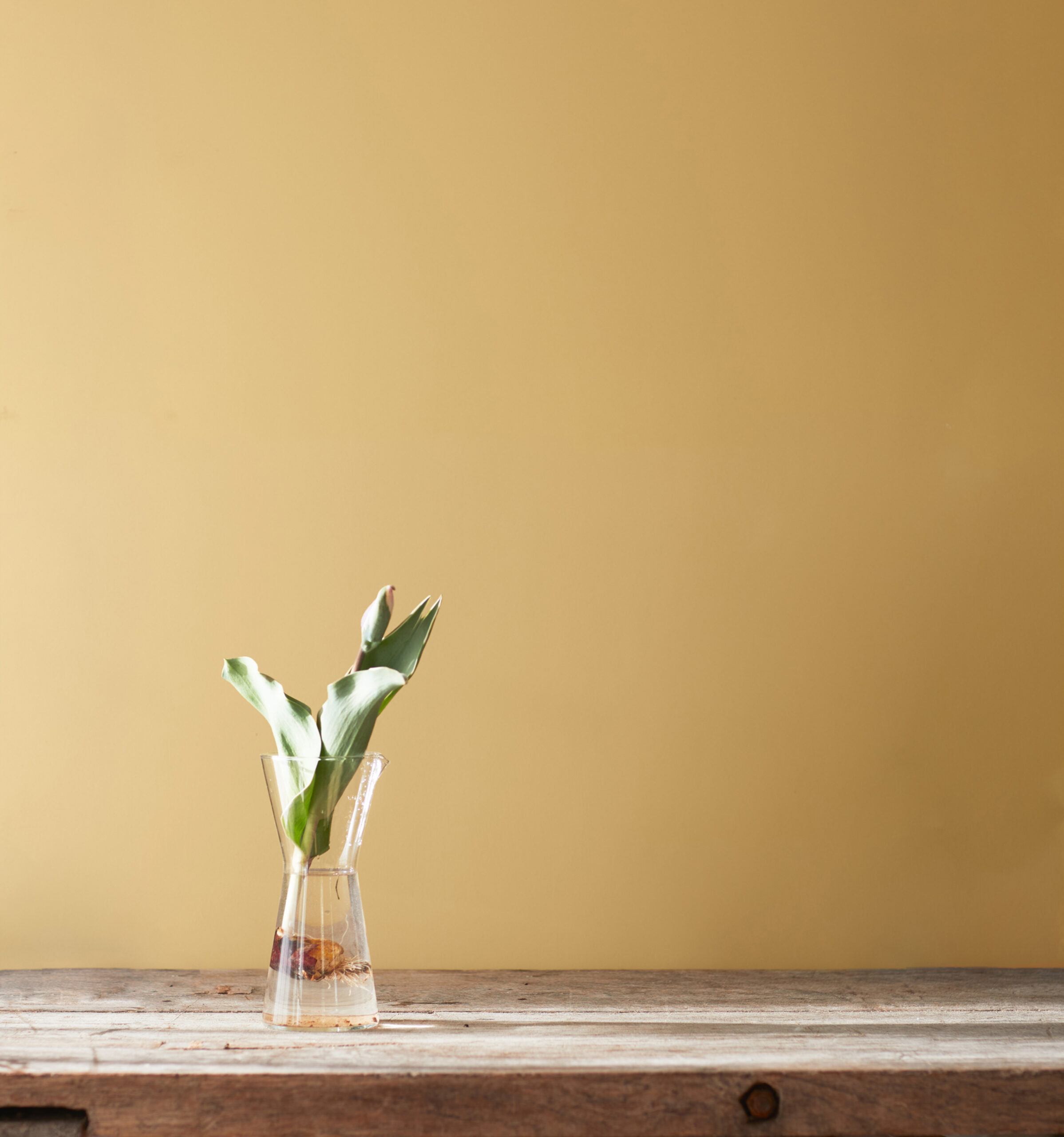
Na prezentowanym powyżej zdjęciu uchwyciłyśmy badania nad kolorystyką potraw, przeprowadzone na początku procesu tworzenia trendów, w których inspirację stanowiły plamki na jajach przepiórczych i niepowtarzalne kolory grzybów. Miałyśmy na uwadze również trwający trend wprowadzania roślin do domu.
Zastanawialiśmy się, w jaki sposób możemy kultywować nasze hobby, doskonalić naukę nowych umiejętności, a nawet zwyczajne „zwijanie się” pod koc z ulubioną książką.
Kompilacja tych wszystkich pomysłów doprowadziła nas do kluczowych koncepcji na „Color Trends 2021”.
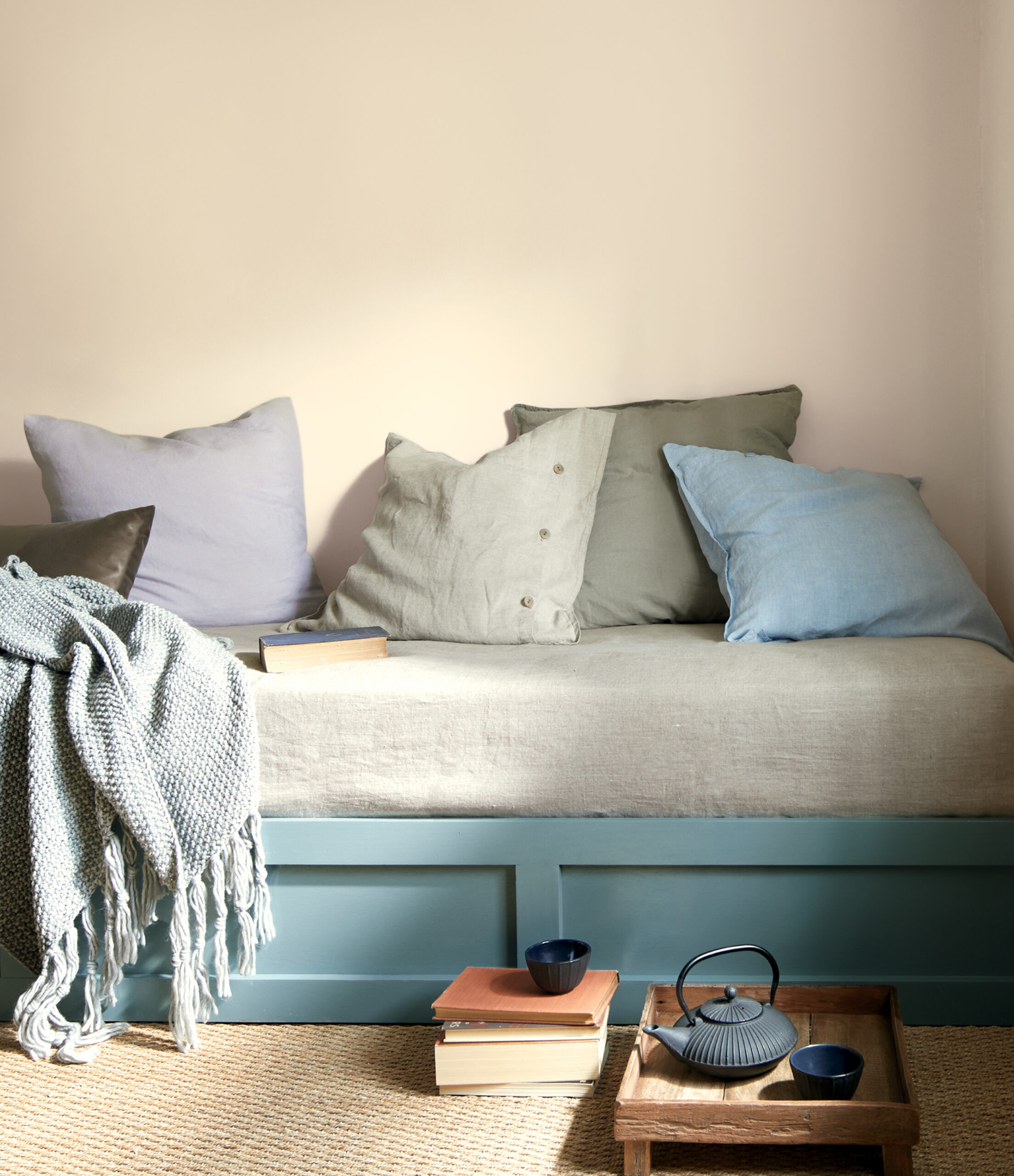
WYCISZENIE I UCIECZKA W NATURĘ
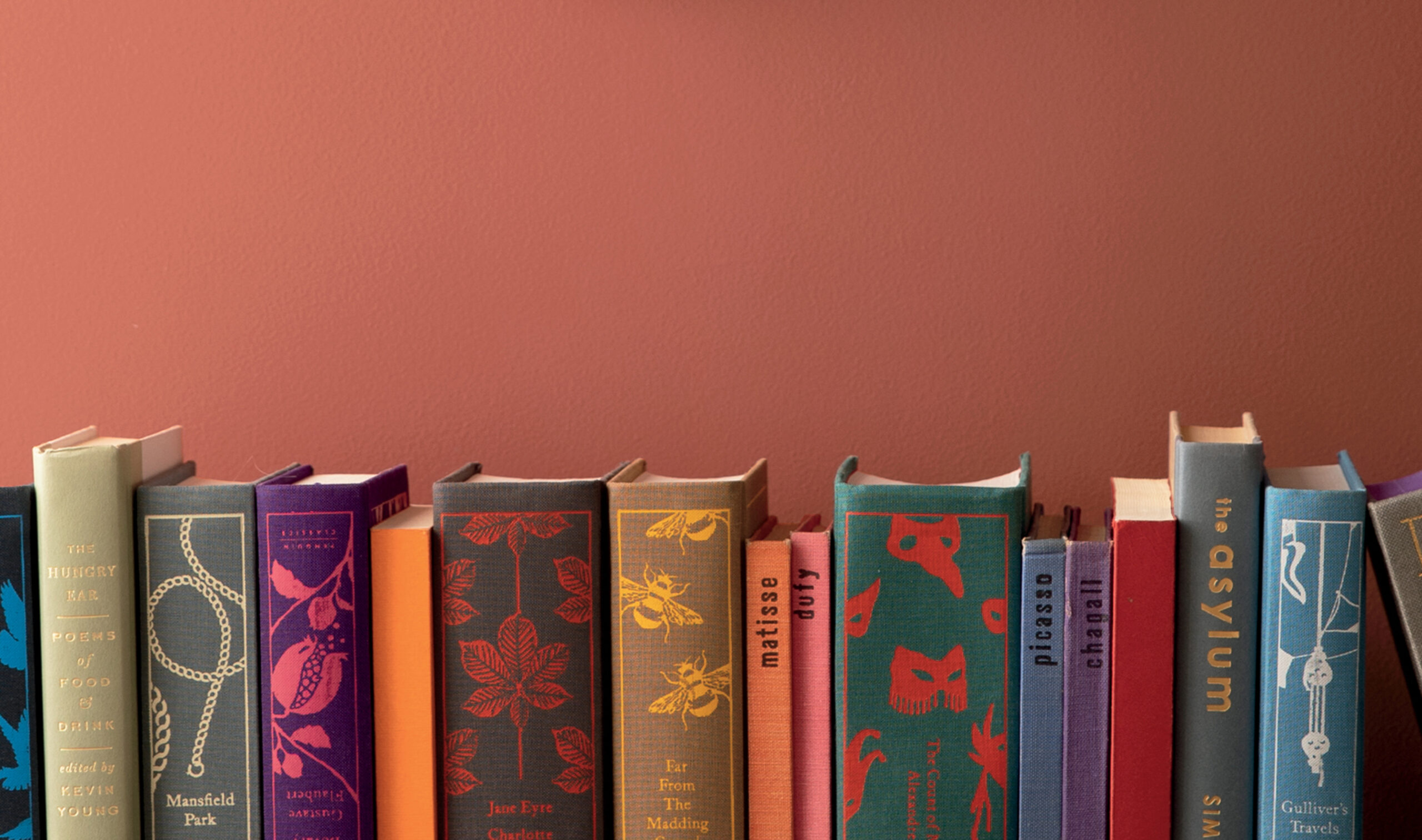
Od kilku lat dom traktowany jest jako zacisze i ostoja spokoju, ale od 2020 roku dodatkowo wzrosły nasze oczekiwania wobec tego kluczowego miejsca.
Pandemia sprawiła, że stało się ono jeszcze bardziej widoczne i bardziej centralne, niż kiedykolwiek przedtem. Chociaż początkowo myślenie takie wydawało się „chwilowe”, to utrzyma się z pewnością w kolejnym sezonie.
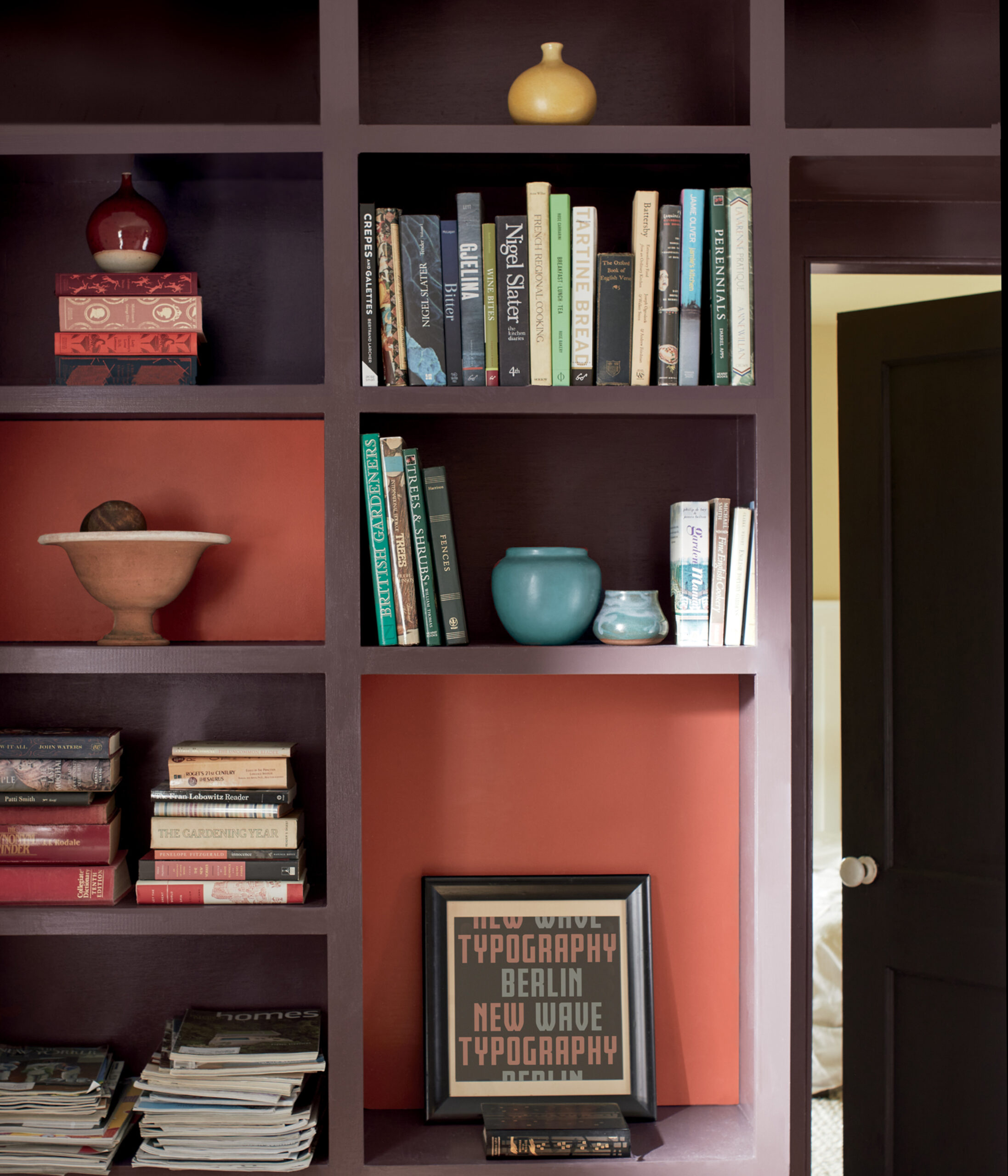
Potrzeba odnalezienia radości w prostych czynnościach stała się nadrzędna. Pragniemy wyciszenia i ucieczki, często w naturę lub poprzez projekty mające na celu odświeżenie naszego otoczenia.
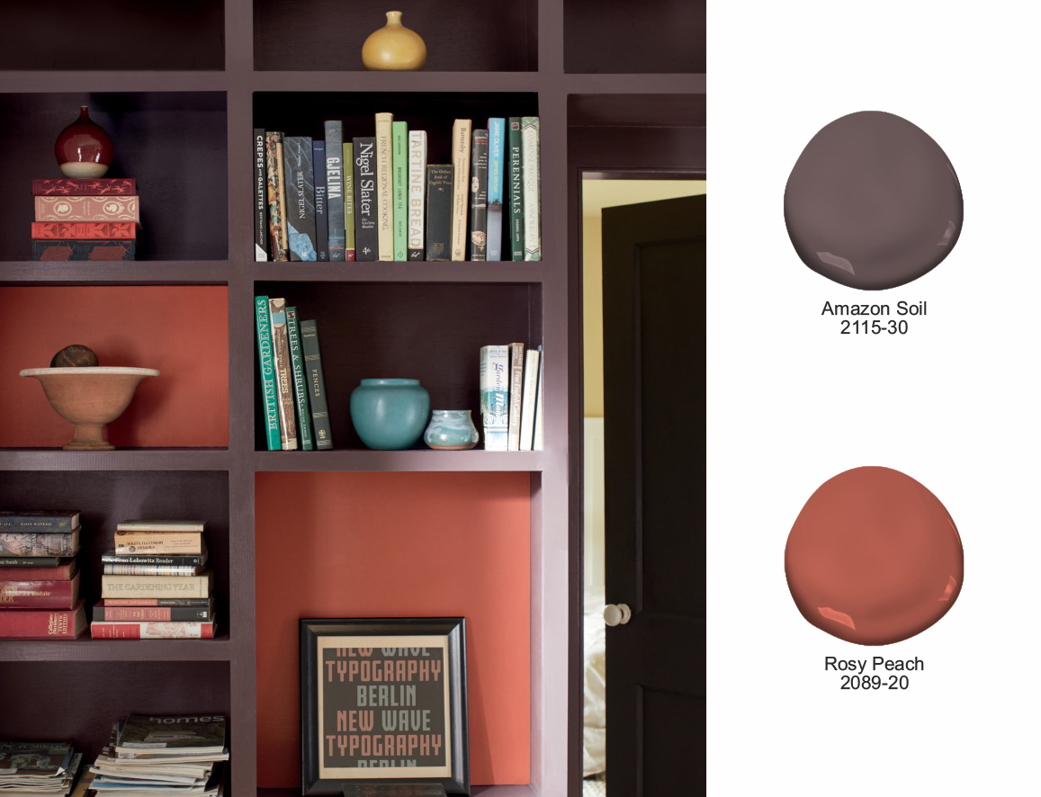
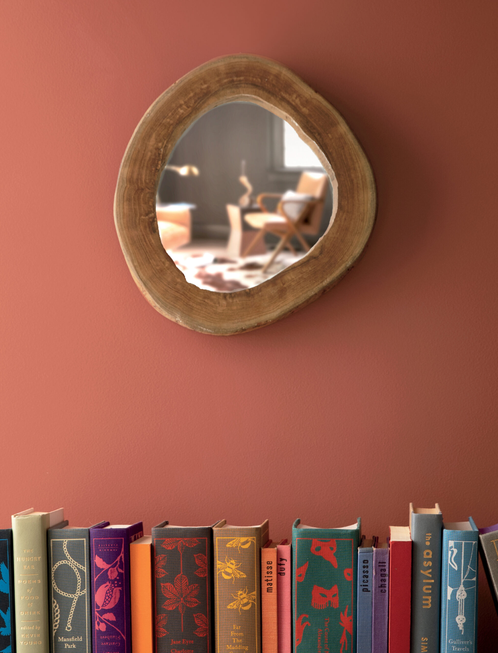
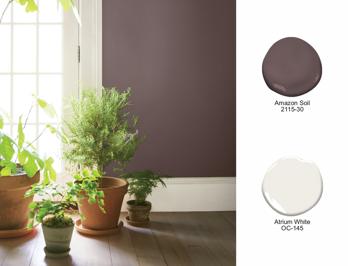
Na fotografii powyżej regał z książkami oraz przedmiotami podkreślają odcienie z nowej palety - „Amazon Soil 2115-30” nadaje głębi, a „Rosy Peach 2089-20” przywołuje na myśl odcień naturalnej gliny.
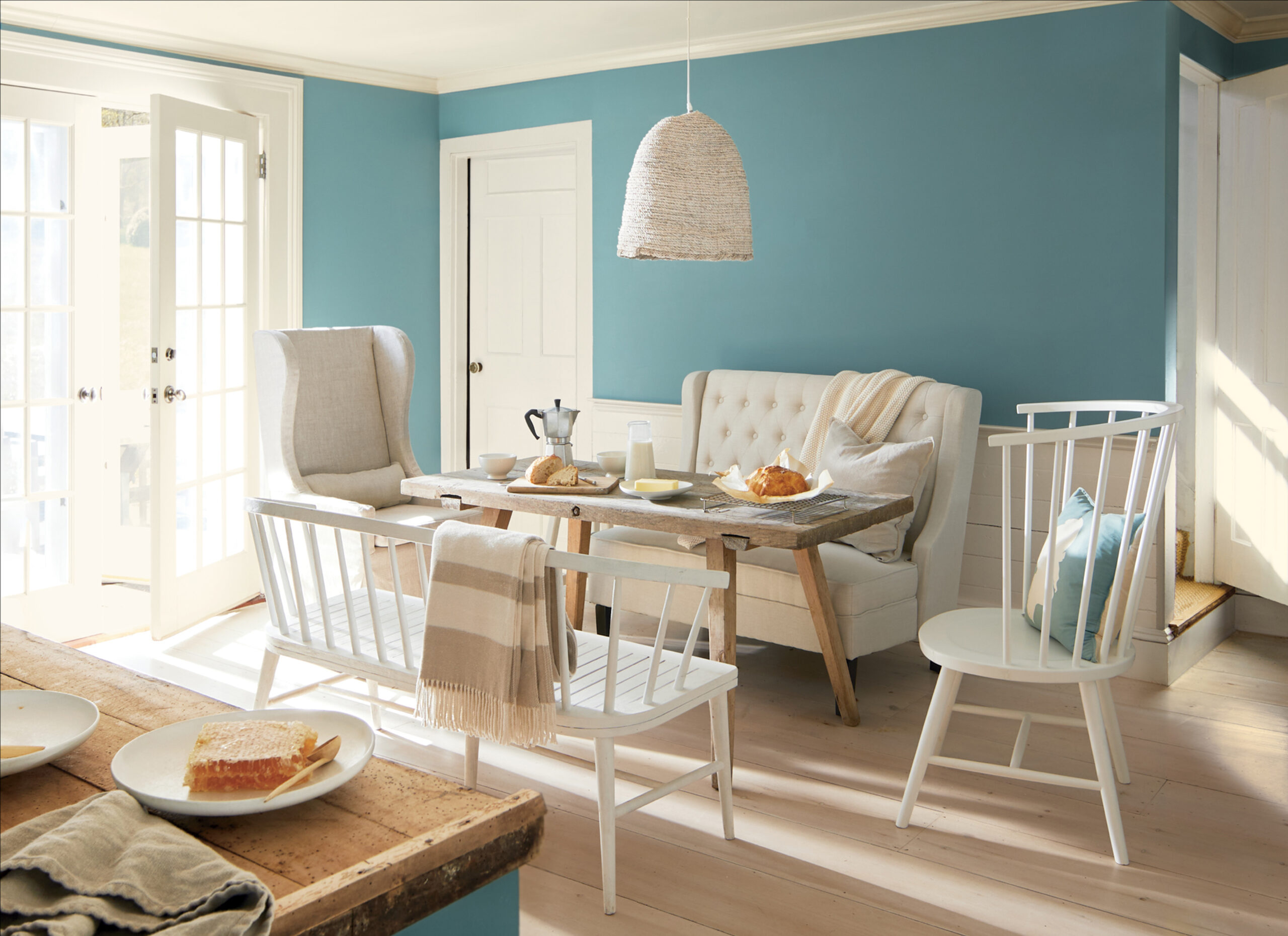
LICZĄ SIĘ RELACJE i KOLORY...
Następnie dostrzegłyśmy dom jako miejsce, w którym nieustannie kultywujemy i pielęgnujemy relacje, doświadczenia, talenty czy umiejętności, a także przestrzeń, gdzie znajdujemy komfort, rozwijamy kreatywność i odczuwamy dobre samopoczucie.
Można to osiągnąć poprzez dobór odpowiednich kolorów lub innych elementów, które mają dla nas szczególne znaczenie.
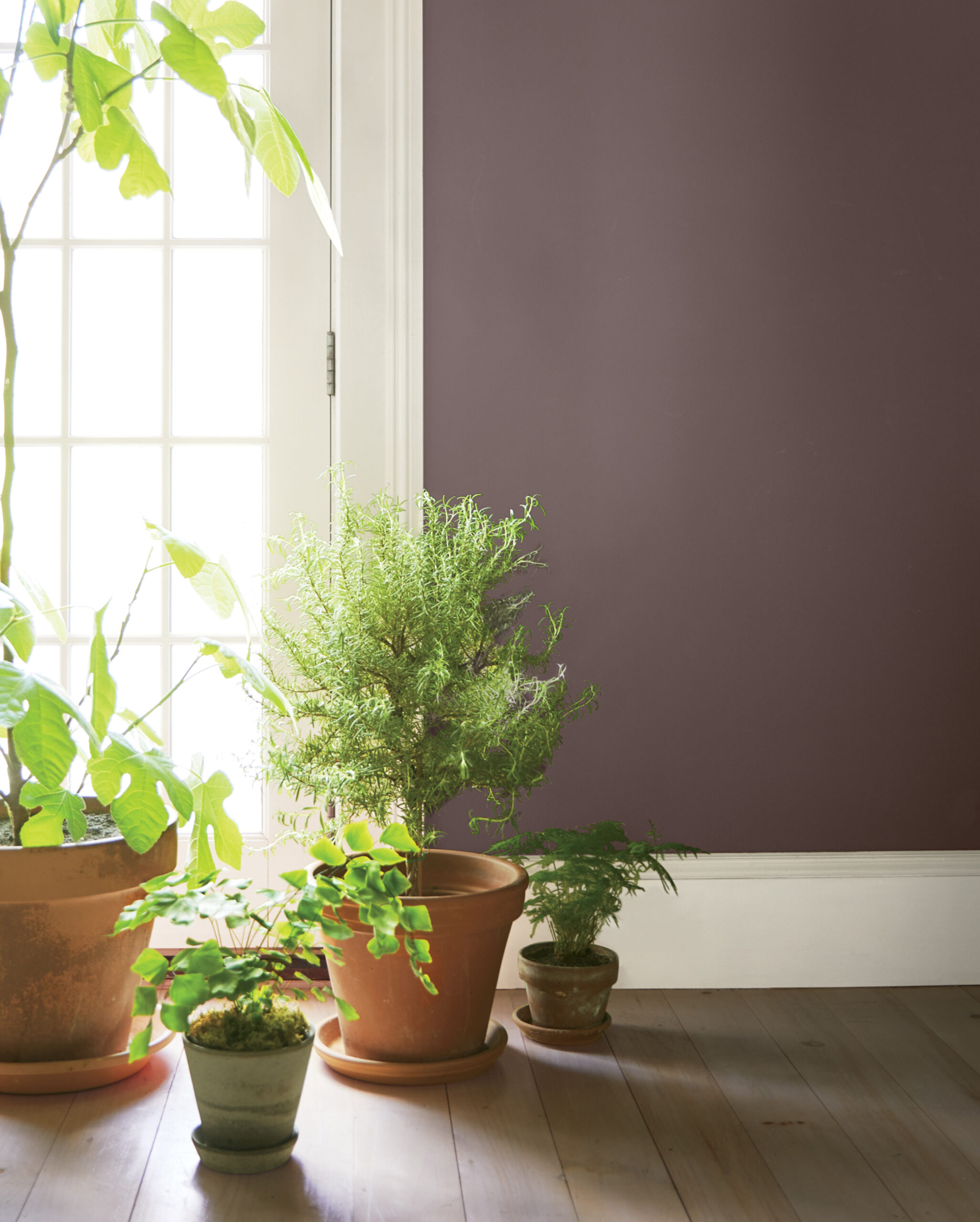
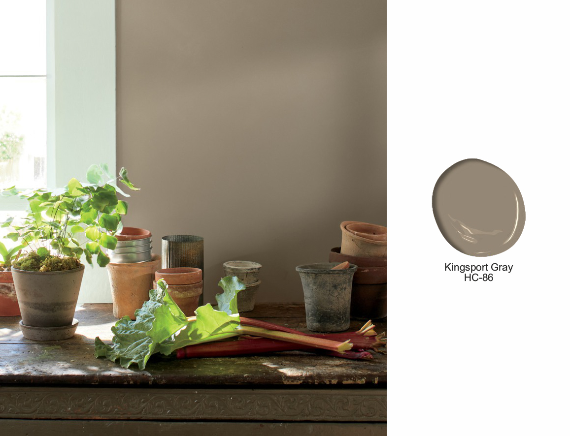
Zobaczcie, jak ściany w odcieniu „Kingsport Grey HC-86” doskonale komponują się z szarością na tle świeżych, zielonych liści ziół i roślin.
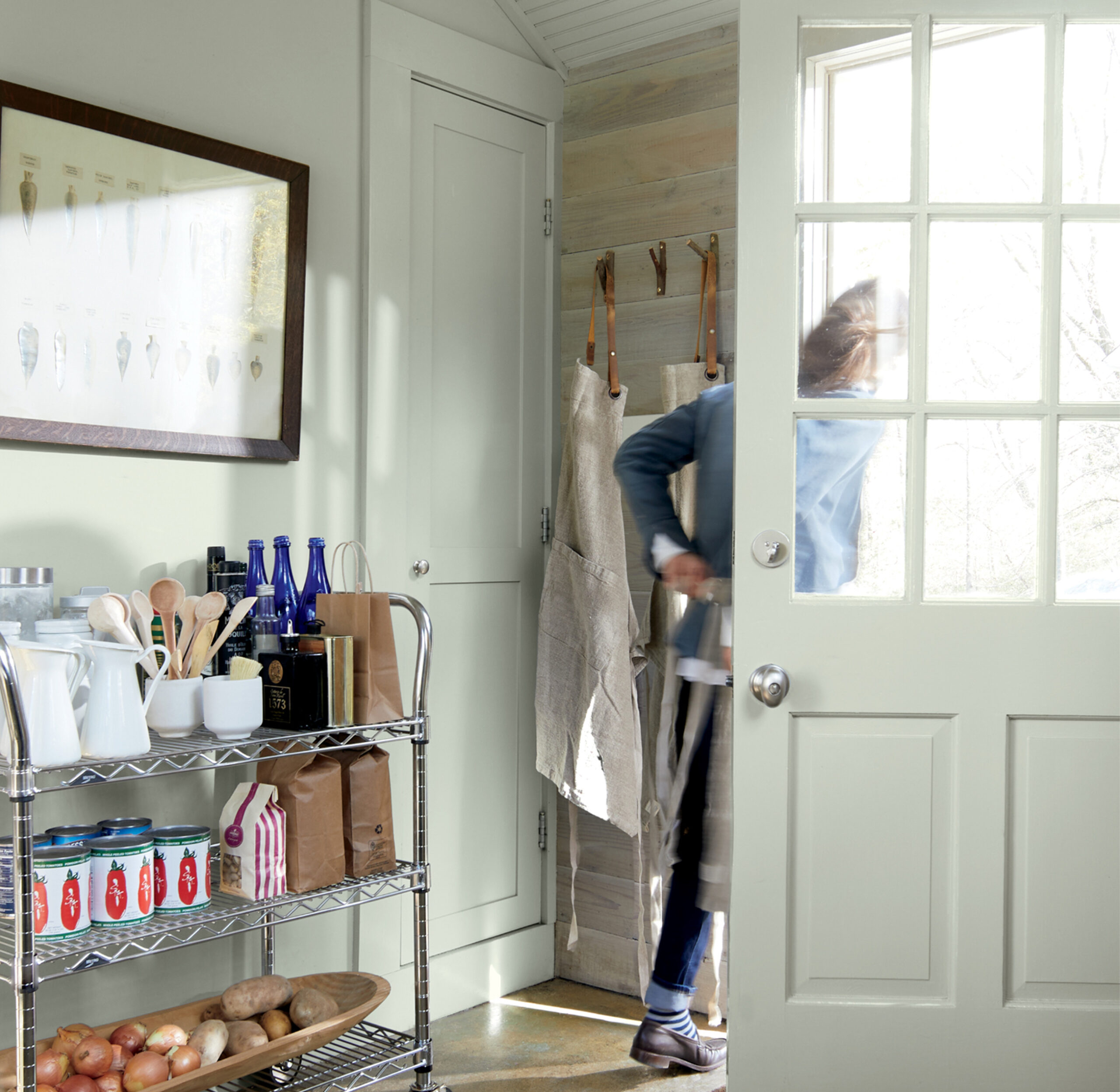
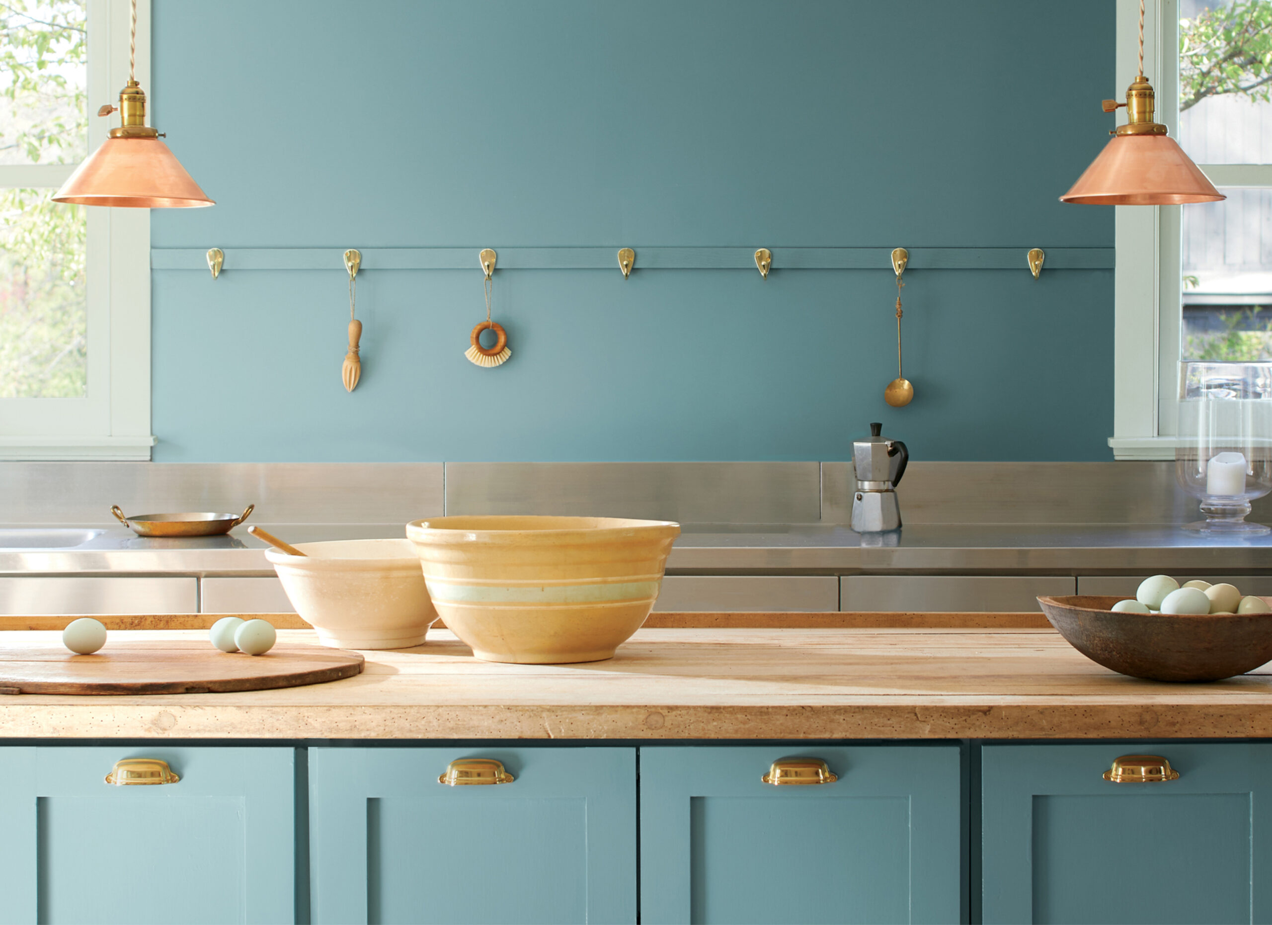
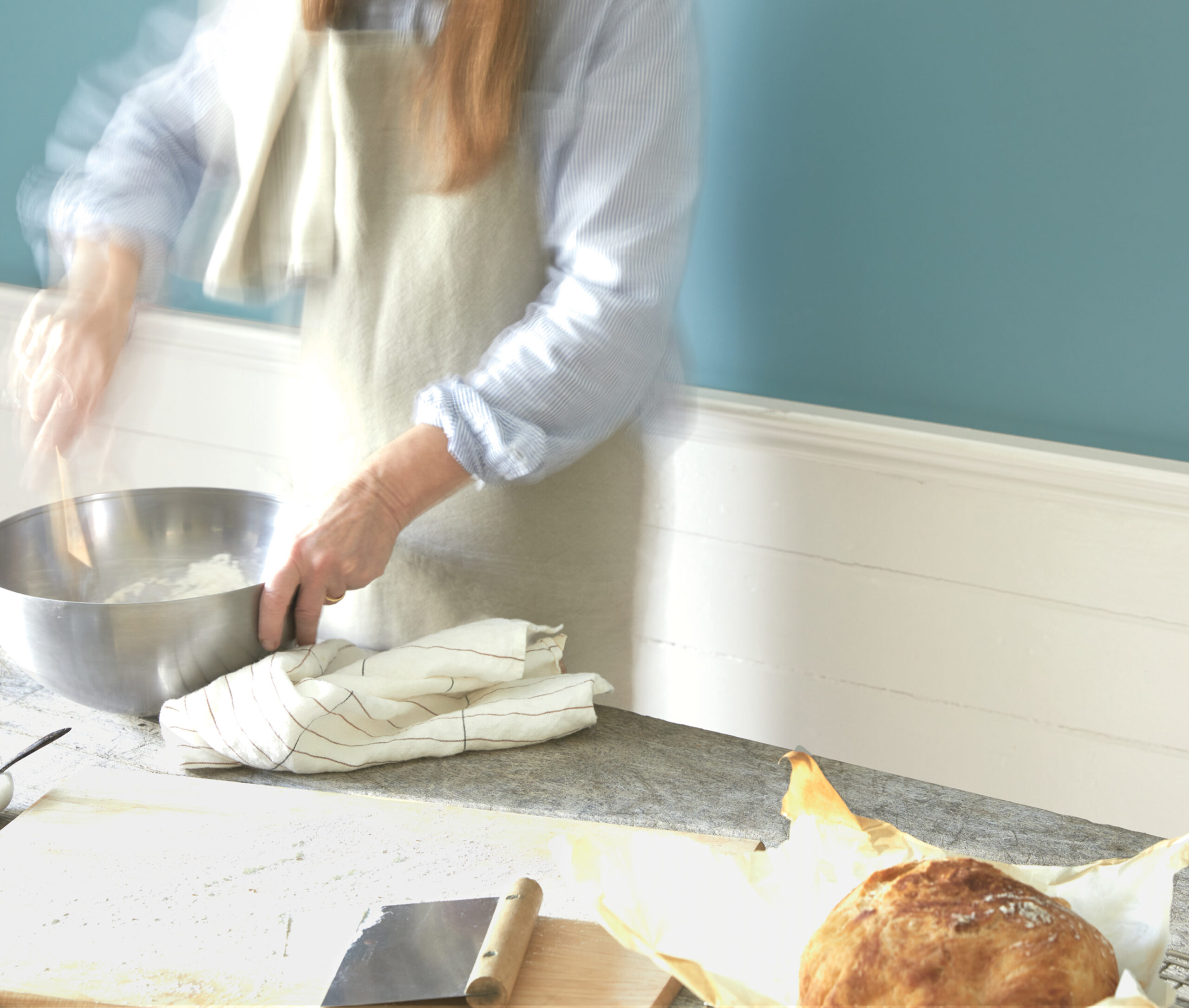
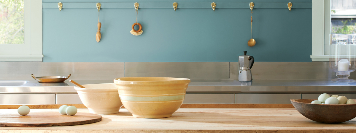
Trzecim elementem całej koncepcji na rok 2021 jest kuchnia, która oprócz zasadniczej funkcji przygotowywania potraw, stanowi również połączenie rzemiosła i społeczności. Ostatnio również nauki i pracy.
Paleta „Color Trends 2021" opiera się na odcieniach „organicznych”, bardzo przydatnych w kuchni, a Kolor Roku 2021 „Aegean Teal 2136-40" okazuje się idealnym wyborem nie tylko dla ścian, ale także mebli. Kuchnia przywołuje na myśl niezapomniane chwile spędzone w gronie rodziny i bliskich przyjaciół, a kolory ścian tworzą dla nich swego rodzaju scenerię.
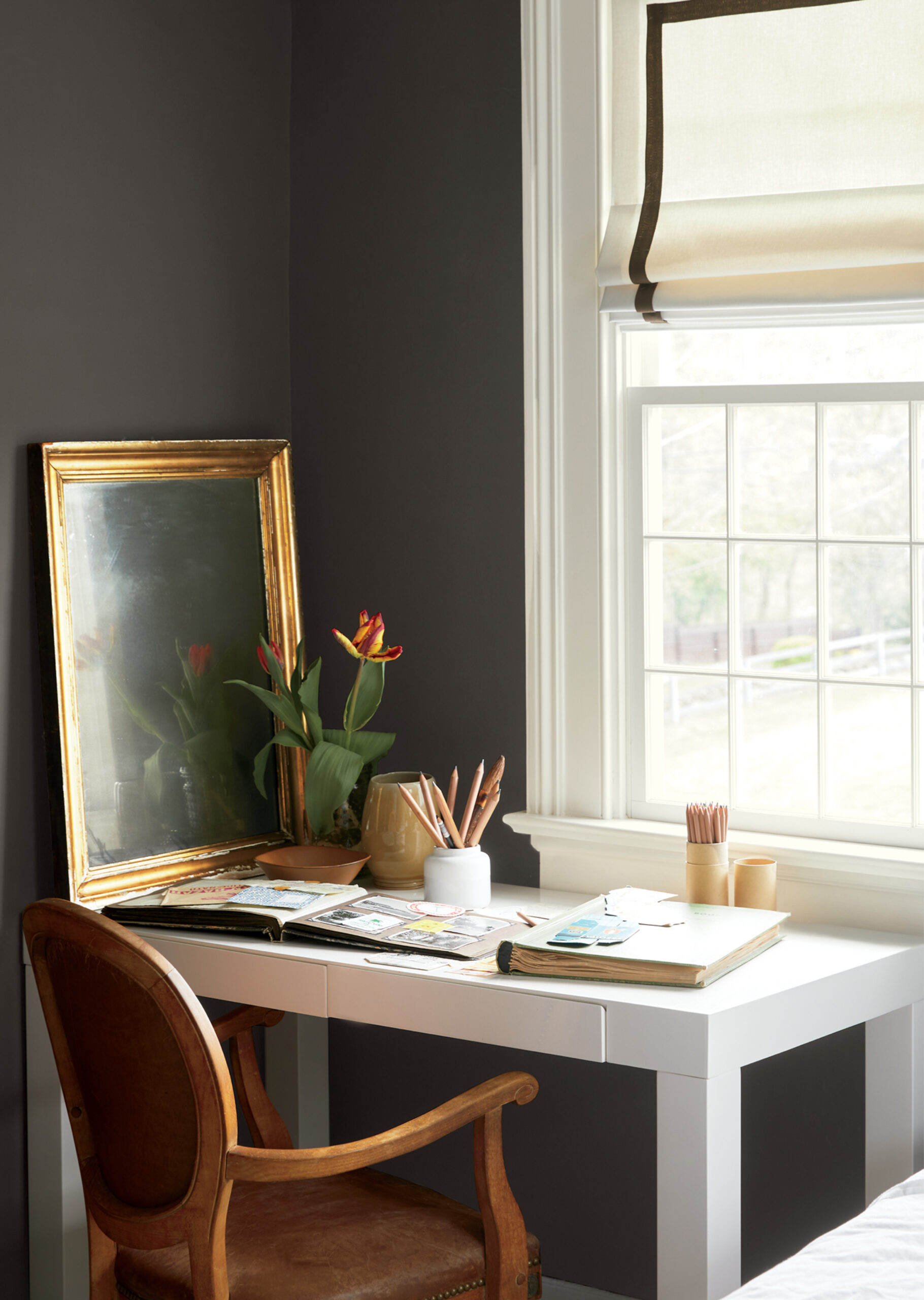
DOMOWE BIURO...
Z kuchni przechodzimy przez inne części domu, które ze swobodnym wdziękiem prezentują kolory z palety 2021, idealnie wpisujące się w dążenie do stabilności i równowagi. Stanowią odpowiedź na potrzebę tworzenia pięknych przestrzeni.
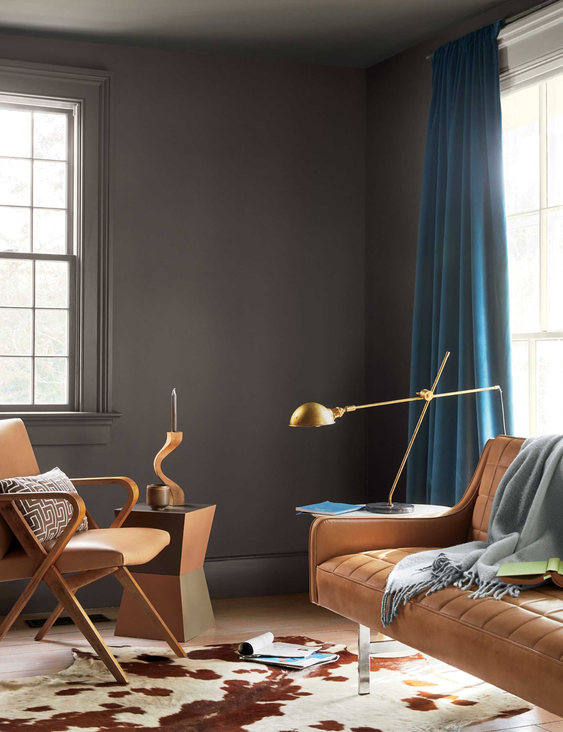
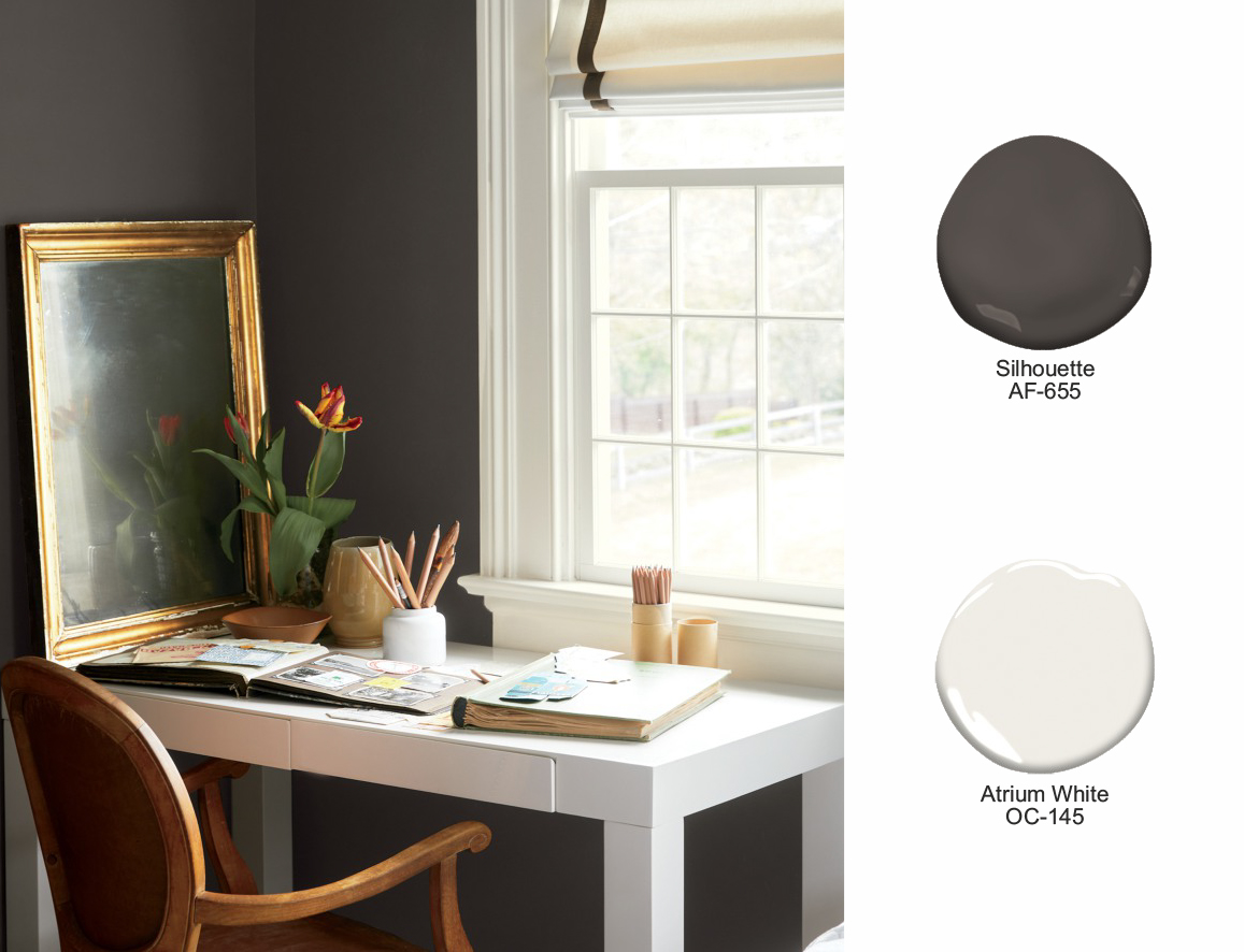
Wiele uwagi poświęcono „biurom domowym”. Na fotografii po lewej stronie widzimy odcień „Silhouette AF-655", łączący głęboki brąz i szarość, który pięknie kontrastuje z ciepłymi akcentami w kolorze „Atrium White OC-145”.
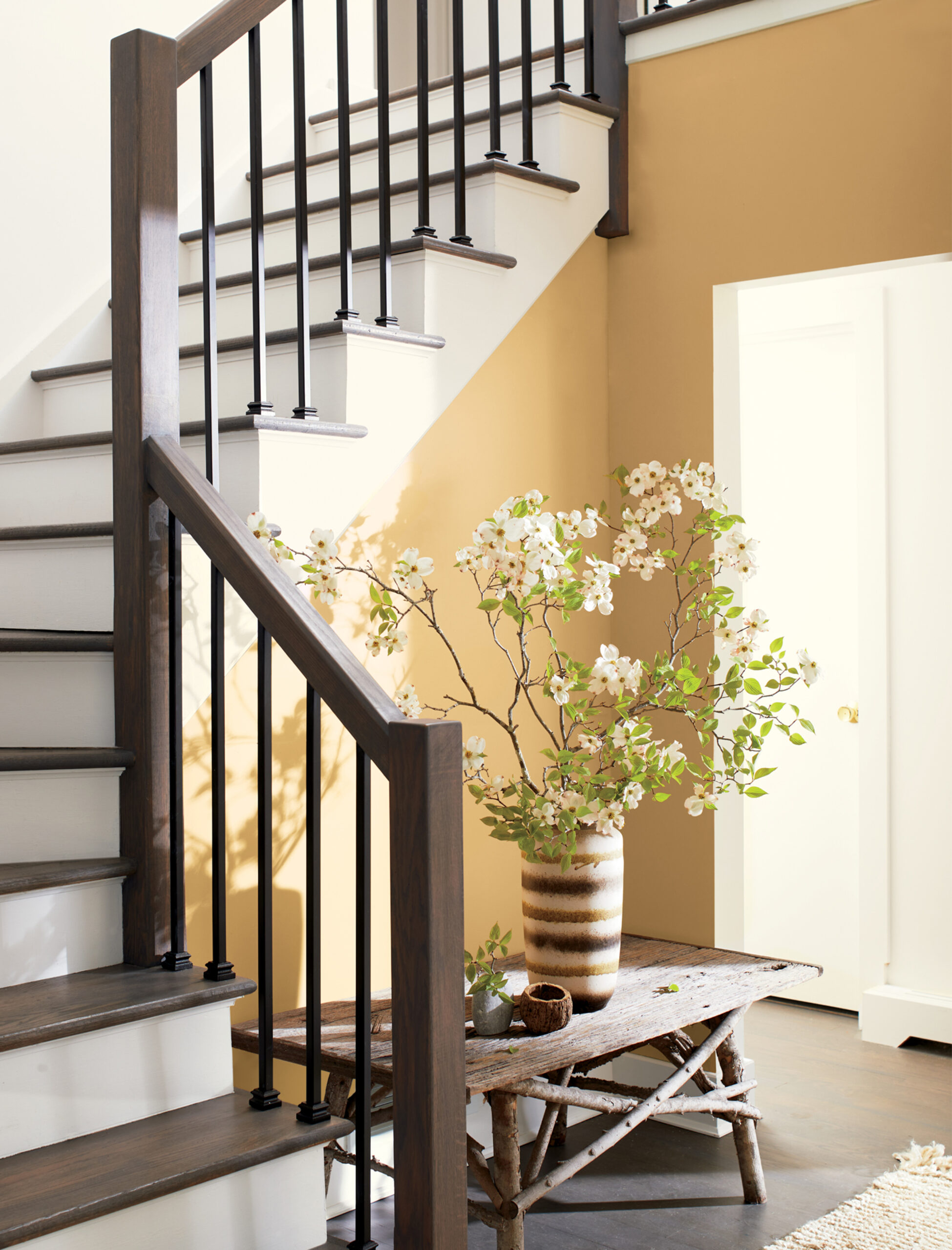
PRZYJAZNE POWITANIE...
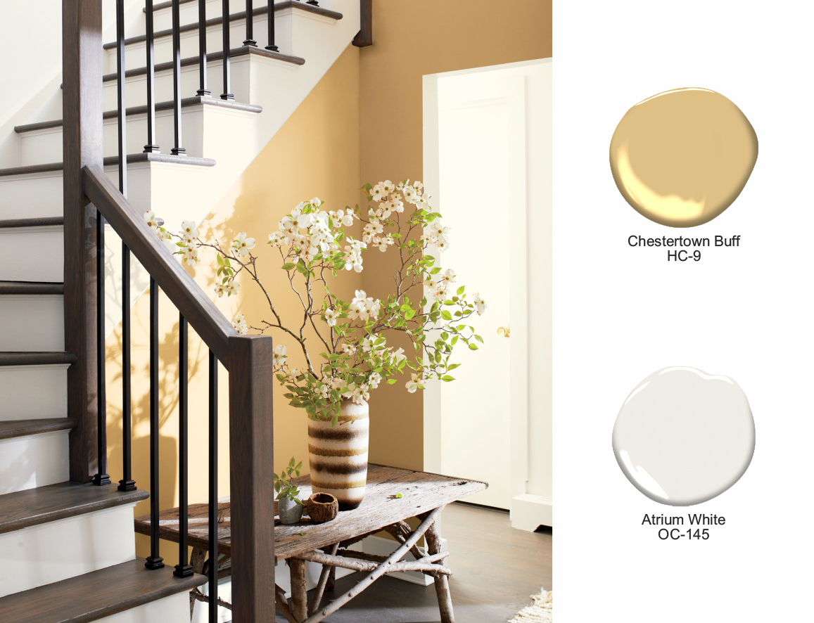
Wchodząc do tego domu, wita nas „Chestertown Buff HC-9”, ciepły złoty odcień z niezawodnej kolekcji „Historical Colors”.
W tym zestawieniu „Chestertown Buff” pełni rolę ciepłego akcentu kolorystycznego i świetnie komponuje się z „Atrium White OC-145” oraz ciemnobrązową podłogą i schodami. Całość dopełnia dostojny „Amazon Soil 2115-30”.
Podsumowując, paleta „Color Trends 2021” i „Color of the Year 2021” skłania do refleksji i „zresetowania”.
Kolory inspirowane eleganckimi, ręcznie wytwarzanymi materiałami obecnymi w naszych domach, zapewniają poczucie komfortu i podnoszą mieszkańców na duchu.
„Aegean Teal" odzwierciedla nowy sposób myślenia, który zachęca nas do wykorzystywania emocjonalnych i fizycznych reakcji na kolor podczas metamorfoz naszych wnętrz.