COLOR TRENDS 2025
Starting point…
As Color Team members looked at the transition from Color Trends 2023, Color Trends 2024 and now Color Trends 2025, this idea of quietly colorful hues came to the forefront quickly.
Throughout travels and tradeshows like Maison Objet, “Color Trends Hunters” saw a more comforting and cozier take on the saturated color story they had seen in previous years.
Undertones and nuanced hues…
The overall mood and direction of the palette stayed consistent throughout Color Team’s discussions - colors shifted in and out as they tried to find the perfect balance and synchronicity among the hues.
But from the beginning Color Hunters knew they wanted to tell the story of undertones and more nuanced hues.
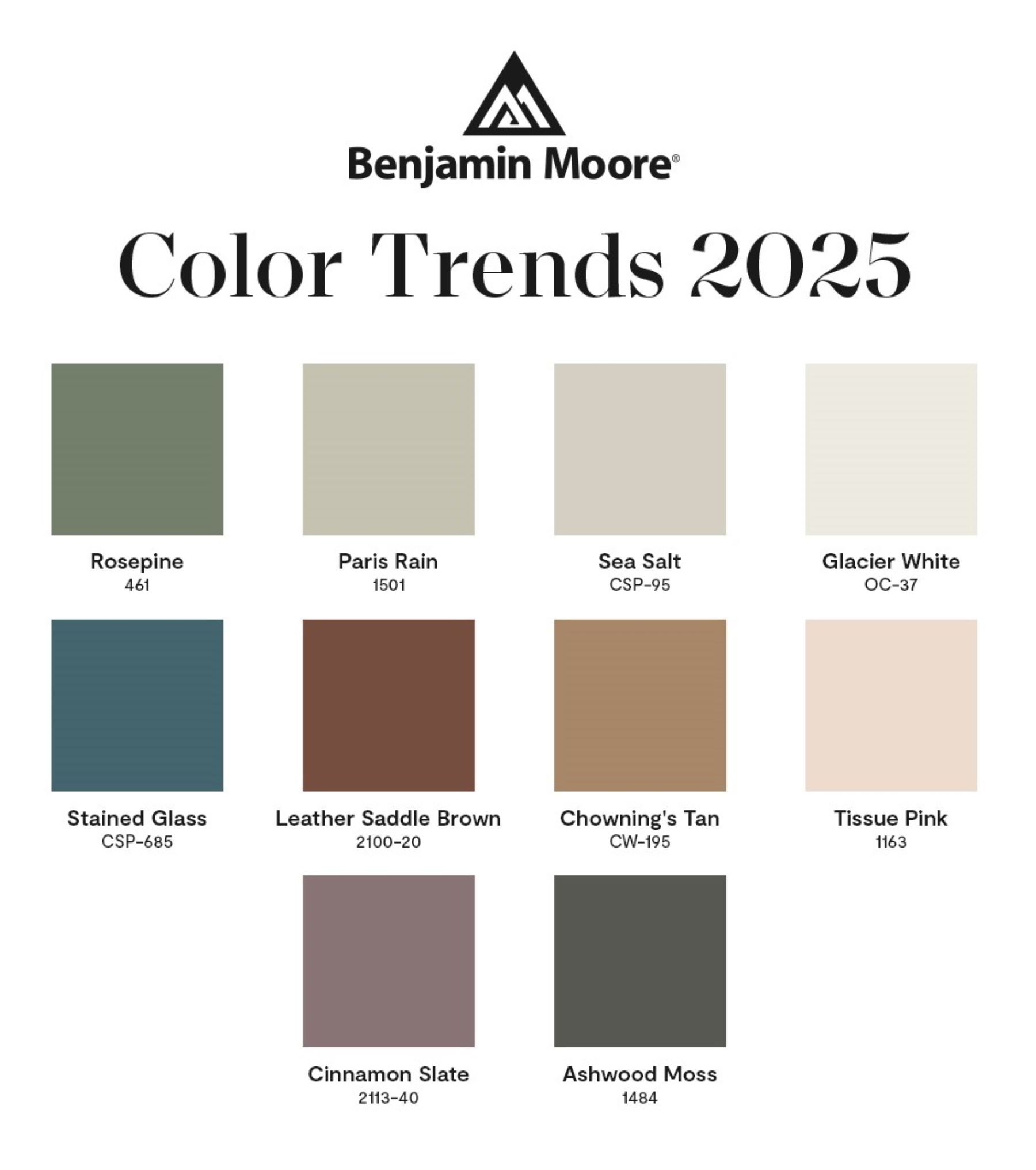
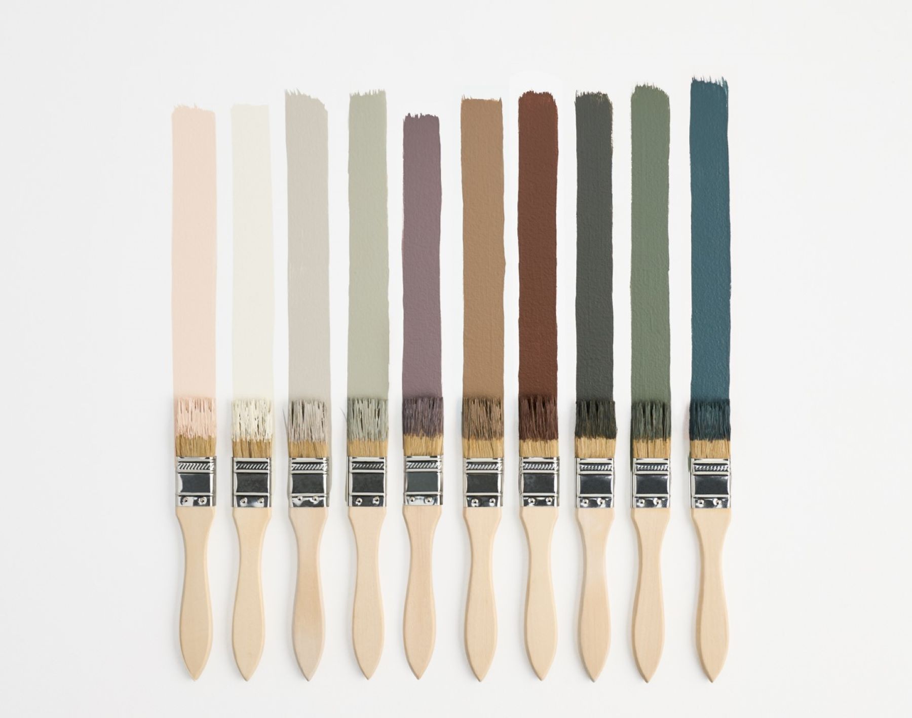
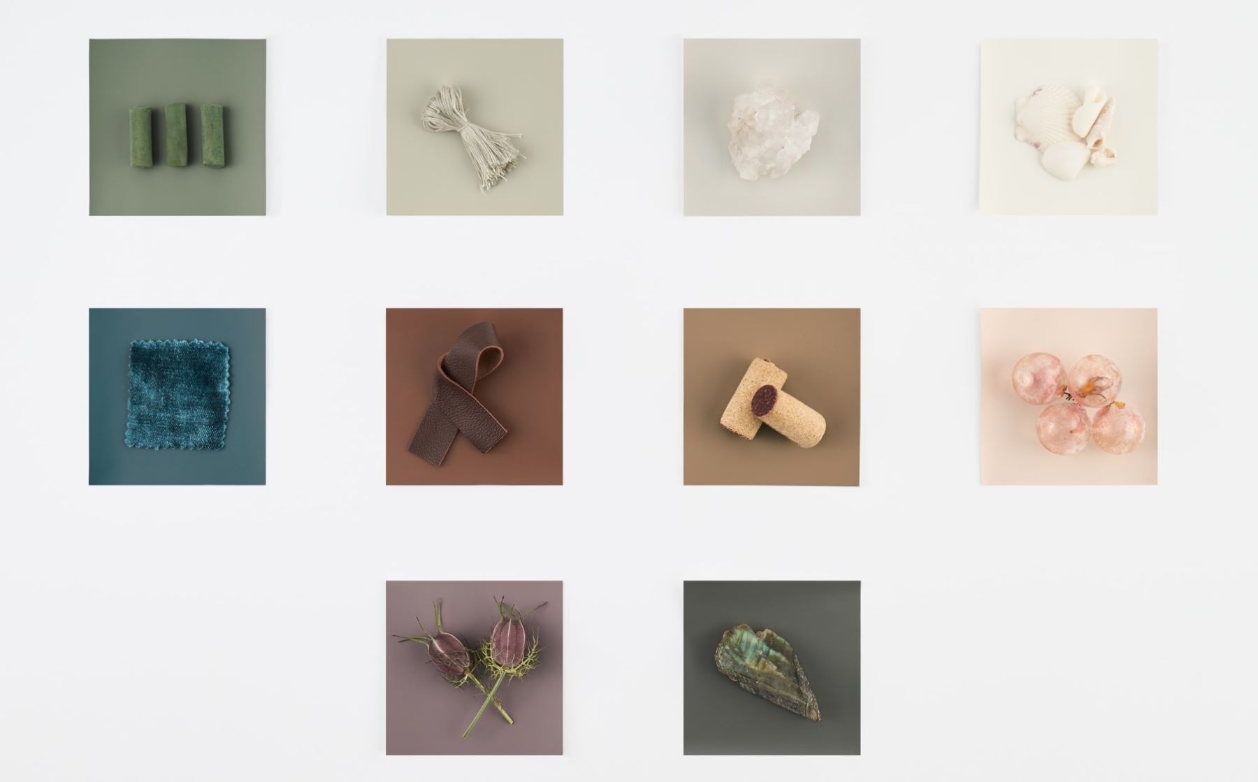
This led Color Team to our Color Trends 2025 palette, ten hushed hues that are unassuming, but still present:
„Cinnamon Slate 2113-40” (COLOR OF THE YEAR 2025), „Sea Salt CSP-95”, „Leather Saddle Brown 2100-20”, „Chowning’s Tan CW-195”, „Tissue Pink 1163”, „Stained Glass CSP-685”, „Ashwood Moss 1484”, „Rosepine 461”, „Paris Rain 1501” and „Glacier White OC-37”.
TRENDS 2025 up close...
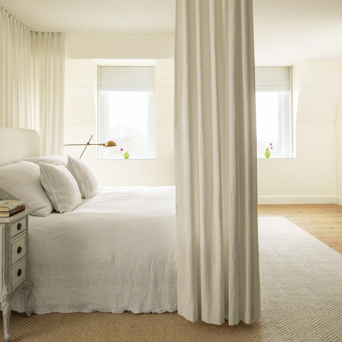
Let’s start with the more neutral side of the palette – „Glacier White OC-37„, „Sea Salt CSP-95„, „Paris Rain 1501„, and „Tissue Pink 1163„.
At first glance these hues may look straightforward or even simple. But as you work with the colors and begin to see them in context, you understand the capabilities and versatility of these hues.
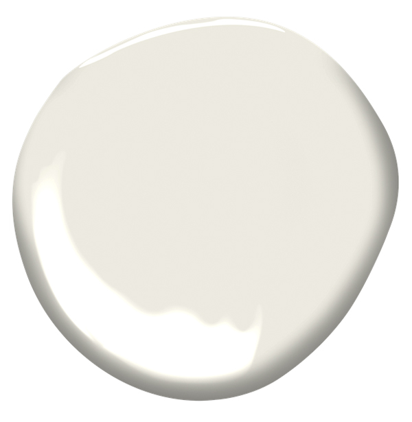
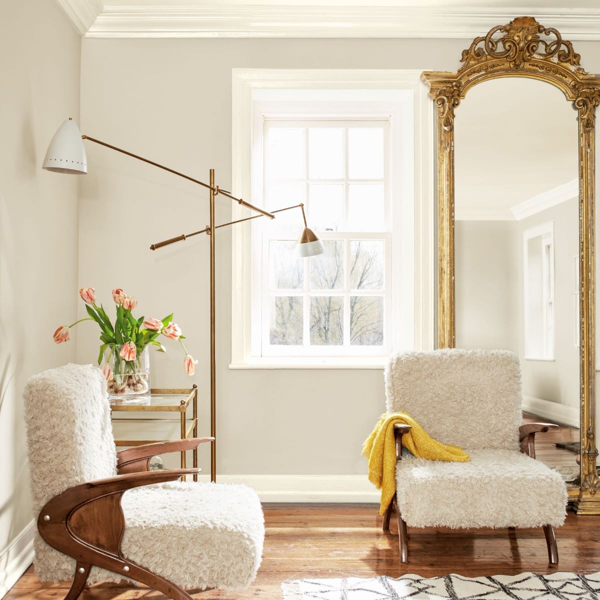
„Glacier White OC-37„ is a soft and serene off-white.
It has just the right amount of depth to prevent it from looking too sterile and cold. With the slightest hint of cream, it makes a space feel fresh but still inviting.
By pairing „Glacier White„ with a deep hue like „Ashwood Moss„ it brings contrast and depth to the space.
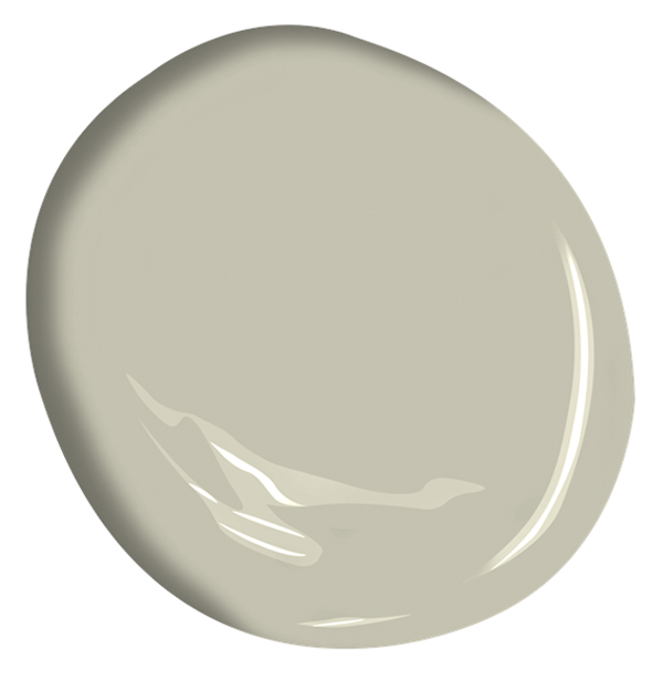
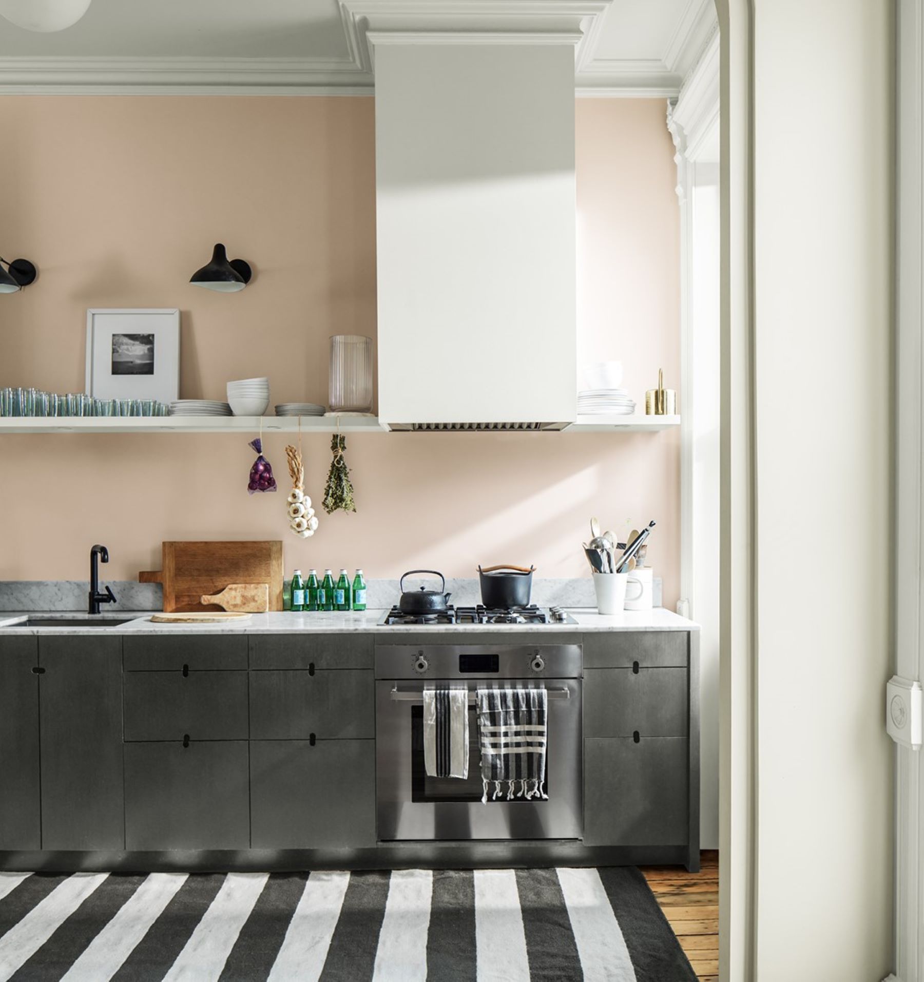
„Sea Salt CSP-95” is a quintessential warm gray. With what feels like equal parts beige and gray, it easily adapts to any space.Because
it is part of our Color Stories Collection, it has a unique formula. Color Stories colors are made with 5-7 pigments instead of the traditional 2-3 pigments and does not use black or gray colorant. This means Color Stories Colors have an accentuated response to lighting, they are going to react more to different lighting conditions.
On the image below „Sea Salt” is shown on all four walls with the lighter, brighter „Glacier White” on the trim and ceiling.
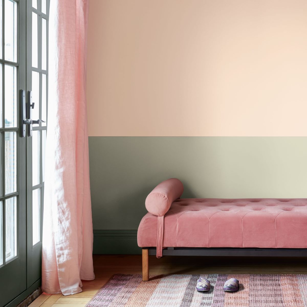
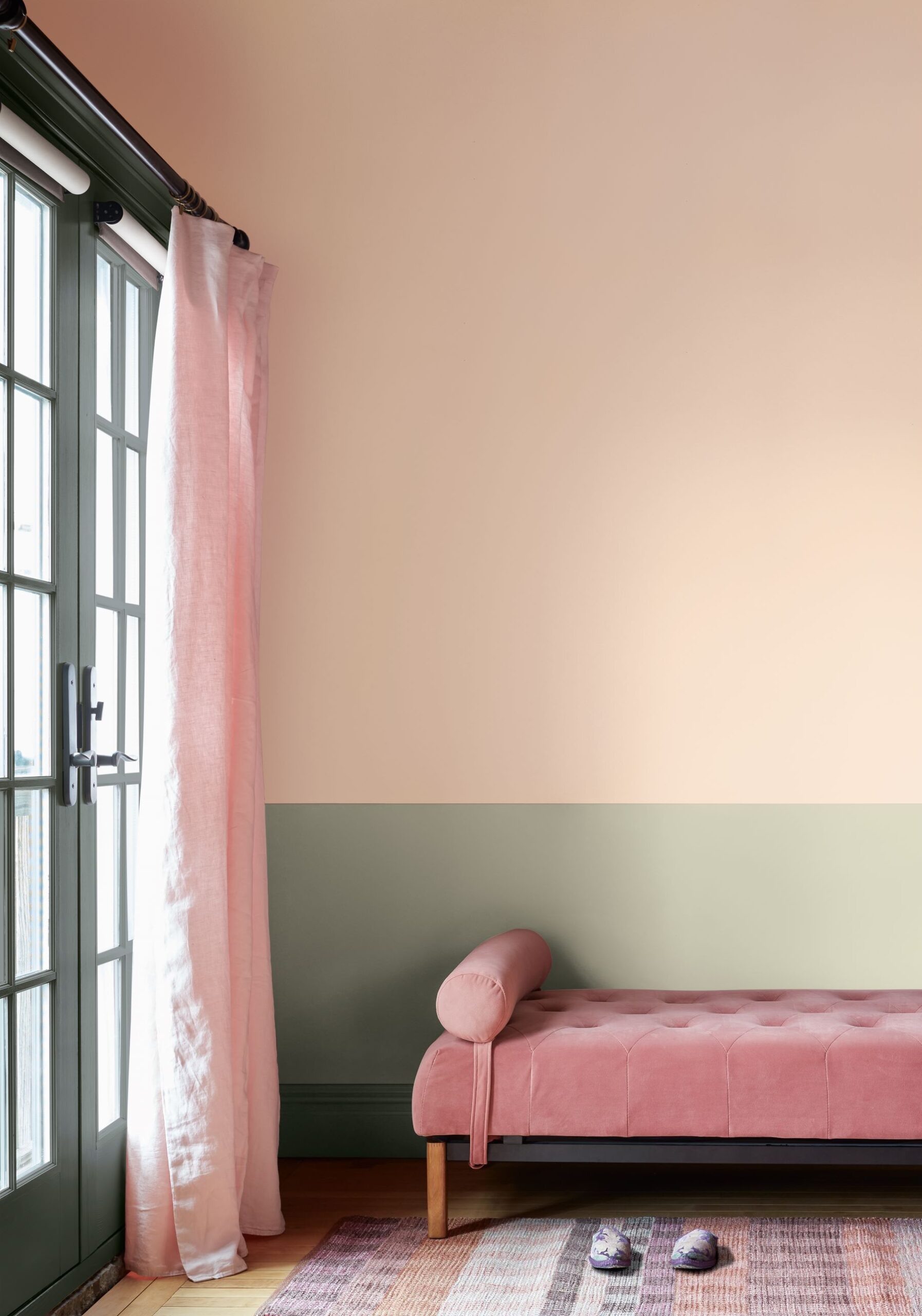
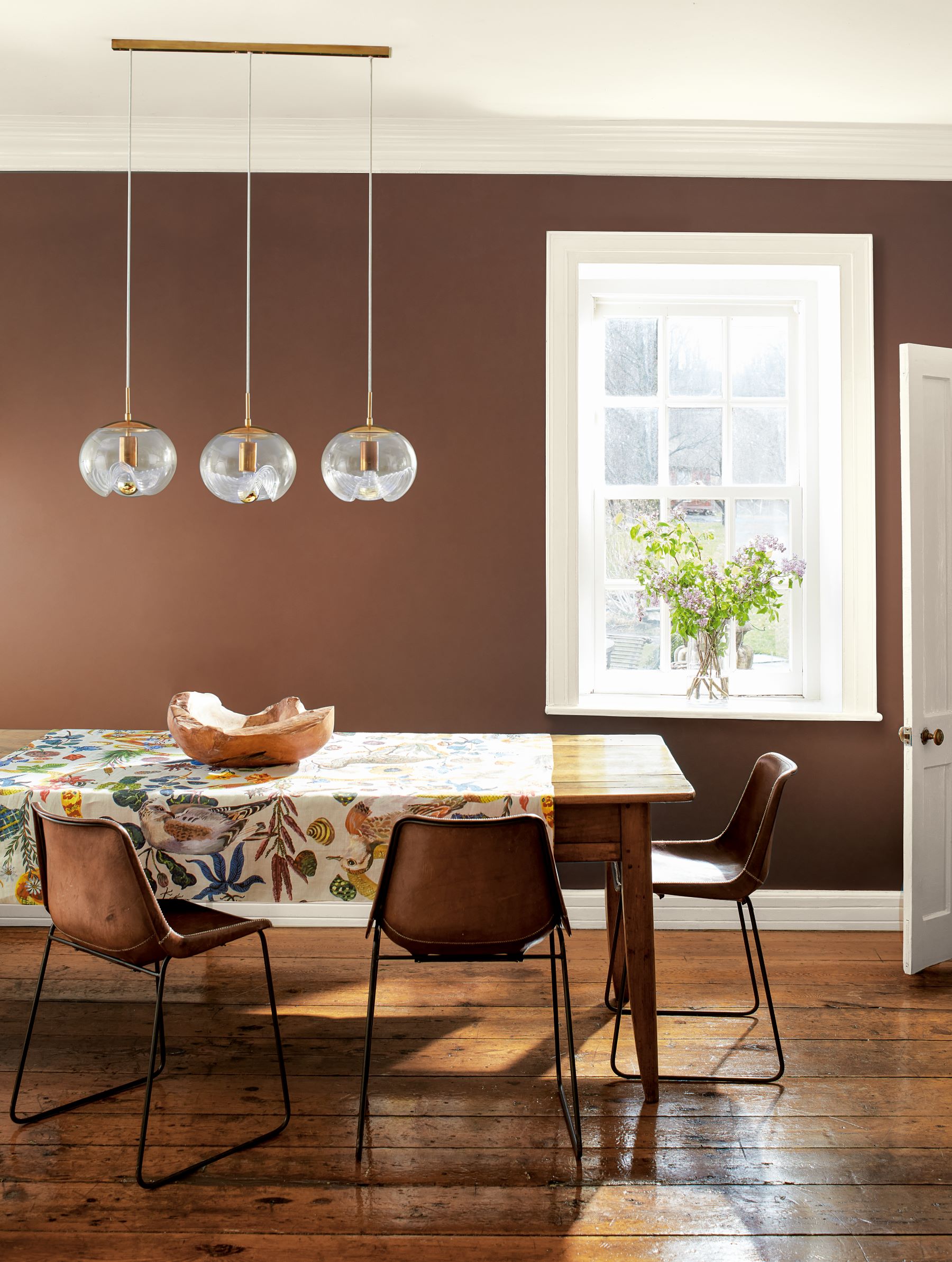
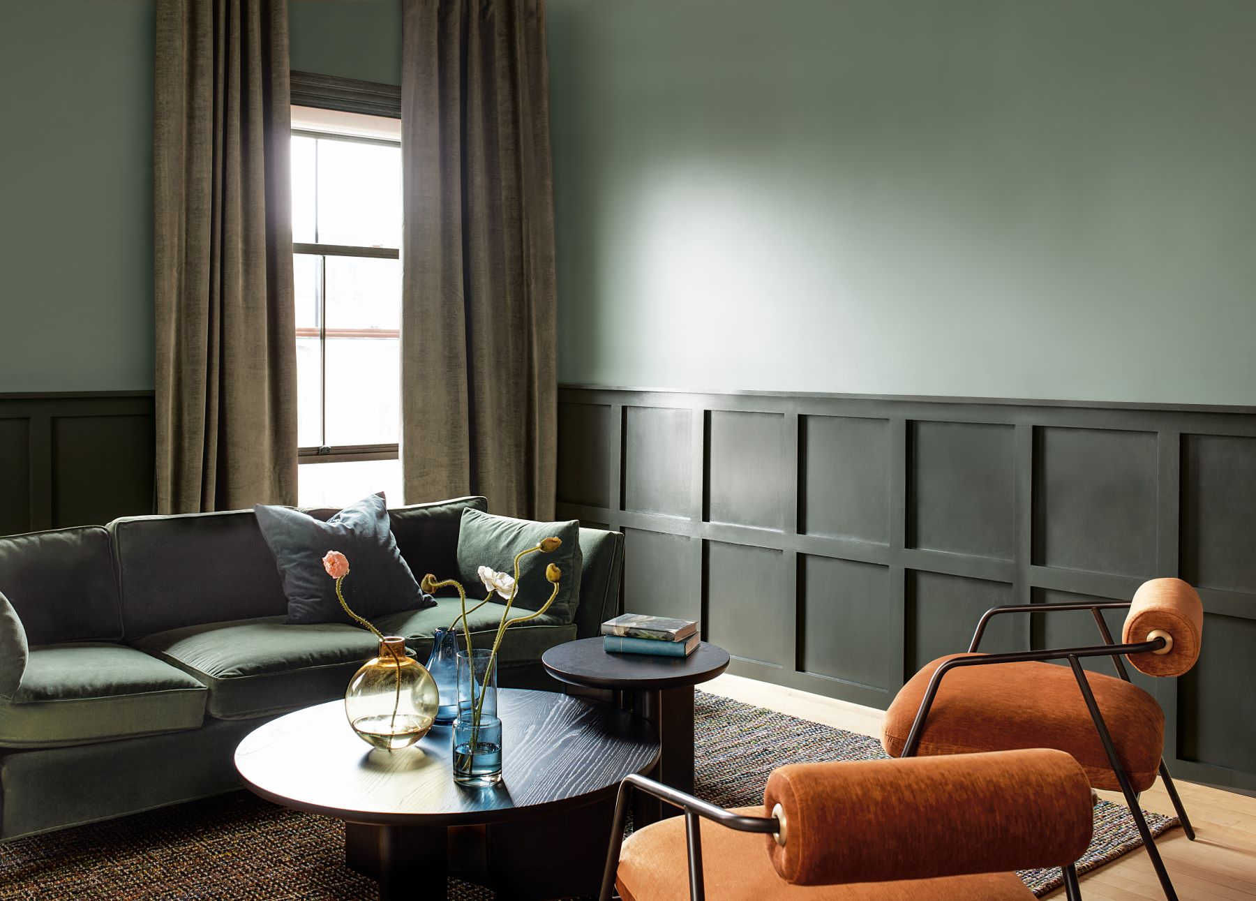
Next, we look at „Paris Rain 1501”. A subtle, but present note of green brings a sense of ease to this hue.
This hue blends the best of both worlds, perfectly exemplifying the versatility of quietly colorful hues.
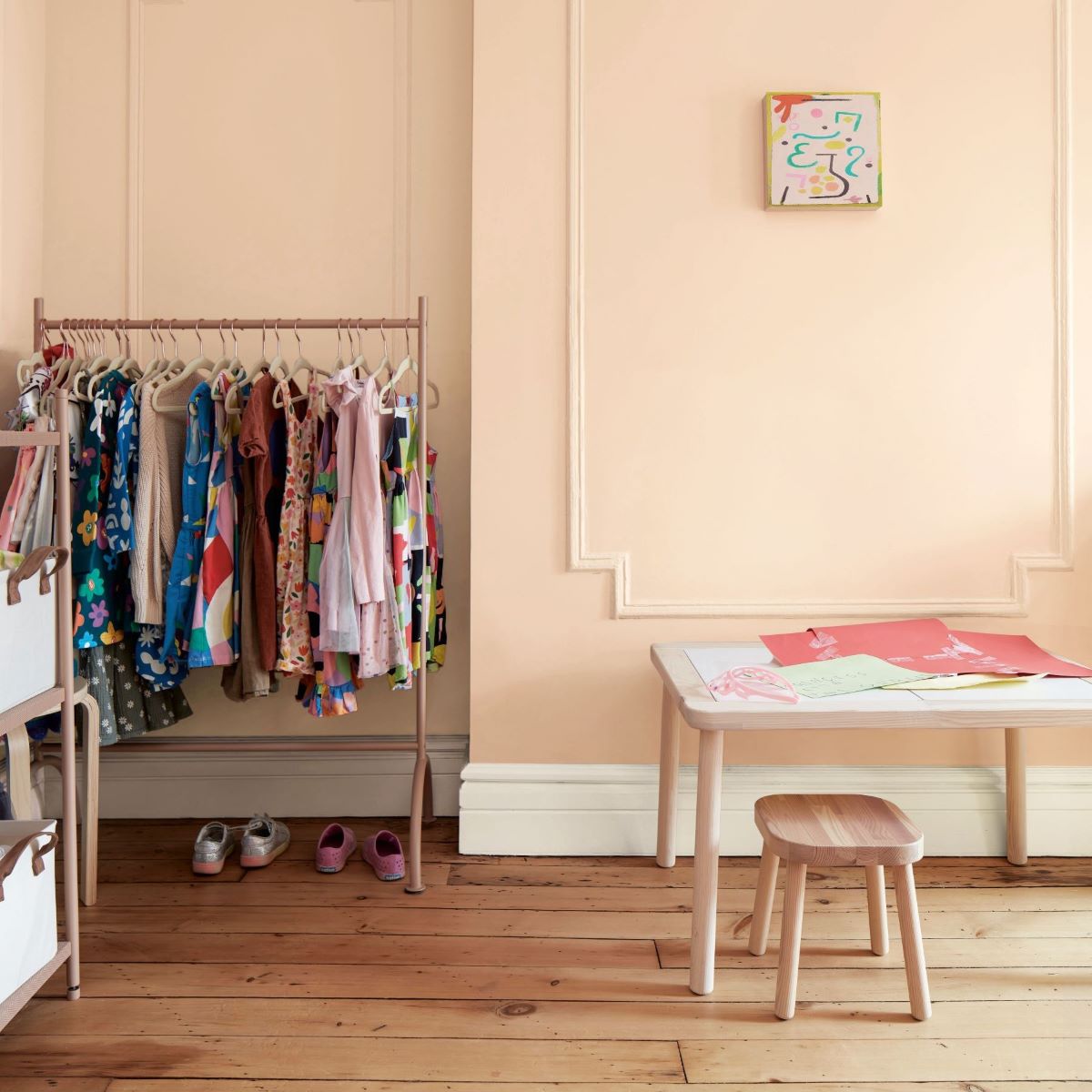
A subtle tint of blush defines „Tissue Pink 1163„.
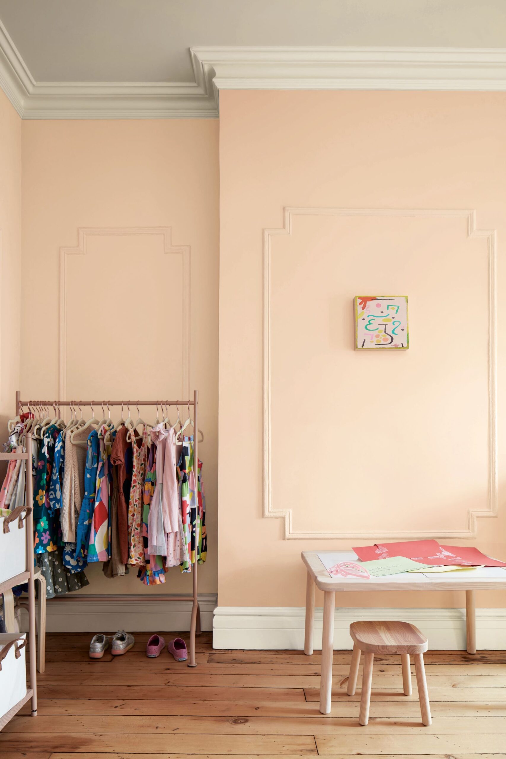
This graceful hue has a flattering cast.
Bring out the pink undertones by pairing it with greens (like „Ashwood Moss” and „Paris Rain”), sages and emerald hues. Or temper it’s rosy disposition by pairing it with violets, reds, and other blushed hues.
It's getting moody...
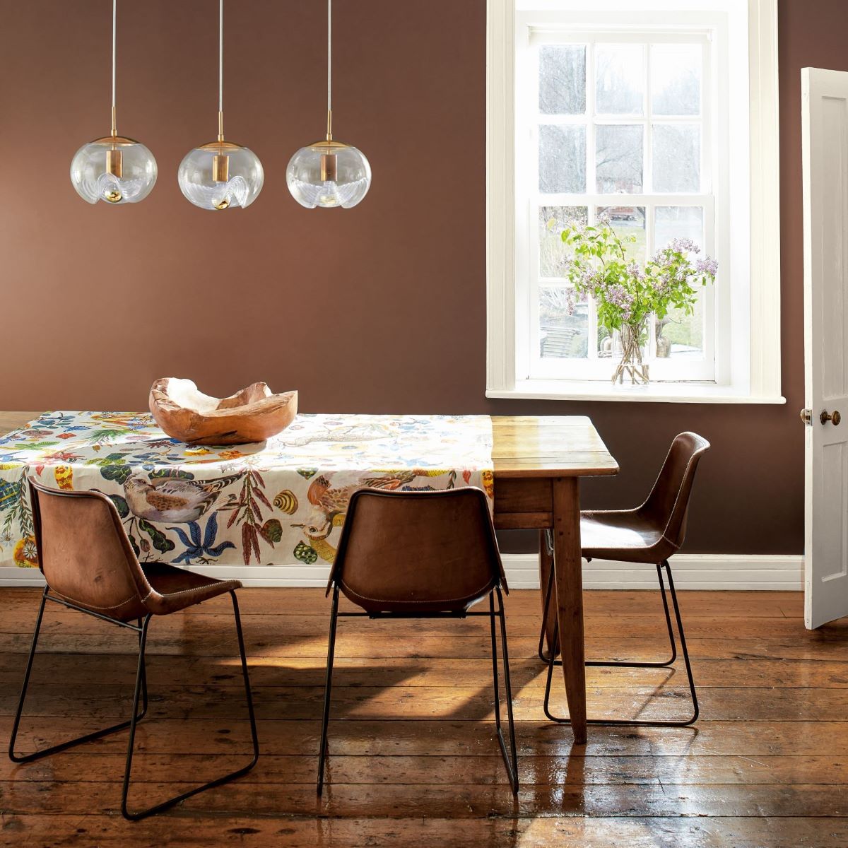
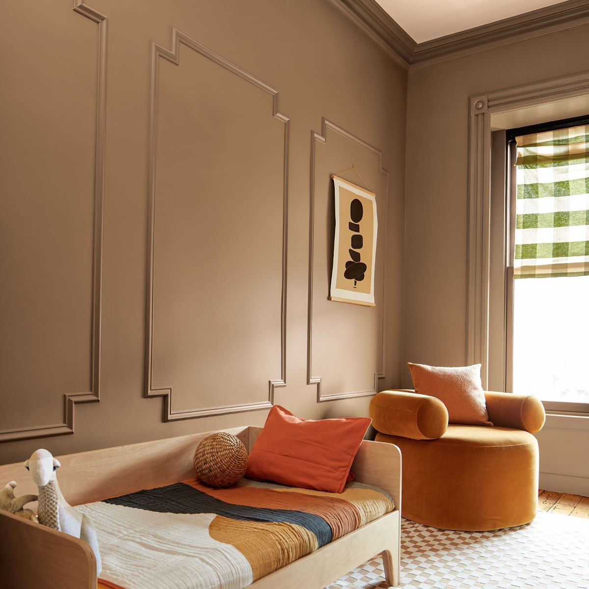
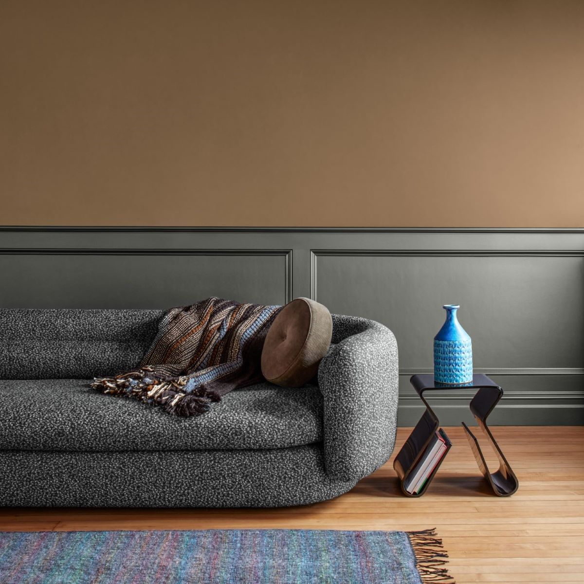
Let’s move into the moodier side of the palette. We start with the browns, „Chowning’s Tan CW-195„ and „Leather Saddle Brown 2100-20„.
Color Hunters have seen this trend towards warmer, cozier hues and nothing epitomizes that quite like the brown color family.
From caramel to leather to chocolatey hues, this versatile color family is gaining traction as a go-to for an easygoing but sophisticated look.
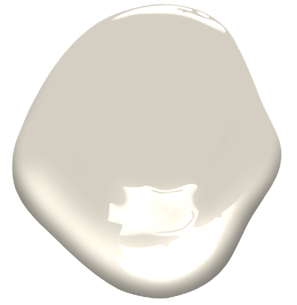
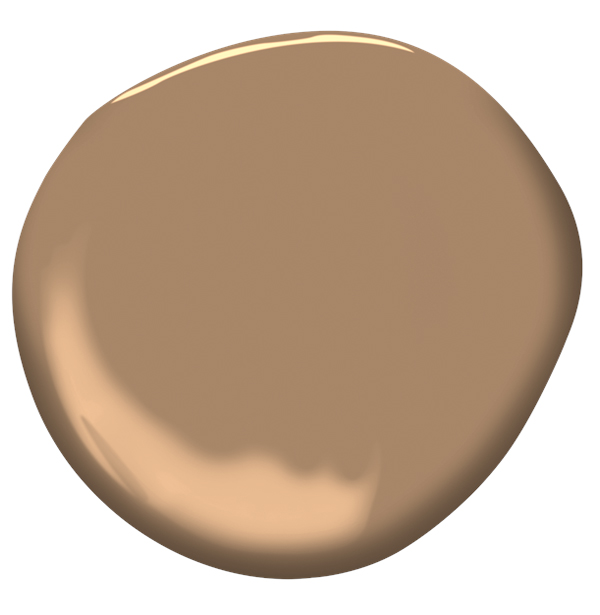
„Chowning’s Tan CW-195„ is more of a midtone that blends orange and brown to make a handsome cidery hue.
It can look more traditional when paired with crisp white trim or more modern when color drenched.
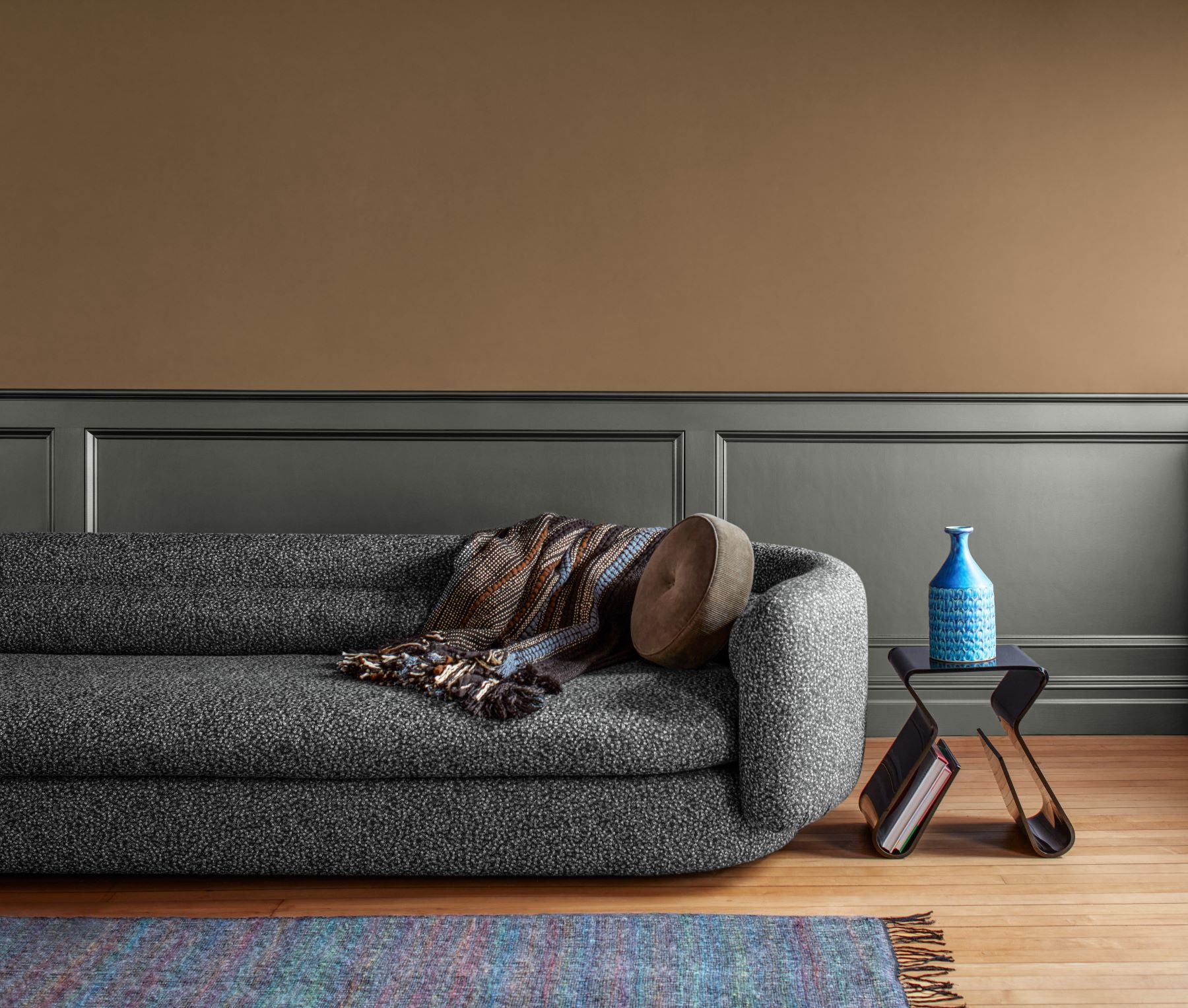
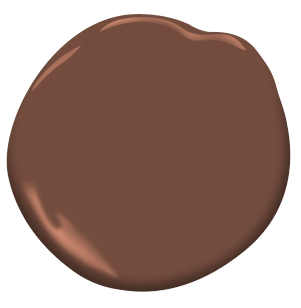
„Leather Saddle Brown 2100-20„ is a richer, more sumptuous color.
With warm notes of red and orange this cozy hue speaks to the growing sentiment towards browns and warmer colors.
We turn up the saturation…
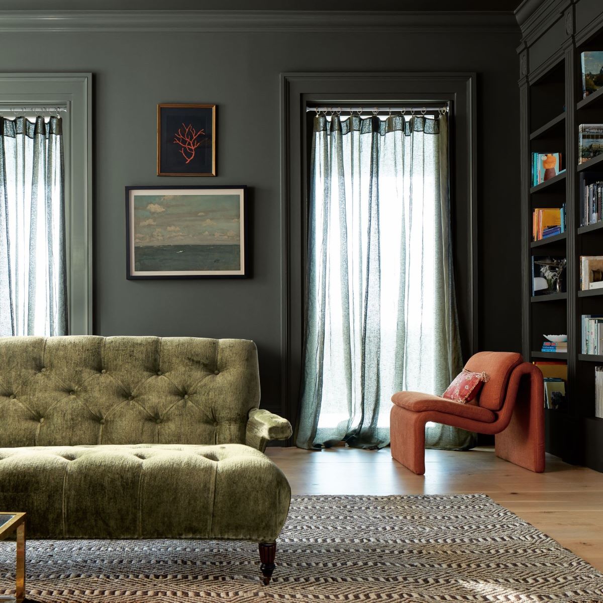
Lastly, we look to the saturated side of the palette with „Stained Glass CSP-685„, „Rosepine 461„, and „Ashwood Moss 1484„.
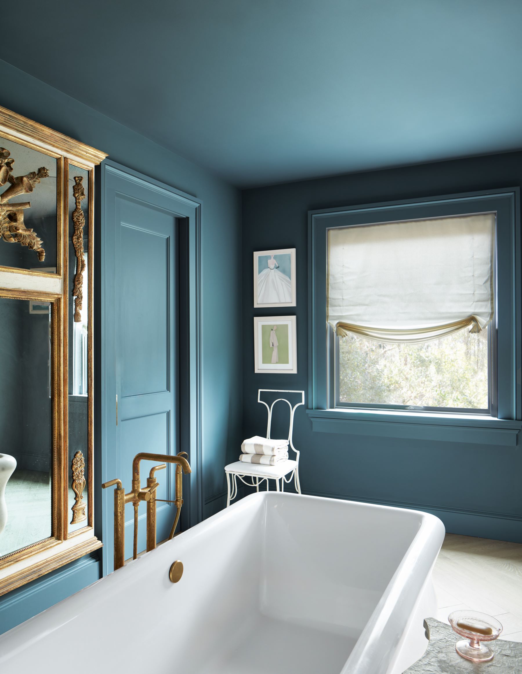
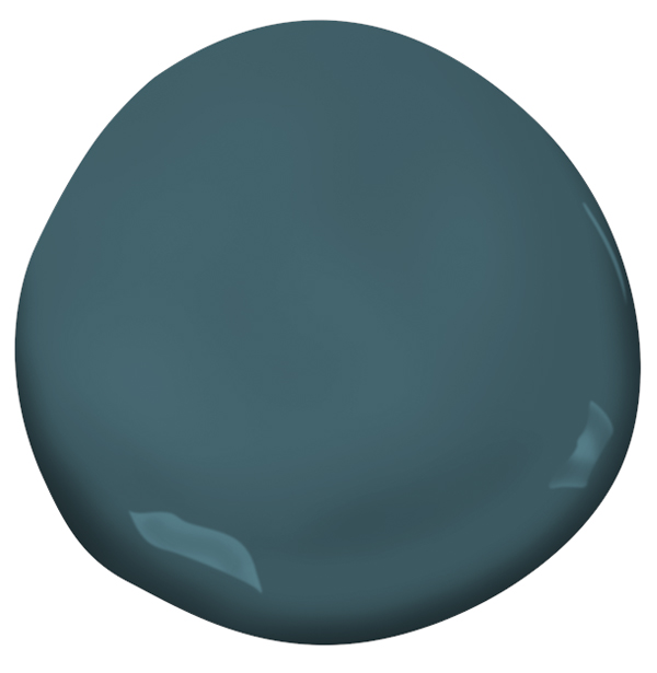
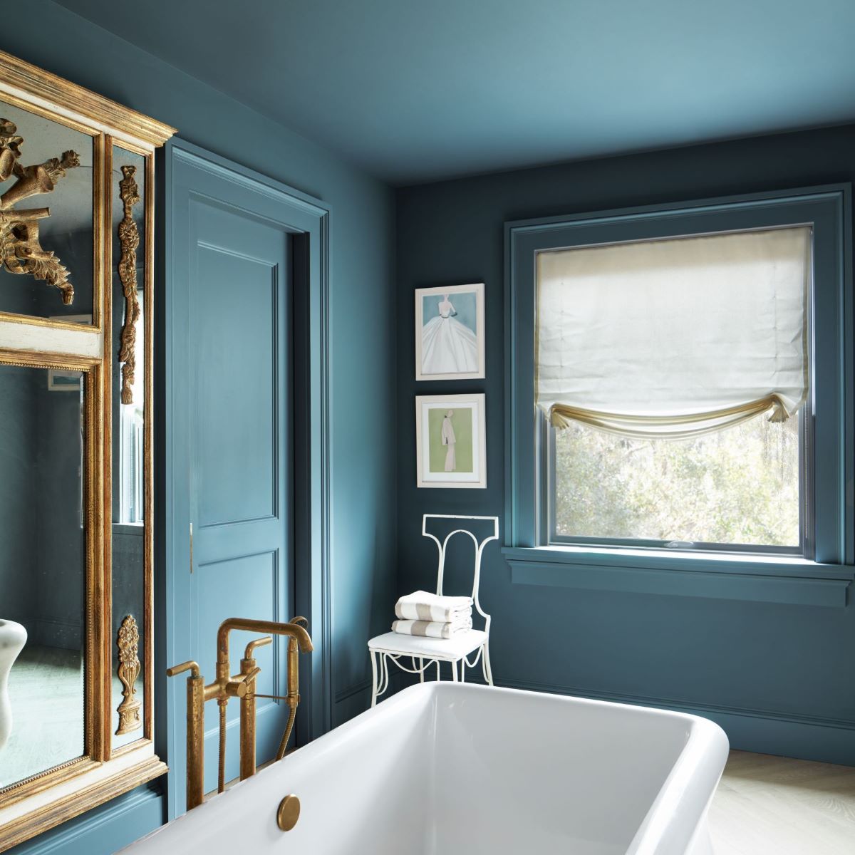
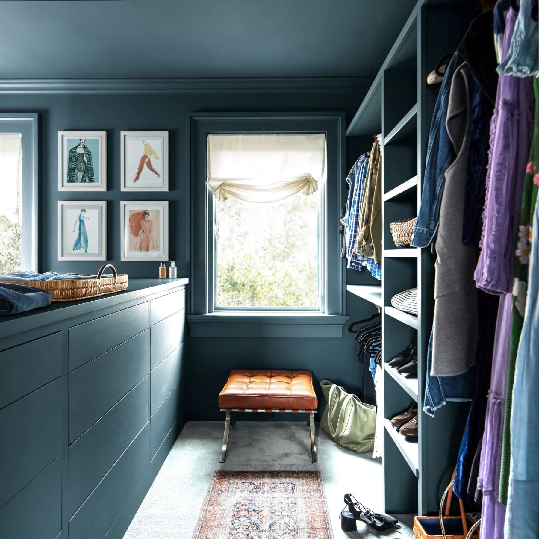
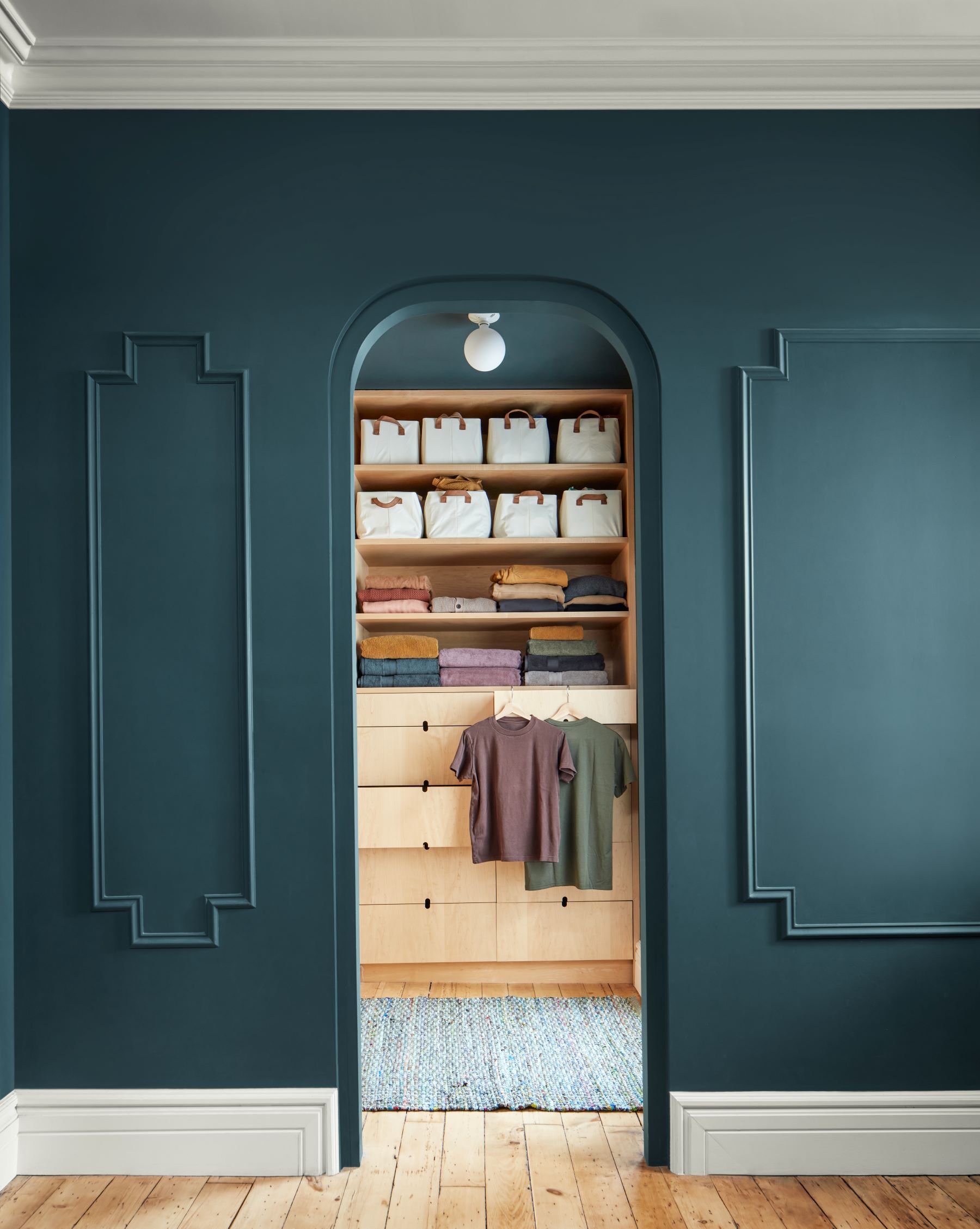
Like the color of moonlight filtering through glasswork, „Stained Glass CSP-685„ is a captivating blend of blue and green.
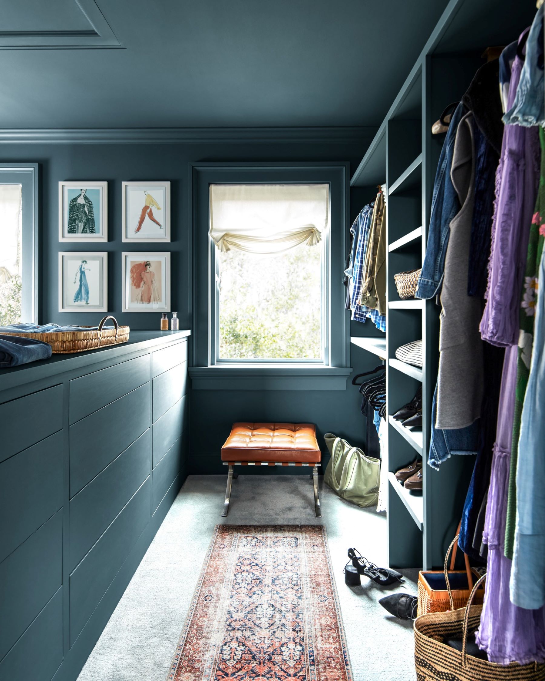
Both stunning and serene it is a chameleon color that can be designed into any space. Being part of the
Color Stories Collection, this color benefits from an accentuated response to light due to its unique formula.
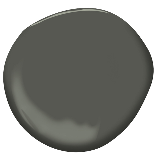
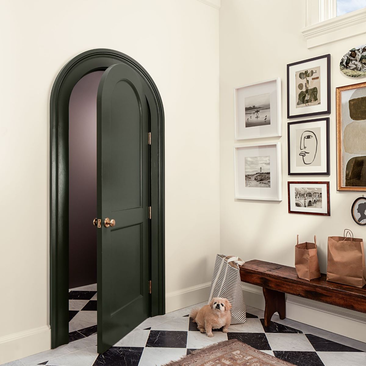
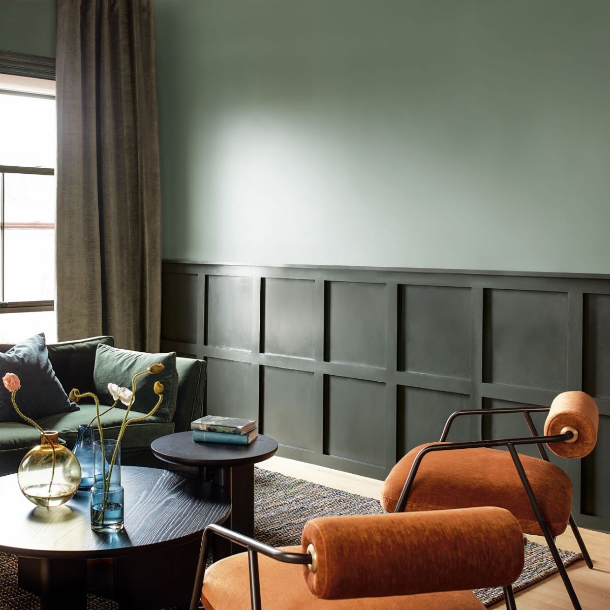
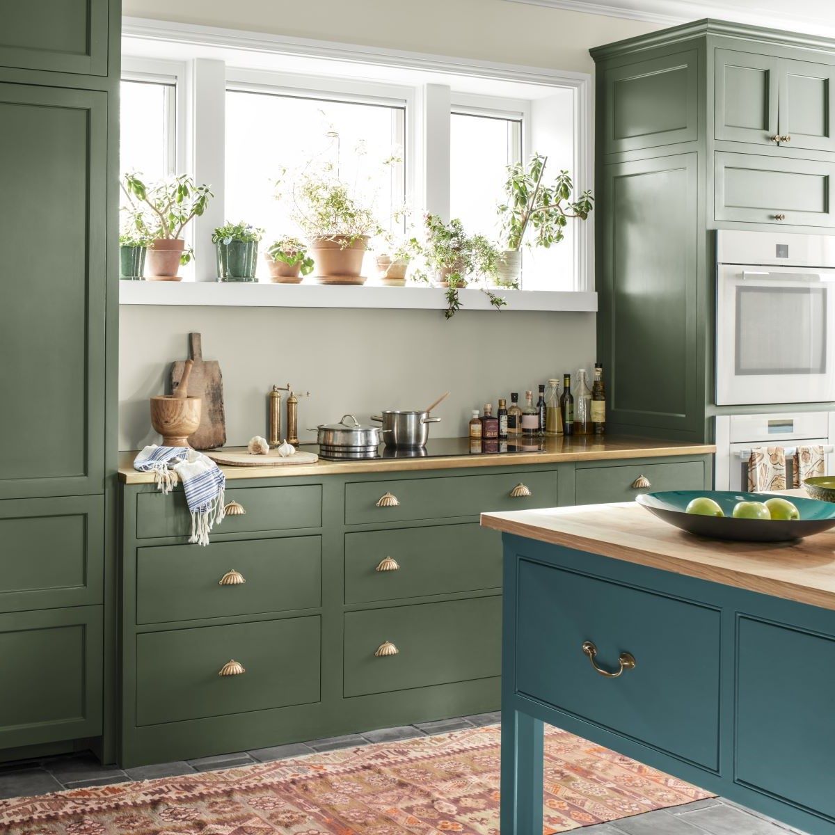
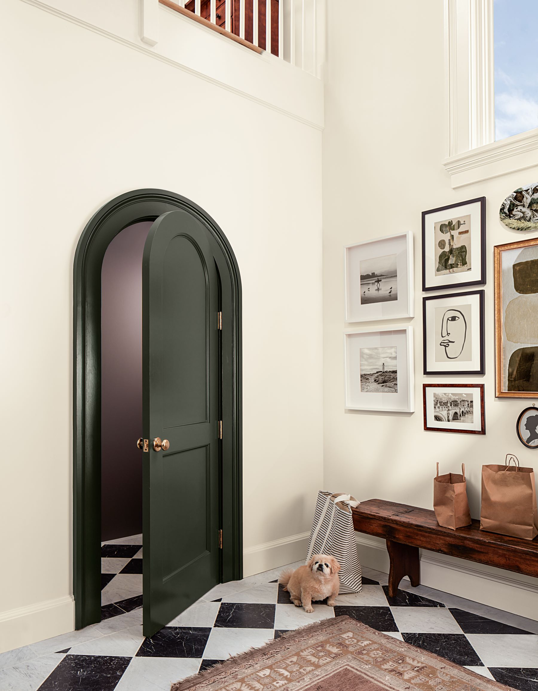
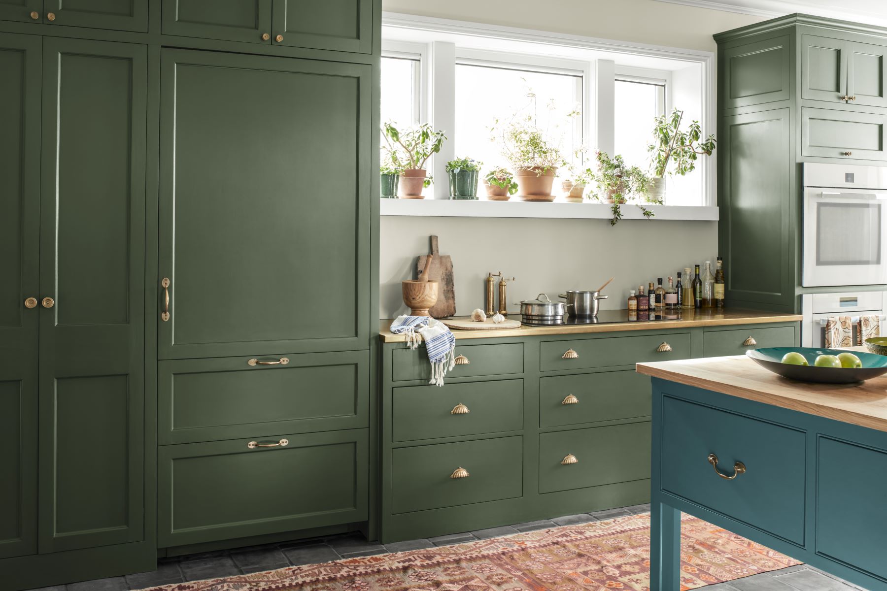
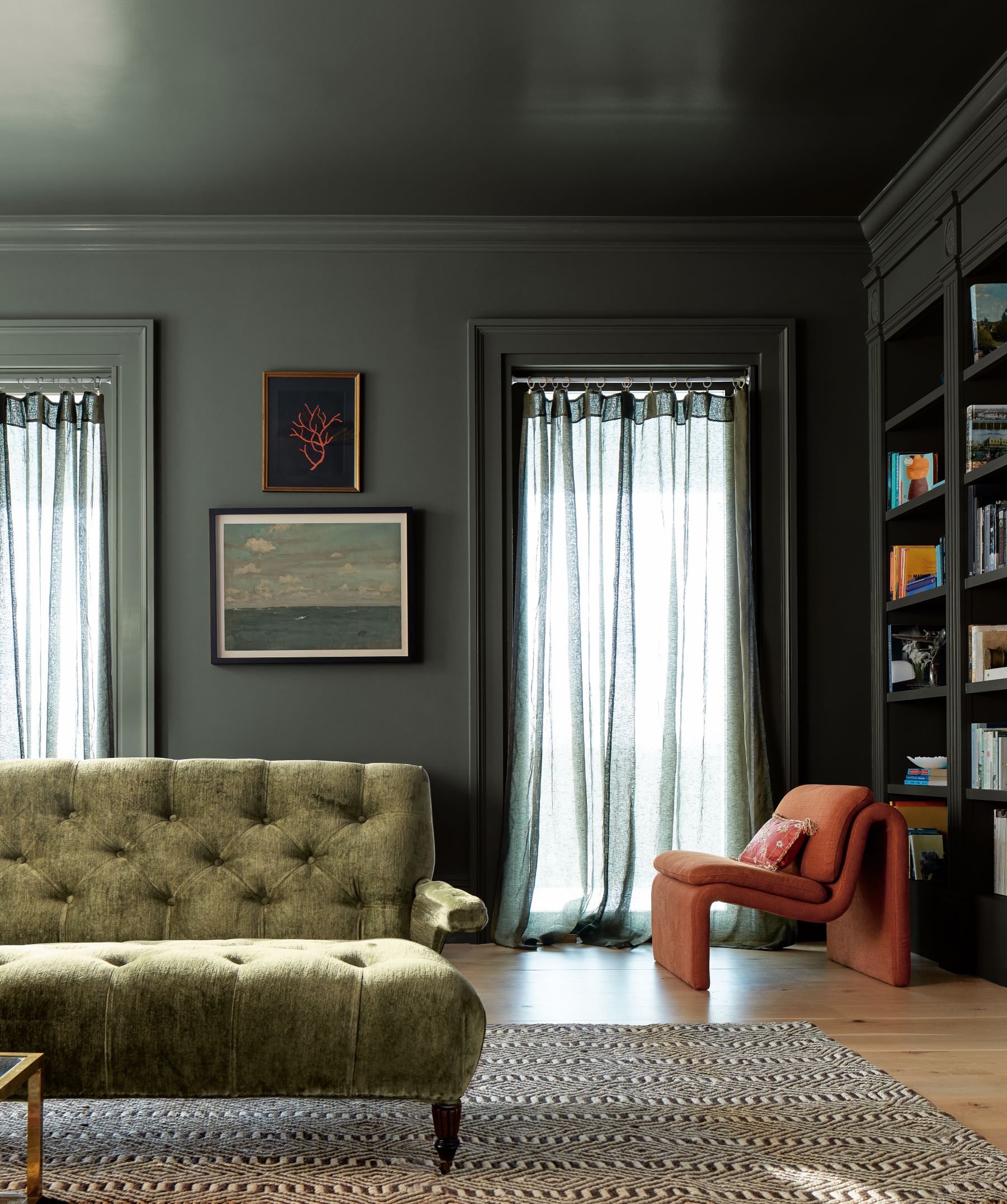
„Rosepine 461„ is a bold, yet refined forest green.
With a versatile gray undertone, it can take the place of a neutral in a color palette without being too overwhelming.
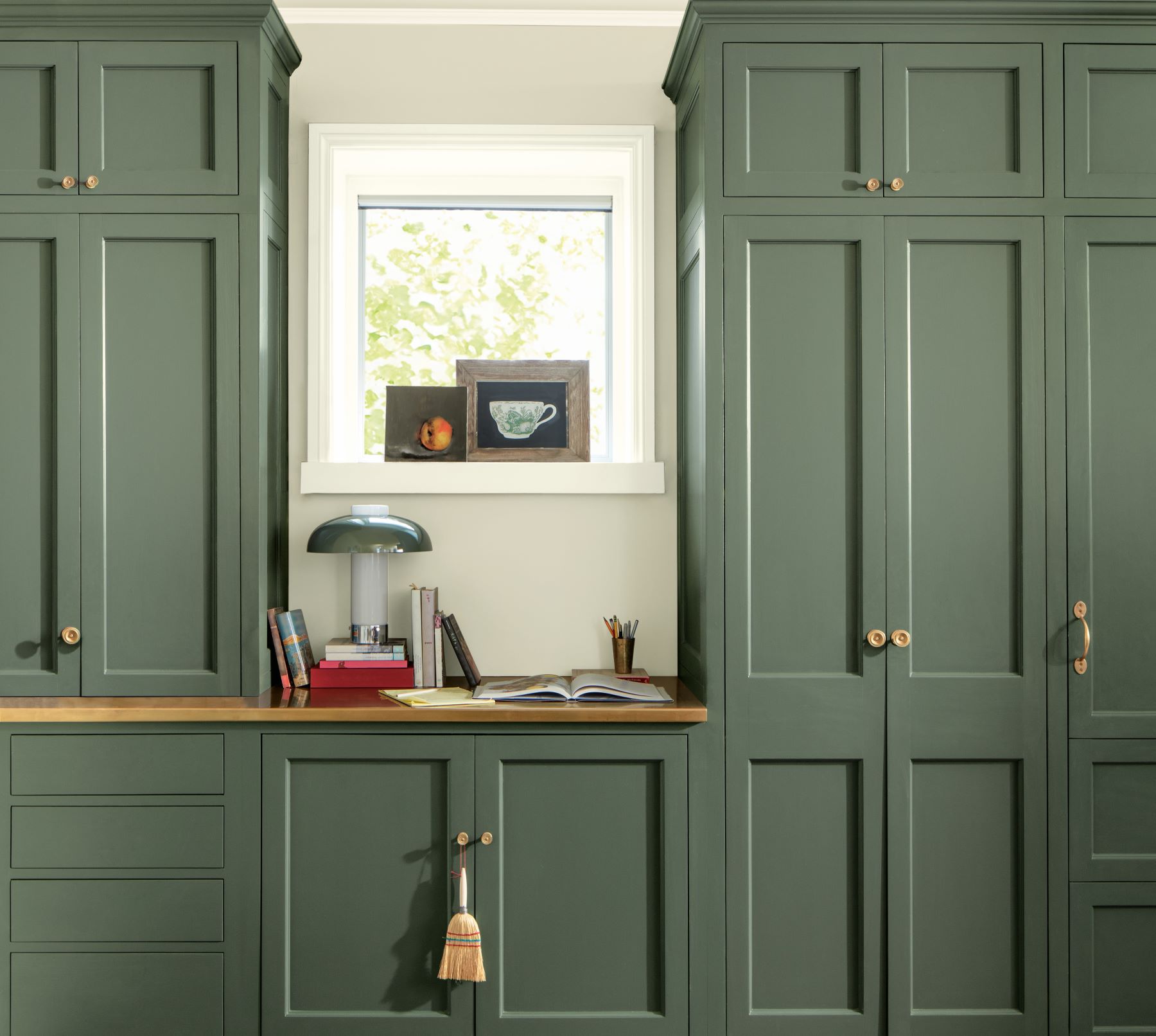
„Rosepine 461„ can make for a statement-making cabinet color with neutral walls or create a playful complementary combination when paired with brick.
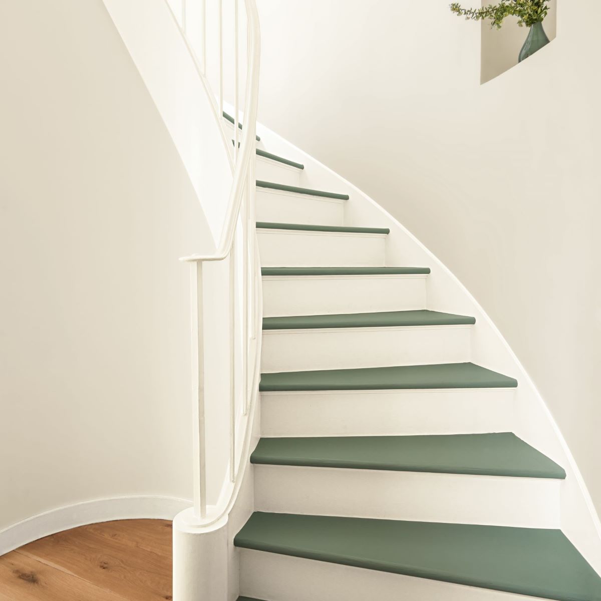
Shades of nature…
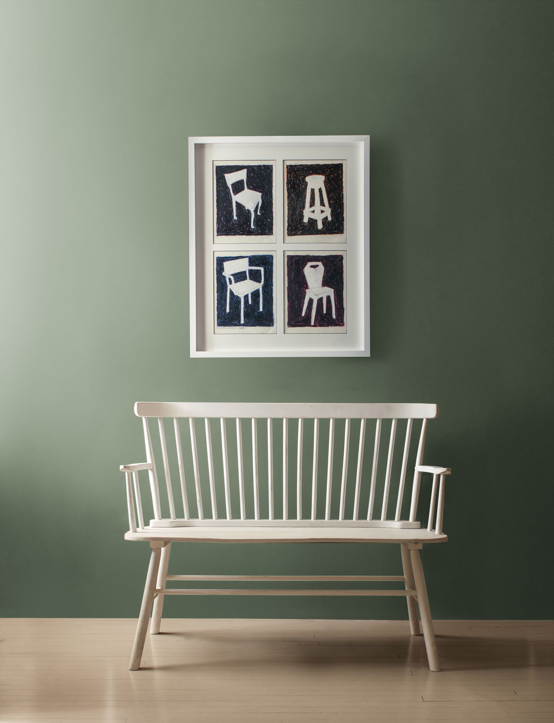
As we continue to see people drawn to the outdoors and nature’s color palette, green-grays are trending upwards.
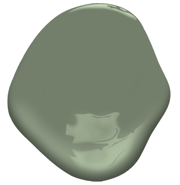
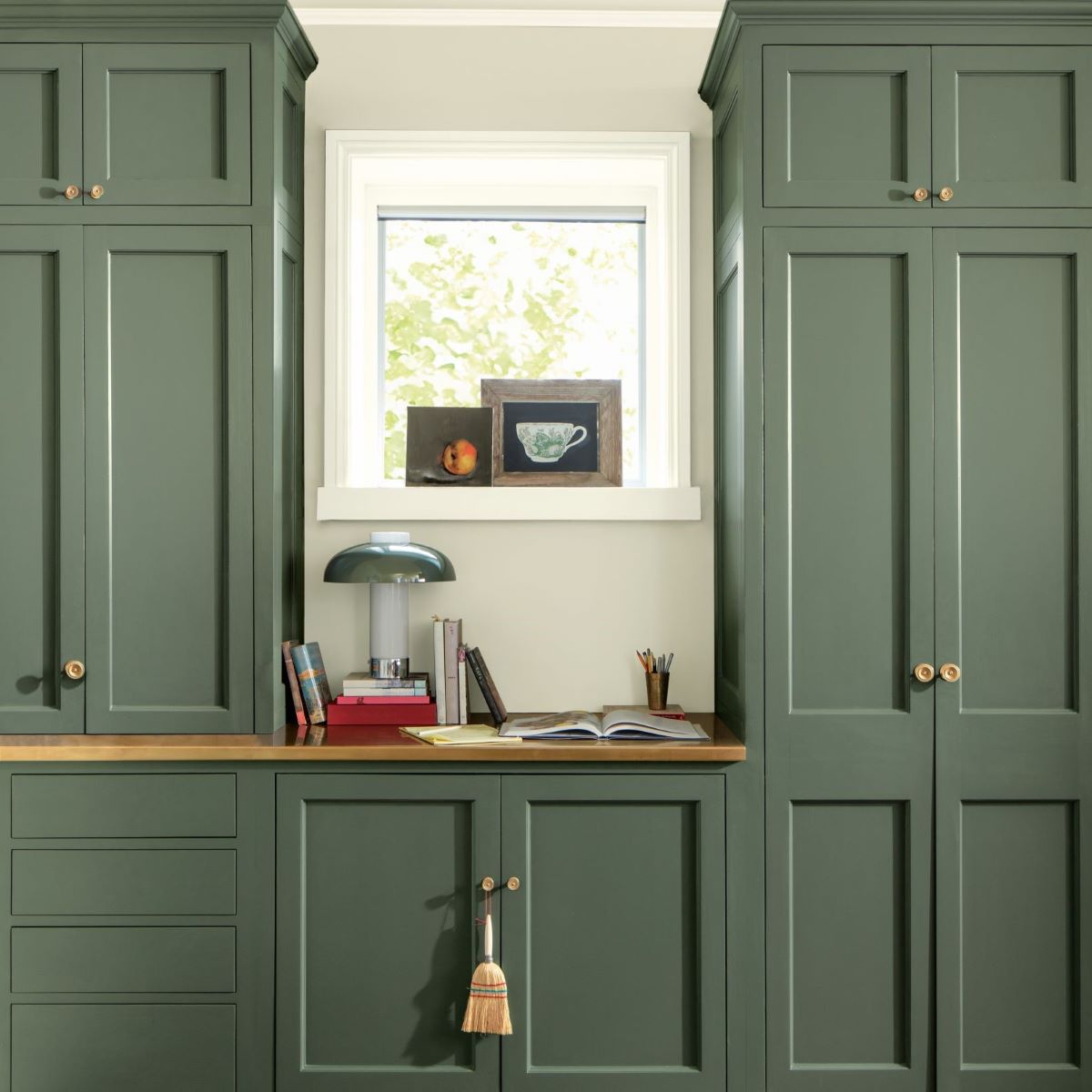
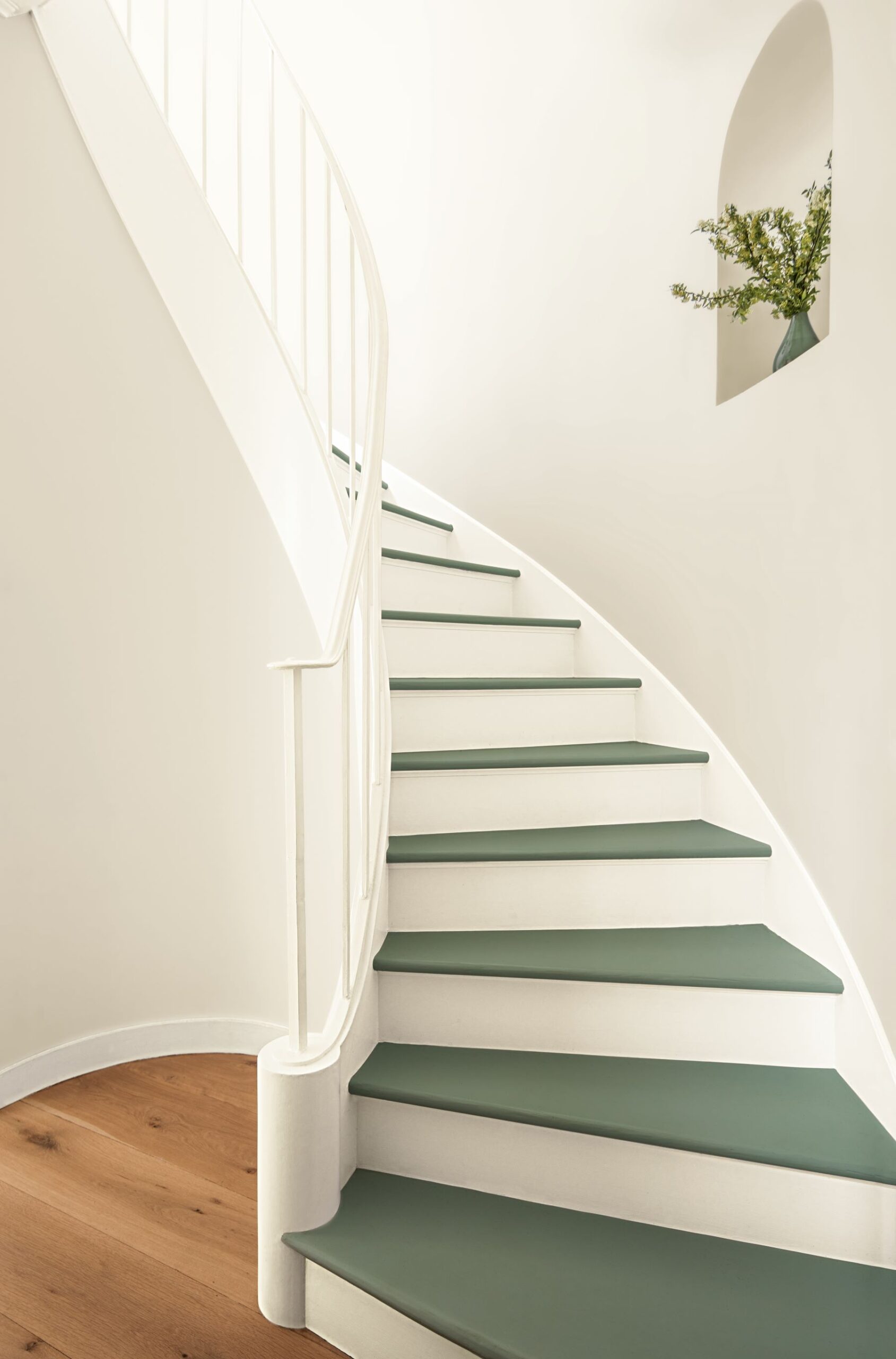
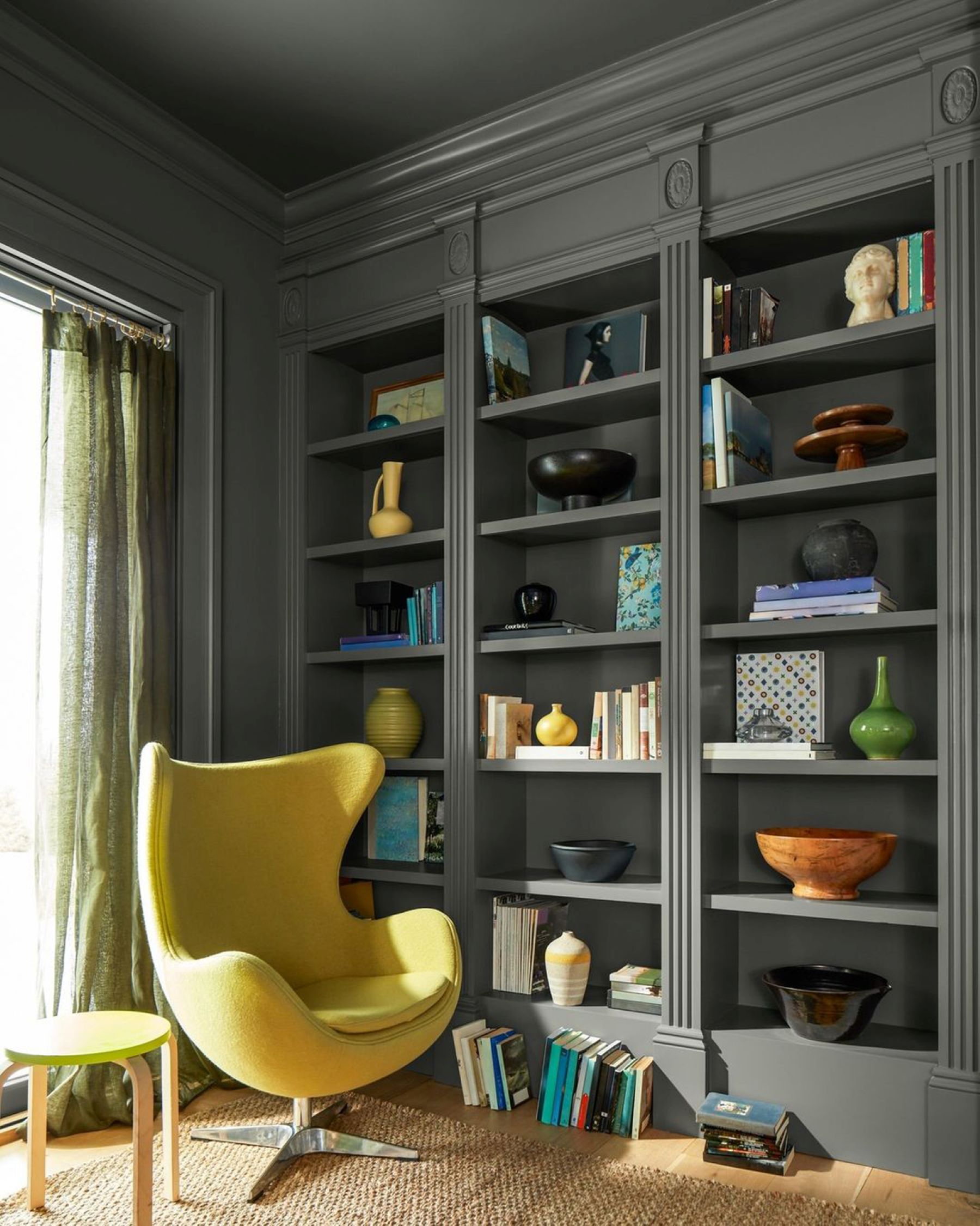
Joining „Rosepine 461” in our Color Trends 2025 palette is „Ashwood Moss 1484”. This deep, graphite green is suggestive of a dark-veiled forest.
„Ashwood Moss 1484” can take on the role of green, gray or black depending on its surroundings bringing depth and intrigue to any color palette.
COLOR OF THE YEAR 2025
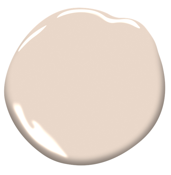
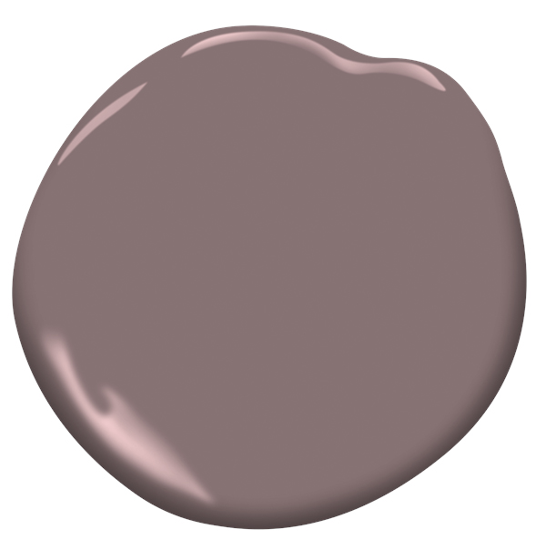
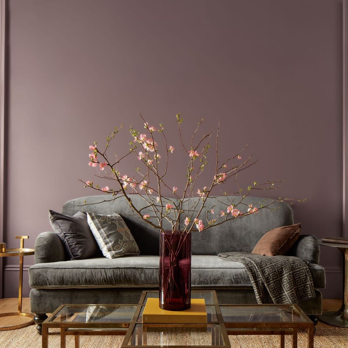
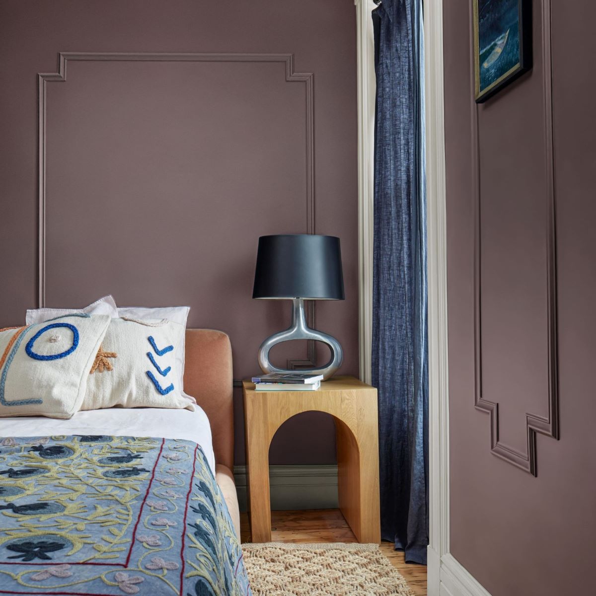
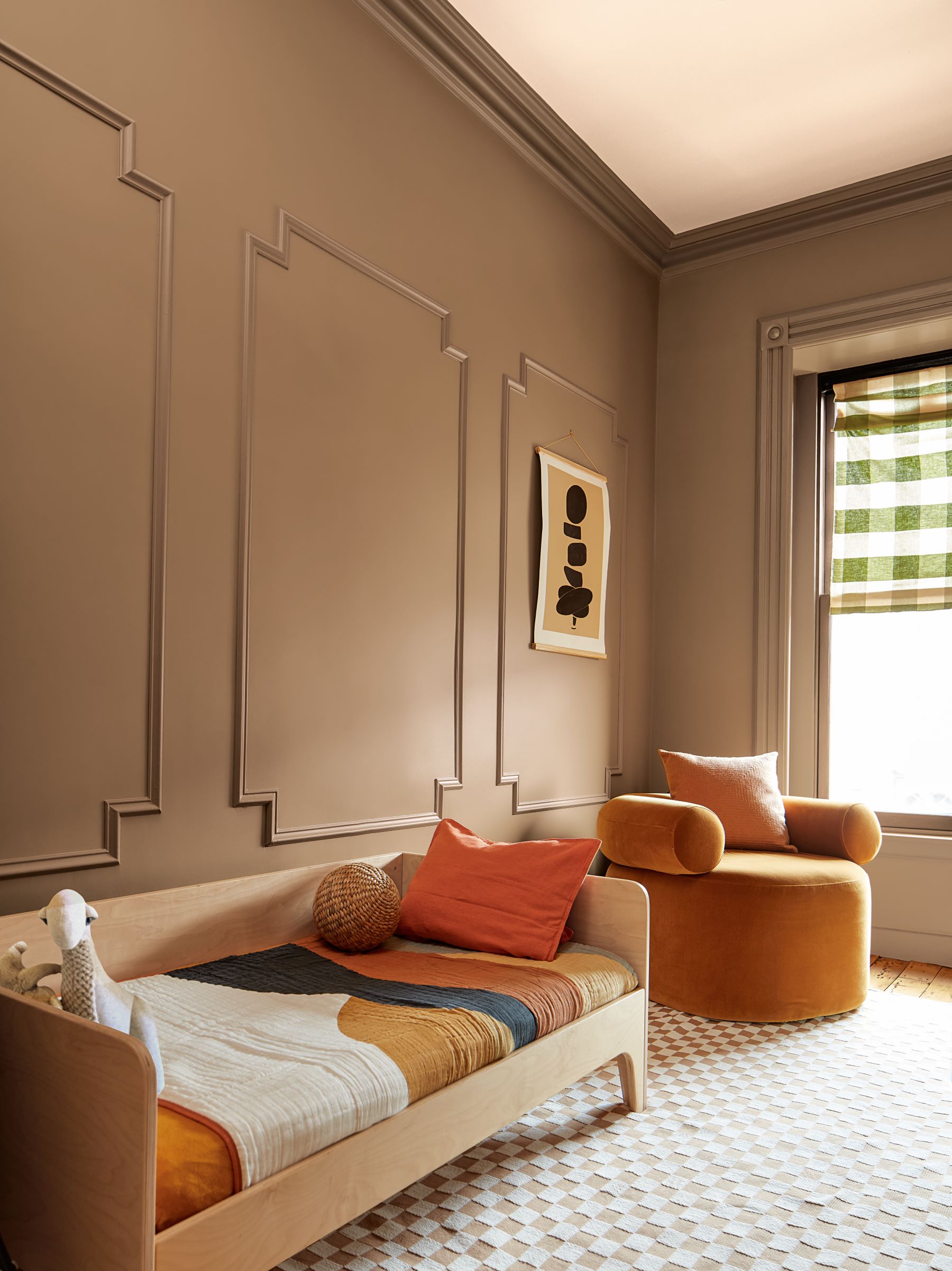
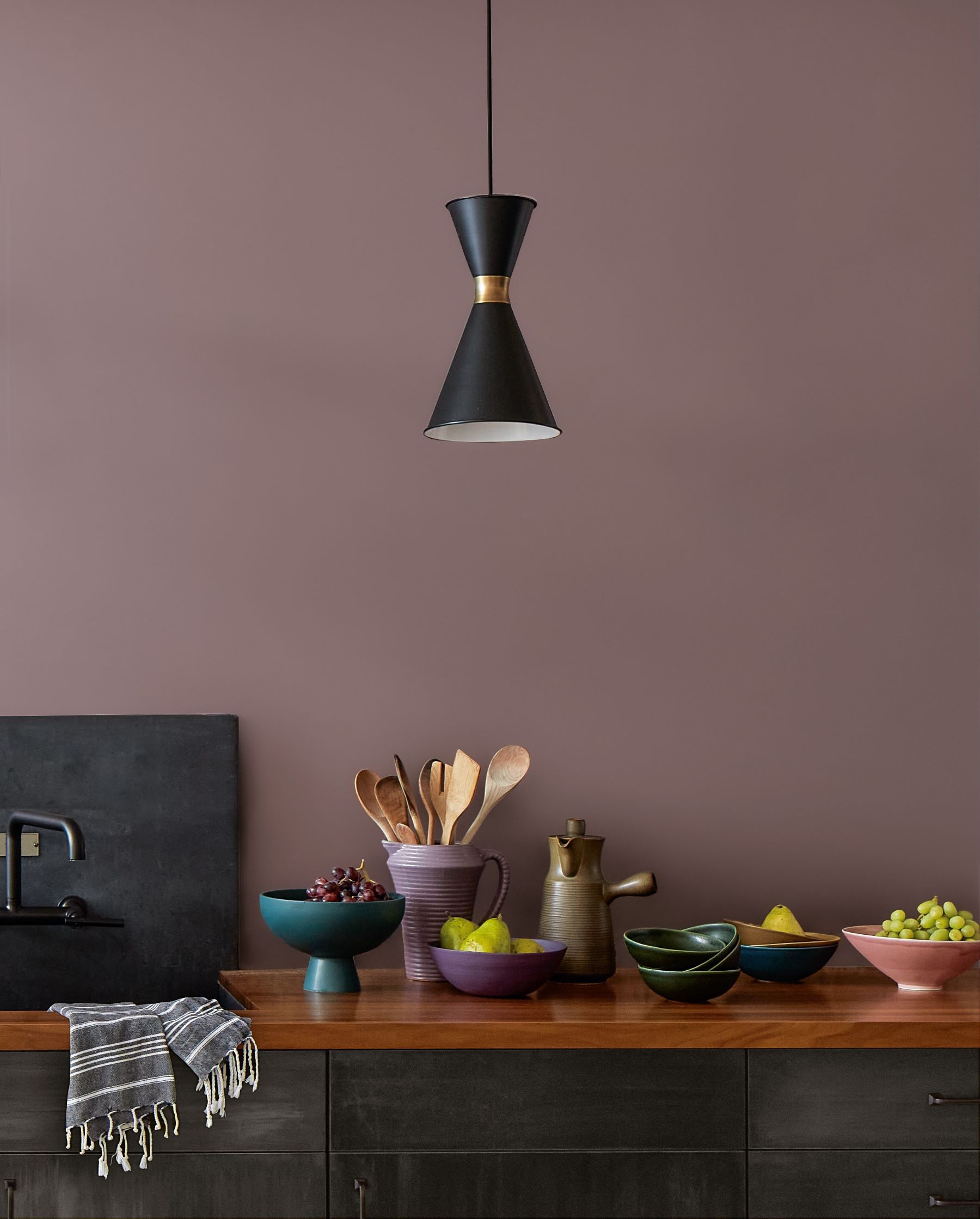
Dignified and sublime - "Cinnamon Slate 2113-40".
The main place in the palette of "COLOR TRENDS" for 2025 was taken by "Cinnamon Slate 2113-40".
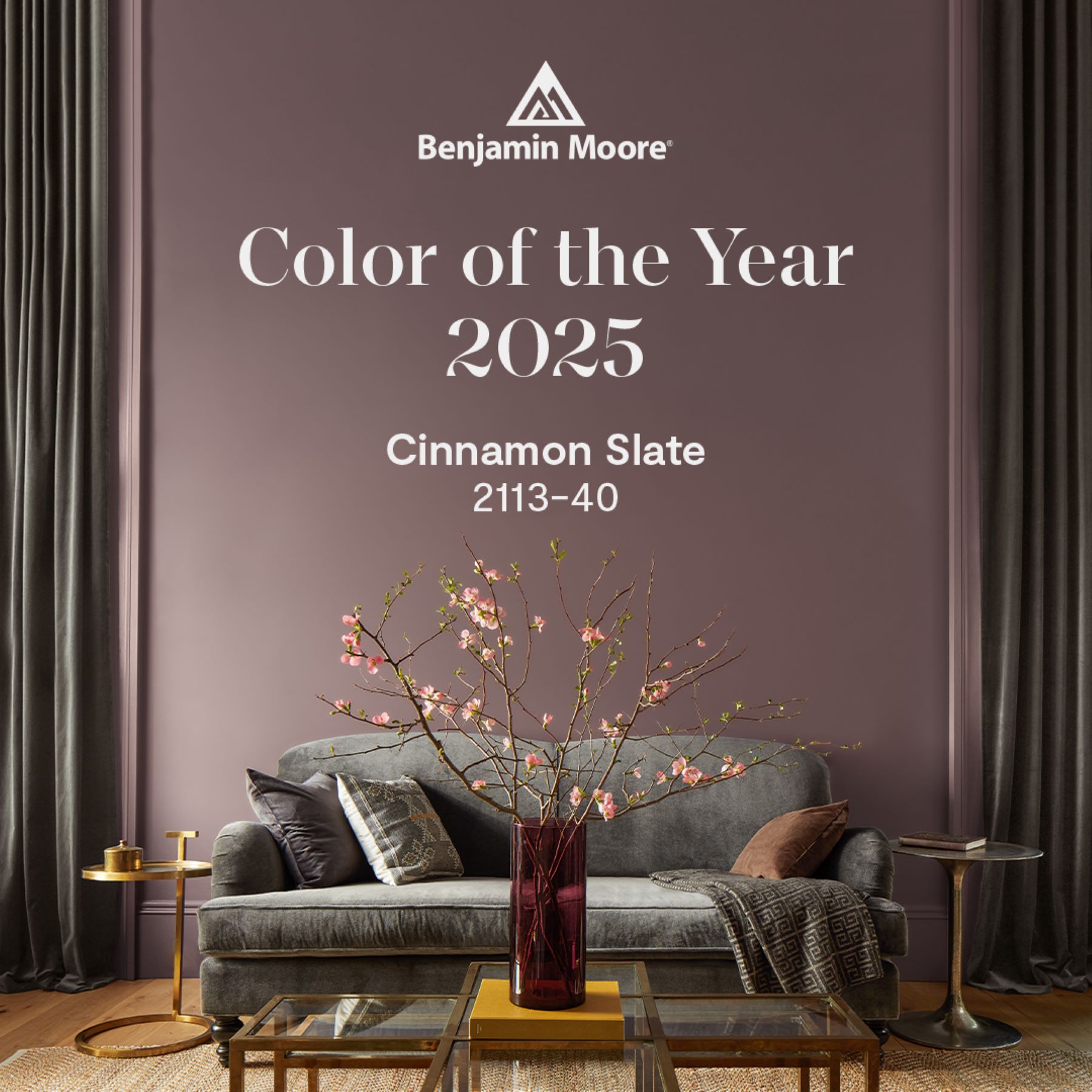
A delicate mix of heathered plum and velvety brown, Cinnamon Slate 2113-40 offers enduring style and a modern sensibility. It encapsulates the idea of quietly colorful.
To define this color without undertones would be impossible. The unique undertones add to the versatility and adaptability of this hue. It gives this color a presence without distraction.
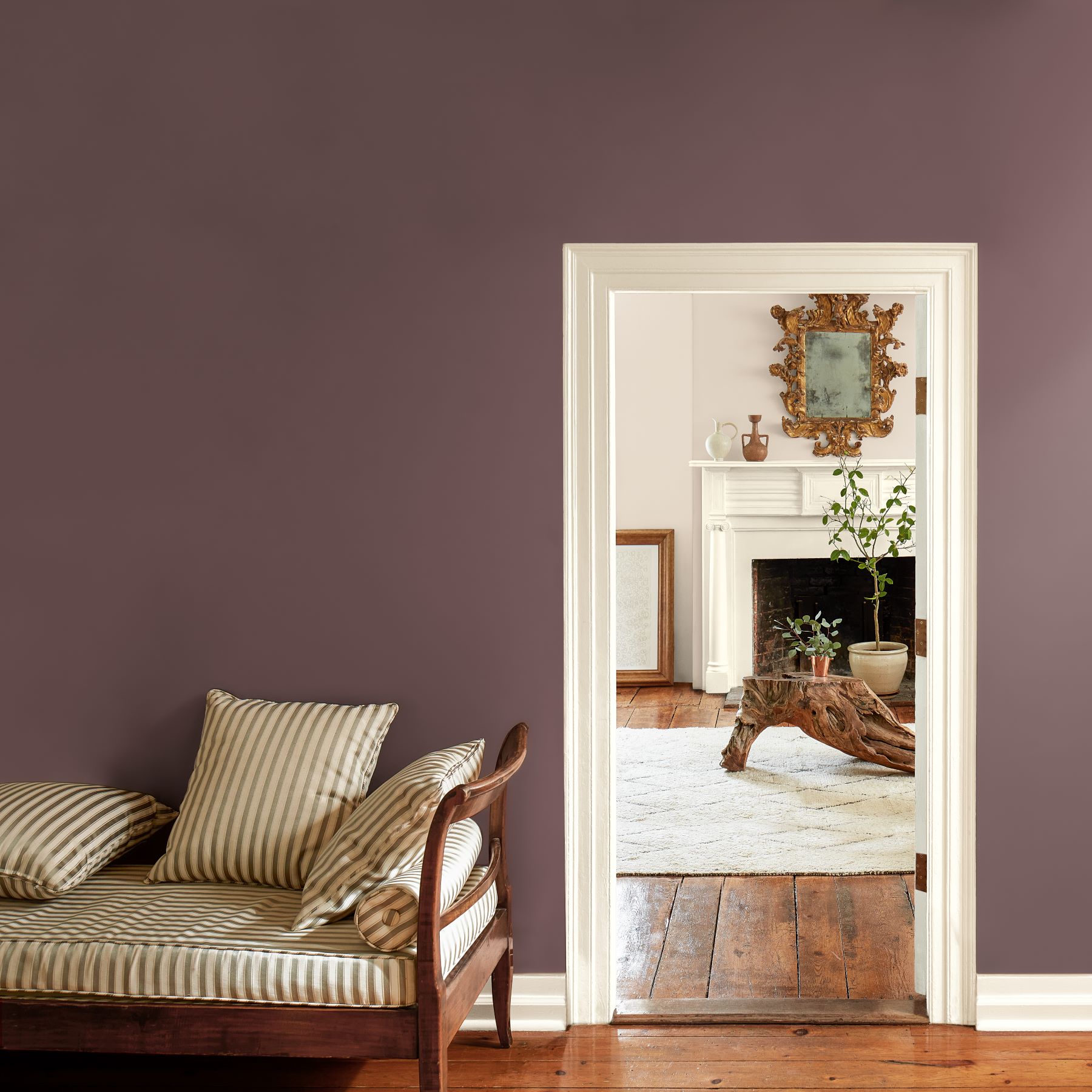
COLOR OF THE YEAR 2025 is a hue that shows the beauty and nuance that undertones can have and bring to a design. It shows the confidence of these types of in-between hues and all that they can bring to a space.
SOLO or TOGETHER?
Together, presented above, ten hues make up the Color Trends 2025 palette. They can stand alone beautifully or work together harmoniously creating a color palette that transitions gracefully from room-to-room.