COLOR TRENDS 2020

The new „American Dream” definition.
As the Color Team from Benjamin Moore & Co. set out to create a color palette for 2020, the current social climate and how things have evolved or changed over time was top of mind. What will the next decade have in store for us? What have we learned from the past that can help to inform the future? What really matters to people today, and how will that carry into 2020 and beyond?
Our values, priorities and motivations…
The dawn of a new decade is an opportunity for us to pause and consider our values, priorities and motivations – the key drivers in defining our unique paths for 2020.

Across generation we are seeing a change in the “American Dream” with human needs or ideals that are interpreted in new ways.
After the Great Depression and World War II the pursuit of happiness hinged on decent housing, a good job, education and healthcare. Later generations followed with similar priorities around housing, education and healthcare in addition to an interest in consumption.
Today we see a shift in this thinking with a renewed focus on what matters most today and into 2020. Creating meaning in one’s life through experiences, connections with others and contributing to society to make it a better place have risen in importance.

10 KEY WORDS
Throughout the year, the color team at Benjamin Moore conducts research and travels to places where they are exposed to an array of ideas and colors. The team determines what feels right for the 2020 color palette and color of the year.

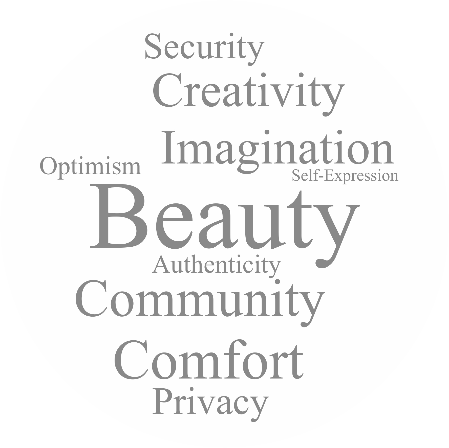
To guide the color conversation, we identified ten key words that capture the things that matter to people regardless of generation, but take on specific meaning for the individual. These words challenge us to question not only the past, but also how we want to live in the future.
The words include: beauty, creativity, privacy, self-expression, comfort, security, community, imagination, authenticity and optimism.
For 2020, the color team took the needs of today’s society into strong consideration as the colors used to create our surroundings are apt to reflect an optimistic outlook for 2020.

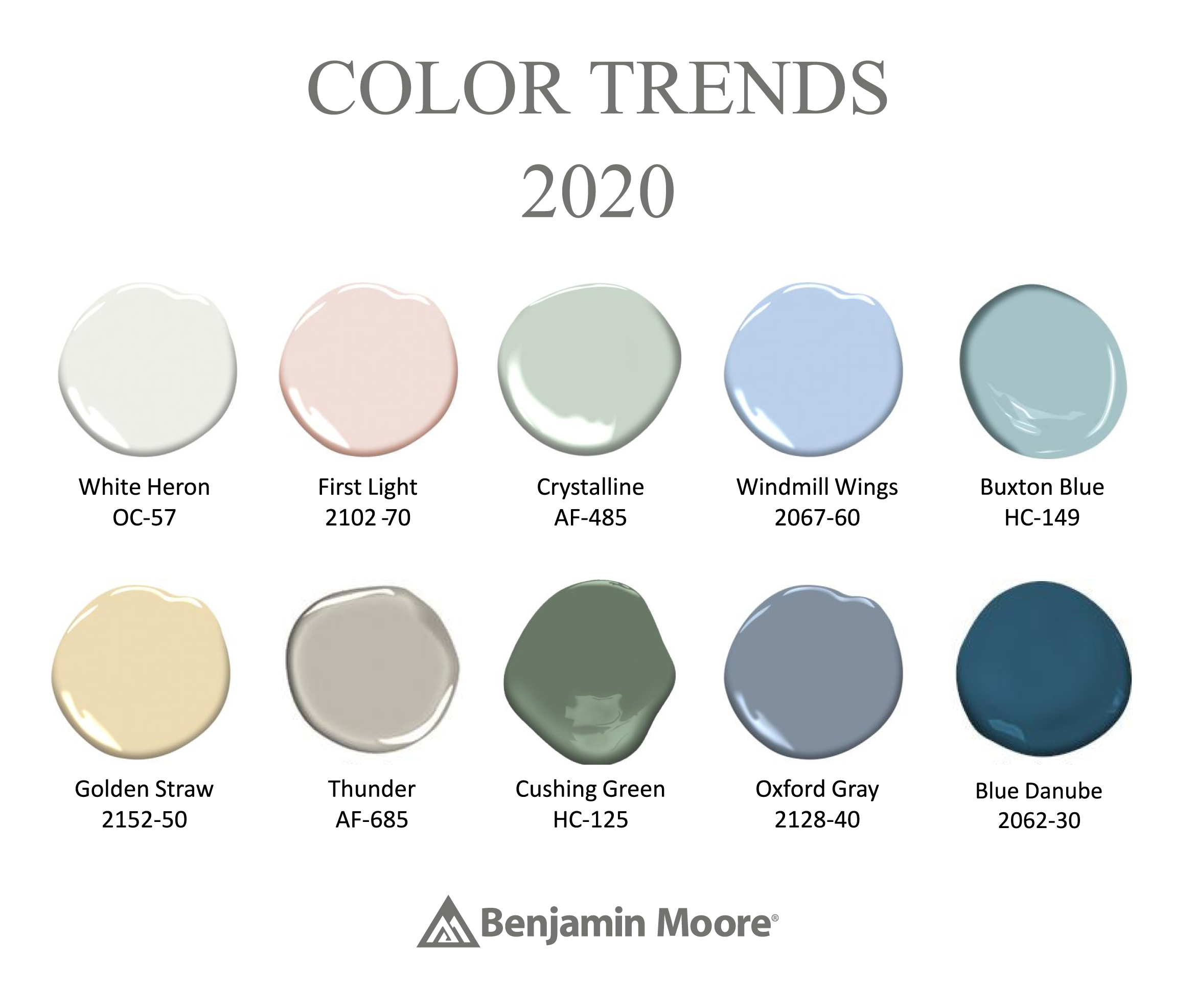
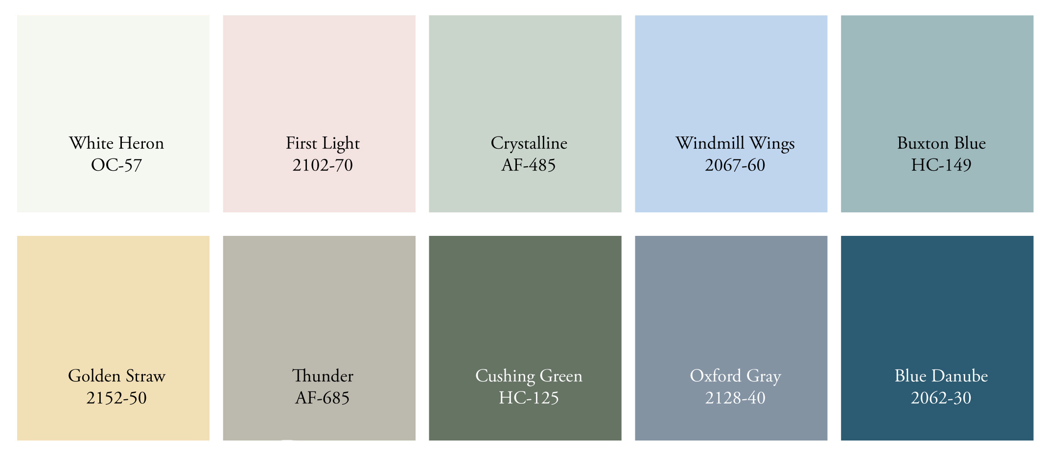
To create our annual Color Trends palette for 2020, we identified 10 colors that capture the design sensibility that will set the stage for the next decade. These colors were selected for their ability to complement many design preferences, each color is easy to live with and easy to love, while pointing to a new idealism.
Together the colors exhibit a freshness and upbeat sensibility, while also demonstrating the ability to serve multiple functions or roles within the home to complement any living arrangement, design aesthetic, and appeal to all generations.
We included colors that can be playful and upbeat, and other colors that feel more serious and traditional. Together these colors offer many options and complement an array of styles. We also took into consideration color pairings and how these combinations can be used for different looks, in different types of homes. Several of the combinations are monochromatic – always a great way to create color flow within one room or from one space to another. Additionally, we looked at how the colors work together as a stand alone color or as an overall palette.
Discover all the „key words” and the Color Trends 2020 shades. What interesting at the end of each „key word” section you can find some associations, which appeared in minds of Color Hunters rom Color Team Benjamin Moore & Co.

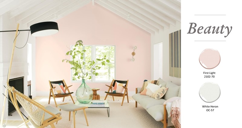
With so much of our time being centered on time in front of screens and devices, there is a craving for softness and beauty in our lives, with First Light being the perfect hue to express the desire to celebrate beauty in the home.

The definition of beauty has never been so diverse, with the meaning of the word becoming something very personal. The home has become a place where we can surround ourselves with beauty infused with quiet simplicity and joy.
We’ve seen neutrals and muted colors dominate the most popular list, with opportunities for deeper colors and bold winks of color to make their way into color schemes over the past few years. For 2020, it’s the wash of beautiful, fresh color to complement spaces that are designed with neutral or deeper colors demonstrating the evolution of color choices that move from year to year.
Associations: less is more, minimalist approach. Clutter-free lifestyle – only hang onto what is essential. Simplicity and efficiency. Softened forms, simple shapes.

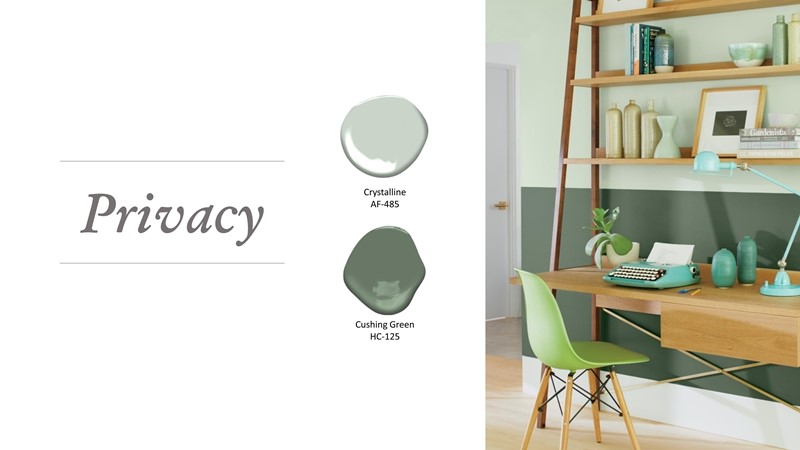
The home has become a sanctuary, perhaps now more than ever. With the pervasive threat to our privacy being invaded through the digital world that has become so essential to how we function daily.
There is much conversation around this topic both in the online world and socially, making the home a place where we seek to create a private or protected environment.
With homes becoming a multifunctional place where we can both live and work, there is an increasing need to maintain our privacy. Our spaces are expected to multi-task as quickly as we do, so creating spaces that reflect our privacy are particularly important. Our color choices can enhance that sensibility allowing for spaces to remain private, while others are increasingly public and connected to the outside world.
Associations: more time spent at home, home is a sanctuary. Work/life balance. JOMO – joy of missing out.

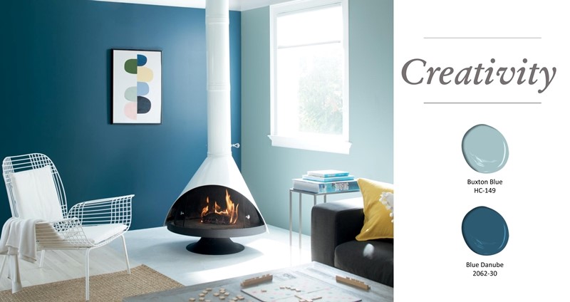
The need for creative thinking is becoming one of the most important skills that companies are looking for as more and more tasks are automated, which is a great thing since a focus on creativity will help to inspire new thinking and innovation. Additionally there is a greater appetite and acceptance for out of the box thinking.
The demands around the quality of content we consume is also increasing, with higher expectations around creativity. We see this being brought into curriculums for Generation Z students with a strong focus on STEM courses since the future direction is based on new, creative thinking to advance not only technology but society as a whole.
With the interest in creativity bring a connection to the home, and being encouraged to be creative in the home whether through color, décor or architecture. We can express our creativity in the home through new color combinations or even simply the bravery to embrace color. Unexpected color pairings complement other aspects of the home while keeping us on our toes – the way color is used today is evolving.

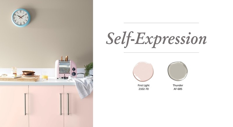
Closely linked to creativity is self-expression, another need that is increasing in it’s acceptance while expanding our thinking.
Personalization has become an expectation, which challenges companies to find ways to allow customers express their needs, tastes and personalities through the products they consume, and the experiences they engage in. This is particularly important with the unparalleled access to information we have at our fingertips.
Self-Expression has become a part of the American dream with a strong need for individuality. Today we can create our personal or “curated self” brand through various mediums that impact different aspects of our lives.
Specific to design, self-expression is hugely important and opens up exciting possibilities for how we bring colors and materials into the home. Tied together with creativity, new materials offer up new ideas that can be used to express personalities, and styles – taking a giant leap away from the rules of the past, and even the judgements that might have stifled our willingness to express ourselves previously.
Associations: living systems – we can tailor everything to our individual needs. Need to express personality even in multi-generations or communal living situations. Attainable design. Mass customization.

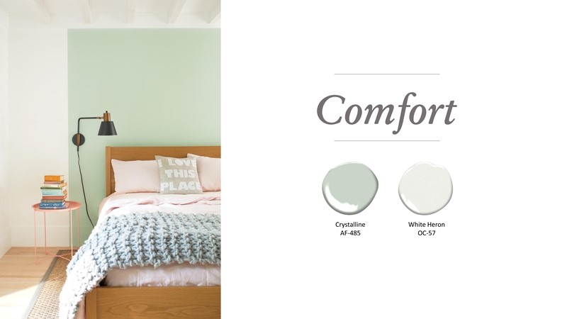
Our homes serve as a refuge from the chaos of daily life, which was a strong focus for us in 2019 where we sought to shut out the noise, making our homes into cocoons where we can relax and enjoy our surroundings.
This sentiment remains alive and well for 2020, but color is making it’s way back into the home.
Flexibility in the home of the future allows us to accomplish many things –we want a place to rest, a place to entertain, and place to make memories with friends and families, and a place to work - among other possible expectations for the home.
The home becomes a place for well-being, making colors that make us feel good and materials with tactility very important. Bringing a sense of warmth to the home through surfaces and colors help to achieve comfort, a need that is yearned for in a time of upheaval and insecurity.
Comfort is also achieved through creating meaningful spaces. Today the attachment to the home has changed with younger generations renting and moving frequently with less of a sense of permanence had by earlier generations. Despite the need or allure of mobility, comfort can still be achieved in the home with color being a key factor, even in minimalist interiors.
Associations: adaptable spaces to work, relax, entertain, cook – multifunction. Flexibility and convenience. Need for tactility to counteract digital lack of the tactile experience – search for a balance to find comfort. Airy living spaces, a sense of calm.

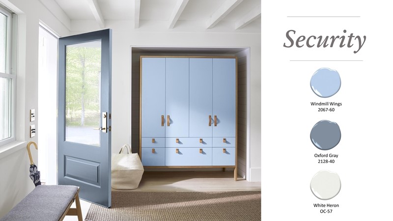
Similar to privacy, security is extremely important in light of the data we share and the data that is collected. We look to feel secure with technology playing a huge role in our daily activities.
Because of the emotional need for security, there is often a natural inclination toward colors that are approachable an familiar – even colors that we associate with trust.
Not only is security in the technological sense immensely important, but also as it pertains to the environment. For instance, we feel the need to secure or protect our environment from harm, continuing the necessity to consider how our decisions and choices impact the world of tomorrow. This is reflected in the home with an interest in bringing nature indoors, furthering how we live with color and how the colors we select provide a sense of security.

Associations: value of the information we receive and whether or not we trust it. Technology transparency – ethical technology. Emotional need for security. Need to maintain consumer trust and privacy. Lack of trust in online services. Need to humanize technology.

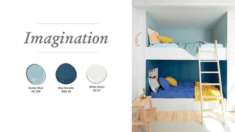
In a time where experiences are desired over obtaining things, our imaginations take center stage, allowing us to dream.
By taking part in more experiences, our imaginations are put to good use, allowing us to express our styles, tastes, and the opportunity to bring a range of influences into the home. This use of the imagination helps to trigger innovation and paves the way for the future, removing the obstacles that too often hinder progress. This need is closely linked to creativity – furthering the importance of this thought and idea freedom as we move into the future. We can imagine where we want to be and how we want to live, setting change in motion.
How does color play a role in exercising the imagination?
Perhaps it’s finding ways to break away from old rules around color by experimenting and thinking in new ways. Perhaps it is through creating unexpected color combinations, or by bringing color into a room in a way that differs from the rest of the home – it’s all about allowing the imagination to run a little wild.
Associations: user experience. Need to play and experience new things – thinking about things from a younger fresher perspective.

With more information in the palm of our hands, we can research and better understand what companies stand for, while gaining insight into the ideas and thoughts of people around the world.
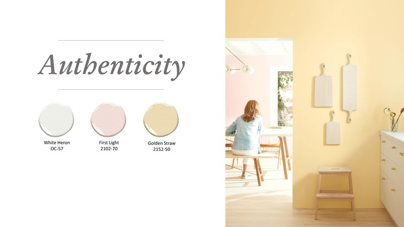
The underpinning of this incredible amount of information is determining what we understand to be authentic. There is a need for authenticity that allows us to trust and make informed decisions on everything from what we want to believe to what we bring into the home.
As individual expression becomes important, there is a need for authenticity to be part of building a persons or a “personal brand”. There is an expectation that there should be a consistency between an online and live persona, helping us to grasp authenticity of a person, place or brand. When there is a disconnect, we question authenticity and may become dismissive as we look for truth or trust.

In terms of the home, authenticity is expressed in a number of ways. We look for real or authentic materials opting for items that come from reliable or natural sources as we want to understand the makeup of the items we live with.
Personal style is a way to complement our authentic selves – aiming to stay true to our tastes and create a home that feels authentic to who we are. By opting for authenticity in the home, we further the sense that we are creating an enclave or safe place where we can be yourself and be free from judgement.
Associations: need for greater responsibility and human-centric approach. Emotional and physical wellness. Brands should have a greater purpose than just producing goods, etc. Sustainability, durability. Democratized décor.

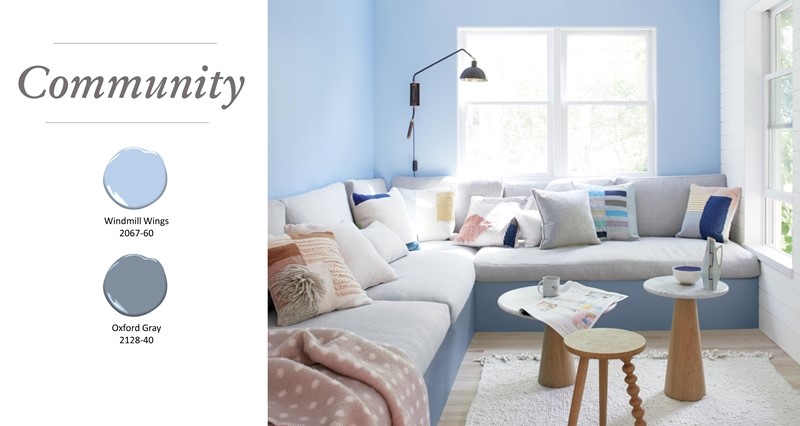
Community and the way we interact with others is a key component in our lives, and there is an expectation that our homes will help to support this need.
The home is now a hub for all activities and a place where all generations can come together. It must adapt to work and play, while being a place of unity where meaningful connections are built.
Since we are so connected in the digital world, there is often a void when it comes to human contact. To reverse these feelings of isolation that may come from only interacting virtually, smaller communities form through shared interests, spanning age groups. The enables people to interact and nurture their social well-being with others who share in an interest or belief.
This interest in community also influences the design of homes and communal living spaces. More homes and buildings are designed with community in mind – with more area given to shared spaces where people can interact and build relationships. More people are looking at alternative living situations that move away from the prior American dream that put homeownership at the forefront. For instance we are apt to see experimental or alternative living situations such as co-housing and other community-based situations as we move into the next decade.

From a color perspective, the palette for 2020 offers something for everyone in a community or a living situation that can be tailored to the individual. To illustrate, in a home where multiple generations live together and engage in different types of activities, the color we surround ourselves with should be meaningful in terms of our tastes and preferences.
The 2020 palette offers ideas that can work for different people in unique ways, but all of the colors come together in a pleasing palette.
Associations: engagement with others in new ways. Social experiences made possible through technology. Changing relationship with the home – homes need to multitask. Home is a hub for all activities. Smart spaces, we expect more from our homes.

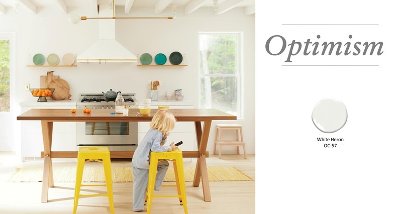
While we don’t know for certain what the future holds, there is a sense of optimism and hope for brighter days ahead. Finding small moments of happiness and bringing color back into the home signals a move toward brighter days.
There is a huge interest in innovation and making improvements, whether in scientific developments or in finding ways to simplify our lives, working it’s way into an uplifting outlook. We are in a time when it is possible to inspire and facilitate change, something that our society is craving.
Younger generations express their confidence in the future, more so than prior generations. Our priorities are shifting in a positive way with a strong focus on things that are meaningful and matter to our well-being emotionally and socially, driving us to a bright new decade with a rosy outlook.
Associations: certainty, hope, clarity. Sensory immersion. Fresh color, growing enthusiasm for color. Looking for small moments of happiness.
IT’S MUCH MORE THAN THE COLOR PALETTE…
Throughout time, colors have gone in and out of popularity, with a close connection to the social climate and advances in science and technology.
Generally speaking, periods of unrest are associated with muted colors, while eras known for an optimistic mindset include bright or upbeat colors.
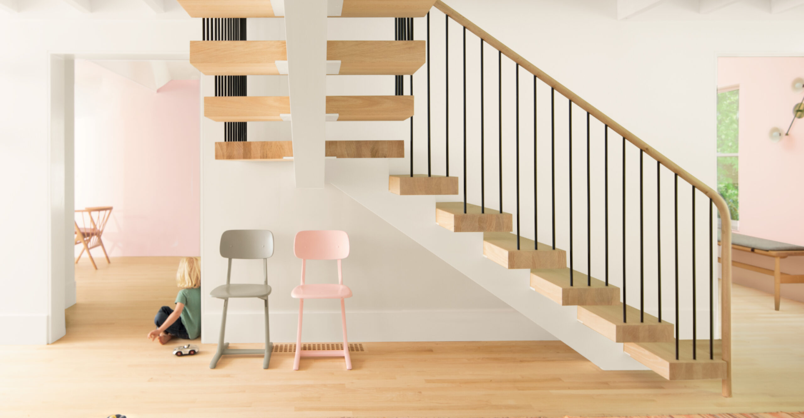
The Benjamin Moore Color of the Year 2020 is First Light 2102-70, a soft, rosy hue blooming with potential. First Light 2102-70 is a sophisticated and warm blush that transcends styles and seasons, delivering a flattering glow while creating an ideal backdrop for a room.

The colors selected for the Color Trends 2020 palette are a thoughtful mix of hues that are easy to live with, easy to love, and appeal to all generations and style preferences. The palette is fresh and airy or saturated and dramatic – it’s all about playing with color to design a space that expresses personality and individual styles.
