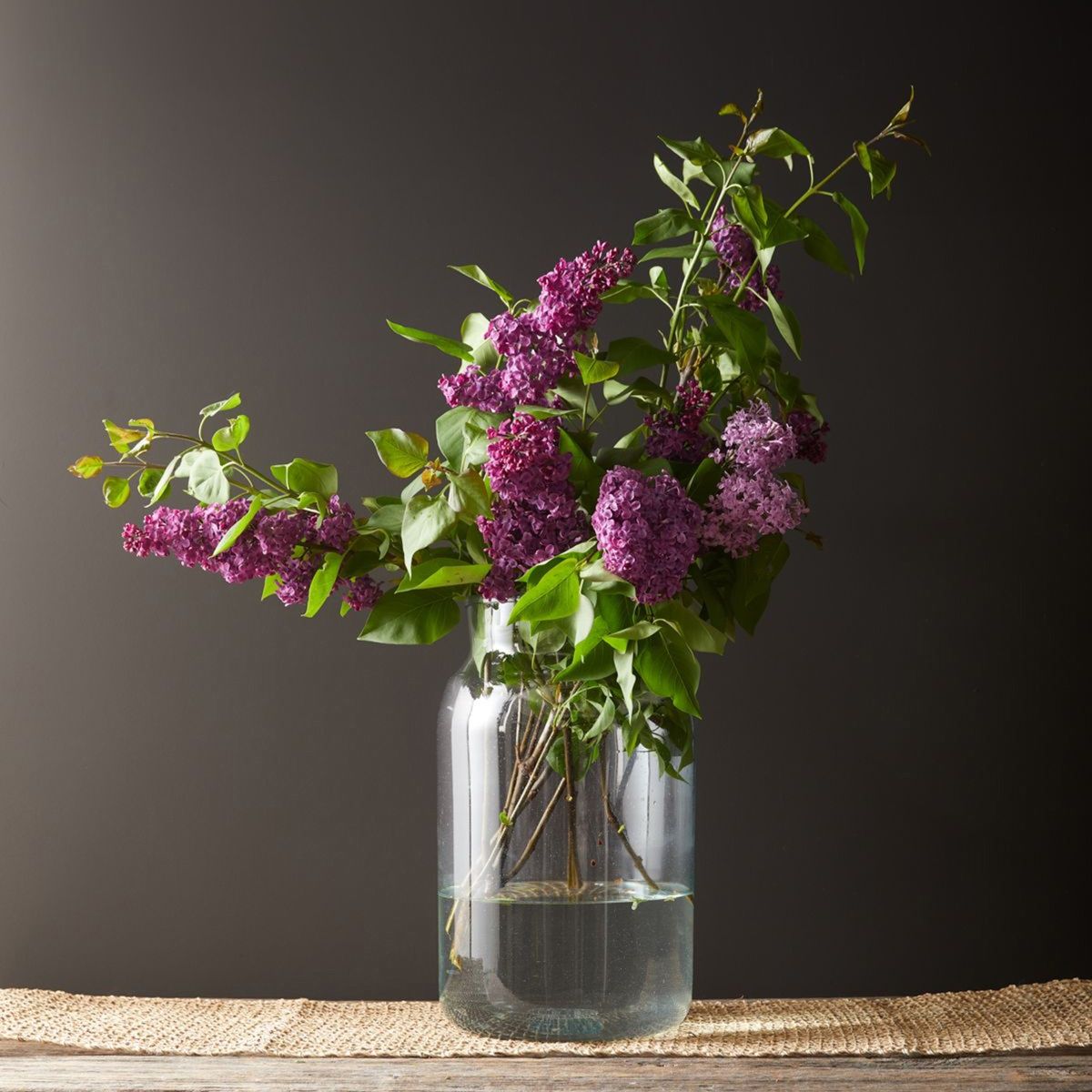
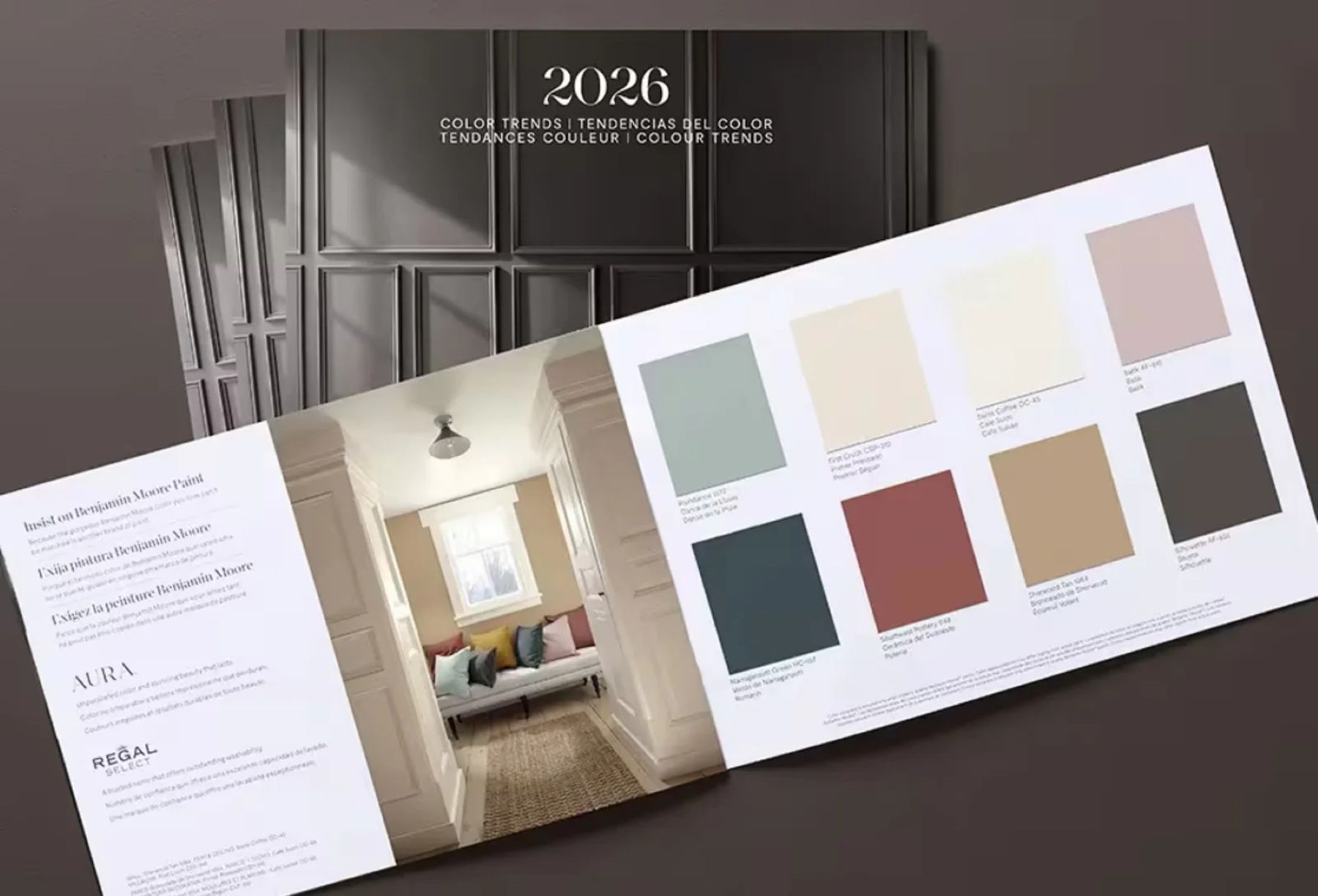
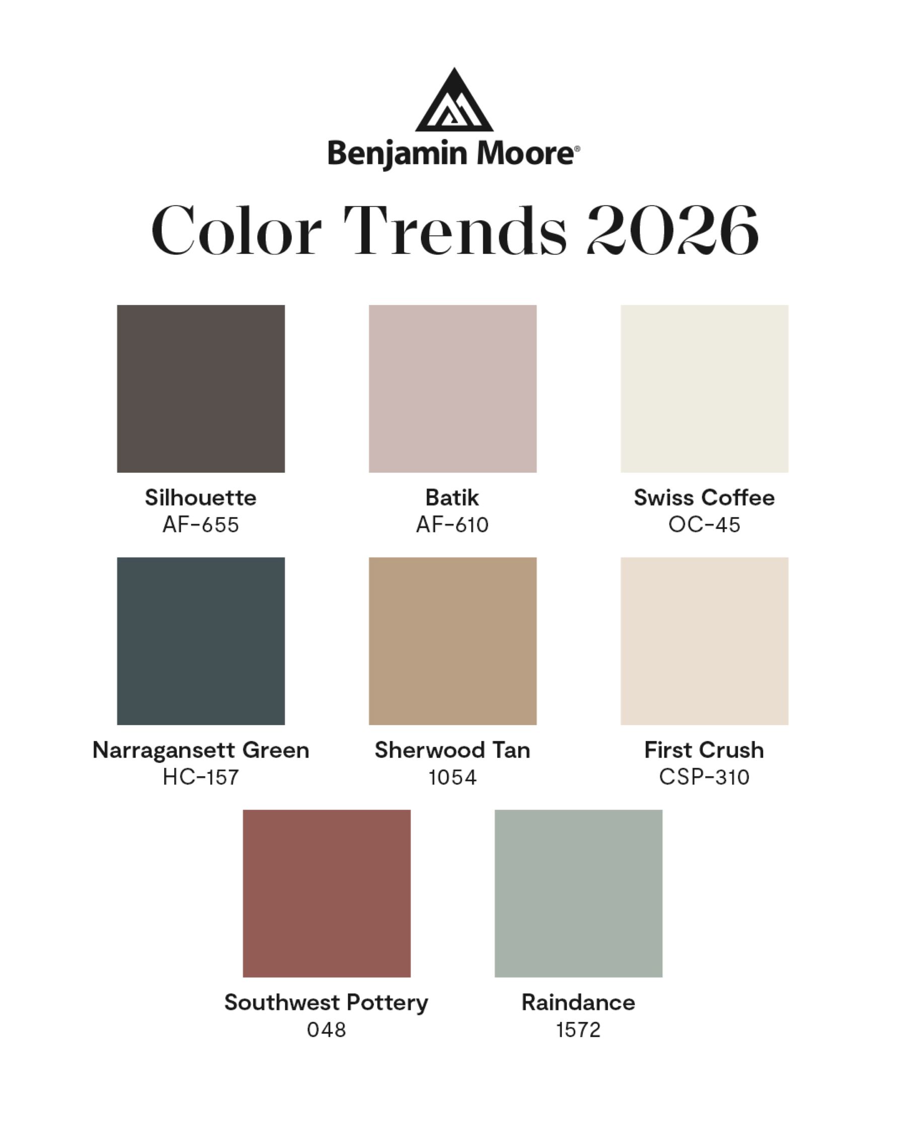
COLOR TRENDS 2026
Tailor-made colors…
The palette of COLOR TRENDS 2026 can be called "Tailored Classics", made to measure.
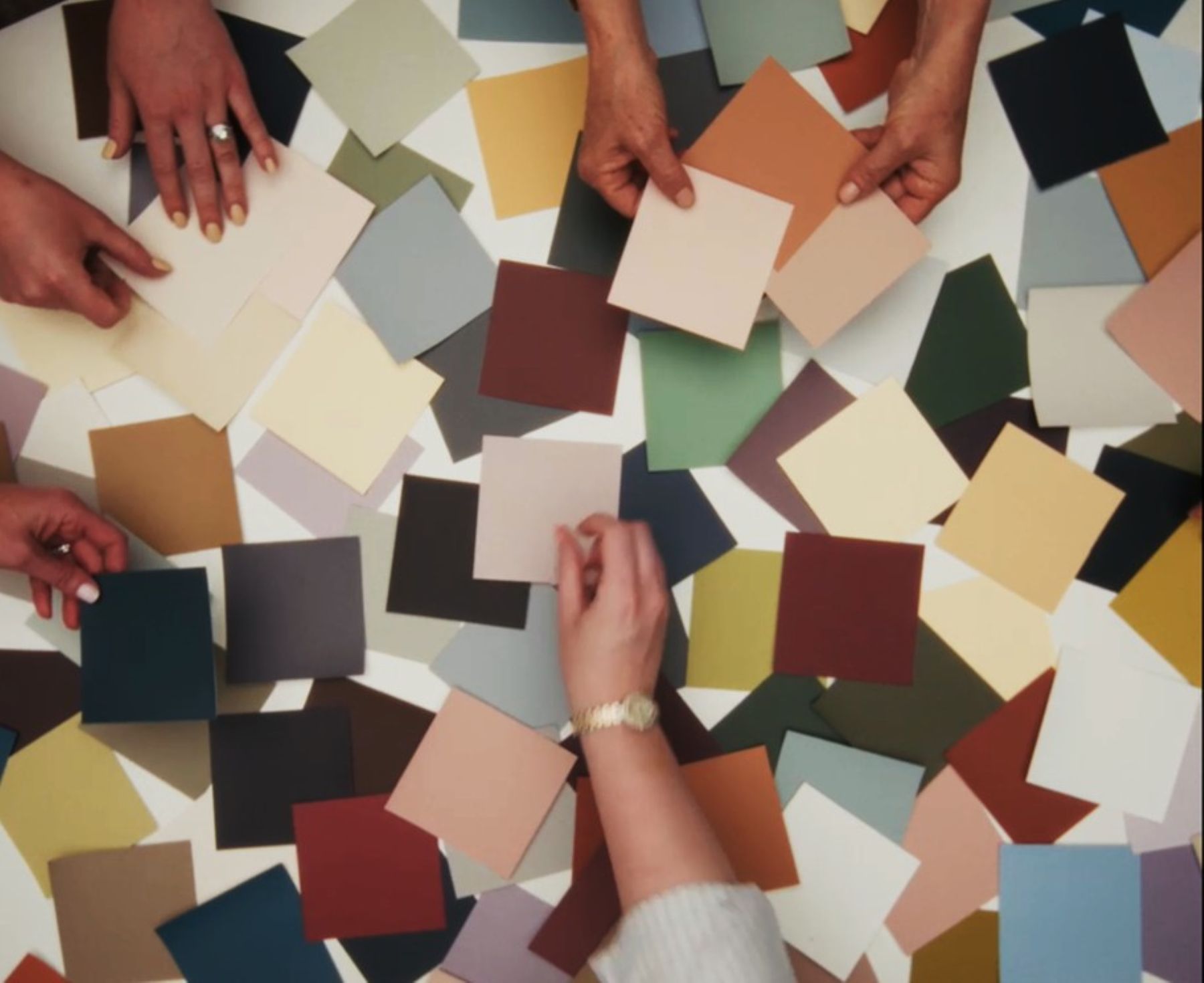
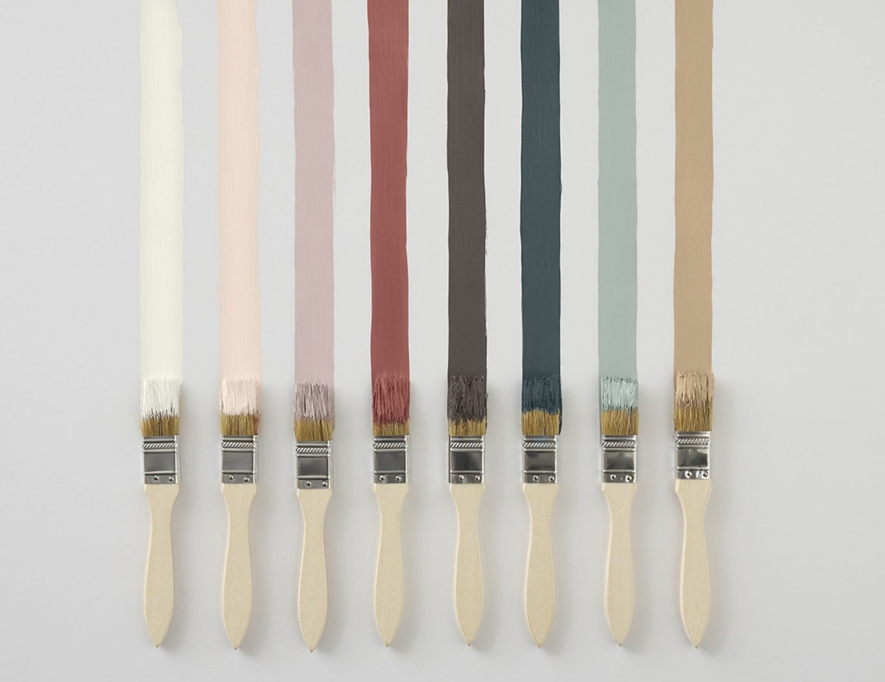
We choose a color of the year and supporting palette to create a distinct and consistent point of view for our Color Trends. Mentioned palette includes eight hues focused on “detail and distinction.”
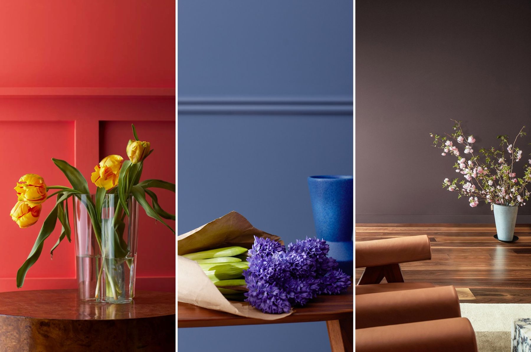
With a focus on attention to detail, craftsmanship and refinement, the Colour Trends 2026 palette reflects a graceful balance of enchanting pales and handsome midtones:
Silhouette AF-655”, „Raindance 1572”, „Swiss Coffee OC-45”, „First Crush CSP-310”, „Batik AF-610”, „Narragansett Green HC-157”, „Southwest Pottery 048”, „Sherwood Tan 1054”.
Each hue is hand selected for its ability to stand alone with grace, or pair with other colors for a sophisticated approach to layering.
As the team was selecting colors, this note of romanticized classics, tailoring, and craftmanship was a key focus that really guided the colors chosen. The result was a palette that balances between handsome and soft; traditional and poetic; sartorial and fluid.
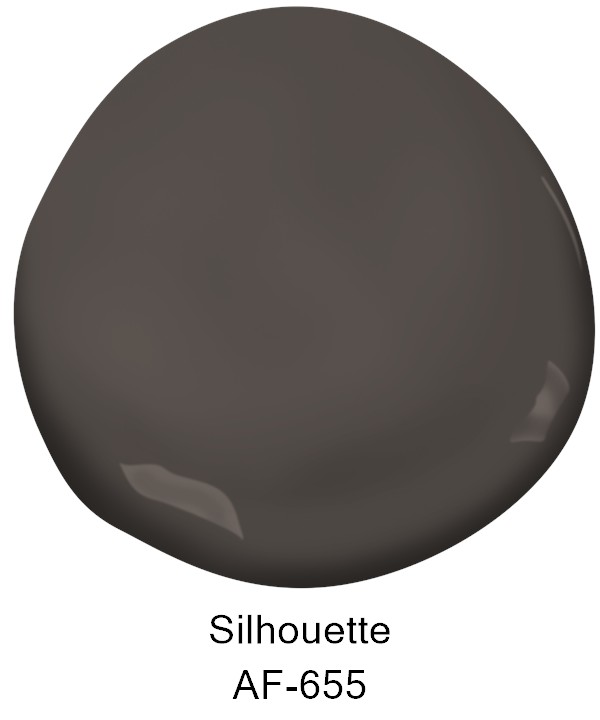
“Silhouette AF-655” weaves a narrative of refined style and grace into this layered palette of enchanting pales and handsome midtones.
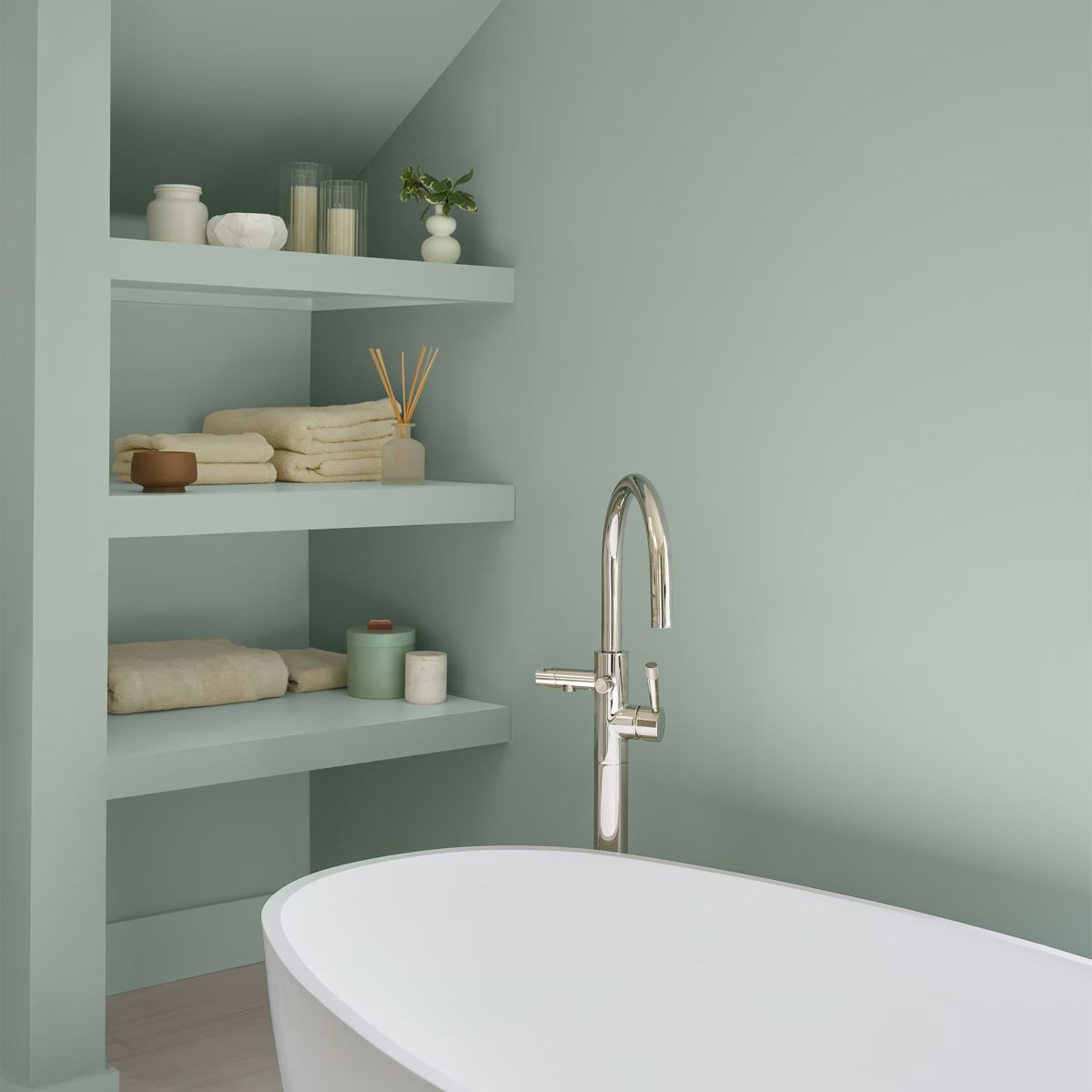
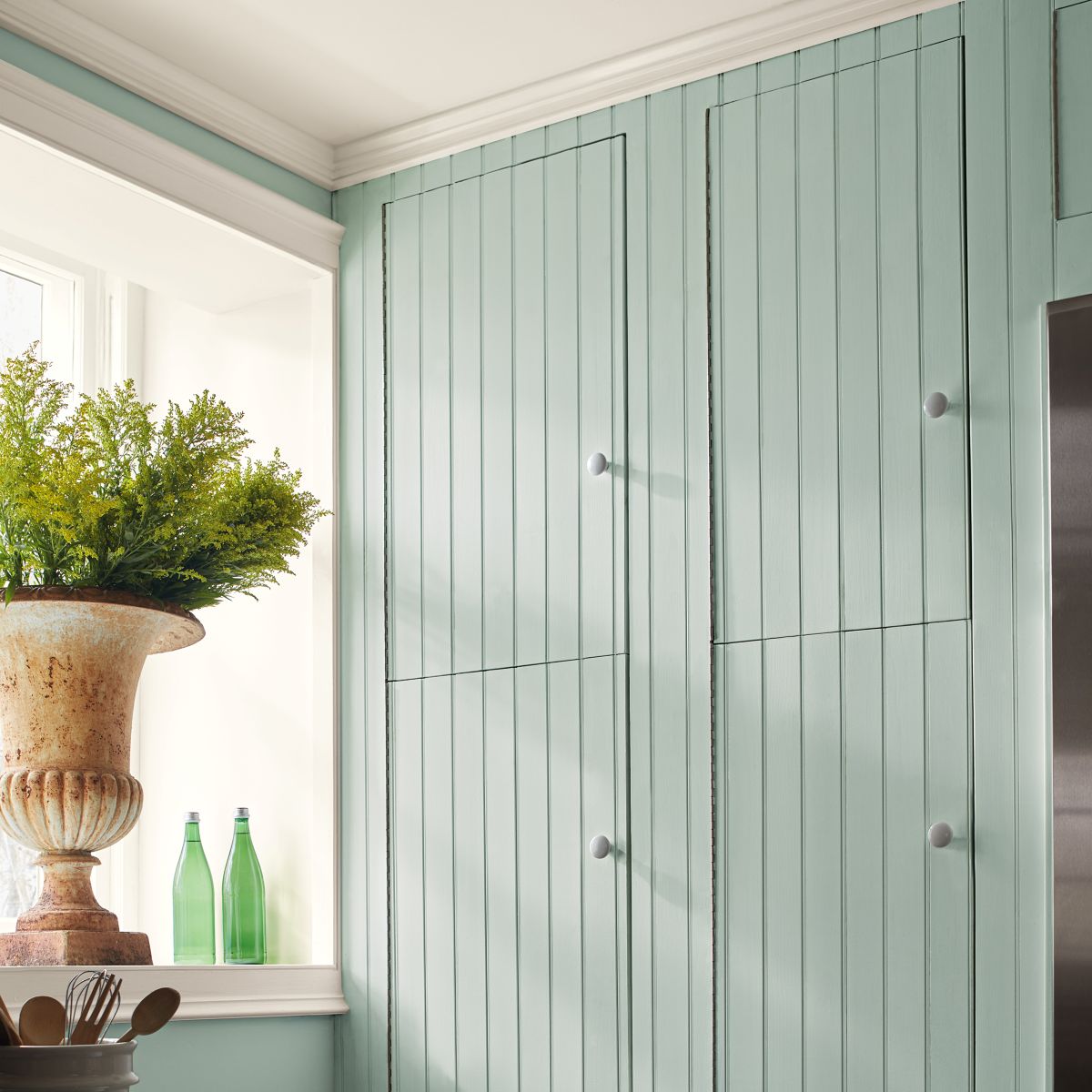
The Color Trends palette is balanced by two main groupings colors - soft, enchanting pales and grounding, handsome midtones. First, let’s look at the more ethereal side of the palette and ways to use these colors in a space.
Fall is not just about falling leaves…
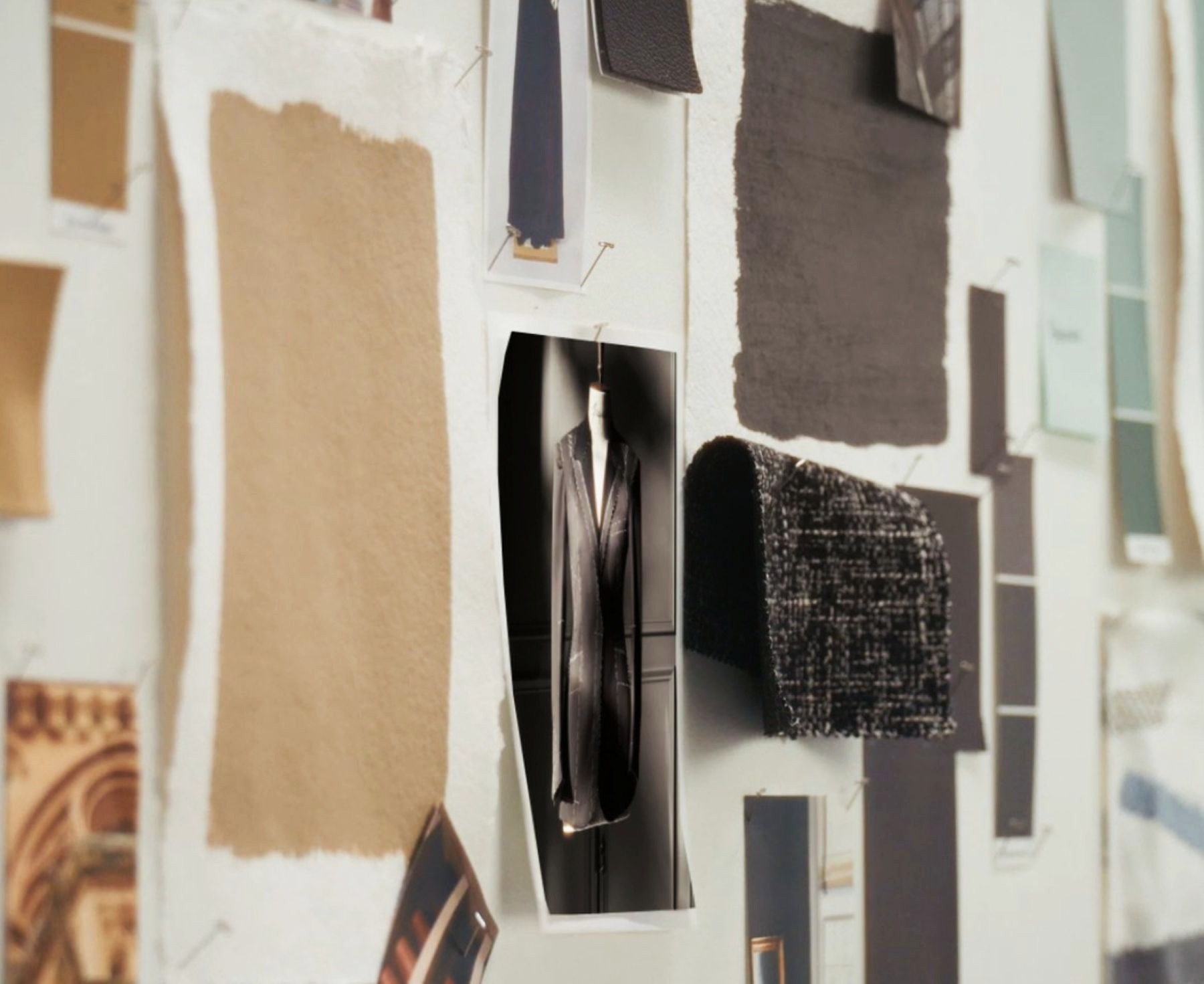
Every Fall, Benjamin Moore’s Color Team meets to discuss Color Trends.
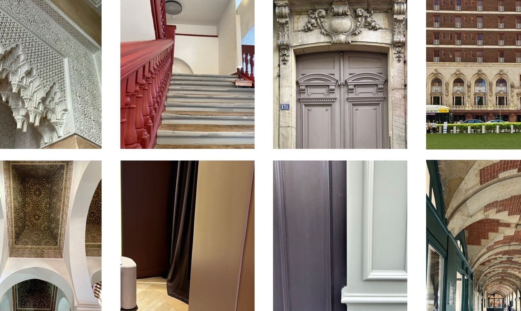
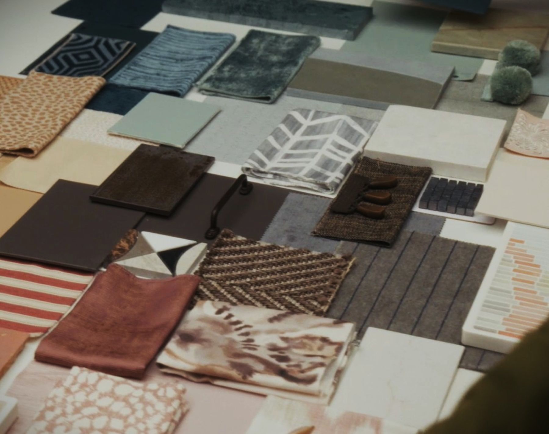
The team goes to trade shows, trend talks, museums, looking at different disciplines from art, to fashion, to architecture, to interiors, and everything in between. Then we synthesize the data through the lens of paint.
This year, we kept going back to the connection between fashion and interiors. Fashion is something we look at every year but as discussed earlier in the presentation, there are points in time when there is a more distinct connection between the trends in the different disciplines of design.
When selecting colors, Color Hunters also look at previous color trends palettes to see how the colors transition from year to year.
Most recently, they see colors take a softer, quieter approach but there is still a presence to them. The "mixing" of color families is also characteristic: blues, shift into blue-greens; oranges into browns; punchy pinks into blush tones.
Sometimes the choice is obvious…
Every year is different in terms of color preferences, but sometimes the Color Team knows exactly what the color of the year will be.
However, these are rare cases, and usually the final selection of the most important shade for the next season and the trend palette is a long, complicated process.
Fashion, fashion, fashion again…
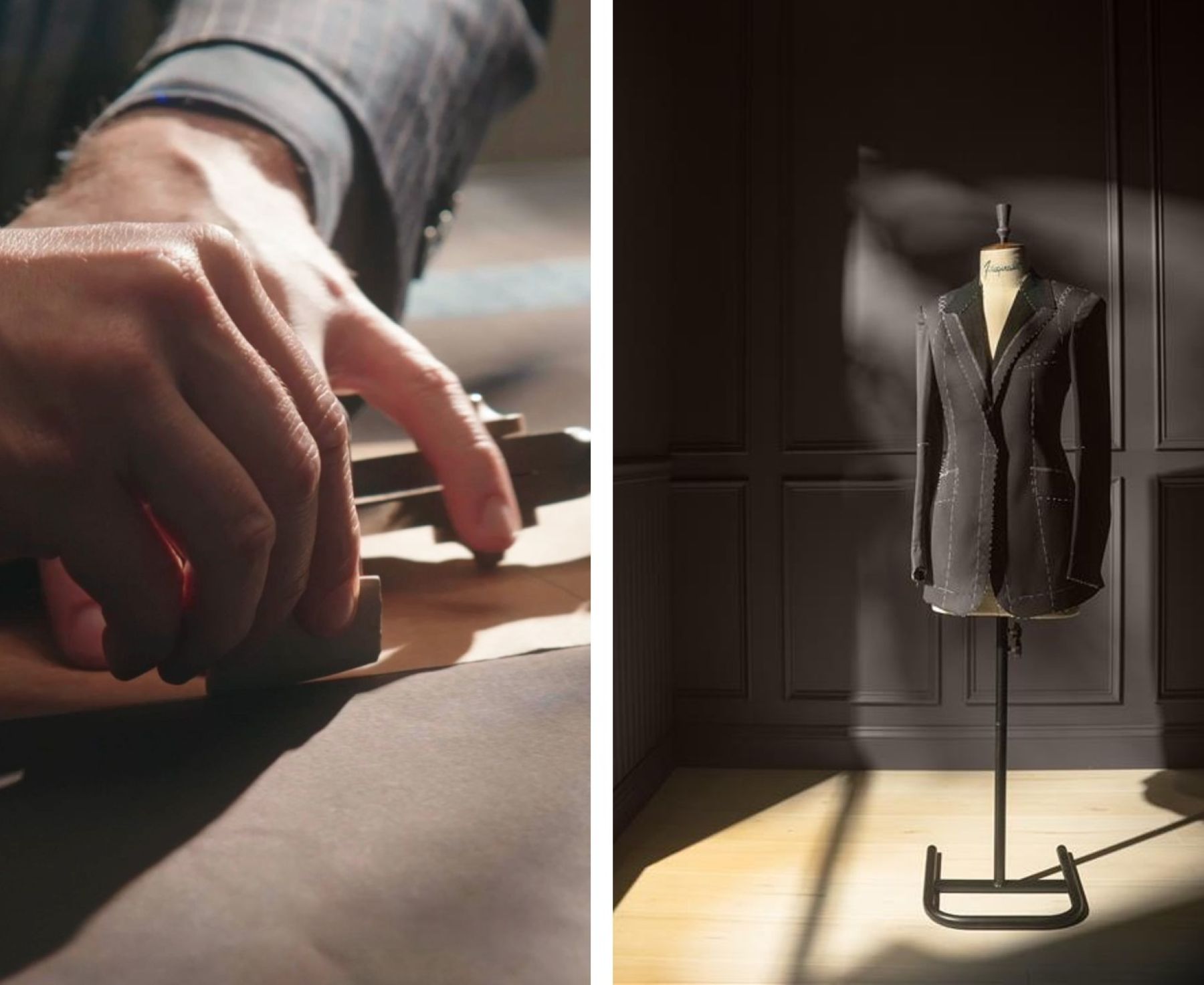
In fashion, we are seeing the return of suiting and tailoring. People are reimagining the idea of it and no longer defining it solely as a tuxedo or a single-breasted suit. In its simplest form, a suit is a matching jacket and pants with notes of tailoring.
There is something classic and stylish about the sartorial look. But we are also seeing people opt for more relaxed, laidback clothing looking for items that straddle between comfortable and chic. With this, we now see a softer take on the suit with sumptuous fabrics, fluid movement, and layered textures coupled with meticulous draping and tailoring.
We see a similar trend in interiors with the return of timeless pieces and elements of more traditional design. With the onset of micro-trend fatigue, we see people reaching for items with staying power. There is a comfort and reassurance in these classic pieces knowing that they can stand the test of time.
Similar to the suit, we are also seeing a softer, more bespoke take on them as well. We see traditional design pieces coupled with more romantic colors, and handcrafted accents bringing a personalization to the space.
It’s all about the details and the attention that goes into dressing an outfit and dressing a room.
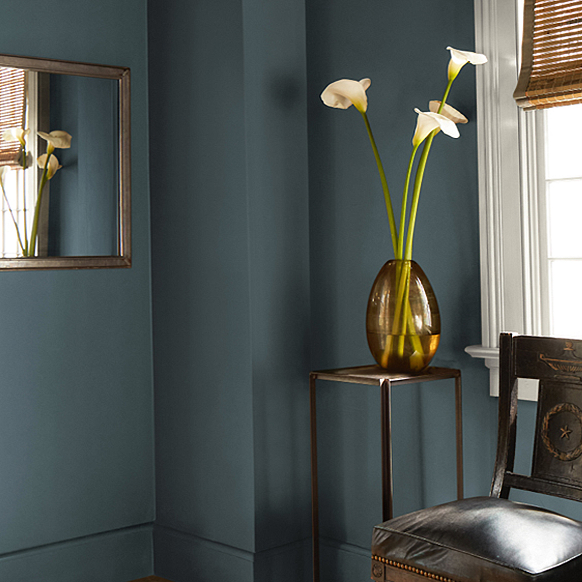
SILHOUETTE – game changer…
Over the past few years, we have been talking about this shift towards warmer hues and creating spaces that feel personalized and unique.
We have seen a growing interest in the brown color family particularly in fashion and interiors. People are more likely to consider it as alternatives to black and gray.
Dark chocolatey hues, sophisticated caramels, and cozy cocoas can be equally parts inviting and chic.
In the Color Trends 2023 palette, we had “Wenge AF-180”. This deep sumptuous brown has hints of black and violet creating an alluring but engaging hue.
The Color Trends 2025 palette featured two browns, “Leather Saddle Brown 2100-20” and “Chowning’s Tan CW-195”.
These two enveloping hues show the versatility and range of browns. Leather Saddle Brown has warm notes of red and orange with a stronger depth and saturation. Chowning’s Tan is a softer, cidery hue that has a more easygoing approach.
As we look at the transition to Silhouette AF-655 we get the best of both worlds. It has the depth and alluring quality of darker chocolatey browns, but with its charcoal undertones, it also has a versatility and softness.
Let’s take a deeper dive into…
Let’s take a deeper dive into these colors and why they were chosen for the Color Trends 2026 palette.
We will start the review with more ethereal side of the palette and ways to use these colors in a space.

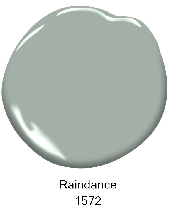
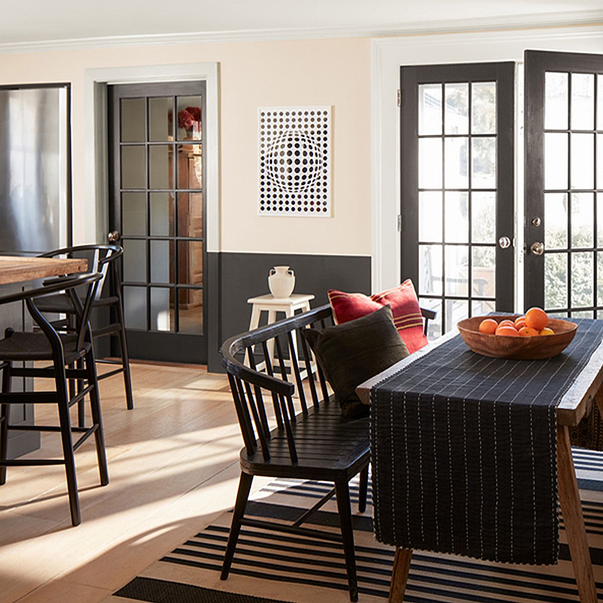
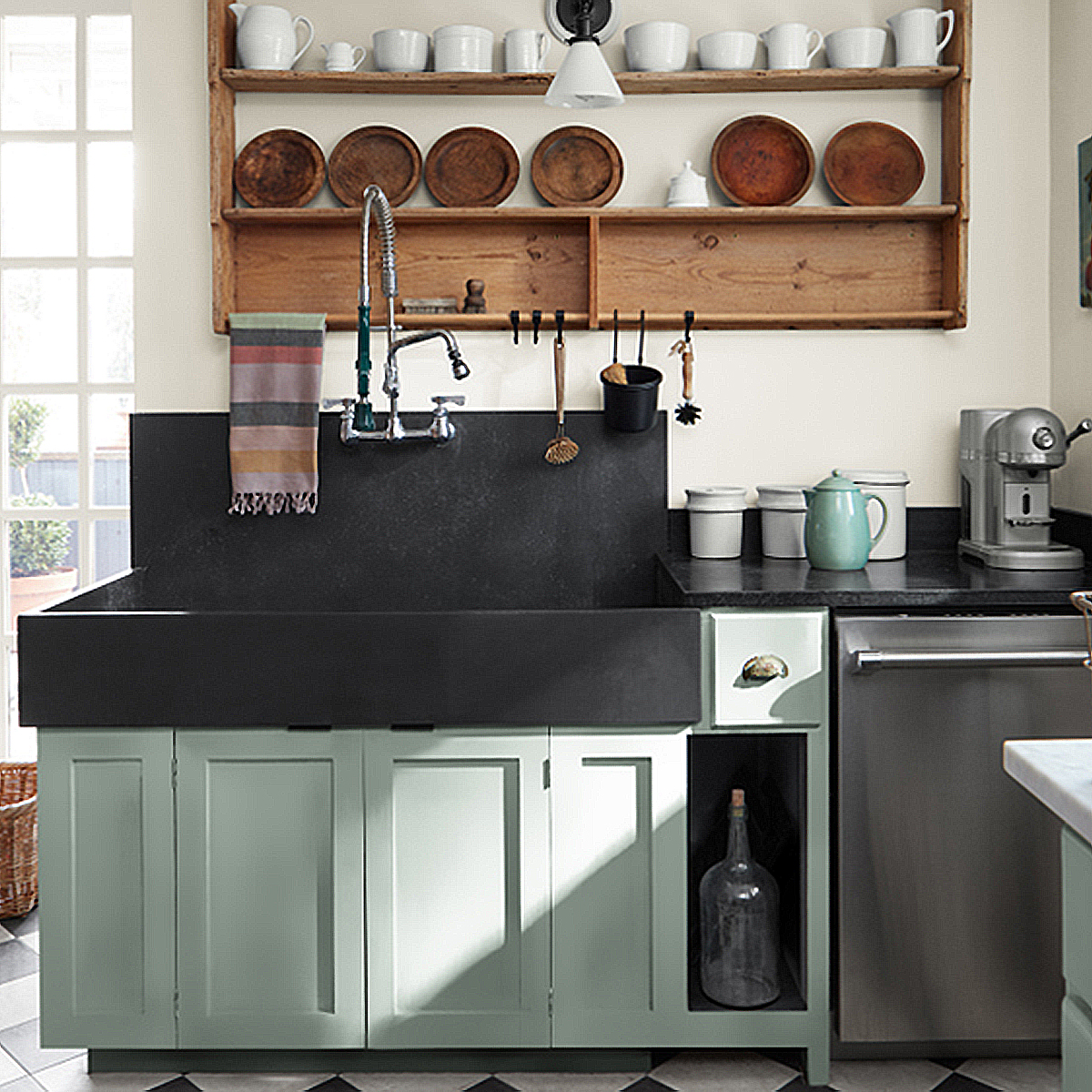
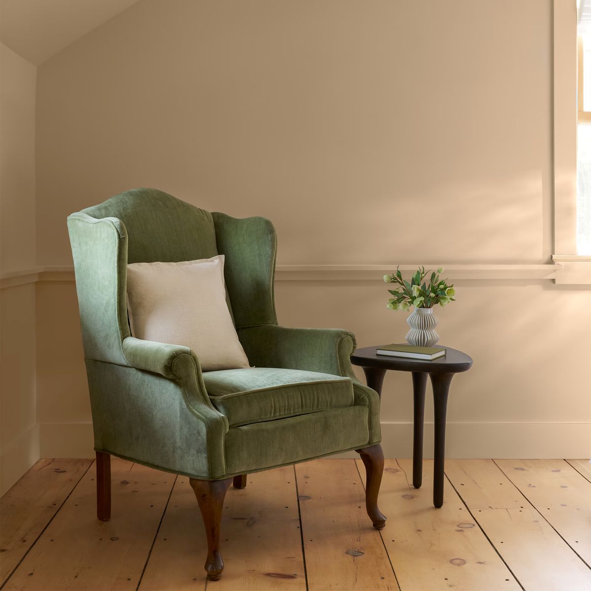
Raindance – the name speaks for itself…
Easygoing gray undertones bring an effortless versatility to this steely green.
“Raindance 1572” is a nuanced hue that can pair beautifully with softer, more textured materials likes linens and wickers to create a more coastal, laidback look.
You can also bring in more contrast with darker accents in charcoals, graphites, and mixed metals for added depth.
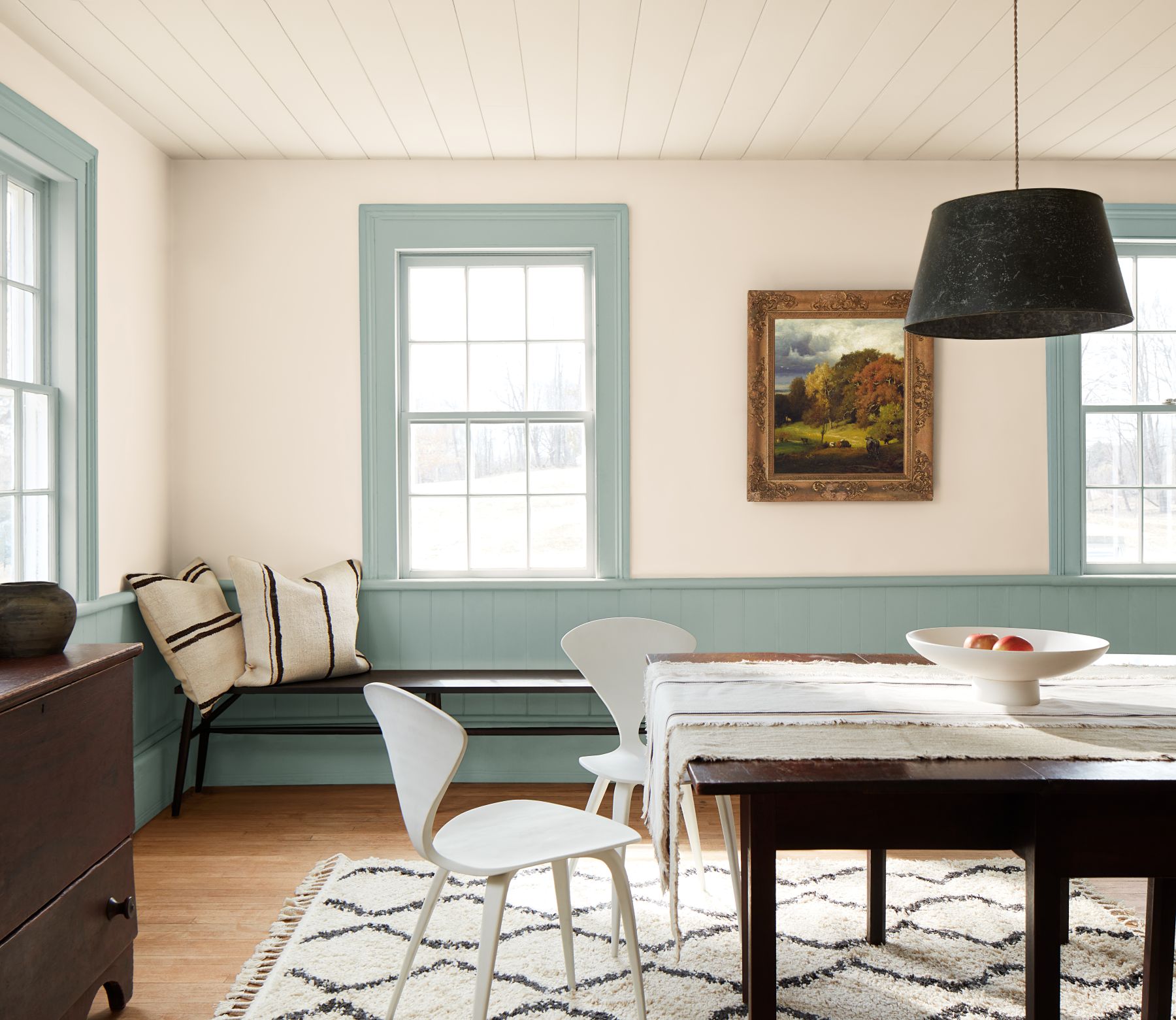
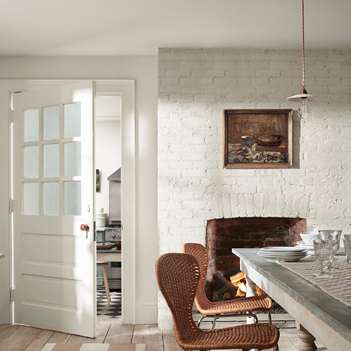
This color can take on more of a rustic, farmhouse look as shown in this kitchen image below. It brings a sense of ease to this space pairing seamlessly with a classic checkerboard floor and oversized soapstone sink.
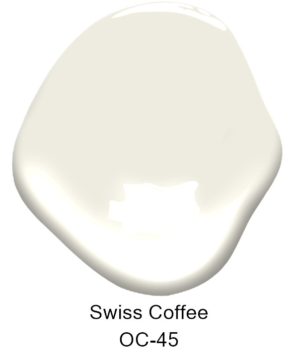
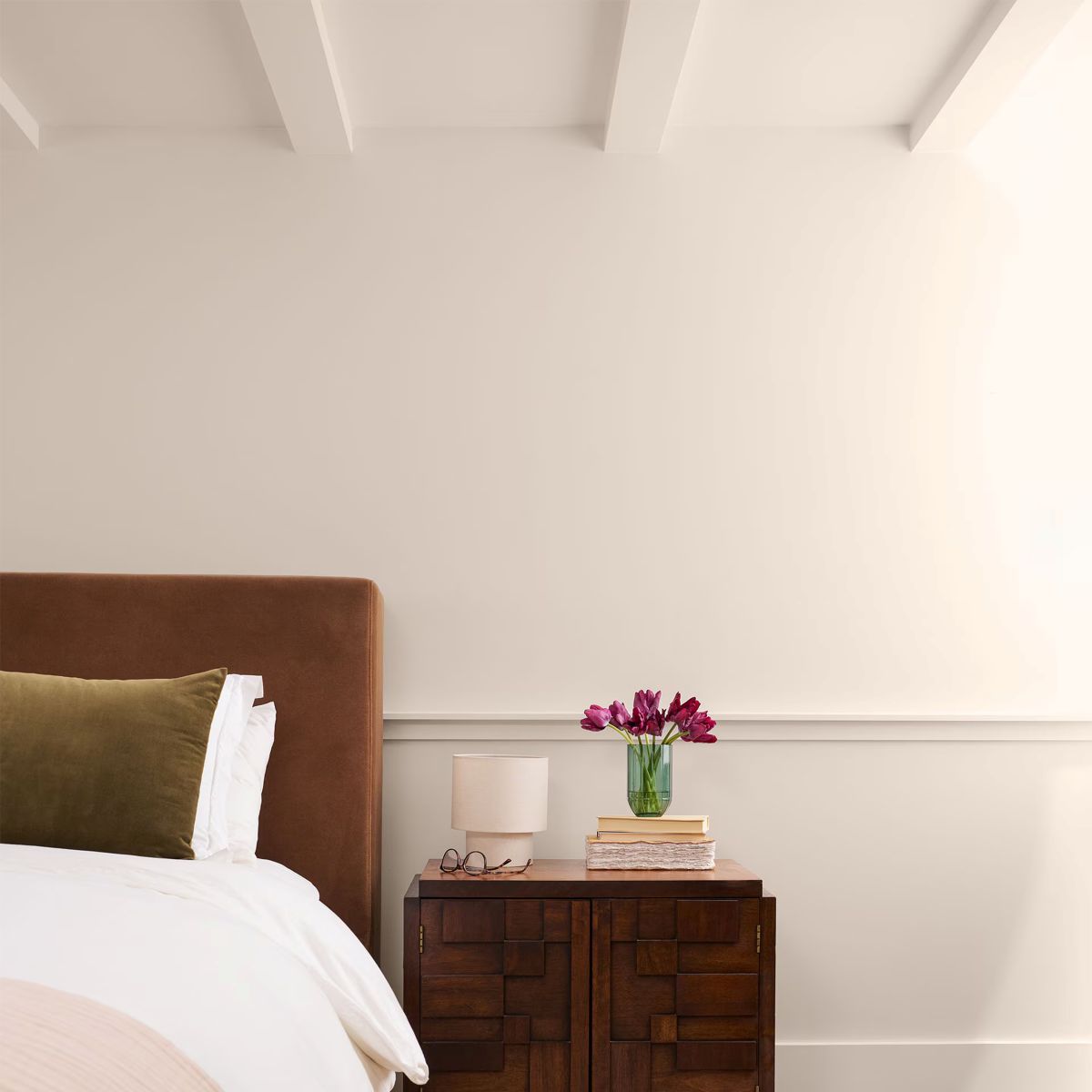
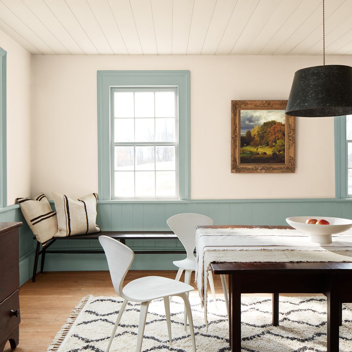
The brightest of the entire collection…
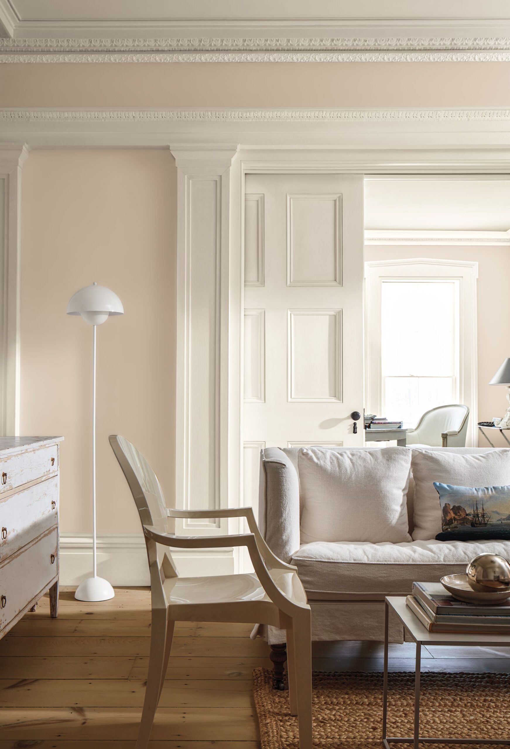
An essential white paint color with just the right amount of warmth.
“Swiss Coffee OC-45” is a versatile color that can be easily incorporated into any color palette and any design style.

“Swiss Coffee” is truly a use-anywhere hue.
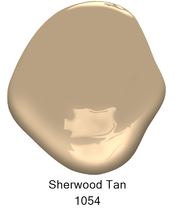
When paired with “Sherwood Tan 1054” and sharp black accents it takes on more of a refined look.
You can also pair it with woven textiles and easygoing colors like mentioned above “Raindance” for more of a coastal feel that feels more casual.
This is a perfect example of ways to dress up and dress down this versatile white paint color.
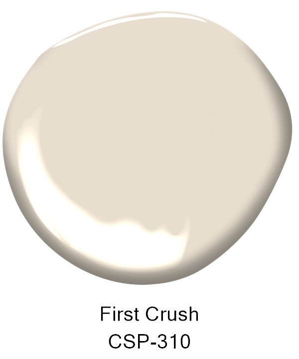
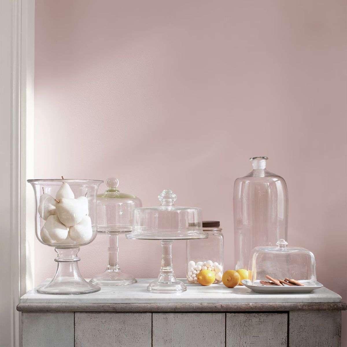
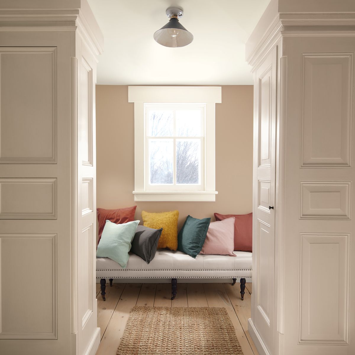
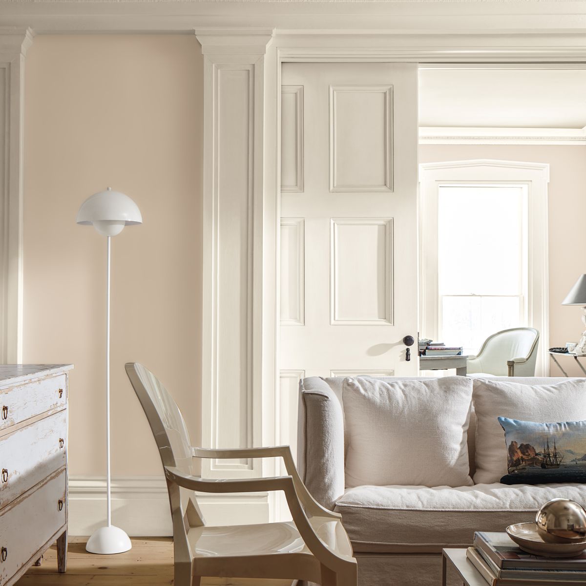
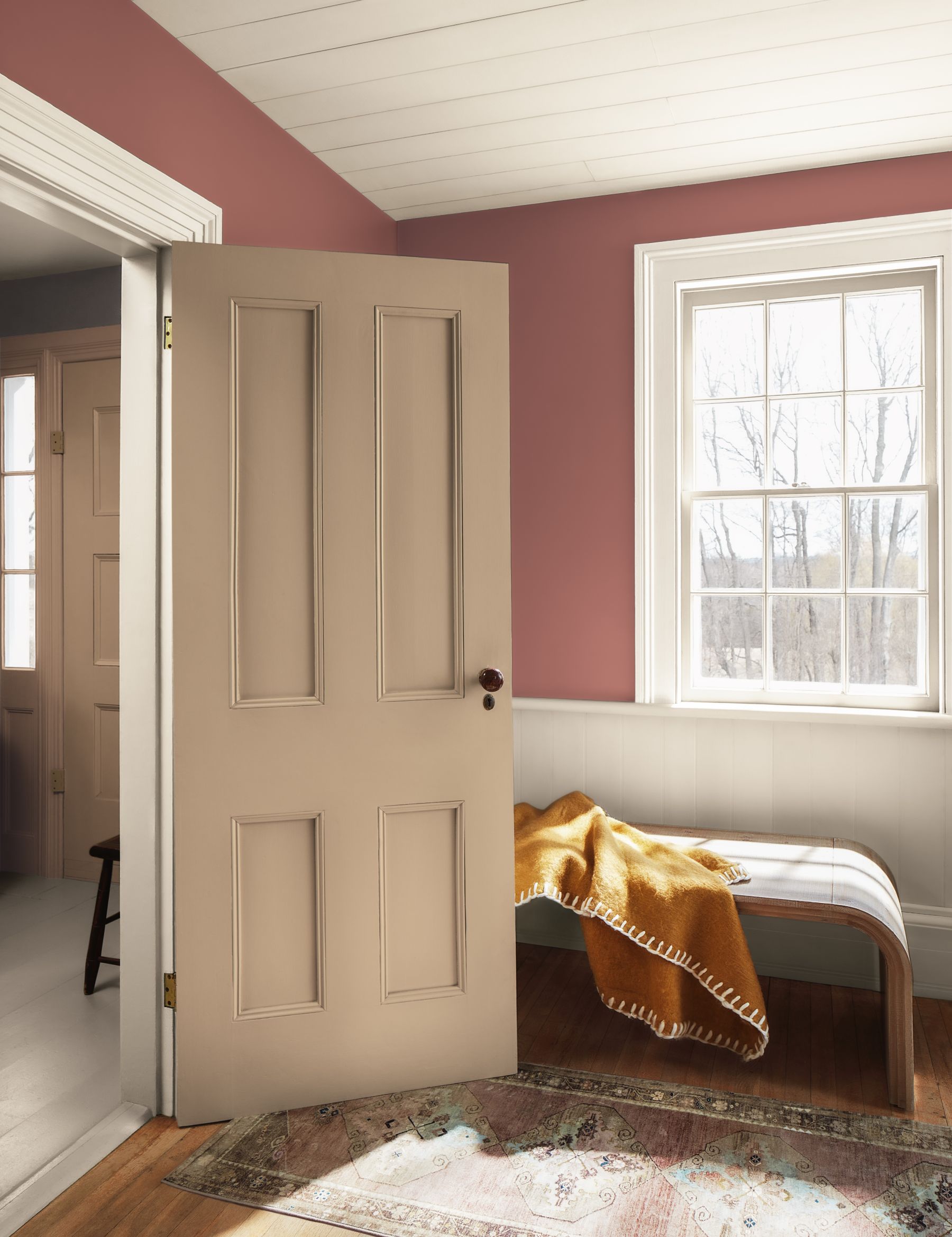
First Crush
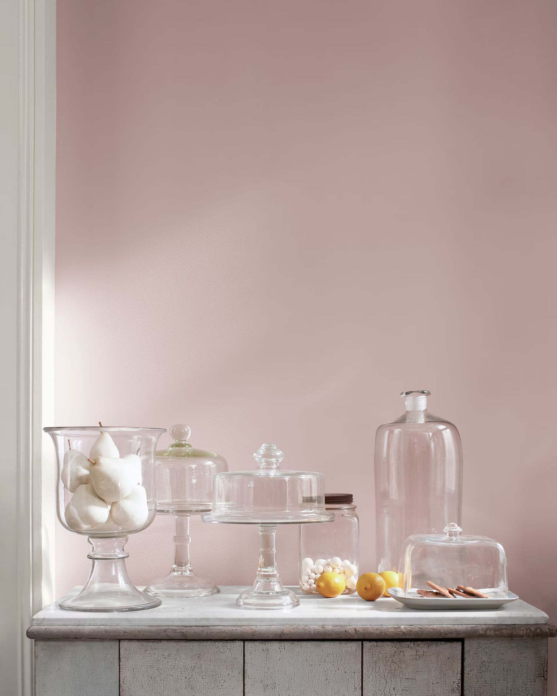
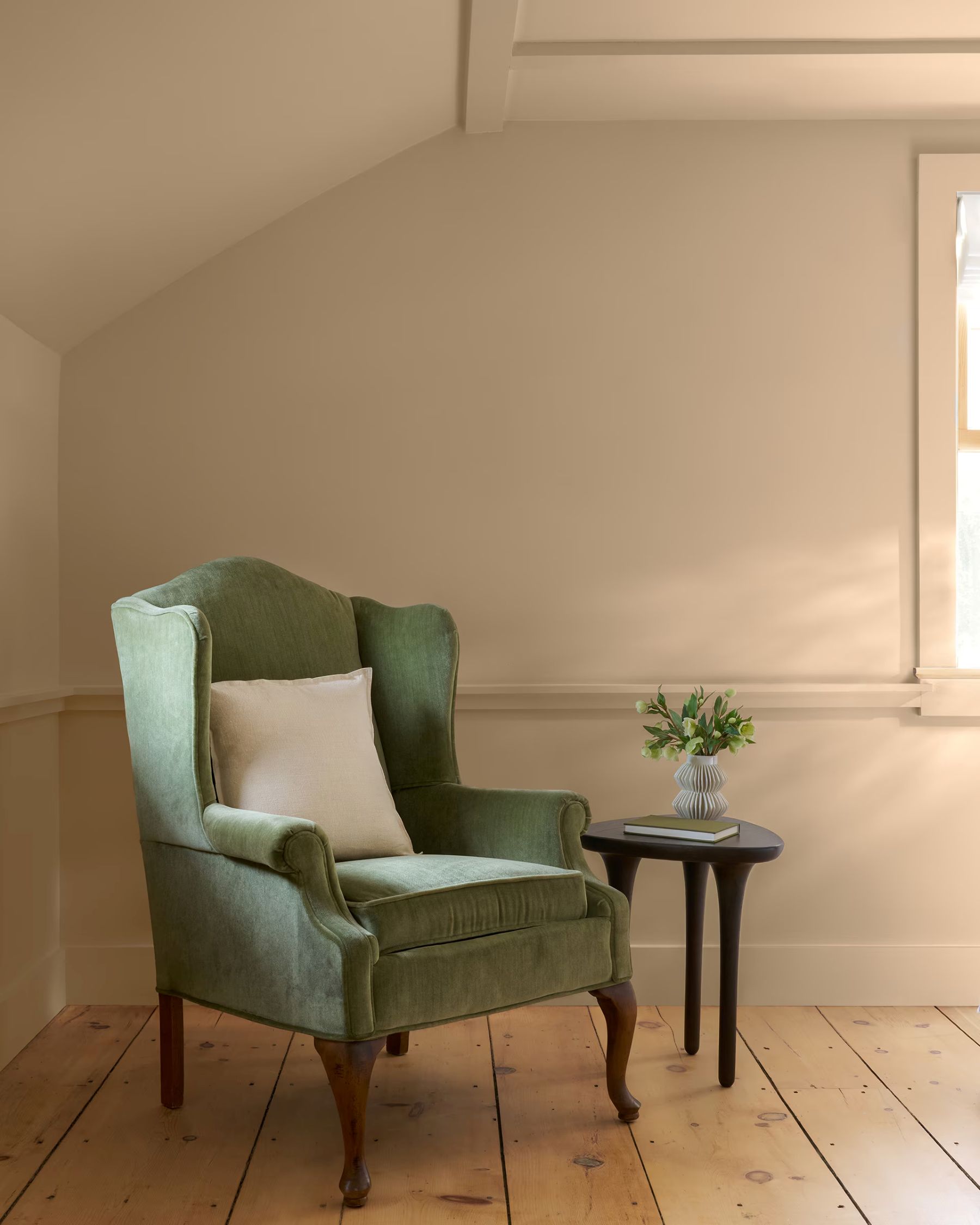
Infused with a hint of blush, this tender hue brings a subtle warmth to any space.

Pair First Crush with light grays and creamy white paint colors for easygoing softness. Bring in darker, more grounding hues like Silhouette for a handsome accent and an unexpected tailored touch.
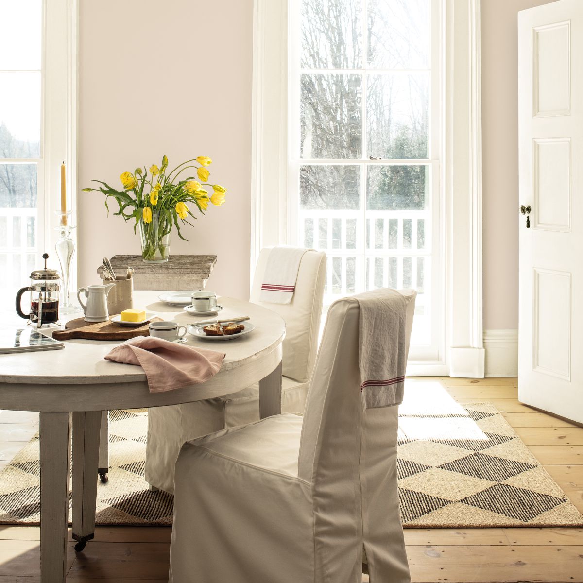
„Rosepine 461„ can make for a statement-making cabinet color with neutral walls or create a playful complementary combination when paired with brick.
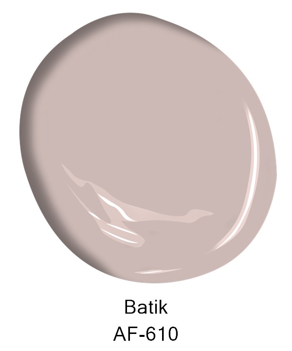
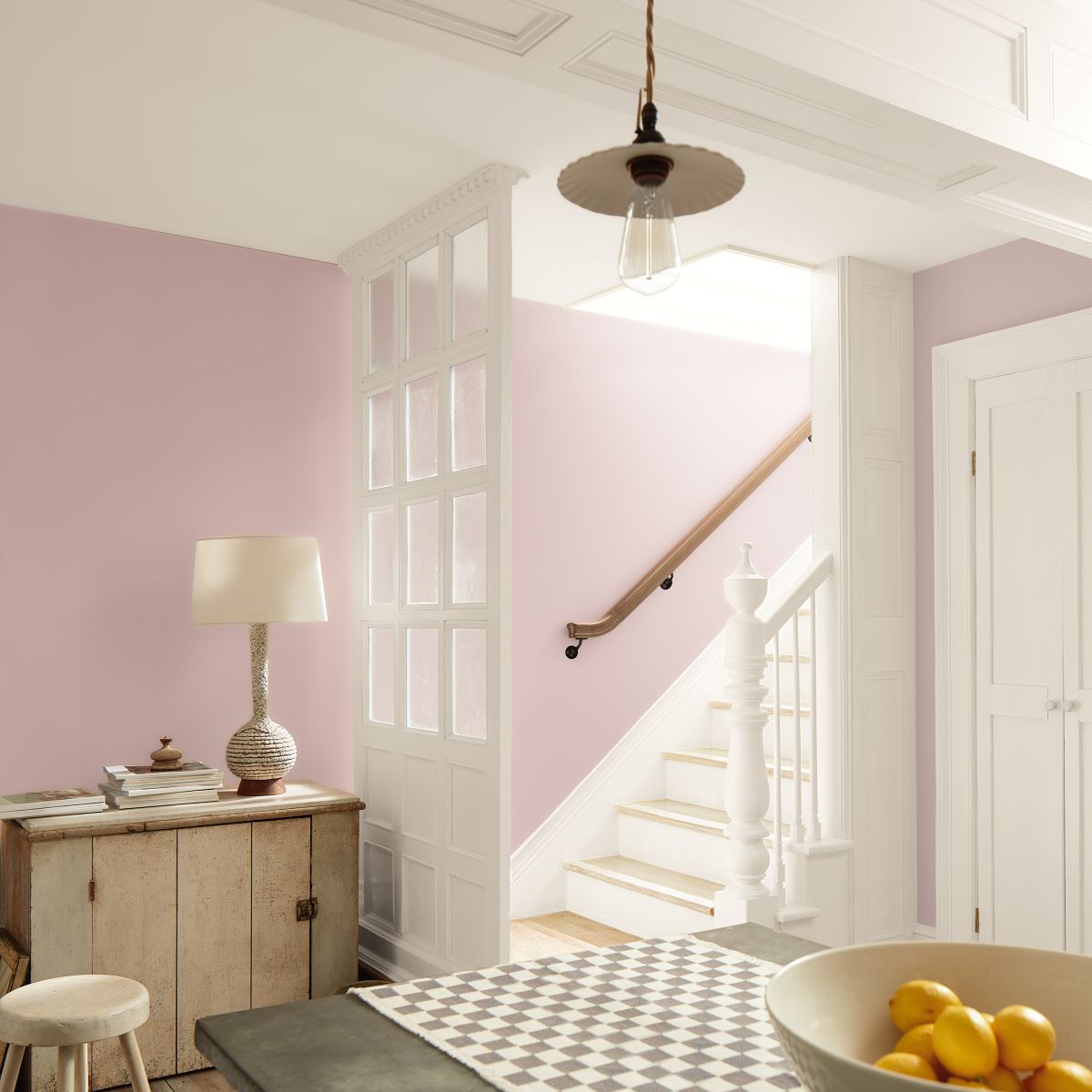
Violet and rose
Violet and rose come together to create this surprisingly versatile dusty hue.
When looking at “Batik AF-40”, there is a natural inclination to pair it with off-whites, blush pinks, and golds.
Batik brings a romantic, cozy quality to any color palette. On the staircase image to the left, it pairs beautifully with soft off-whites and weathered wood tones infusing a touch of warmth and refinement to this transitional space.
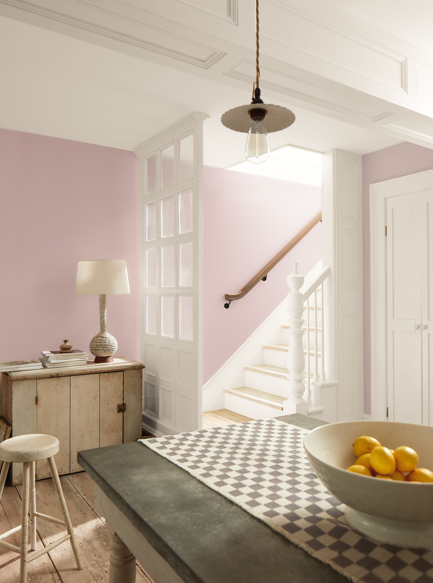
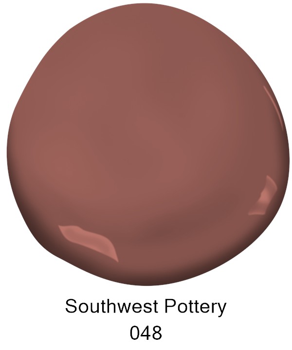
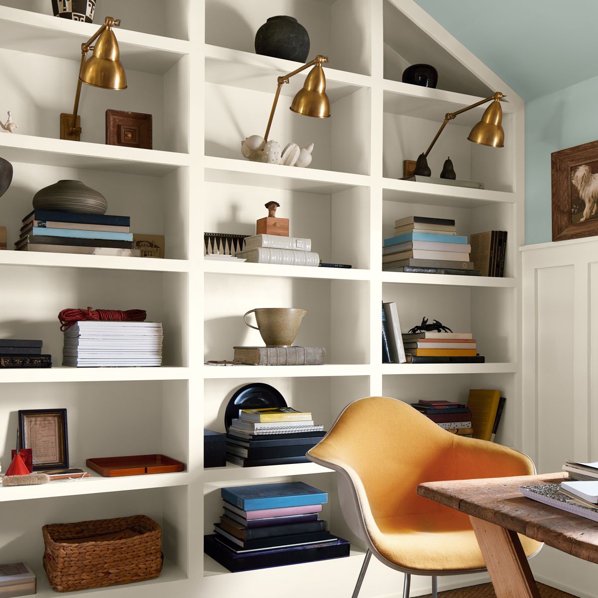
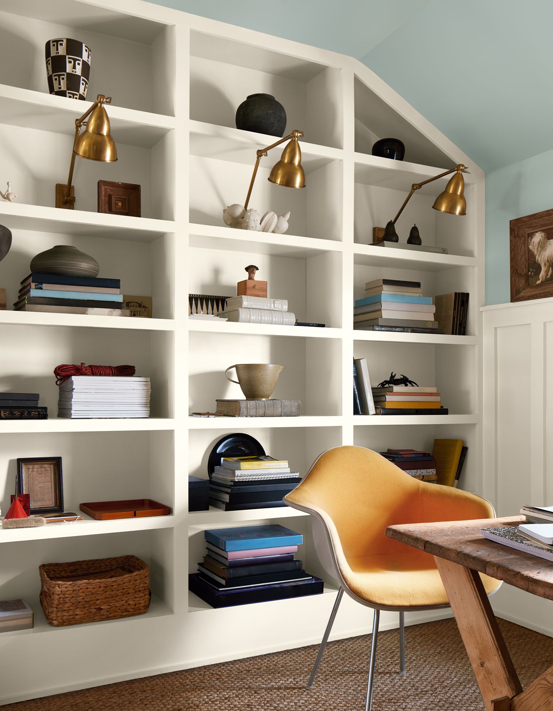
On the home office image (below), “Batik” plays more of a supporting role when paired with walls in “Southwest Pottery 048”.
Oversized floor to ceiling window trim make the windows a focal point in the space. Painting them with a dustier hue like “Batik” instead of a typical off-white adds an unexpected wink of elegance to the room.
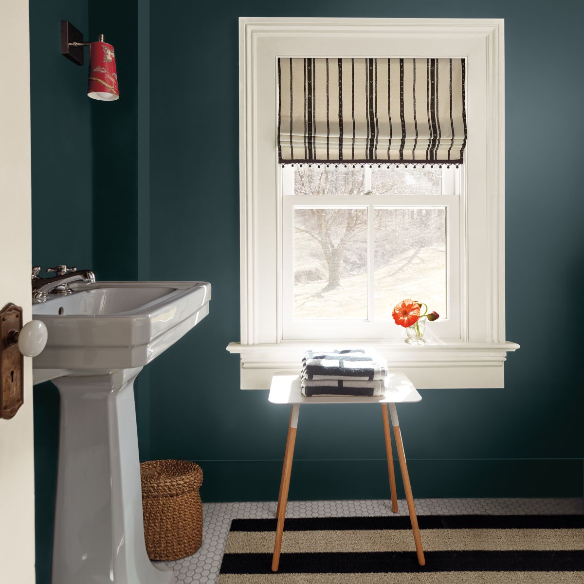
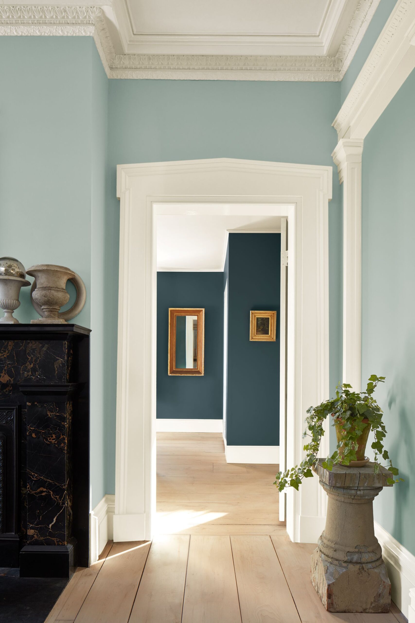
The “darker side” of the force…
Now let’s move on to the handsome midtones. These moodier hues feel equally parts welcoming and sophisticated.
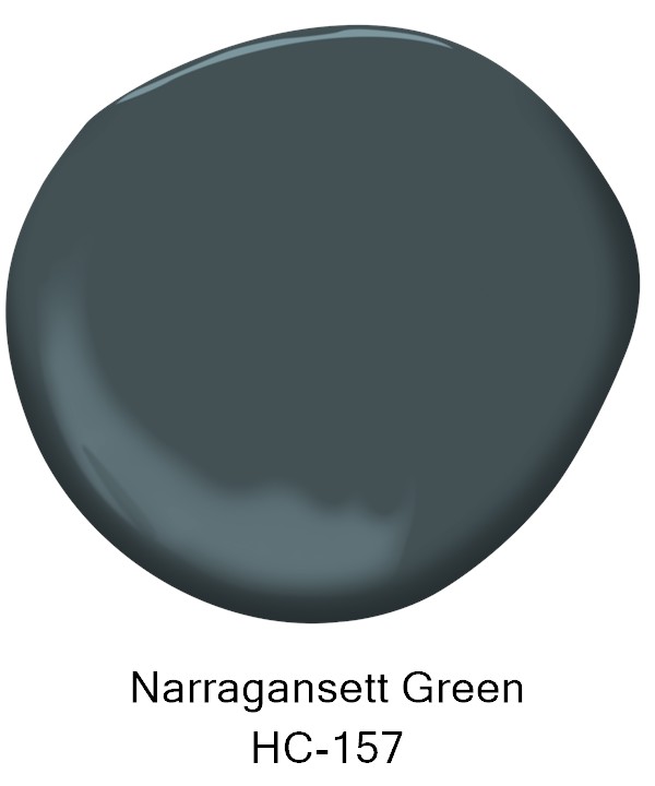
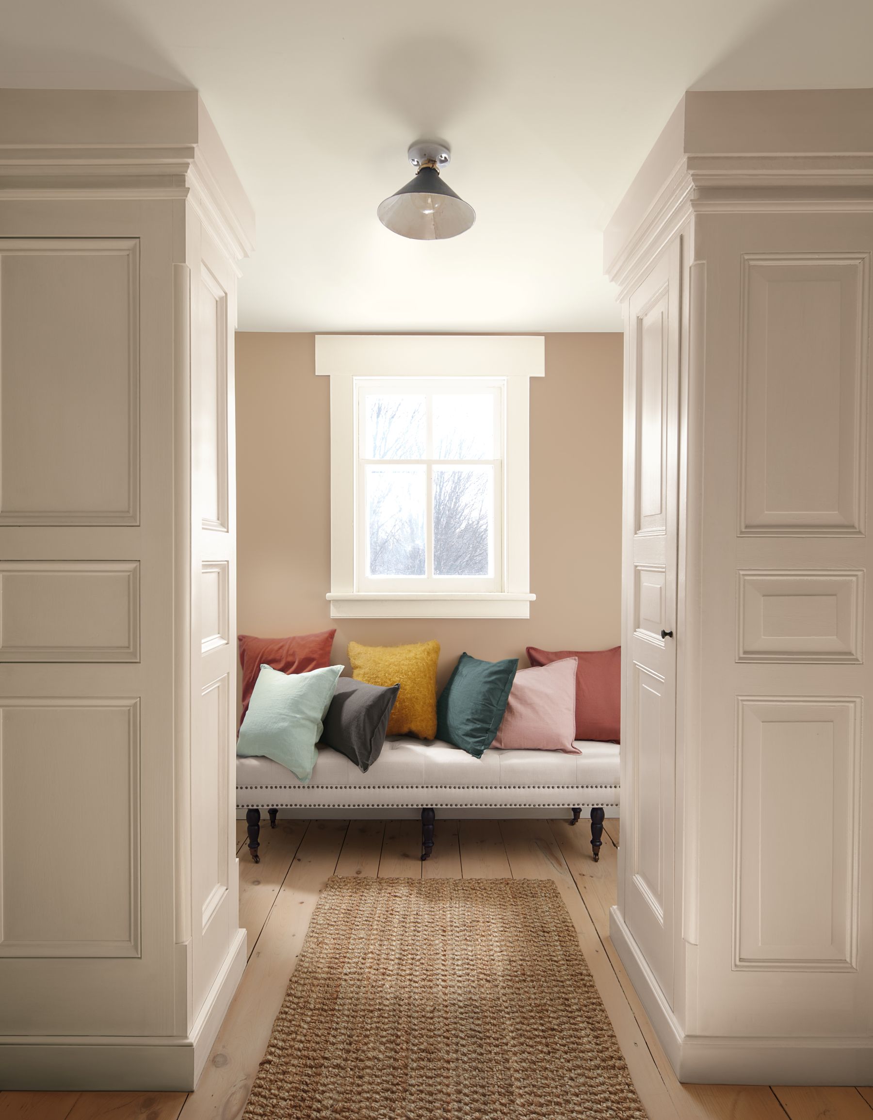
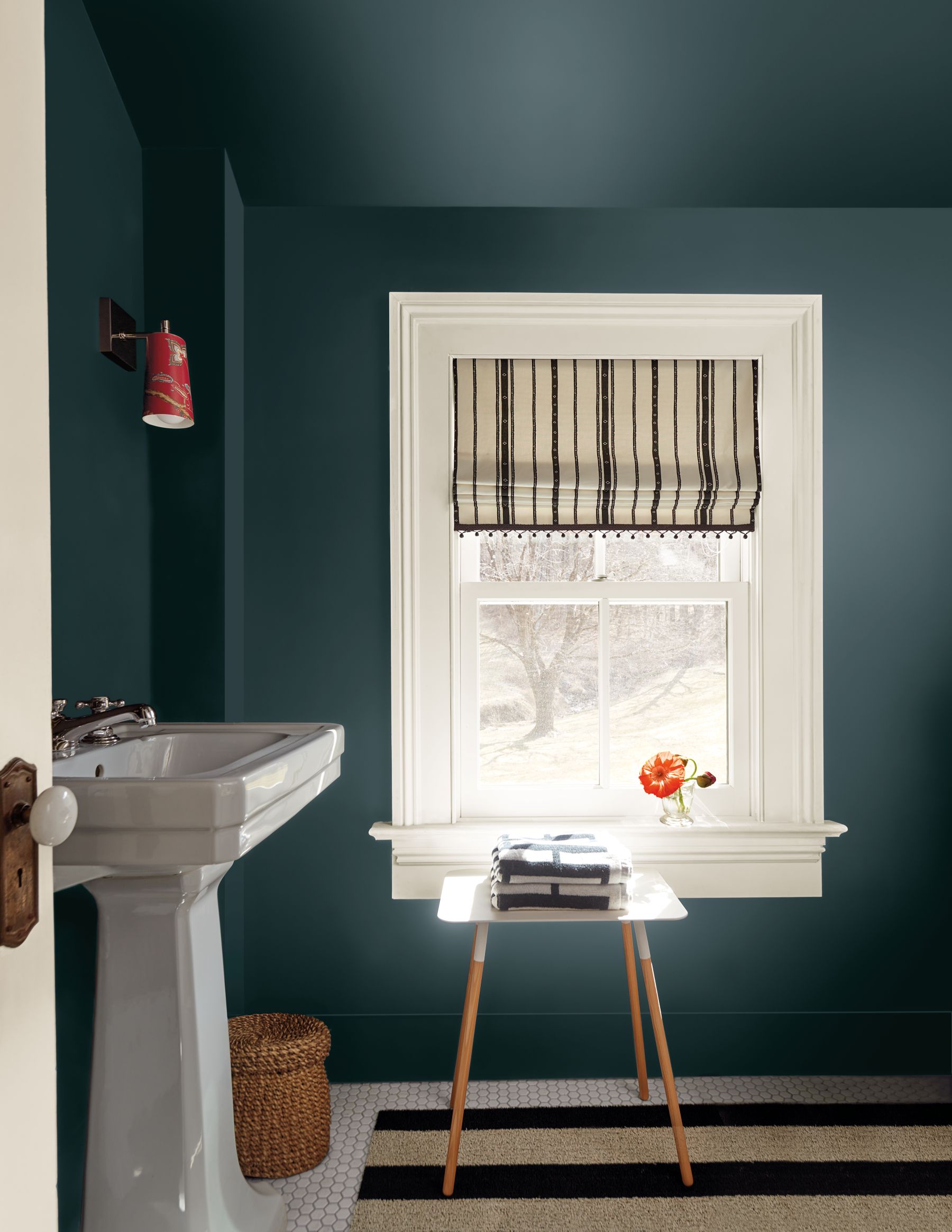
The moody green “Narragansett Green HC-157” is the darkest color from the 2026 TRENDS palette.
It is a stately hue that can bring a classic touch to any color palette.
“Narragansett Green” can make for a statement-making space. Painting it on the walls, baseboards, and ceiling can help to blur the lines in the room and make it feel larger.
Finishing the window strips with white will enhance the contrast of the space painted with the aforementioned green.
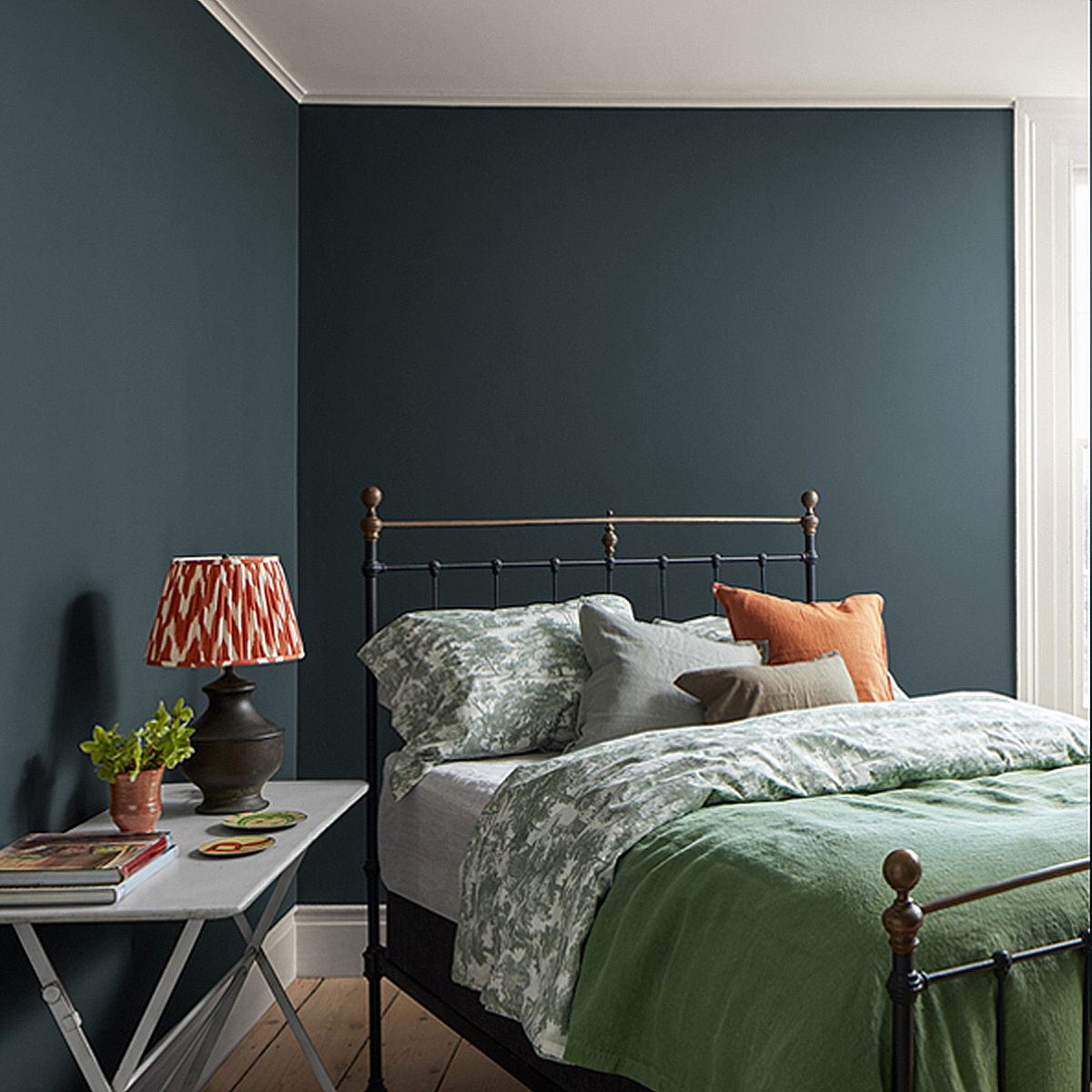
If you prefer a more traditional look, use this handsome hue on the walls with the classic white painted trim and ceiling.
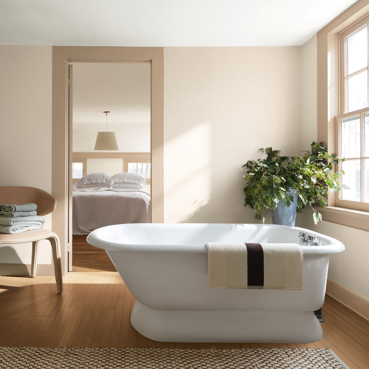
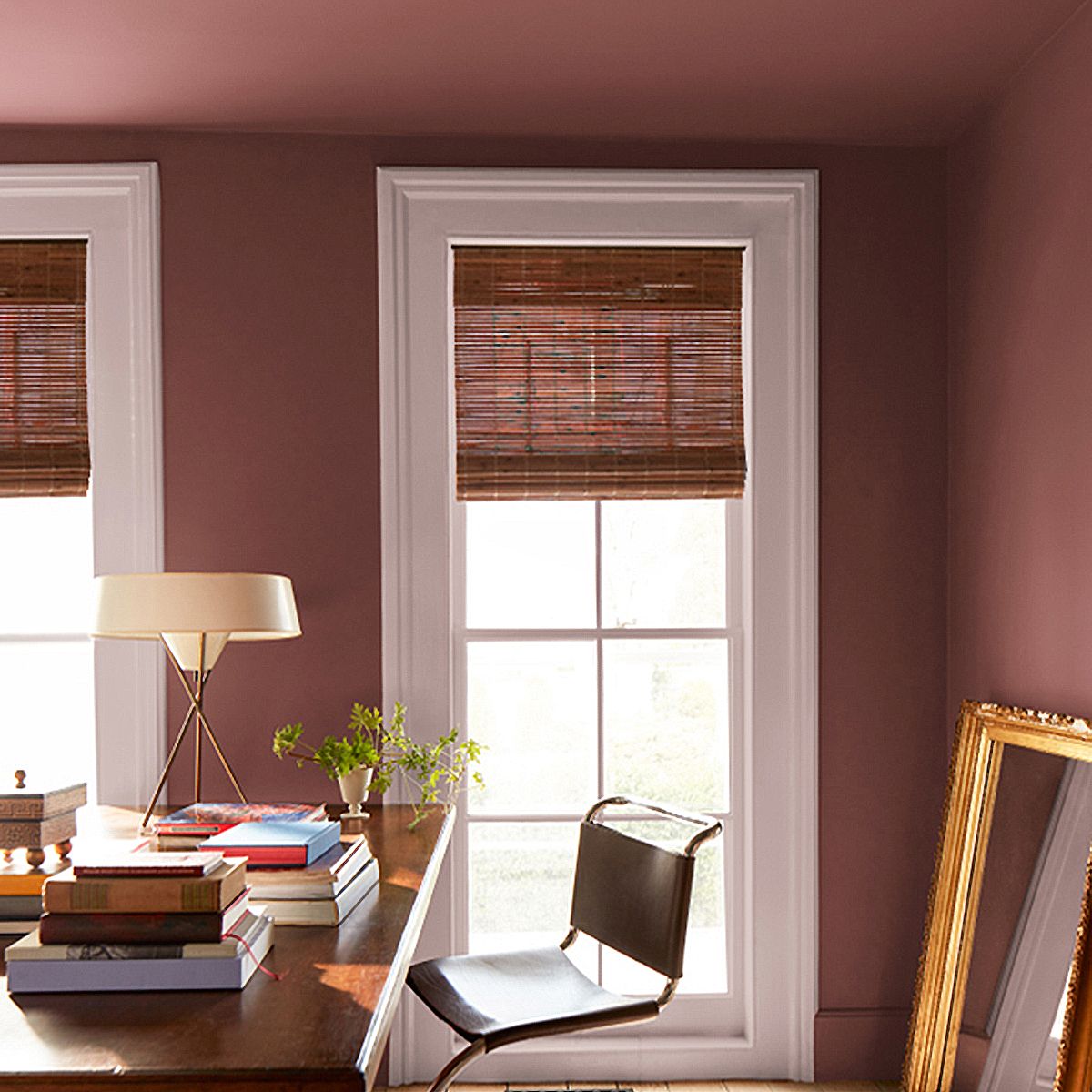
Hot as a brick…
“Southwest Pottery 048” is a nuanced hue that captures the brown and red tones of kiln-fired clay.
Crisp whites, silvery blues, and warm brassy hardware bring a modern touch to the color palette showing the versatility and adaptability of this terracotta hue.
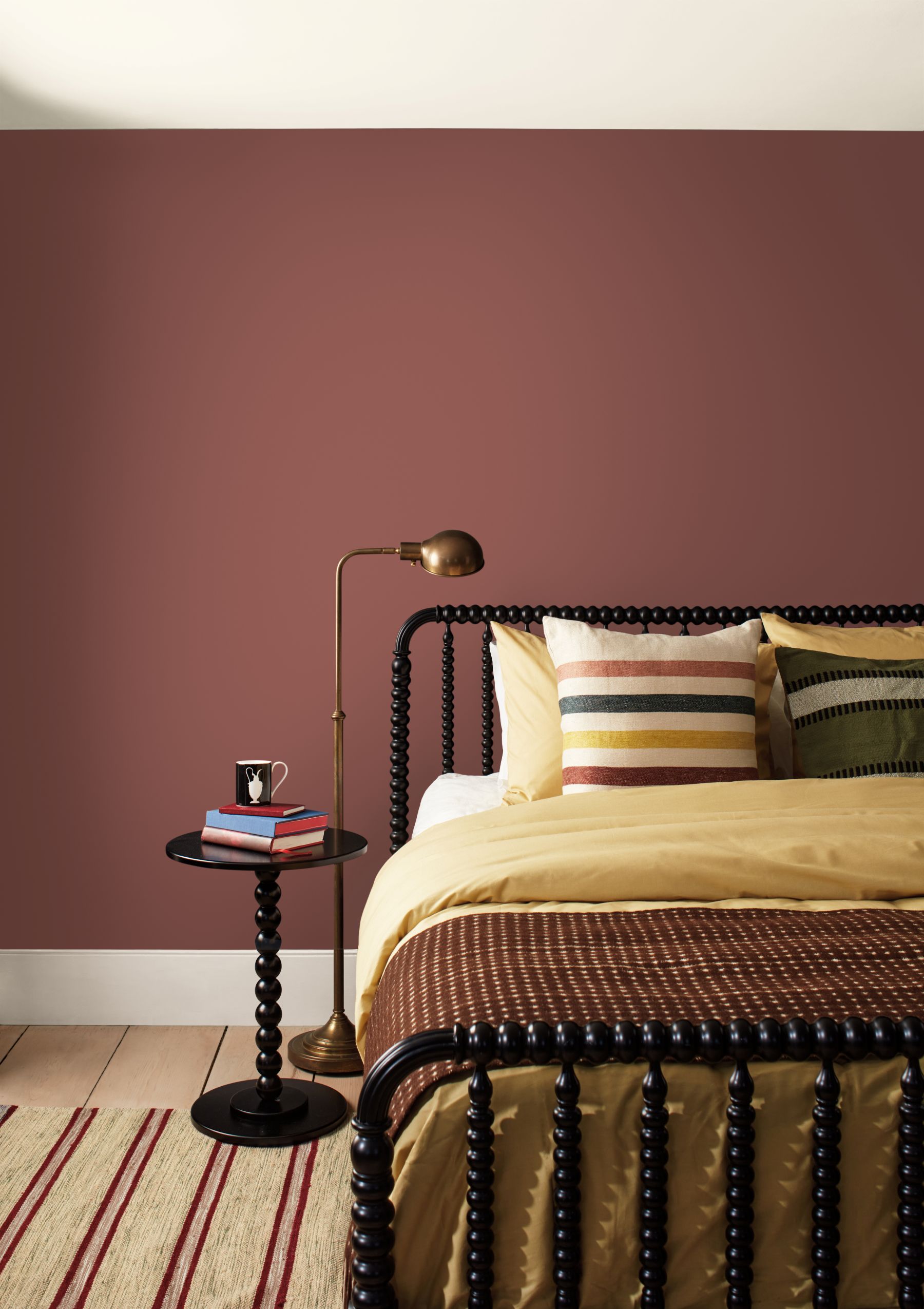
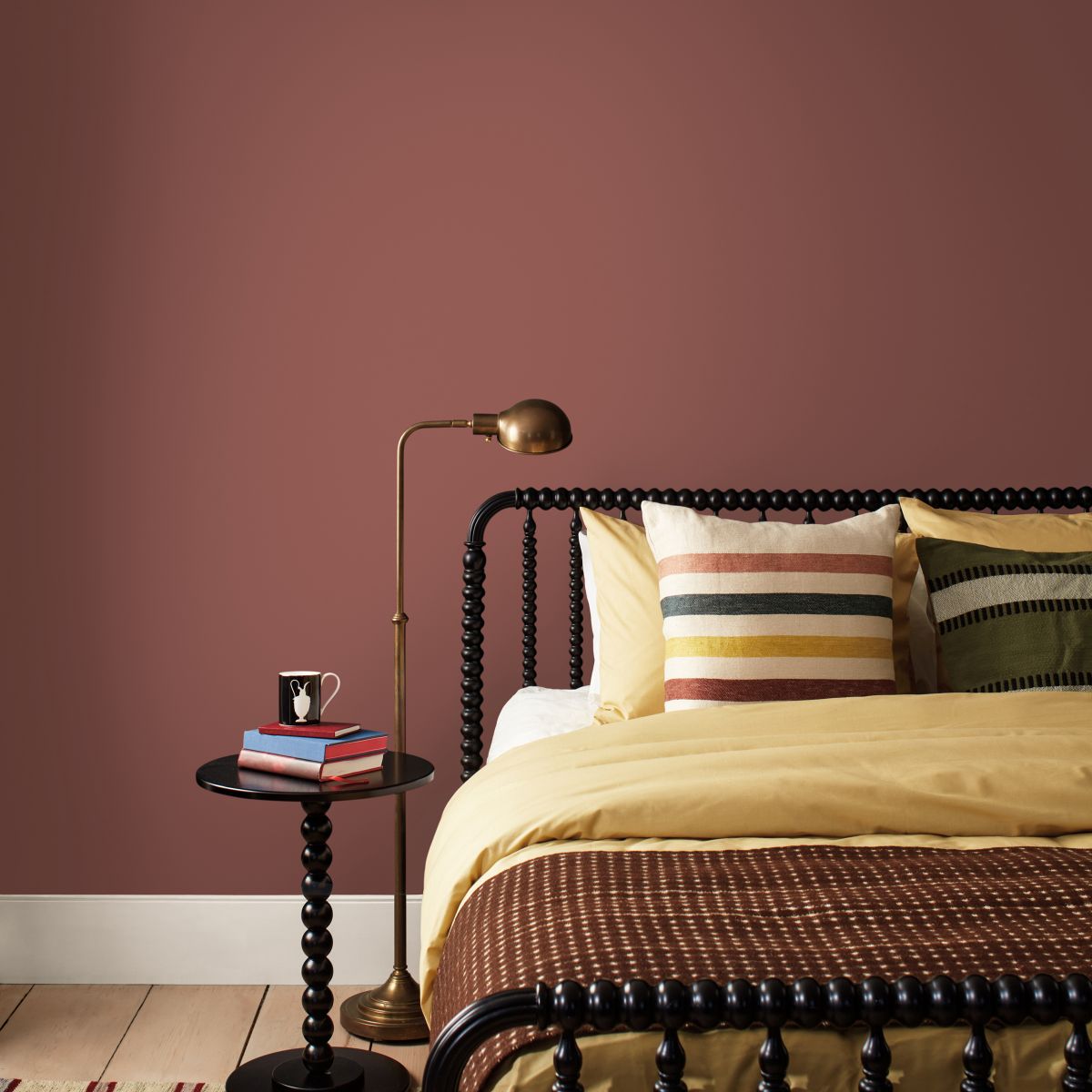
“Southwest Pottery” can create a beautiful backdrop for private spaces like bedrooms when used on all four walls. Warm textiles bring added notes of coziness to create a welcoming respite.
Create a monochromatic look by layering in blushed hues like “First Crush” with “Southwest Pottery”. This softens the palette bringing a modern touch to a more classically styled space.
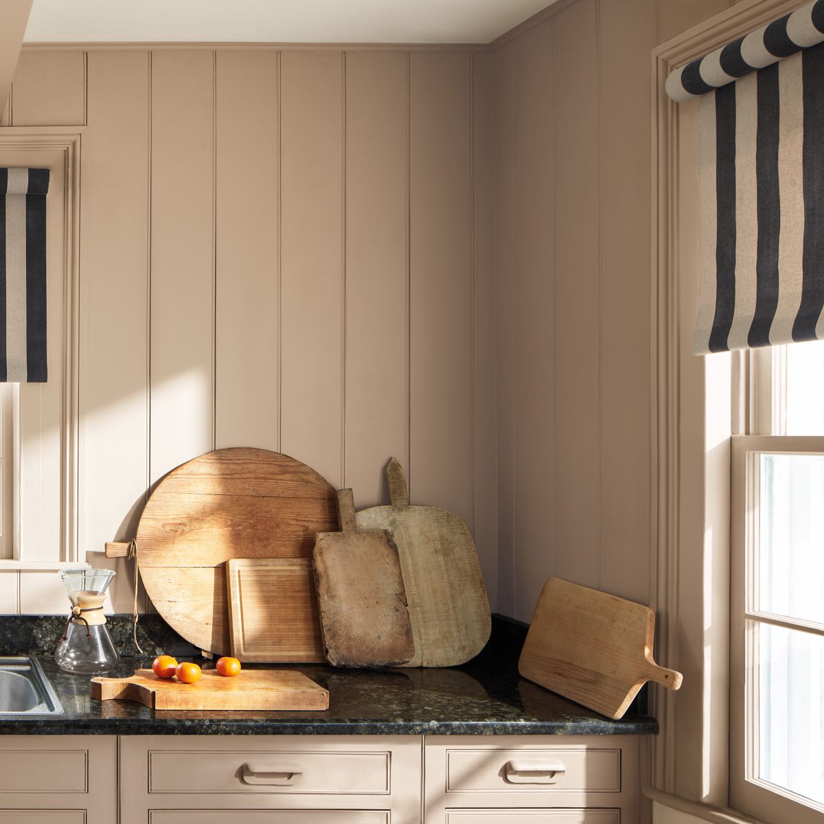
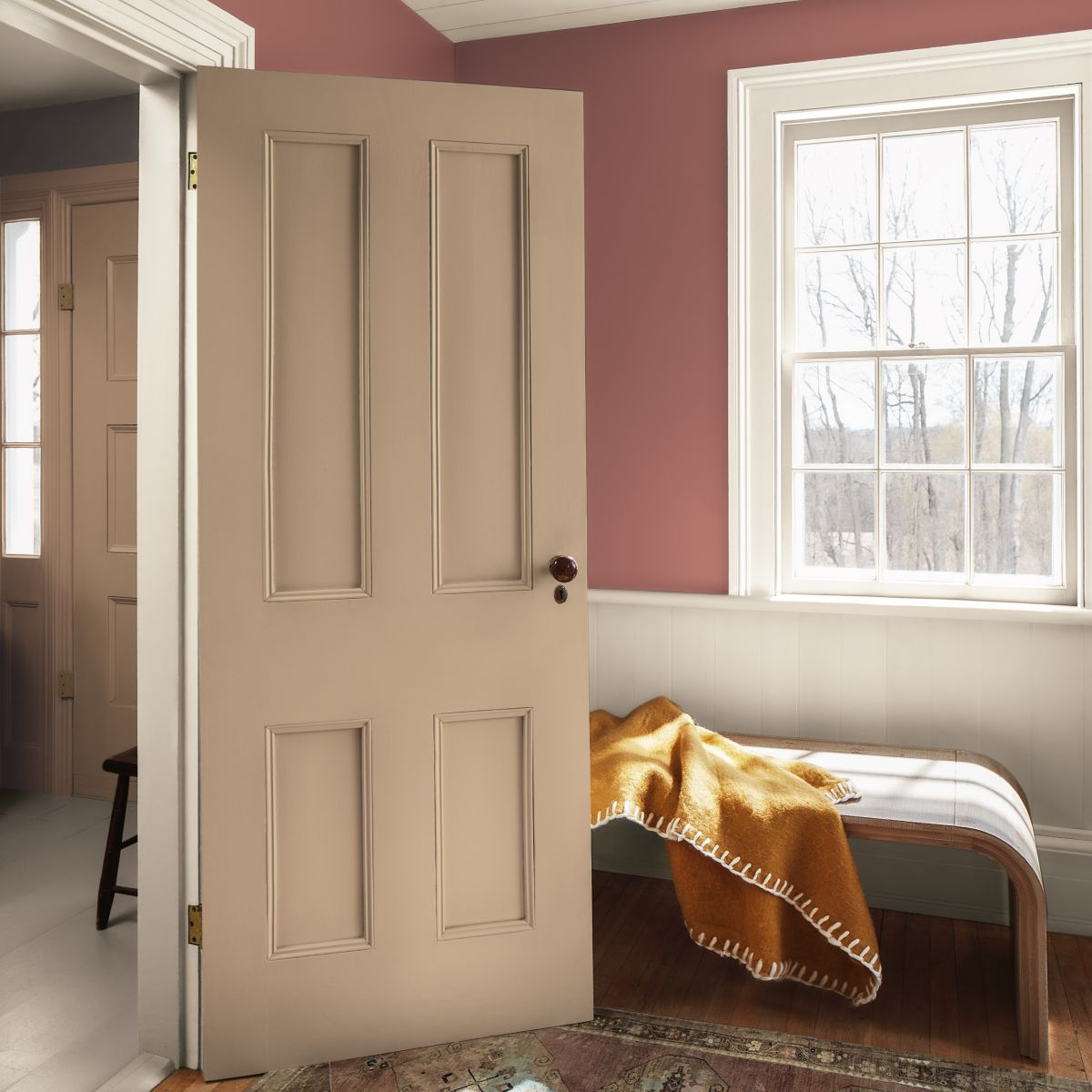
Classic beige…
“Sherwood Tan 1054” is a classic tan hue infused with notes of earthy brown.
When we combine it with navy blue, we get a timeless color combination. Keep the space feeling warm and welcoming with sandy neutrals, soft linens and blush accents.
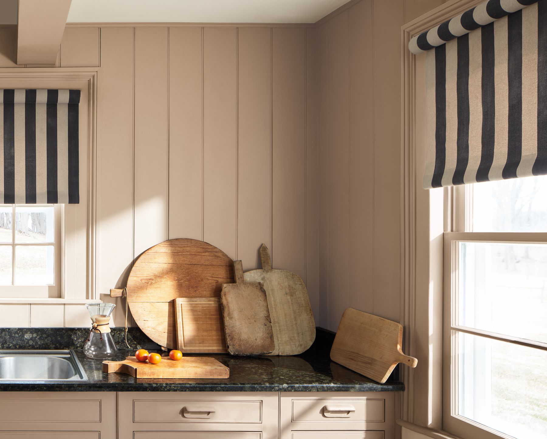
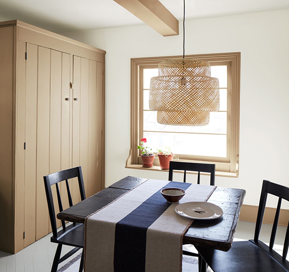
“Sherwood Tan” creates a refined touch in this kitchen space. This subtle shade on wooden panels with vertical joints, combined with a dark countertop, introduces a subtle but expressive contrast and adds depth.
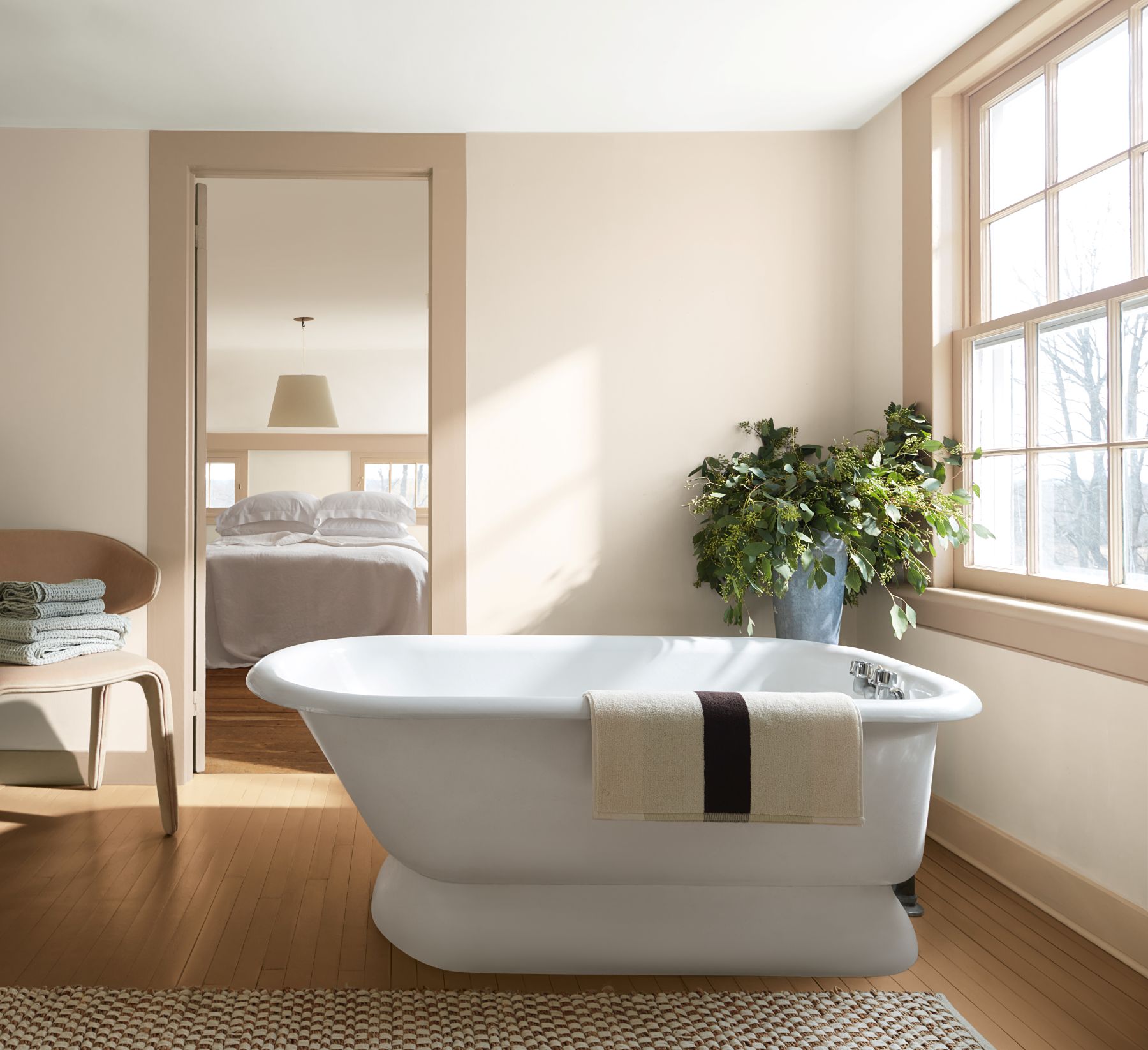
For a softer, more unexpected take, use “Sherwood Tan” on the trim with walls in “First Crush”. This highlights the large windows in the space and limits the need for additional décor and accents for a more minimalist but still inviting look.
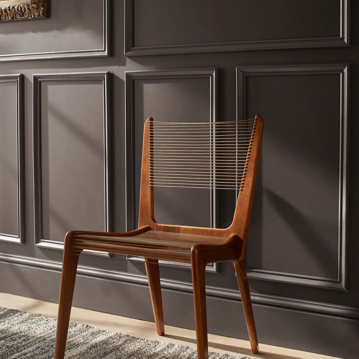
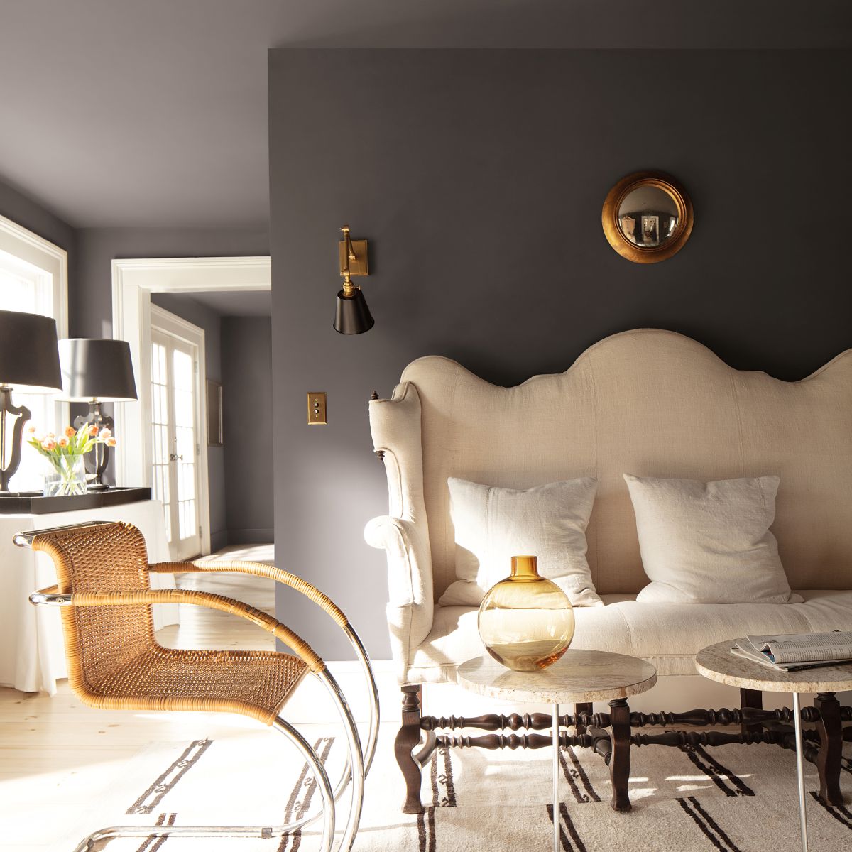
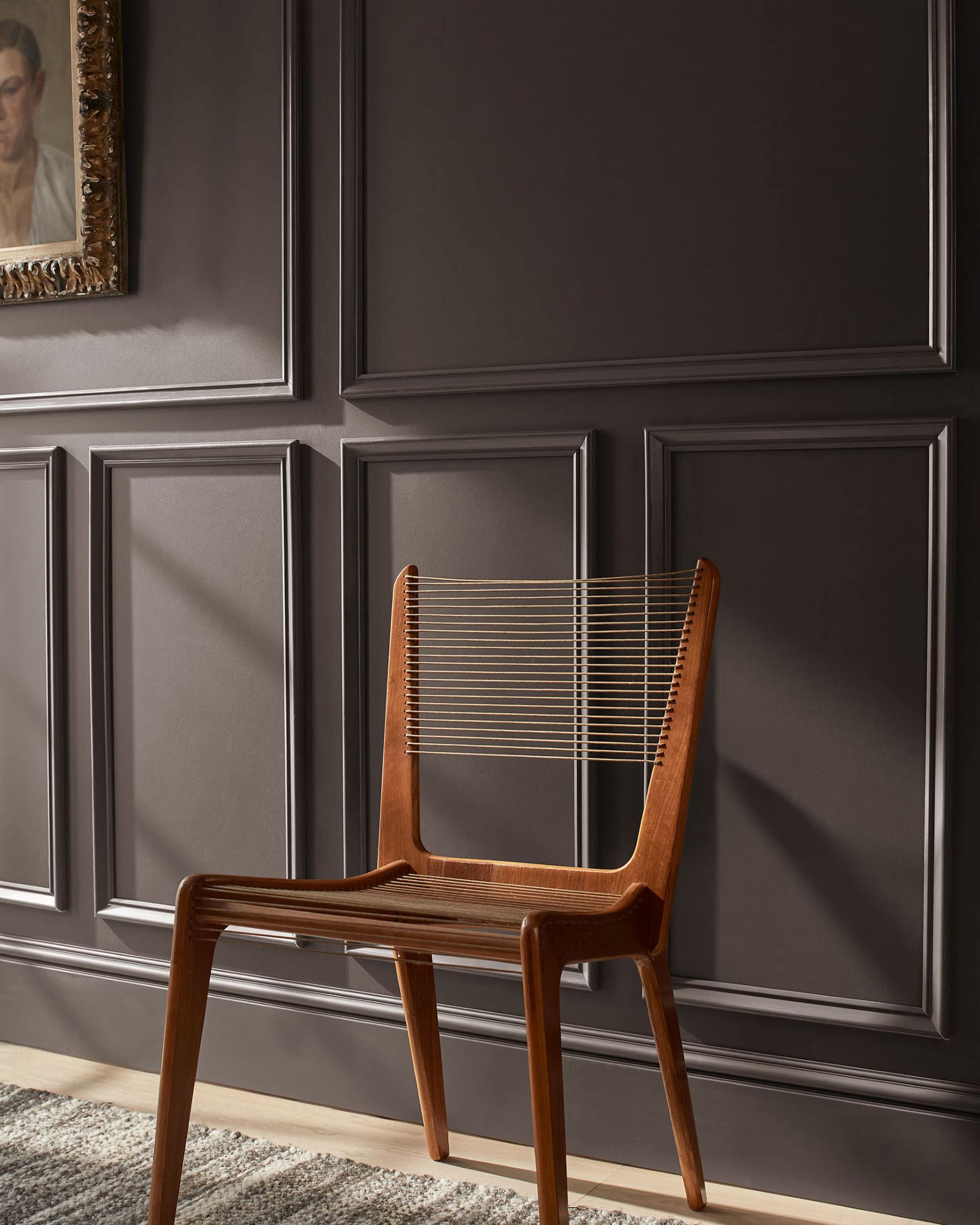
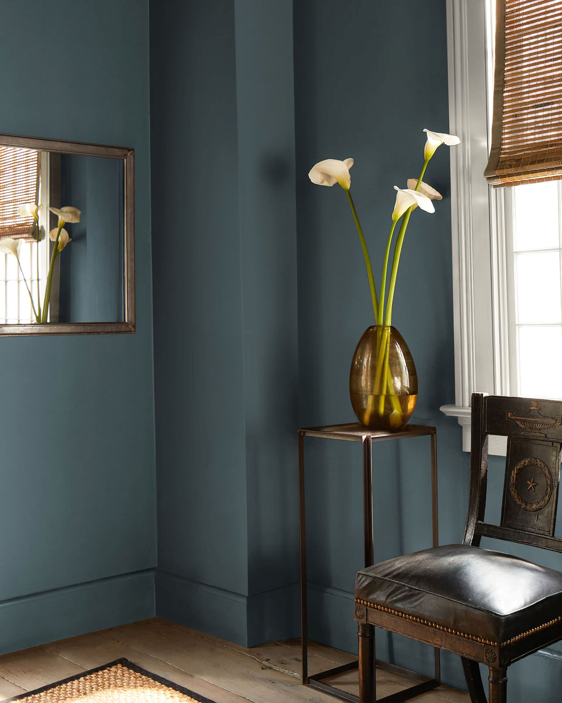
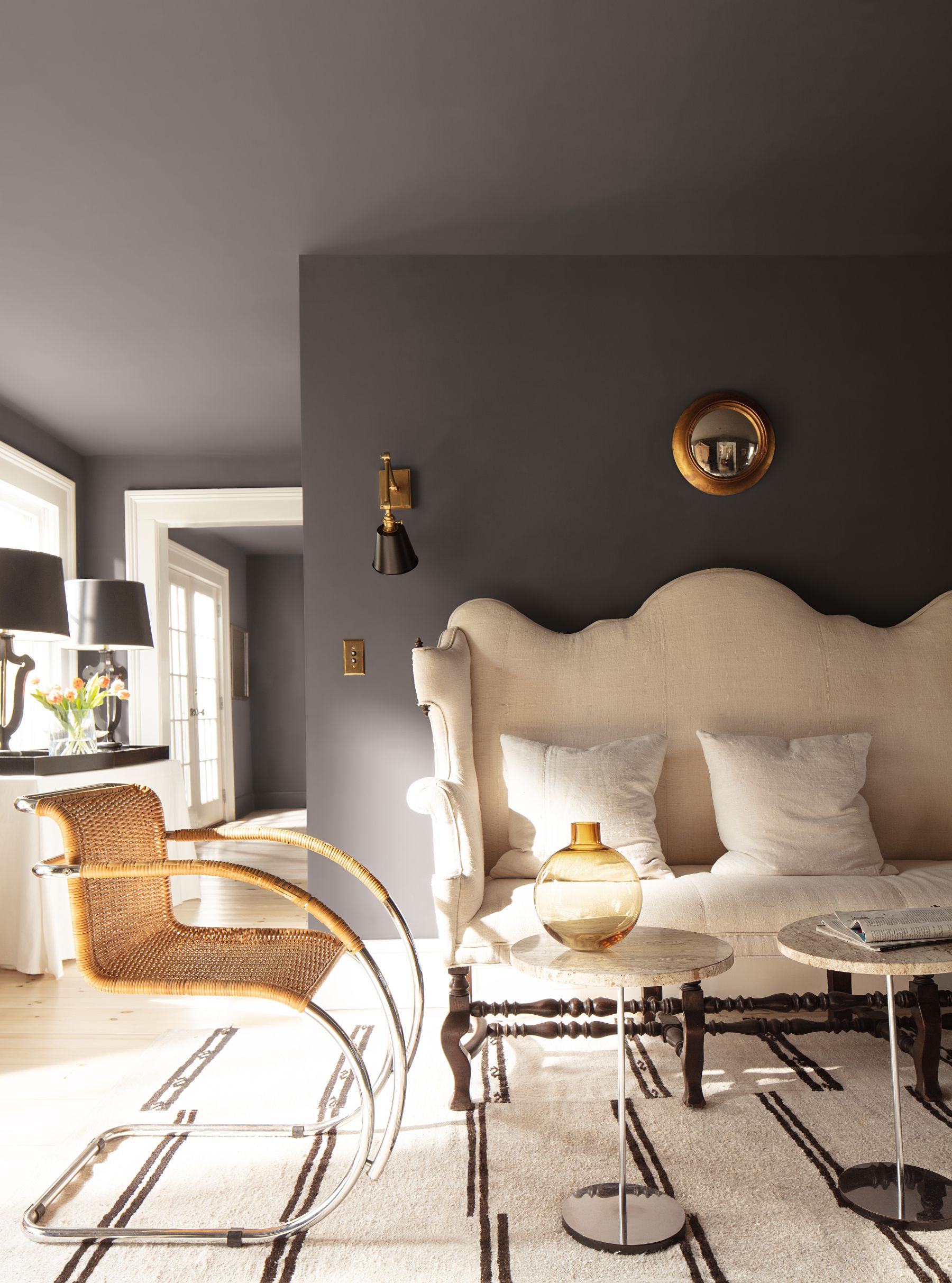
SILHOUETTE – the one of a kind…
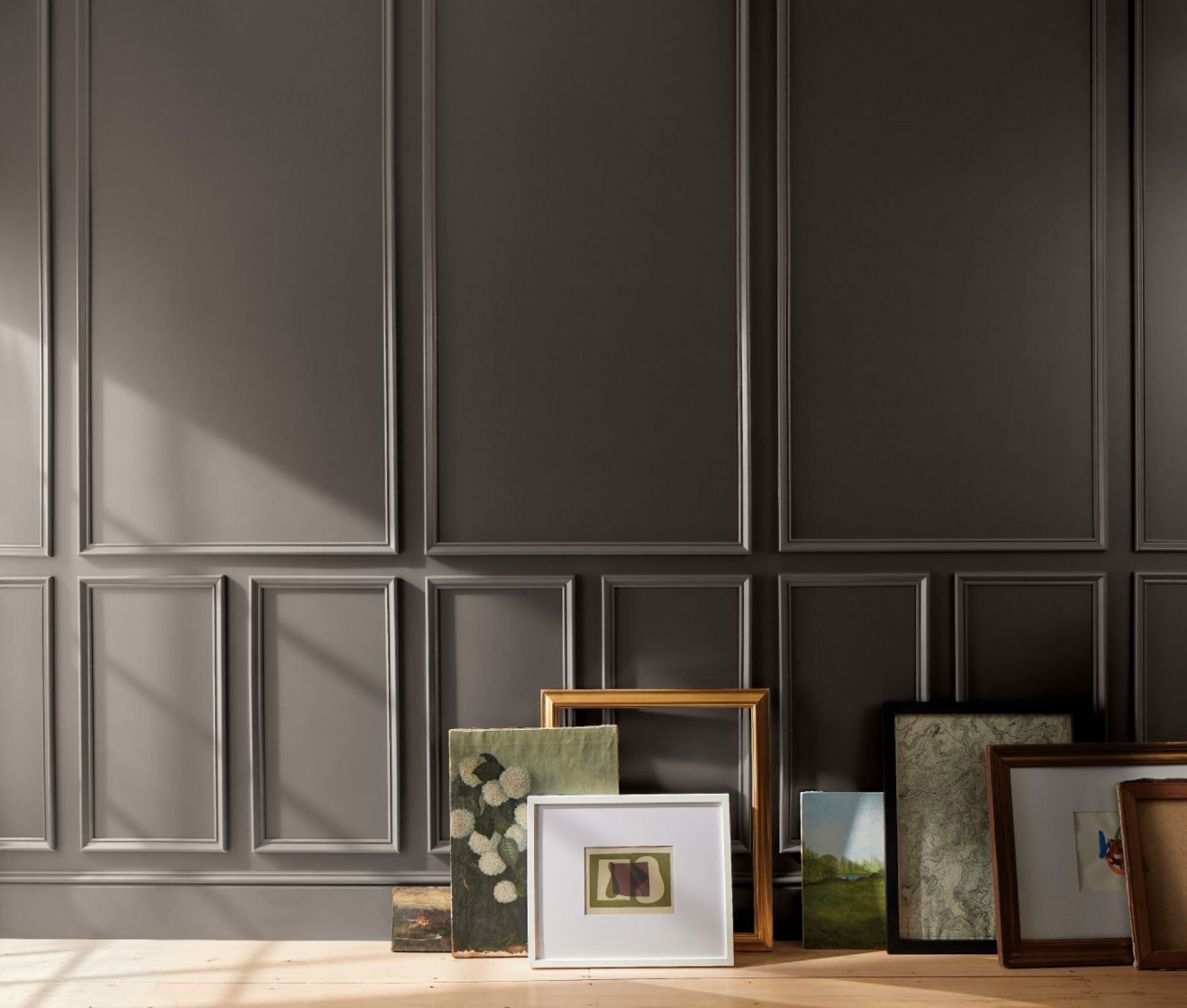
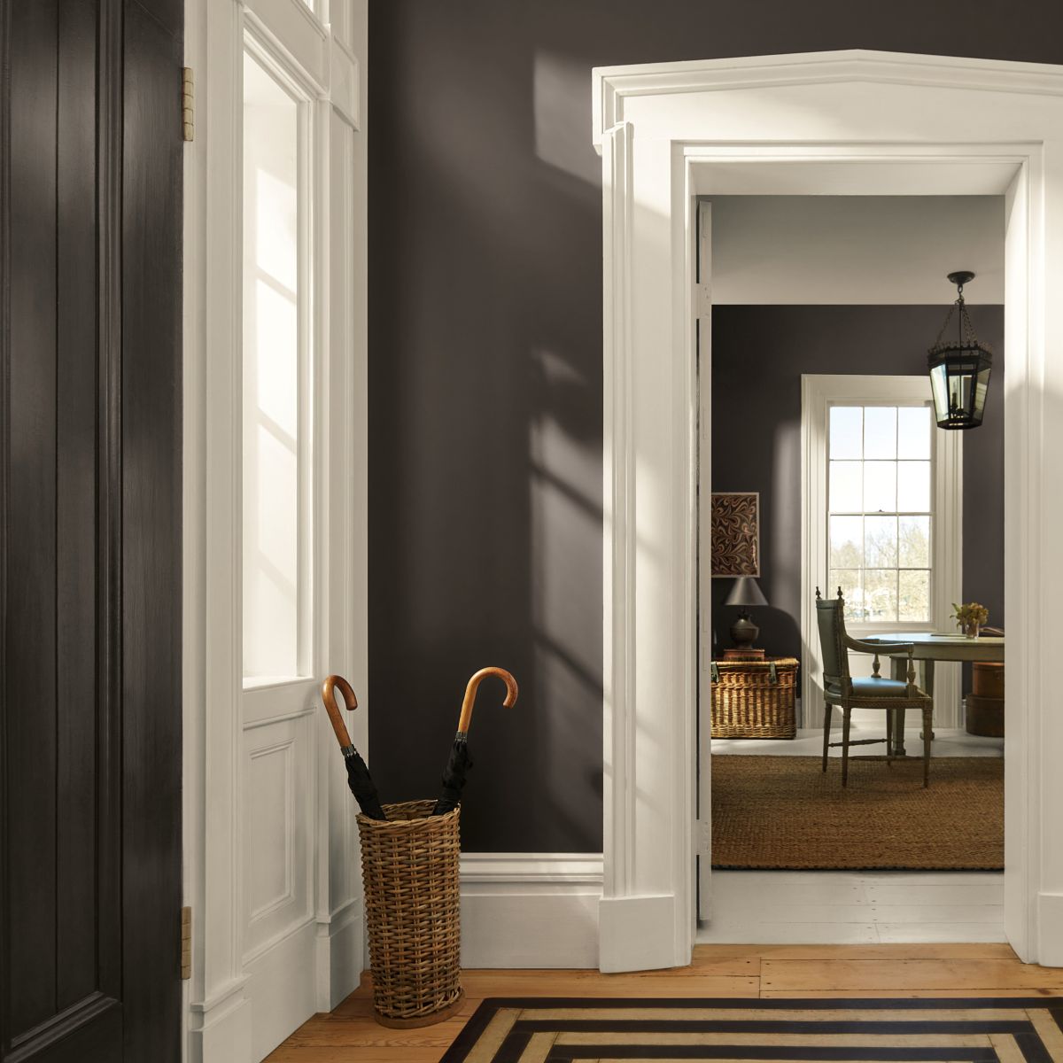
Reminiscent of tailored suiting, Silhouette AF-655, COLOR OF THE YEAR 2026 is an elegant color that weaves rich espresso hues with refined notes of charcoal.
Color drench the space by using it on the walls, trim and ceiling. Silhouette creates the perfect backdrop to playfully blend patterns for a more sophisticated take on bold design.
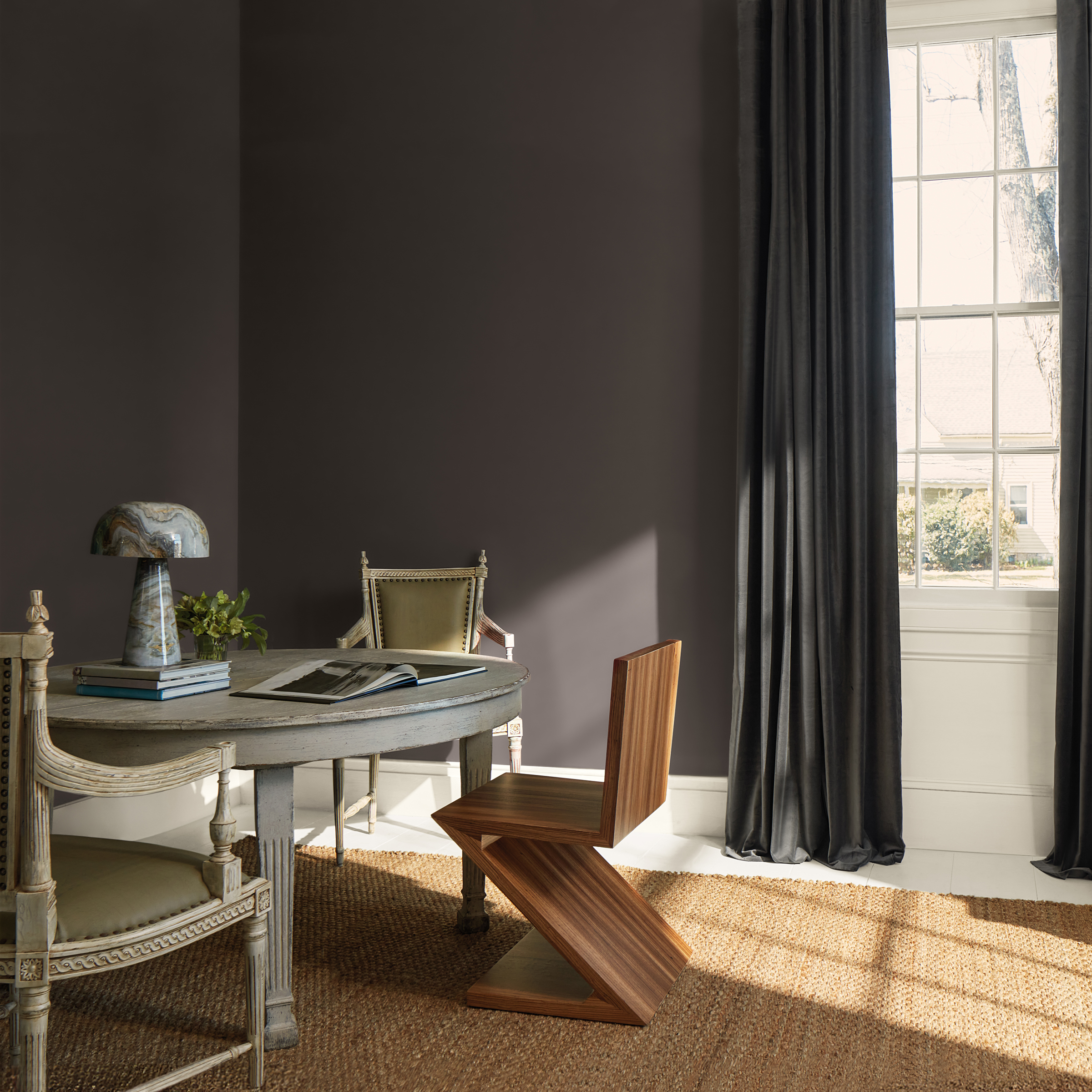
If you are hesitant on using darker colors in your design, consider trying them out in small doses and smaller spaces like bathrooms.
When using Silhouette on all four walls, consider using it on the ceiling as well for a more streamlined look. Keep textiles, accents, and furniture soft and light for added levity. Bring in metallic accents and reflective surfaces to keep the space from feeling too heavy.
When using darker paint colors, it is especially important to consider how all of the accents and details will work together in the space to create a cohesive look.